jasonhart
Name: Jason Hart
Bio: I'm a graphic designer, comic creator, & beard-maker/destroyer. I don't have neck or chest tattoos (yet). You can view my work here: http://showerstorm.tumblr.com (includes a handful of my short comic stories for your sampling pleasure) Some stuff I'm loving at the moment: Prophet, B.P.R.D., Casanova, Multiple Warheads, Love & Rockets, Orc Stain, Lone Wolf & Cub, Pluto, Preacher, Saga. I miss Scalped a lot though.
Twitter:
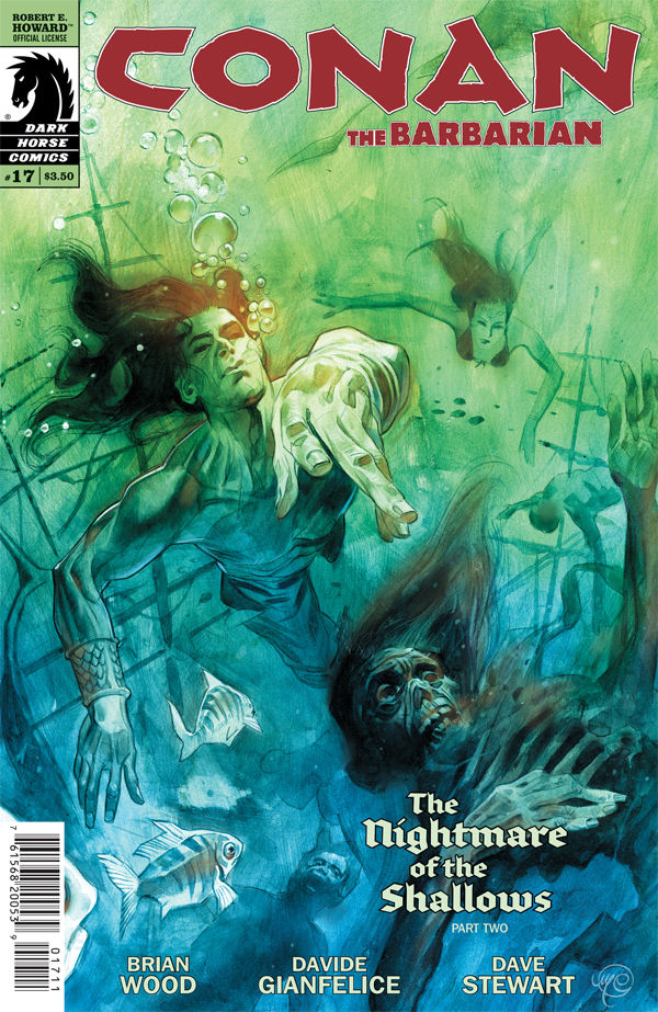
To be honest, I was not looking forward to this issue at all. A continuation of #16’s drug-induced dream/nightmare trip,…
Read full review and comments
This was pitch-perfect for me. The writing was witty & quick & established its characters. Spurrier doesn’t explain every element,…
Read full review and comments
[This stays abstract, no spoilers.] I’ve been trying to only sound off about things I feel positively for in comix…
Read full review and comments
