The rumored new DC Comics logo is the real deal. As expected, the initial impression of the black and white logo from everyone was I HATE THIS IT IS AWFUL WHY ARE YOU SO AWFUL DC COMICS HATE SPIT BILE.
But today, on the marketing website Fastcocreate.com, DC revealed their true colors, and the thinking behind the change.
“It wasn’t as obvious to the rest of the world as it was to the comic fans that Batman is from DC Comics or Sandman is a Vertigo character,” says John Rood, DC Entertainment’s executive vice president of sales, marketing, and business development. “Now that our audience has exploded beyond just a readership, we needed a way of making a more consistent connection between our properties and their parent brands.”
So you start with this:
But DC says that because of this:
“We didn’t want a static logo, but a living identity that could capture the power of our characters and storytelling,” says Amit Desai, senior vice president of franchise management. “What is special about DC content is the notion of a dual identity. When you think about our DC Comics superheroes, there’s a secret identity. When you think about Vertigo, it’s this notion of good vs. evil in many of the stories. And so, in addition to flexibility, the new logo communicates this idea of dual identity: There’s more than meets the eye. You have to take a closer look to understand the richness of our characters and stories.”
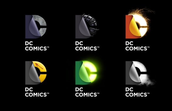
You get something more like this:
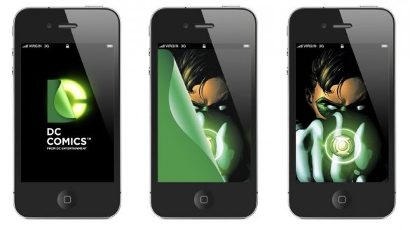
Or in terms of, say an iOS app, it might look like this:
And do you know what? I buy it. It works. One of the main criticisms I had about the DC relaunch was that they didn’t do enough to differentiate themselves from the past. Their old logo was an updated version of their older logo. It was for comic book fans who already existed, but wanted to modernize, but not too much. Well, here’s your change. It looks like a modern company, and it’s malleable within their various brands, and I think it works. Will this help them finally capture the fabled new reader? Lord no, but it’s not a bad step.
I also think Alan Moore is going to hate that Watchmen one. But the sun will also continue to rise in the east, and water will stay wet.
UPDATE – 1pm ET
DC Comics has just updated their blog with a statement about the logo and a whoe mess of images. Here are a few:
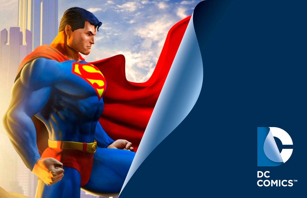
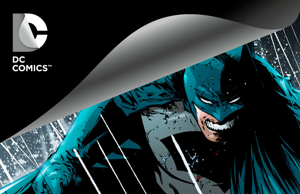
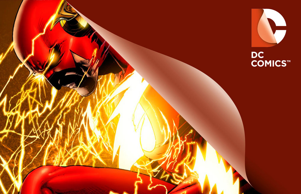
This one could be the main, sort of all-purpose DC Comics logo:
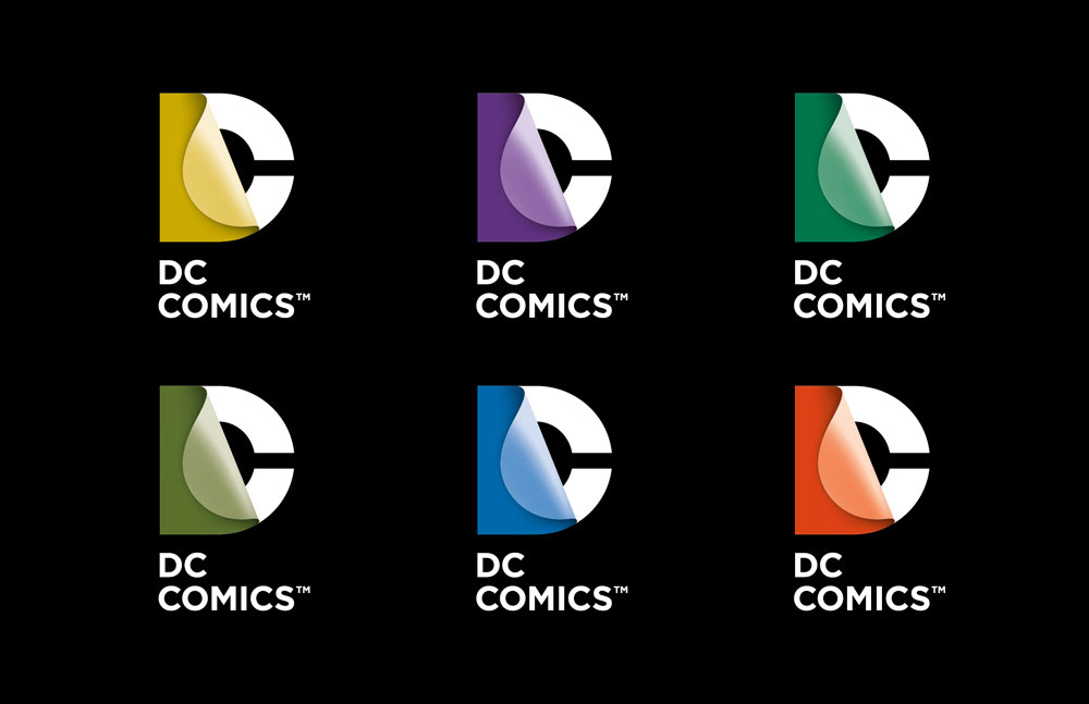
A group shot of colored logo without the character specific art elements:
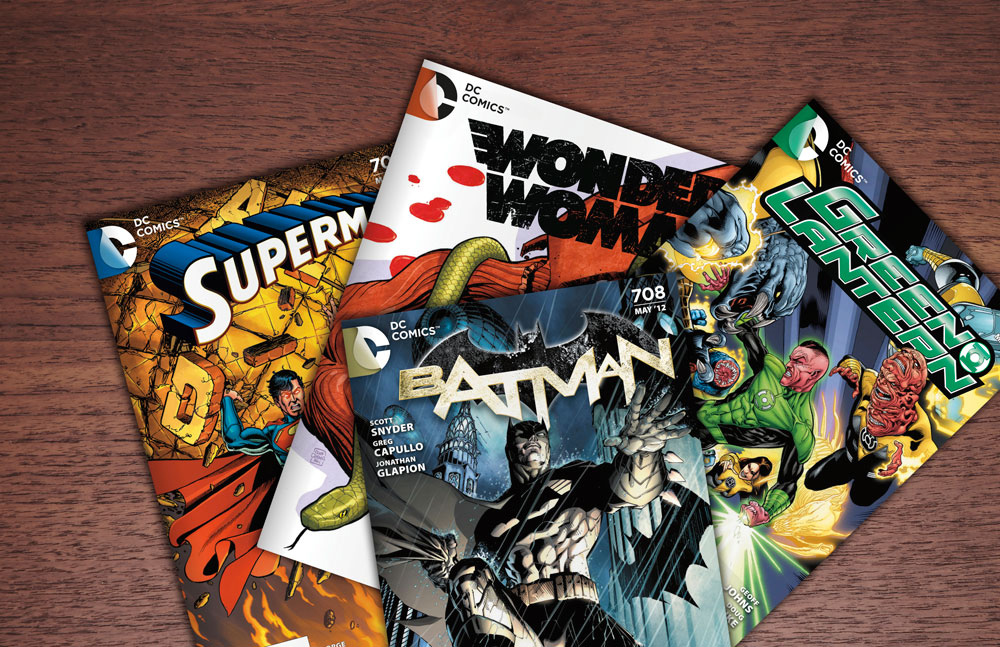
The new logo in context on single issue covers:
On a trade:
Some character specific plain color logos:
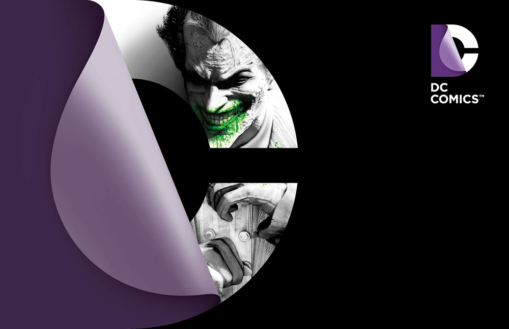
A character embedded in the logo itself:
Increased DC brand visibility:
Ali Colluccio is back with some thoughts:
Thursday we got to see quite a few samples of the new DC logo in possible executions. And love it or hate it, come March this is very much the new face of DC Entertainment.
The logo itself is turning out to be much more versatile than I was expecting. The majority of the character-based and color versions we’ve seen so far have worked quite well. It very clearly states “find out what’s inside”. It’s active. And when it’s well-executed I totally buy it. Personally, I really like how the cover treatment of the logo looks and how it starts at the fold instead of free-floating. And those “wallpapers” with the characters behind them look really sharp.
It is, however, a tricky devise. I think future variations created by competent graphic designers, will work quite well. But it also has potential to be trite and tacky if it’s not handled just right. I’m particularly nervous about how the animation of this logo will work.
What I think is most interesting–and very smart–is we’re starting to finally see a brand identity for DC Entertainment. There’s clear messaging that DC Comics, Vertigo, and Mad are all under the DC Entertainment umbrella, with the hope that there’s something for everyone to enjoy. I think this is something DC as an organization will be driving home over the next few months. The use of “new identity” in their messaging to describe the rebrand is a clever play on the secret identities of their characters; although, I think it could get a bit old if used too much.
Regardless of how you think these elements look, DC and Landor Associates (the branding agency behind this new identity) have created a strong brand strategy here. This isn’t warm-up pants and tshirts, DC has put a lot of effort and money into this new image. I really think they’ll come out looking like a legitimate, viable media company. Truth be told, they’ll need to make sure the quality of their content stays up to snuff through all this. But I think this is a great step forward for DC in the broader market, and hopefully for comics as a whole.


Wow….. that looks brilliant
One of these days I’d like to know what Alan Moore likes. 🙂
He’s sort of like Oscar the Grouch – being grumpy makes him happy, but being happy makes him grumpy. Caught in an endless loop of despair!
Alan Moore doesn’t even like what Alan Moore does.
I think he liked Lost Girls.
I’m fairly certain he likes to sing.
About how much he hates things.
He likes LOLCats.
Alan Moore is probably the only person lucky and talented enough to be writing in comics that also hates his job.
@TheGoddamnDeadpool: He’s not even close to being the only one.
@goddammdeadpool–self loathing and hatred of your professional success is pretty common in just about every creative field. Kurt Cobain is a good example…
I know he’s fun to jab at, but Allan Moore is one of the sweetest, kindest people out there. Yes, he doesn’t like his work being adapted, and yes, he doesn’t like the majority of comics that come out, but he’s a man who consistently tries, not just to make a good story, but explore and push the medium. I watched a video of Alan Moore talking to occupy protestors who called V for Vendetta a movie and not a comic, and he didn’t correct them. He just continued in the conversation, even though we all know how much that must of hurt him. He’s a genius and a humanist who believes in the power of the mind and imagination, and sure he’s easy to make fun of, but he doesn’t deserve all we throw at him. Also, I know this comment is totally TL;DR and unwarranted for the conversation, I’ve just been defending him a lot to a lot of people recently.
You don’t need to defend Alan Moore to me. He’s the single best comic book writer we’ve ever seen. I’m making a joke about his public persona, which is incredible comedic at this point.
On the other hand, I’ve also heard first hand stories about Alan Moore from industry vets that would tarnish whatever image you might have.
I would argue that most of Alan Moore’s perceived “grumpiness” is a misunderstanding of his extremely dry, sarcastic humor. If you read it in print, it comes off as pissy, but in audio interviews you can hear the wink in his voice.
hey, I hate myself for reading the MOST of the comics that i do. I can only imagine what it’s like to be forced to produce that cod’s wallop.
Alan Moore likes sweet rings.
Alan Moore is great. Also very jovial.
I like that an off the cuff comment by Josh takes up this much comment space. Even when DC does something as brash as changing their logo, Alan Moore still wins.
@serabird I’d be interested in watching that video, can you provide a link?
I love a lot of Alan Moore’s work and wonder why he hates his job, he’s definitely not the only one in comix but try working in n a steel mill or w toxic waste then talk to me about hating your job w creative freedom in a field you live an admire. I didn’t know he hated it, just thought he is a recluse and know he won’t watch any movies based on his work. I can see being preterbed w the industry and its expectations and deadlines but hate it, c’mon.
“The sun will continue to rise in the east, and water will stay wet.”
I laughed out loud when I read this. 🙂
The new, customizable and character-specific (?) color schemes do add a bit of panache to the new logo. I wasn’t really on board with the monochromatic gray/black palette, but this could grow on me.
Alright I can see the designs looking better when it’s applied to title runs but idk it still looks like a 70’s tv channel logo.
And now I love it. It really was a matter of it being black and white I guess. Still not terribly comic book, but there trying to break away from just the comic company and it works for that. Still not looking forward to seeing it on a print comic though.
I really dig those new dynamic looking logos, as opposed to the plain one that Ali showcased earlier in the week. They each have their own bit of character to them.
On a related not, the plain one reminds me of this, for some reason: http://www.youtube.com/watch?v=aDOuFnZnPMs
Wow, that context really makes a difference. Way to go DC, thinking outside the box. This approach really will lend well to digital applications, I think. From one marketing dude to another(s), Kudos.
that’s cool! Alright for DC getting out there and respecting their fans.
I still hate it. A logo mustn’t change color all the freaking time, it will confuse people! You should recognize the logo in less than 3 seconds for it to work. If I try to stare at it and wonder what the hell it is before realizing “oh, it’s DC Comics logo…” it means it failed.
Give me back my old logo in Blue and White DC!
a. because this can be confused with what other logo displaying a top letter peeling off a bottom layer? As a matter of fact, through you automatic hatred for it, you’ve already identified and know the logo. Your logic is ill
b. How long do you have to stare before the font that reads ‘DC COMICS’ directly under the logo registers with you?
Only failure is your rant.
Don’t like it? No problem, no one going to argue with you. But don’t make up fake BS to justify you dislike. You don’t like it. cool. Leave it at that. No problem dude.
The old DC bullet logo was presented in various colours to suit the design of the cover it appeared on. I’m sure designers hate having the blue logo messing with their cover’s design esthetic . I know the New 52 had differing coloured logos, but before the re-boot was the logo presented in any other colour than blue?
@JesseCuster: The fact you mentioned that the logo only reads with the aid of the tagline demonstrates the logo’s weakness
@JesseCuster, wow thanks for the hate message dude, you responded like you designed the damn thing! 0_o
@Edward, that’s exactly my point.
Marvel comics’ logo is recognizable instantly. The old DC comics logo too, out of context and without the tagline, most people who’re not into comics will fail to recognize it. Especially the colored/textured versions! The Green Lantern one is kick ass but my girlfriend who doesn’t read comics and doesn’t even know who Hal Jordan is wouldn’t recognize it being a) DC Comics logo, b) a nod to GL…
“DC content is the notion of a dual identity. When you think about our DC Comics superheroes, there’s a secret identity. When you think about Vertigo, it’s this notion of good vs. evil in many of the stories. And so, in addition to flexibility, the new logo communicates this idea of dual identity: There’s more than meets the eye. You have to take a closer look to understand the richness of our characters and stories.”
Didn’t get that at ALL. This does not say dual identity, good vs. evil, or yada yada. I do like the other versions with color, texture, etc. But since I’m more a fan of literal interpretations when it comes to graphic design, I can’t get into a logo that conceals half of what it’s all about.
those kinds of conceptual conversations usually stay in the early creative meetings as they rarely translate effectively to the “everyman”….sometimes a product of over thinking and justifying a giant creative fee.
It’s to sell to CEOs. They need a story.
I like this
Ok I feel a ton better about this new Logo after seeing this. Much better
The middle top one looks like a Xenomorph curled up.
I don’t trust it…
The basic logo reminds me of Apple’s apple logo. From a branding standpoint it works. And hey, I like it!
Cool! I like it with the different themes and coloring.
I get the idea but I still find the design visually unappealing. But hey, I already like DC Comics and in a few months I’ll be used to their ugly logo.
Okay I’m on board.
I’ll admit I wasn’t a fan of the template that was leaked earlier in the week. I guess I just reacted too soon, fans have never done that before 😉
When I look at the current logo I can already see it starting to look old (much like when I first saw the new Doctor Who logo) if that makes any sense. I’m still not 100% used to it but I’m sure I will be.
Well done DC.
I’m warming up to it. From the color renditions shown, some work better than others (dark on dark is tough). I still don’t love the brand mark or the afterthought Gotham type thats just dropped underneath, but i suppose its better. I dunno..its a lot of eye candy on something that isn’t inherently great on its own. It’ll be what its gonna be i suppose, but this is much more interesting than just the greyscale mark.
I still don’t like that its 100% dependent on smoke, mirrors and eye candy to be effective. There is something very limiting about that. I’d like to know what the real brand mark is. Like on letterhead and on official company stuff? Does it constantly change?
Landor does good work and they have really smart people working on some of the biggest brands in the world so i’ll give them a bit of credit to see how this gets implemented.
Its pretty experimental and conceptual for branding, and it does really stand out.
“When you think about Vertigo, it’s this notion of good vs. evil in many of the stories.”
As opposed to superhero comics?
I understand how this new logo can serve as a connecting point between DC’s various properties, but I don’t quite understand John Rood’s comparison/contrast between DC and Vertigo as an explanation. Why did he single out that one aspect? Does this mean that future Vertigo projects are going to bear the DC stamp more overtly? Is it really a distinguishing factor that DC superheroes have secret identities and Vertigo comics are about good vs. evil? Haven’t the protagonists of American Vampire, iZombie, and Unwritten tried to keep their identities secret at times? Is Scalped really about good vs. evil? Does Jonah Hex have a secret identity? Is secret identity a euphemism for costumed heroes? I have no complaints about the logos but I’m curious about the explanation.
I actually really like some of these variations, particularly the green and orange ones. Though I maintain that if it’s meant to be a D peeling away from a C, the D needs to have a hole cut out of it.
i only see 3 obvious characters. The other 3 aren’t very overt and could be lots of things. That right there is troubling. Where is Superman, Wonderwoman and Batman? if they are there its not an instant iconic read.
@wally
but its out of context. I agree with your assessment on what the ‘base’ or ‘home’ logo would really look like, what would appear on letterheads? (My assumption is the basic grey and black we all saw yesterday).
But in regards to identifying what the graphics represent, its presumably for whatever product you are holding in your very hands. If a golden version of the logo isn’t obvious… well it certainly will be if its on the package for a Booster Gold action figure or a Booster Gold comic… where you would presume that the golden version wouldn’t appear elsewhere.
I doubt there is going to an instance where you see a graphic logo with no context behind it. I admit I’m assuming a lot, but it just seems to make most sense to me. Everyone is over-thinking it right now.
@jesse—yeah it appears they are going with color coding instead of FX. You’re right its all about context for this. Its looking better.
The logo still looks bloody stupid. Seriously, remove the “caption” beneath it and tell me what brand that half covered “C” is supposed to be representing?
I’m no marketing expert but isn’t that immediately a fail?
You’re right.
You’re no expert in marketing.
Still think it looks awful. Not because I hate change, but because that design is pretty ugly.
I like it more with the color, simple and bold. I bet they needed to get it out there now so that a motion graphic is ready for Dark Knight Rises.
First off, the new logo won’t make me boycott DC. I will still get the books that I like regardless. That said, I still don’t like the logo in its variant editions. I still think that if you look at the logo by itself, without the “DC Comics” or DC Entertainment” text underneath it, a casual viewer wouldn’t easily place it as DC. In a two second glance, all I can see is the “C”. In the color versions, I only sometimes see that. Marketing’s main task is to make products recognizable and easy to understand. It seems to me that these logos are counterproductive. The variant editions especially aren’t catering to an expanded fanbase, but specifically to longtime comic fans who can easily catch the references in the color changes or the effects in the logo. The DC star-swoosh thing was just fine. Maybe flattening that and just using the star and trail would’ve been more eye-catching and still stayed more recognizable than this complete overhaul. I dunno. I can see it’s animated application in iOS or Android apps, but it’s going to take a long while for me to get used to seeing this and it’s variants in print.
Moore likes facial hair!
This logo is actually quite inventive, nice idea.
Cool!
The color helps a lot. I don’t hate it as much by a long shot. That still doesn’t look like a “D” to me. Not sure if laymen will get it or not, but it’s not like new readers are flocking to comics these days.
This looks more like a “C” is doing burlesque and giving us a peek under it’s outer wrapping. (I KNOW, I KNOW, https://ifanboy.com/articles/whats-wrong-with-you-boys-and-girls/). But it does!
“And so, in addition to flexibility, the new logo communicates this idea of dual identity: There’s more than meets the eye. You have to take a closer look to understand the richness of our characters and stories.” That’s a line that takes me back to college where some blowhard professors read too much into things. It’s a logo! Can people clearly see it stands for DC? No. Fail.
I want to sell the individual characters logos, like supes and ww
It’s probably illegal to do that though. We talking key chains?
Stupid phone auto correct!
Curious to see how the “C” effects (glow, smoke, sparks, etc) will look printed on a comic, assuming that’s the road this will go down. Might be weird to see that GL-glowing logo up in the corner of my next GL comic buy.
Love the fuel-on-the-fire potential with that Watchmen logo too.
As that Black and white thing it was a disaster, I wasn’t aware that was a template. Probably should have been, but hey that’s on me. This and the explanations are pretty good, the green lantern one especially!
However, once again comic fans get treated like garbage for being unreasonable, as if they are the only “fans” that act in the various ways derided constantly by everyone (including those within the various stereotypes).
Any one ever been to a video game blog/site or the imdb forums? But whatever, I guess it’s always fun to hate one’s self?
I was taking a look at the official system images and applications (on comics) over on the source blog….its starting to convince me. Its very bold and looks pretty damn contemporary. I dunno…i might be flip flopping…
So when do we think we’ll start seeing this on the books?
In the article it says March. They already have comp photos out.
I love the way it looks on that comp image. Especially how the logo goes right into the spine. I liked the logo before, but I like it even more now.
Not bad. They look like weird lifesavers….yum
Nope, even with the update I’m still not convinced… I guess I’ll get used to it, but still!
I definitely like it more now then what first came out… more on the logo change here: http://martelljt.wordpress.com/2012/01/19/dc-entertainment-unveils-future-brand/
Man, I would have liked to have gotten paid thousands of dollars to simply put “From DC Entertainment” under the Vertigo logo.
After the kind of money made off of it??? Presumably this guy: http://www.anorak.co.uk/wp-content/uploads/2011/09/happy-dog.jpg
Ron its actually the guy who came up with “New Coke” Genius!
@Ron–If you only knew how much Landor charges for branding work……
At least they used a font called Gotham.
I’m assuming you realize they got paid, not just for that but the whole kit right?
@JNewcomb: He knows. He’s being snarky.
Love em all! The original one we say, as was hoped, does work in the right context and the others just look cool. Looks professional and will sit nicely alongside those trades with a red bar running down the side. It just works.
With color it works.
I really like how it looks on the books. It’s simple and clean and easily adapted to each book. To me, it looks like a logo that a normal book publisher would use. You can tell it’s DC but it doesn’t distract from the rest of the cover.
Also, did anyone notice the issues they altered are numbered 708? Does that number have any significance to DC?
I’m really curious to see how they’ll handle the different colour palettes for trades. My DC shelf is already inconsistent enough with the logos — some are blue! Some aren’t! Some are vertical! Some are horizontal! — and having a single, simple logo may help with standardization. I like seeing the logos match and line up, which Marvel and Image do much better with their trades.
I HATE THIS IT IS AWFUL WHY ARE YOU SO AWFUL DC COMICS HATE SPIT BILE.
Not really. I think I’m too dumb to care. It does look more modern than the old one, but I really didn’t have a problem with the old one. I’ll leave it to you brand geniuses to criticize, but from a moron’s perspective, I think this will work just fine.
In the end changing the logo will make no difference in sales! It’s nice but what is the goal of the change?
‘One of the main criticisms I had about the DC relaunch was that they didn’t do enough to differentiate themselves from the past. Their old logo was an updated version of their older logo. It was for comic book fans who already existed, but wanted to modernize, but not too much. Well, here’s your change. It looks like a modern company, and it’s malleable within their various brands.’
That the goal. As for your sales point that’s a different matter. Though it does present DC are a far more organised, coherent managed modern company. That’s the point of branding.
It might make a difference for DC Entertainment sales, but for DC Comics sales it may not. And I’m pretty sure they’re okay with that. In the big picture, the money isn’t it in the comics. DC will make their money with movies, toys, cartoons, t-shirts at Target, etc. and all of those different merchandising areas will be united with this new logo.
It does bear a bit of a resemblance to the Discovery History logo
http://images.wikia.com/logopedia/images/8/8e/Discovery_History_2010.png
It certainly makes more sense in color, in context, and all that. I just still don’t like the look of it.
Oh well. I’ll live.
It looked like ass sitting by itself, but it looks MUCH better in use, especially on the spine of that trade, and the covers of the comics. The Supes/Batman/Flash/Joker images, not so much.
Looks better. Still not a fan of the design. Simply not visually appealing to my eye. If I was a big company, I’d demand better. But it’s not the worst thing in the world. And given it’s minimal stature, odds are it will blend into the background and nobody will even notice it much once it’s fully integrated.
why is Batman and Superman issues listed as 708 and 70? in the preview example images?
Probably just for mock-up purposes.
My immediate reaction was, “Great. Now my bookshelf is going to have inconsistent trade dress…” I do like the logo though.
it’s funny how a little colour can go such a long way to help change people’s minds. I’ve definitely warmed up to it with these mock ups. It looks good on the books and much more of a fan of the plain colour version than the specialize dynamic ones at the top of the article. I still wish they had kept the old logo around a little while long as it does feel that it only just started getting it’s legs, but Im happy with this new one now too.
lol, I loved this from the beginning but I could tell where they were going with it.
Wow.
What?
We’re just so very impressed is all.
What the hell is with this passive aggressive sarcasm.
I’ve worked in branding.People shit their pants about logos all the time and they see it in context and wish they had clean pants.
I find it amusing that when the logo was first revealed every piled on. Now they see it in action and they’re all: “Well, I guess I like it now”. So I made a comment about it. Someone assumed I was bragging about this? Seriously?
Well, let this be my turn. Wow.
I think this is your super-villain origin.
Okay, let’s everyone dial it down.
so wait, those first two images (the logos and the apps)… are those Photoshopped?
Do you mean are they not real? They’re in the linked article from the firm that de the rebrand. They’ll probably be used for non-comics media.
@kuhan–they are probably not real yet. What you are seeing is the foundations of the identity system for the new brand. Its a necessary step in the design process.
i wonder how much creative control the book’s creators can use with the new logo. would they be able to choose a secret little drawing to put on the logo or would they have to use the predetermined color-scheme for the logo? that joker on the logo is pretty cool.
i still wish that the part that was peeling back looked more like a page and less like one of the security strips that come on cds.
Can’t anyone make something that’s simply fast and brown these days?
I like it. But which heroes do those character-specific versions represent? I see Watchmen and Green Lantern.
Superman (Man of “Steel”), Catwoman (“whip”), Flash (“lightning, sparks”), Watchmen (“blod-stained badge”), Green Lantern (“energy ring glow”), Batman (“smoke screen”)
I really love this new take on the terrible logo.
The original idea was bland and boring. But now they really seemed to have figured out how to make it more then just a sleek and modern logo for the 21st Century. Having the logo match the character in each book, for example, is a fantastic idea and I can only think of how you can improve it from there.
I’m glad that a company actually looked at what they had, felt it was bad too, and fixed it to make it better.
Wow, now that I’ve seen it on some actual comics… I think it’s worse than ever.
Am i the only one that doesn’t care about the logo one way or the other? I just care about the comic itself. the logo doesn’t even really register in my head for whatever reason.
Seeing the variations and in context really helps. It’s not so bad now. I especially like the top pic of DC Entertainment being in a box. Framing it makes the lopsided wording work better. Also, the edge of the D trailing off the cover works well. It certainly looks cleaner than the giant COMICS they added to the new 52.
Don’t judge a book by its cover
Story and Art are what is important.
I can’t remember the last time I looked at the logo
this is not that big of a deal
Yu have a logo as your avatar. Ha.
i like it. but, your right. this not that big of a deal
You*
I think Yu missed the point
Texas just paid $111 million for Yu.
I think it’s a cool logo. Not bad at all when you see the variety of things they can do with it as far as personalizing it with different color schemes, etc.
That said, I don’t like it better than the current logo. I do prefer the logo to the “bullet” design of the 80s and 90s, though.
I like the application of the themes, that’s really great and cool. There’s one huge problem with the logo. It doesn’t read as the letters “DC” specifically the “D” That’s one of those fundamental elements you need to consider in design.
But what do i know? I only have a degree in graphic design
That’s my main thing. But whatever.
Ack! I just agreed with Edward! 😛
@edward – I agree, except that the peel alludes to a ‘D’ shape when it isn’t peeled back.
In my eyes, the biggest challenge of the static logo is that it does require the viewer to animate it in their heads (which requires some creativity on the end users part). I’m sure it will become clearer once we see the logo animated (perhaps during The Dark Knight Rises?)
@Kmanifesto: then you actually disagree with me
Pretty weird logo still, also is up with the black ribbed logo? Aliens?
Ribbed for her pleasure.
Nicely stated update Ali. I share some of those same concerns, but also have come around in thinking it could really work if they stay true to the system. Staying “on brand” with an ID system is always tough, but .this one looks particularly challenging.
OK, now that’s better.
Me like, me want, me buy!
Did anyone else notice that the single issues in one of the photos has pre-New 52 issue numbers? Perhaps DC’s initial plans were not to reboot the numbers?
Nope, they’re just mock-up covers.
Yeah I like that a lot. Looks especially good on the trades, looking forward to seeing it on some new books.
Interesting times! I don’t understand how the wider public are expected to get to know the new brand when it has apparently infinite variations, mind. I do like some of these, but agree with the posters saying it doesn’t obviously read as ‘DC’.
To me, the new logo feels mature which I like. Comics may not be for kids, but I wonder how it plays on all ages books, which I hope DC plans on putting more of out. . . putting out more of. . . I HOPE THEY PUT MORE ALL AGES BOOKS OUT. Stupid syntax!
Just say “publish”.
Screw that! That’s just lazy.
This whole thing is a huge misstep, obviously not done with any forethought. Any new logo, good or bad, should have been rolled out with the New 52, not 6 months later. The logo is still inappropriate for comics however, and the most adaptation you’re going to see a few months from now is maybe different colors. The idea of a glowing green logo for Green Lantern and lightning for the Flash is cool, but won’t last. A logo needs to stand on its own first, and can then be interpreted into new permutations. This seems designed with customizability in mind first. Very gimmicky (on the other hand, what screams “COMICS!” more than gimmicks). It does look good on a screen, but it doesn’t look good in print. Also, logos that rely on gradients are limited in their use, and will suffer greatly when translated to one color printing.
I’d like to see a poll on this subject to get an idea of the general feeling towards it.
Not a fan, the concept behind the d and c is just goofy.
130 comments about a logo? I’m loving comics fans more and more.
Maybe it’s all the work of that damned red hooded reset button woman.
I just printed the logo out and brought it to three people and said, what is this the logo for? And they all said “C” something, I guess.
And they I said, “the sticker is a ‘d'”.
And they said, “Oh. I guess. You can’t see that, though.”
If you handed the three people who’ve never been to or heard of a McDonald’s their golden arches logo, would they know what it’s for a chain of fast food restaurants?
Context is key.
Sorry, scratch the first “the”
yes context is key, but it should also be legible enough to make out the things your’e supposed to see. Thats basic first read stuff…context and application is 2nd and 3rd read stuff. He wasn’t asking if they knew it was a comics logo…just if they could see the two letters there. Thats a big deal if the man on the street doesn’t get it. Remember these are for a media conglomerate, not just a comic book publisher.
The average person isn’t aware that the Toyota logo is more than just a T in a circle. Every letter of the word Toyota is found inside it…but you’ll never see it unless someone tells you..its a really big stretch, but its in the concept.
Fair enough but it seems like all of the appearances of the logo will also spell out “DC Comics” or “DC Entertainment” underneath. It just seems like mountain-making and moles are terrible climbers.
oh sure its all degrees of nitpicking. Its kinda fun for me cause i’m in that business. I’m always very interested in seeing how average people react to design work. it can be the most honest critique on the planet.
It’s a cool looking logo, I think, but if you have to spell the whole company name out just to make people recognize the two letters you are trying to represent, I’d call that a failed design. And one of the three people I showed it to is a regular comic reader, so the letters “D” and “C” together aren’t far from the tip of his brain at any given time.
The McDonald’s arch is definitely an M.
The McDonalds logo is definitely an “M” and has remained essentially the same since it was designed in 1962. That said, I would stop just short of saying the classic “DC” logo is even in the same ballpark in terms of design, recognition, elegance, etc. That said, this has that New Coke smell.
C’mon, the blood splatter on the Watchmen-themed logo is wrong! The angle of the blood on the smiley face is supposed to represent the hand on the doomsday clock, an important visual motif of the story.
If you’re going to desecrate my sacred cow, at least do it right!
haha
Hmm batman issue 708?
It’s just a mock-up. The internet has been atwitter with rumors that DC is going back to their old numbering because of that image. BATMAN ran to issue 713 before the relaunch, so if they were going back to their old numbers, it would be near 720. It’s just a mock-up. No need for concern.
I like the “opening a book” concept for sure but don’t know if I wanna see it on every issue as I’m partial to the current “swoosh” logo but love it for a DC Entertainment logo sometimes animated before a feature as its obvious they needed an imprint and division brand recognition to stamp they’re mark like Marvel Studios. Wouldn’t look bad on the lower back corner of absolute and omnibuses and probably not bad on comix covers either but still love the current logo as it has the feel of a comic book captured. The different thematic versions are brilliant and fun too and am curious to see others but hope they have better ideas for Batmans. VERTIGO looks good as is, a division that says adult themed books here.
Its a big deal in brand recognition and although I’m partial to the current logo, they can lose the New52 headline already. I love that two tone Vertigo Sandman pic and putting DC Entertainment underneath it may be a smart marketing move, but glad its done minimalist as not to clutter a good VERTIGO logo.
I didn’t really look at the mock up pics above before commenting, not bad but think they’ll improve and do kinda like it.
Woah I really like that. It works really well, simple but not so simple that it looks like a child thought it up. I glanced up at the books I have on my shelf and it looks a million times better compared to the pictures they have on the trades. It will take a bit of getting used to on the front of the single issues for some reason.
I liiiike it.
Did anyone see the ‘deluxe.com’ ad on the home page here? Look at the logo.