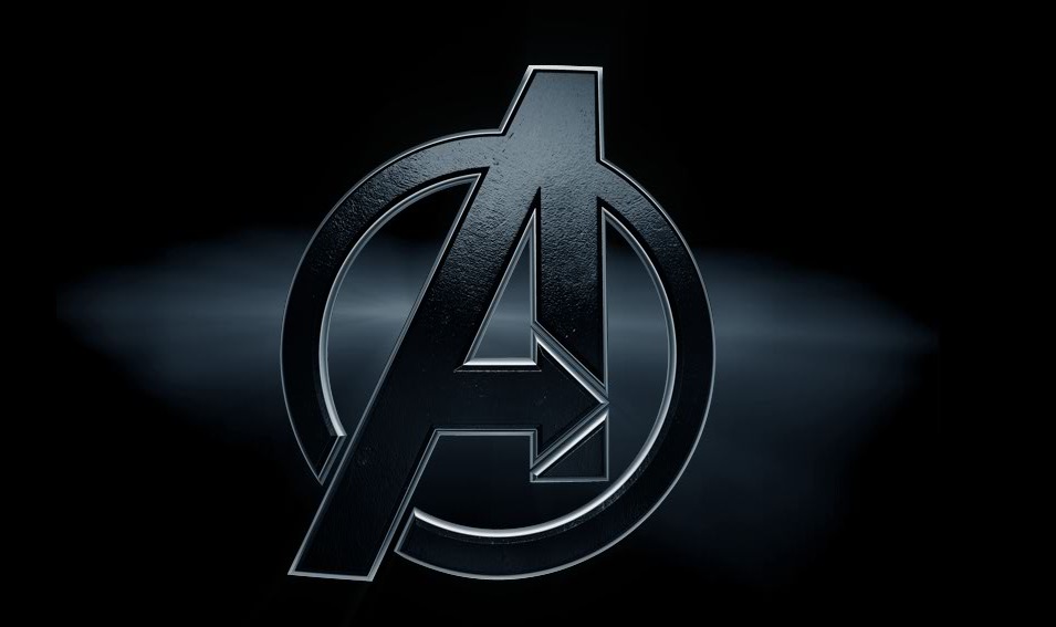
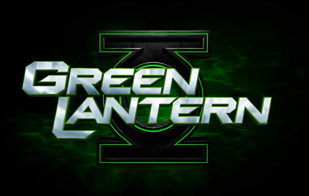
Today we got two new logos for the upcoming Avengers and Green Lantern films. Onward to automotive analogies!

Here's the official Avengers logo from Marvel's new movie website. Some nice texture and polish to the traditional team logo. Feels rich. Like a luxury edition Mercury Sable maybe. *whistles*

And we now have a finalized version of the Green Lantern logo, updated since its previous appearance in some early marketing material. A little bolder with some brushed aluminum. It maintains those same Windows Media player visualization effects in the background. You know, maybe not so lush as the Avengers logo. Maybe…maybe this one's a…Scion xB.
With a Mountain Dew decal.


Geez, yeah, I preferred the "unfinished" Green Lantern logo. you can tell a committee designed the last one though.
I dig the Avengers "A." Neat stuff.
The GL logo is off center. I hate it.
@Nathan: Damnit, now I can’t not notice it.
I still think both logos look ok though. I’m not that picky I guess.
all this news from CC is making me jealous with Red Hulk rage.
i made a pact with a buddy that we are going to go for sure the summer of whenever Batman 3 is happening!
Just gotta reaseach on best places to stay and SDCC stratigery.
I’ve always liked that Avengers mark. I’m really glad they didn’t overload us with kitschy effects…but i’m sure its coming.
I’ve never liked that Green Lantern typography and lockup. Its really amateurish and trying way too hard to be "edgy". Changing background effects and treatments isn’t really going to save the overall "design". Its just figuring out ways to polish a turd.
Photoshop is the best/worst thing to ever happen to movie advertising/posters.
The Avengers logo is far superior to me, though I am a layman in nerd fontery. A thing that shall remain unchanged.
Nice, slick design for both. Has that ‘A’ always been an Avengers logo or did Marvel do them recently for the relaunches and films?
@TNC – The A with the arrow in it? It’s not the original Avengers A, but that motif has been around for a while. At least since the 70s, right?
@Paul: To be honest I never really noticed how their logo looked. X-Men I could tell right away but it never seemed that important with their logo.
But was that logo present during the ‘New’ and ‘Mighty’ runs?
Yes, though not with the circle.
the A with an arrow in it for the Avengers logo has been around for a long time, just not the circle
I like them both, nice updated looks, clean and yet full of energy and potential
I’m happy enough with the GL logo as long as they don’t have a lens-flare orgy going on like in the previous version…
The avengers one looks like a Star Trek logo and the GL one is not that great either
The GL one looks amateurish, yes.