BATMAN AND ROBIN #11
What did the
iFanboy
community think?
Pulls
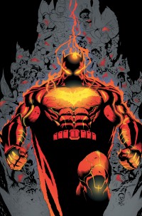
Art by Patrick Gleason & Mick Gray
Cover by Patrick Gleason & Mick Gray
Size: 32 pages
Price: 2.99
PROS:
-Patrick Gleason is almost a God now, in my eyes. Every single page, every single panel in this book is so god damn gorgeous. Damien using Jason’s mask as a Motorcycle mantle piece? Gordon looking at the Bat Signal on the rooftops? Batman just shrugging a hot brand with his logo on it? All of these, and much more, are drool worthy. In my last issue I failed to mention Mick Gray, the inker, and colorist John Kalisz. While they are integral to each issue as much as Gleason, they are also mixed into two other inkers and one more colorist for this particular issue. The changes in inkers and colorist isn’t noticeable here so don’t worry. But all the praise should go to every single person on this art team because they make Gleason’s gorgeous pencils really shine.
CONS:
-While this issue, writing wise, was a lot of fun I did have one issue with it. Batman screaming to the bad guys as ‘cowards’ and continuing to do so was very corny. Tomasi is usually good at writing a stern Batman/Bruce Wayne but here it’s way too corny for me to take seriously. Tomasi tries to make a joke that even Damien thinks he’s being an idiot but it still doesn’t make it funny.
CONCLUSION:
-While Scott Snyder and Greg Capullo’s Batman is still the #1 Batman book, this series is quickly becoming one of the best books at DC period. Tomasi brings a lot of fun to the script with Damien and this new threat even if the ending with Batman is a bit corny. But the real draw here is Patrick Gleason’s pencils. His pencils and his army of inkers and colorists really bring a special book to the stands each month. Maybe I’m in the minority but I find this book mostly with what I want in a Batman book: Gorgeous art and a lot of fun times.
Art: 5 - Excellent


I love Patrick Gleason’s art also, especially the way he draws Damian but that cover? It’s a bit much don’t you think?
Well it looks like the cover is mixing Batman getting ‘branding’ and Terminus. So it does look weird before you read the issue but it makes more sense afterwards.