Batman is built on the fears and superstitions of criminals, but these days, Kate Kane might corner the market on intimidation and outright scares. Batwoman is looking for Maria Salvaje, and when she wants something, she’ll hunt it to the ground. She’ll rouse you from your alcoholic stupor in the middle of the night to shake some leads out of ya. And she’ll do it will a glamorous and haunting scalloped cape layout across two pages. Rude awakening, sure. But it’s undoubtedly prettier than whatever he was dreaming about.
Batwoman #4
Written by J.H. WILLIAMS III and W. HADEN BLACKMAN
Art and cover by J.H. WILLIAMS IIIBlood drenches the back alleys of Gotham City in Part four of “Hydrology” – and Batwoman’s life begins to burn!
32 pages/ Color/ $2.99 US
On Sale December 14, 2011
DC was peachy enough to send us this exclusive preview of Batwoman #4, out next Wednesday! Let’s have a look.

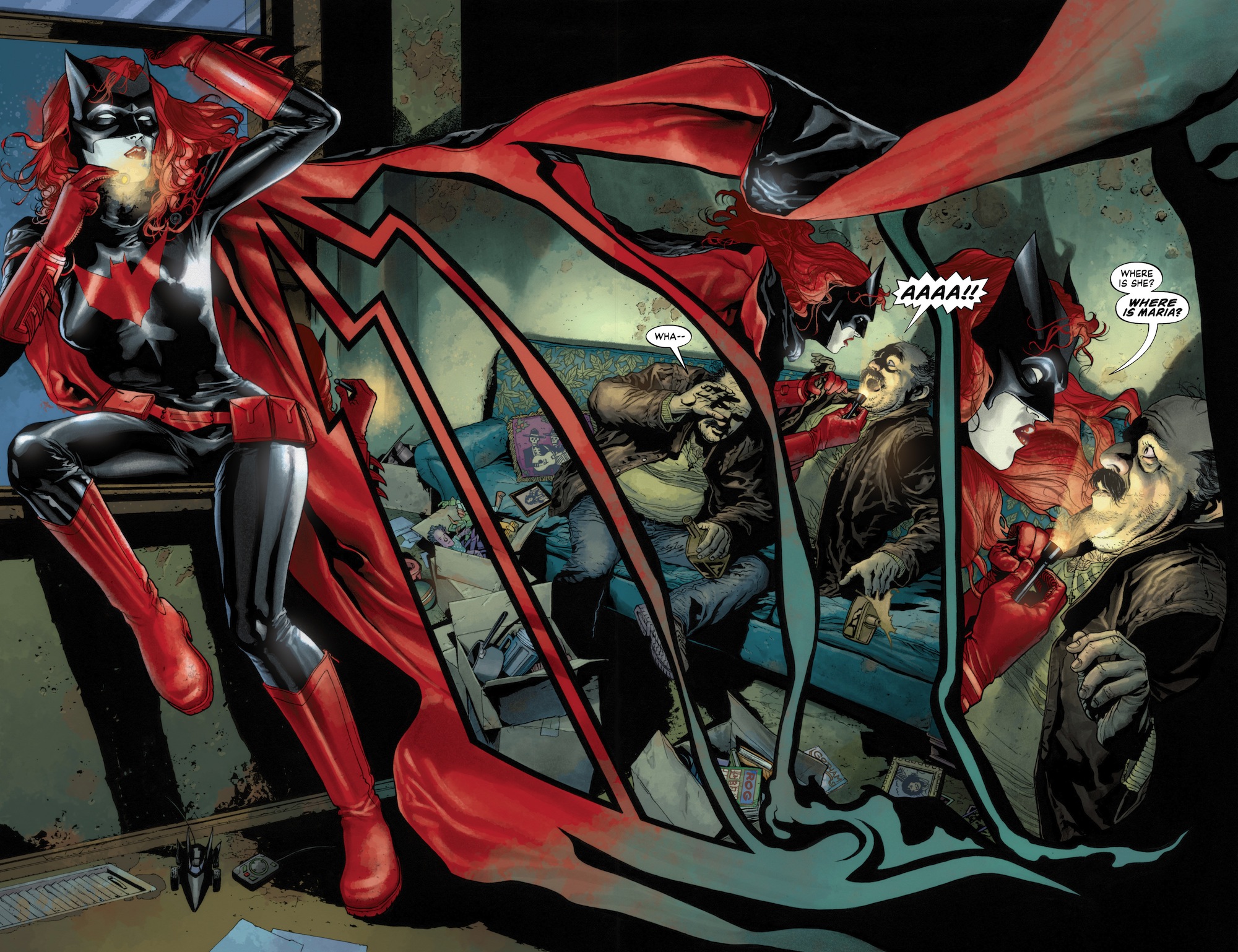


That third image. . . damn, damn, damn, James!
Companies should issue a mandate to have more female characters with glasses. 😛
Also, remote-controlled Batmobile.
Nice eye.
On both statements. 🙂
😉
Is it too early to call it now? This is the Number 1 illustrated book for 2011. The power of the layouts, storytelling, colours – is just ridiculous. It is not my favourite book by far, but seriously. This book is gorgeous. In this age of transition to digital where spread pages and guided views do not lend Splash pages with the same level of majesty. This is one of the VERY few titles, that I am willing to change the configuration of my digital reading for.
Yeah, this is the only DC comic I buy in print, because the art is just too grand for an iPad screen.
Wow, I can fabulate and say that this is going to be my personal birthday gift from DC (on the 14th)! 😉
I love reading that book, I really need to buy Elegy a.s.a.p!
I really wish Dave Stewart (who, aside from this nitpick, is my favorite colorist) would put just a little bit of flesh on Kate’s face. I get it, she’s pale. But it’s so extremely stark-white, it stands out TOO much.
I think that’s the point.
@HailScott, I agree. I know that it was a conscious decision that they made but I find it to be distracting. Dave Stewart is the greatest colorist in the business and has been for years, so I hate to nitpick too, but that’s a decision that I find stands out way too much as well.
That said, it doesn’t take away from the wonderful work being done in the art on this book.
I don’t mind the super pale skin when she’s Batwoman. It makes the image even more striking with the reds and blacks. I do agree it’s a bit much when she is ridiculously pale as Kate Kane. The art is clearly great but I do wish they’d put a touch more color on her when she’s not Batwoman.
Also, how many freakishly pale ladies are there running around Gotham? Seems pretty obvious she’s Batwoman 😉
I feel the same way. The white skin has a disturbing quality, that distracts,
That’s the first time I’ve seen something like that. Impressive.
I am gonna go ahead and say it right now. This is the best damn art i have ever seen in any medium i have ever read. J.H. WILLIAMS III’s art is simply beautiful. He has redefined what comic book art should look and feel like.
LOCO!!!
J.H. WILLIAMS III is just too good for his own good. He needs to clone himself so that he can be on more books.
You know … it’s funny … I’ve been looking forward to Amy Reeder’s arc. But now I’m starting to wonder what it will look like. I think she is a wonderful artist and (thinking back on her Madame Xanadu renditions of London and Paris) is perfect for drawing Gotham–but I wonder if the shift from Williams to Reeder may be too much for some readers to bear. It will be interesting.
JH Williams pretty much defined the look of the book and it will be difficult to fill his shoes, however Amy Reeder’s Batwoman art looks promising: http://amyreeder.blogspot.com/2011/08/teen-titans-100-and-covers.html
Thank you! Seen them, and I think her work is stunning … but I’m waiting especially to see the interiors. Williams’ layouts have been amazing.
Besides the fact that the art is jaw-dropping gorgeous, it’s consistently the most creative panel design & layout EVER.
And the characterizations don’t suffer for it! The look of this book has blown me away every month.