“Sugar, ah comic covers
You are my candy girl
And you’ve got me wanting you.
Covers, ah sugar sugar
You are my candy girl
And you’ve got me wanting you.
I just can’t believe the loveliness of loving you
(I just can’t believe it’s true)
I just can’t believe the one to love this feeling to.
(I just can’t believe it’s true)”
–Jeff Barry and Andy Kim, evidently hopped-up on Red Vines outside a comic shop
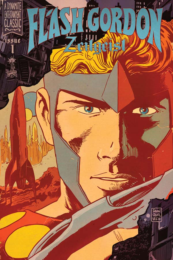
This feels like an artifact uncovered from a trunk in the attic, in the very best of ways. Again, the hand lettering. The extreme close-up and a color scheme ripped right from an animal cracker box. I love the composition of the vertical rocket in the background and the ray gun slanted in the fore. I have no idea what that accent mark is doing between the L and the A, but I like it!
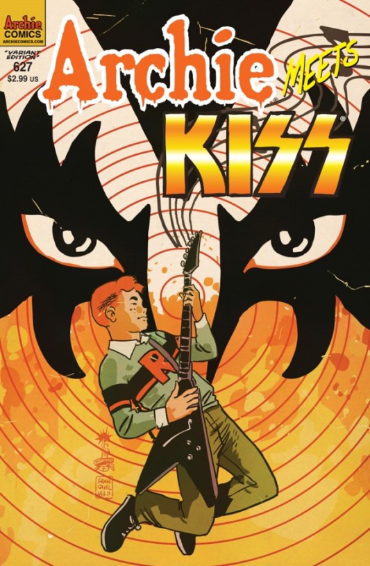
Francavilla more than earns a second spot in the week’s lineup with the much anticipated Archie Meets Kiss variant cover. The streets of Riverdale will flow with blood (even if it turns out to be tomato paste from a supply truck in the end). Simply put, Archie’s never looked so boss. One of our favorites has topped himself again.
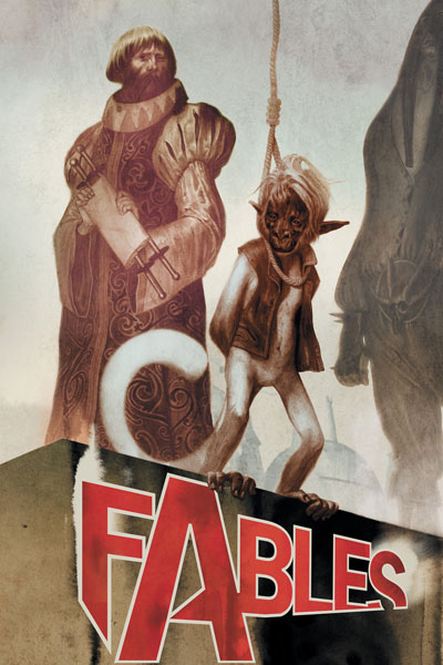
Trying to think of anything nearly so sad as a monkey awaiting execution. Possibly the monkey’s uncle watching from the crowd. Wiping a single tear from his cheek with a banana peel.
Love the cover treatment for the series. Simple and elegant. A bit mod in the coloring. It harkens to the dystopian SF of the late 60s and early 70s.
Tanks for the memories, you old Schmidt! One more tremendous propaganda poster from Aja, but also the most expressive of the bunch. The Red Skull is at his breaking point here. You see it in his down cast face, in his asymmetrical posture. What makes this isn’t just the horizontal strip of cream-colored negative space, but the slant. Slightly less than minimal and all the more perfect.



Francavillaaaaaaaa!
A cover i was hoping I’d see here was the cover to Daredevil. I loved the design. Love the book as well.
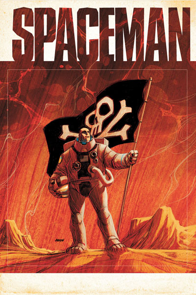
Francesco Francavilla, Ryan Sook (not shown) & Dave Johnson are the Holy Trinity of Comic Book Cover Artists!
If anyone could lure me into buying an Archie comic, it would be Francavilla.
Great picks this week Paul!
These were all really solid covers. Flash Gordon and Archie are my favs. As far as the Flash Gordon accent mark…i’ve seen the technique used before on vintage hand lettering and even some obscure display typefaces..its used to fill in large negative area spaces created by butting letters like “L” next to “A”, to defeat the optical kerning nightmare created by those two letters, and helps your eye move along and all that. =) Francavilla really has some keys to the vault on that one. =)
Wow Wally, a graphic design history nugget! Thanks, I love this sort of thing.
The Red Skull covers have all been great. And despite having absolutely no desire to read an Archie comic–negative desire, if that’s a thing–the Archie/Kiss cover’s really cool.
I am more interested in a Dynamite book when it has a striking cover like Flash Gordons. I feel like usually all Dynamite Covers look like they are done in a factory.
All the Red Skull covers have scared the shit outta me.
(In a good way.)
That Flash Gordon cover is absolutely incredible.
I agree and was totally bummed that my LCS sold out of Francavilla’s cover. I gave him a quick ‘boo’ as he informed me of this.
well, now i’ll never get that song out of my head. also, you missed daredevil.
Honestly, not one of my favorite DD covers in the run. There’s been some good ones though.
Those Fracavilla covers are the reason I’m not completely sad that Samnee is leaving Cap and Bucky, and the Red Skull covers have all been phenomenal. I’m glad to see this one on the list.
Ditto!
I was thiiiis close to buying Flash Gordon #1, but the lack of Francavilla interiors dissuaded me.
Gotta love that Archie cover!