THE HUNTRESS #1 (OF 6)
What did the
iFanboy
community think?
Pulls

Art by MARCUS TO and JOHN DELL
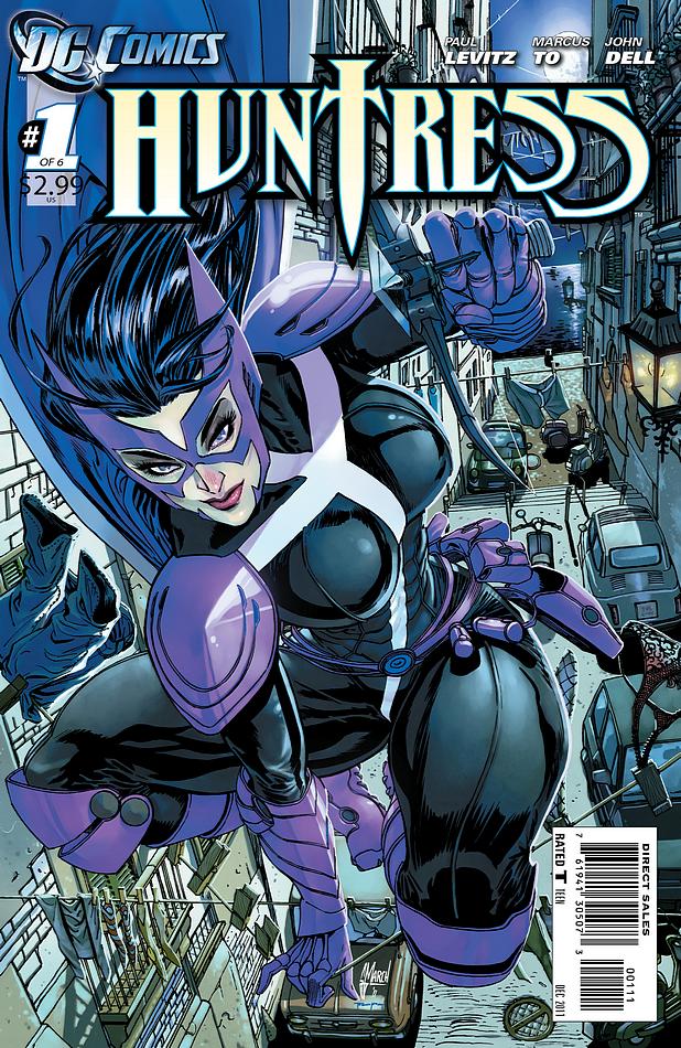
Cover by GUILLEM MARCH
Size: 32 pages
Price: 2.99
Is it wrong to love a comic because of its use of the colour purple?
This comic is GORGEOUS. From the elegant plot to the similarly elegant leading lady this comic was a vigilante comic done well. With an extra helping of great atmosphere. And I blame the purple.
There’s nothing extraordinary to the plot of this comic. No high sci-fi concepts to buy into, no need to explain why or delve into intricacies of any kind. It just is what it is – a female vigilante/hero in Italy doing her thing. And it works.
She’s a babe and she kicks butt. We know this because we see it. Realistic, action movie-style fight scenes done well. And nary a gratuitous cleavage shot in sight (except the cover but that looks like it was done by the same bloke who did Catwoman- a completely different species of artist). There’s even a lingerie scene but it’s done realistically so there’s no ‘drool here’ shots, just a chick in her nightie kicking a dude in the head. It looks sexy but it’s in the service of the plot. Shock! Horror!
But in the end this whole comic is tied together by the colour purple. Through this one simple device this book ‘looks’ like a Huntress book. She’s purple, it’s purple. Every page reinforces this fact. Where books like Birds of Prey can lack a bit of context or fail to convey some sort of unique ‘feel’ to the story world which revolves around its characters all Huntress does to give itself a unique character is theme itself in the colours of its protagonist. Purple. It binds the story together and sucks you into ‘her’ world. And she owns it, baby. Like all good heroes should.
A simple story done well. And all thanks to the colour purple.
Art: 4 - Very Good


Leave a Comment
Login or Register to get involved and leave a comment