“And it seems to me you lived your life
Like a candle in the wind
Never knowing who to cling to
When the rain set in
And I would have liked to have known you
But I was just a kid
Your candle burned out long before
Your comics covers ever did.”
— Elton John, Bernie Taupin in a ditty about comics covers
Nope. Still not done gushing about Batman #3. While the over-designed logo doesn’t do the composition any favors, Capullo’s depiction of Batman and Talon locked in mortal combat is no less striking. I agree with iFanbaser Firevine, who commented, “I get a sense of [Capullo] channeling a bit of pre-crazy Frank Miller with this cover too.” It’s all in that squared jaw and gritted set of choppers. But it’s also there in that unnervingly expressionless gaze from Talon. How do you follow up something as impressive as that “Black Mirror” Detective Comics run? Just like this.
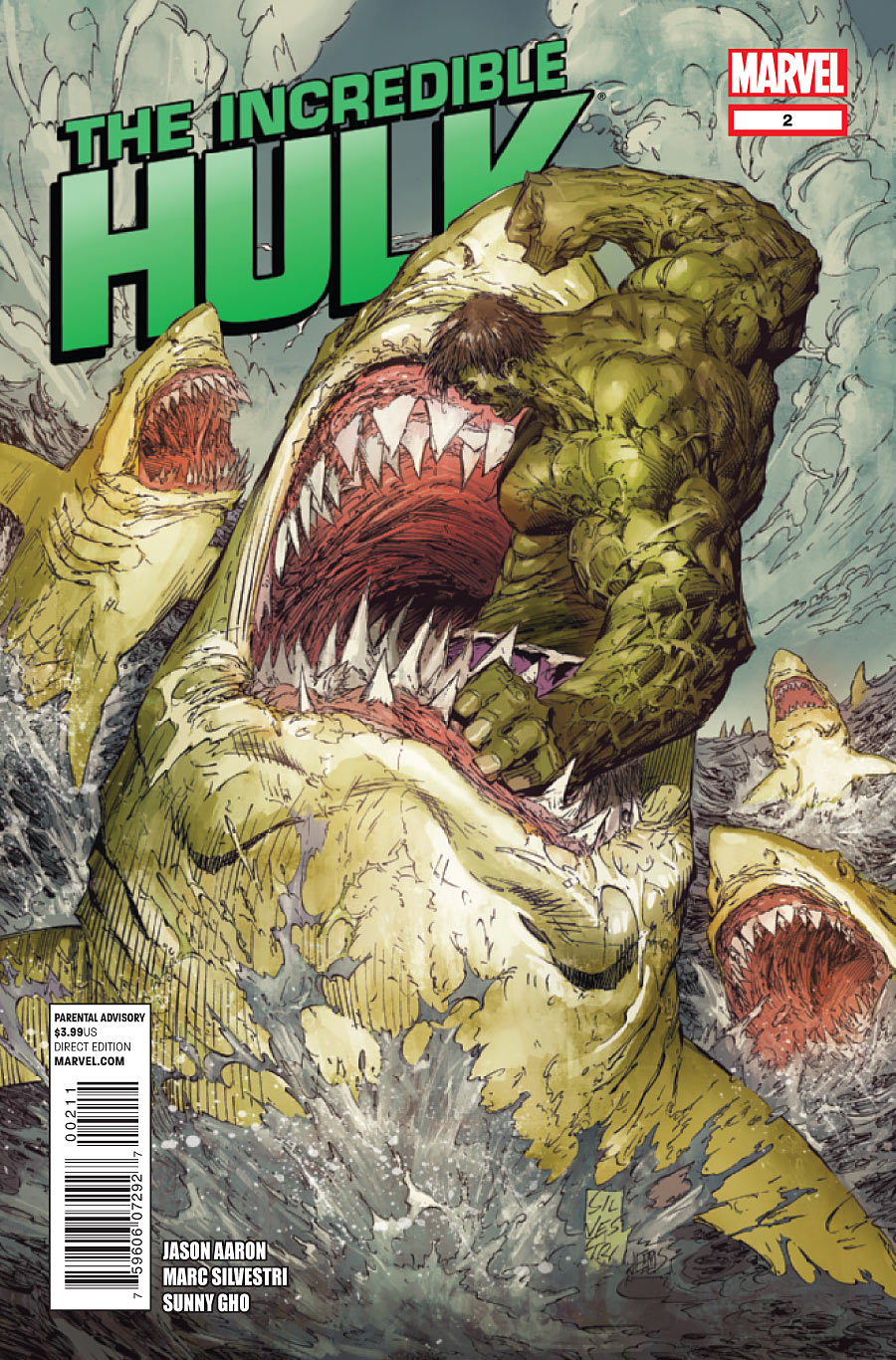
I’m tempted to offer a “‘Nuff said” and leave it that, but i’ll try and earn my keep. As if great white sharks weren’t formidable enough on their own, Bruce Banner’s got some puke-green Hulk Sharks circling his island stronghold. Just imagine the implications this little experiment would have, not just on the ecosystem, but on a Marvel Cosmic level. A single Hulked-out great white could probably give Thanos a long weekend’s worth of trouble. Anyways, this is the kind of image that would’ve sent 9-year-old Monty’s heart racing. And little has changed 17 years later.
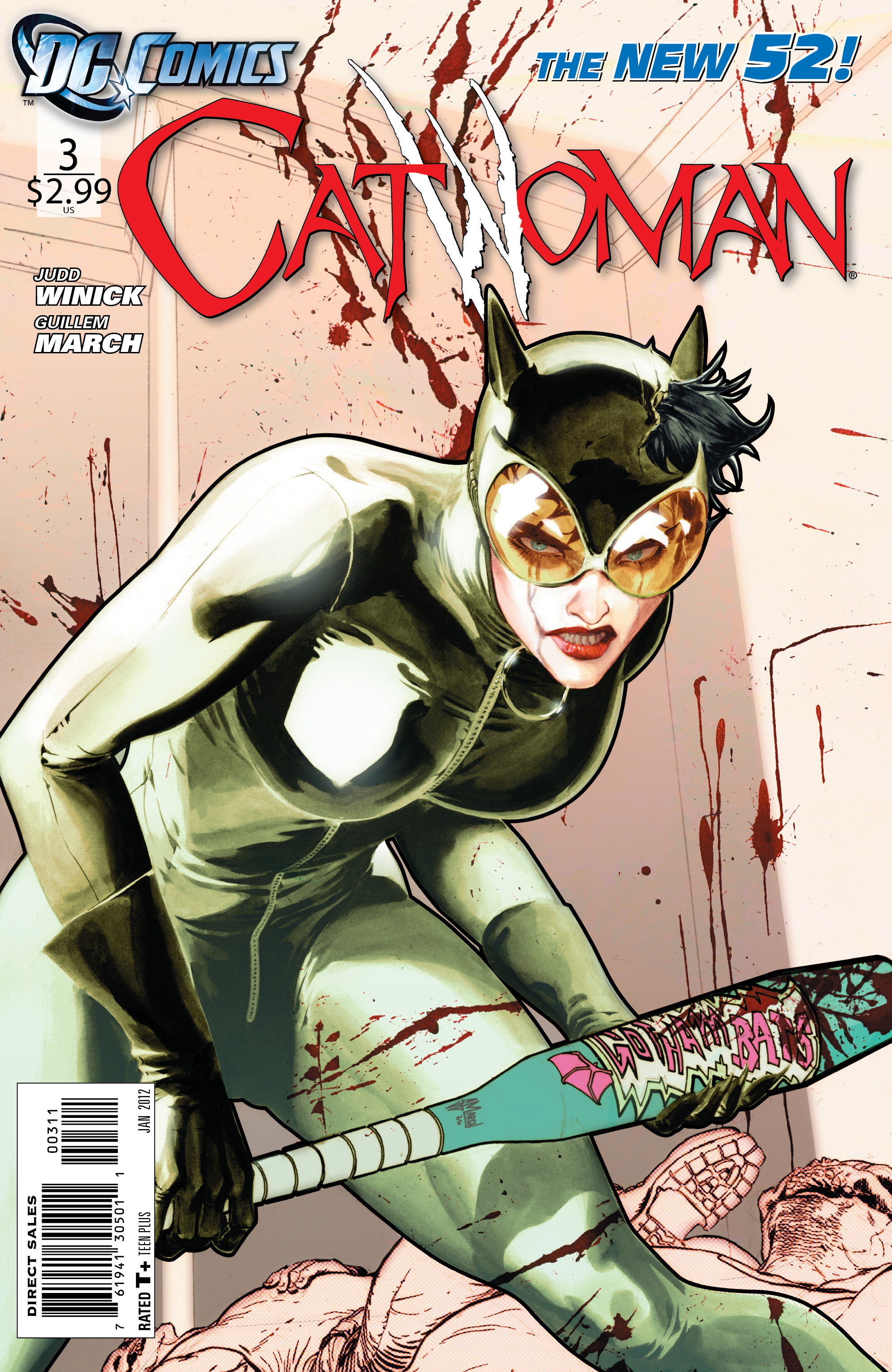
While I haven’t embraced the new direction for Catwoman overall, I kind of get the appeal here. Grindhouse Selina is an acquired taste, and this image makes no apologies. Backed against a wall, she’s the pampered house cat gone beyond stray to back-alley feral. It’s far-removed from the high society cat burglar we know and adore, but it’s a perfectly applicable alternative within the bounds of the concept. The image is so strong, so unapologetic, that I’m tempted to give the series a second look after a harsh dismissal. That’s saying something.
A winning pin-up. Simple as that. It’s impossible to deny the allure of the Eisner spirit imbued in that hand-drawn logo. The brown monochrome color scheme seals the deal with a mocha latte decadence.
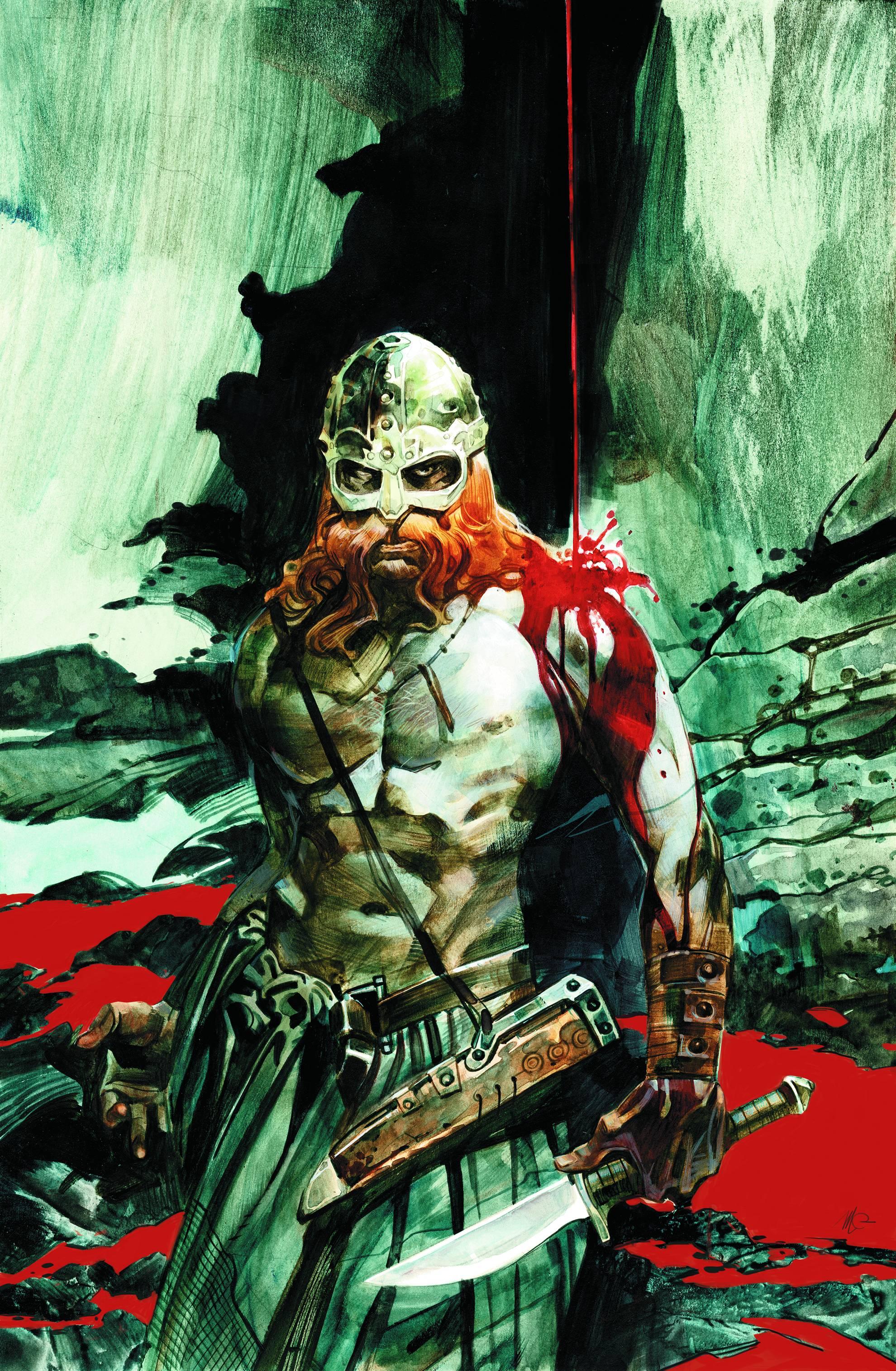
Carnevale is doing gods’ work on this series, of late. They’re dark gods, coiled in the sulfurous bowels of the earth, but luminous nonetheless. More than a mere victory pose, this image begs the question…”Did that dude just impale somebody on a stalactite?”
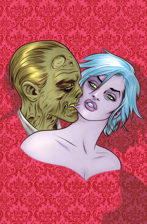
Love hurts. This image would be beautiful without the dimensions of light and shadow, but it’s those elements that make this next-level astonishing.


Marc Silvestri’s cover for Uncanny X-Men 243 was the image that drew me into comics (yes, I blame Silvestri for all of my longboxes). It’s nice to know he can still bring it.
I love the Mudman cover. I don’t have any history with Grist’s work, but I think I’ll check that one out.
This is the cover that got me into comics http://www.blogcdn.com/www.comicsalliance.com/media/2011/11/snake00.jpg
When I saw that baleful ninja face starting at me from the news stand I knew I needed to find out who he was. All it takes is one kick ass amazing cover to pull a kid into comics, one hit and he’s hooked for life.
I remember seeing that cover. It’s so striking that I can see why it would be the thing to pull you in. You’re so right that a good cover can get someone hooked for life.
Pandering to who?
I’m not really a big fan of Capullo, and I actually had the Batman cover was the worst I picked up this week. Maybe it’s because of the inking or the color, but to me it looks like Wolverine, not Batman.
That Northlanders cover was definetly my pick.
That is, I THOUGHT the Batman cover was the worst.
I thought Batman looked like Wolverine, too. But overall I liked the cover, and I LOVED the issue.
Hulk cover is awsome
I love the white space on the Batman cover. It makes the rest of the image pop.
The graphic elements on Batman and Catwoman take those covers from awesome down to pedestrian incredibly fast. I just can’t separate them. Very unfortunate.
That Mudman cover is so great….smart and well done.
Remind me why I’m not picking up iZombie every month, again?
Because your a ‘Madman’?
Because you read it? Ha, I kid I kid. Well not really, that’s why I dropped it….
I was hoping DC Presents might get a look in this week. Loved that cover.
Just missed the final cut. I think I’ve included every other Sook cover from the last year and I’m worried about receiving some kind of restraining order.
Pandering to me. I love reading about mole people .. .. what can i say…. reading Hulk is like reading Cat Fancy magazine to me except with Mole people.. instead of cats. Aaron really captures that desire i have to have more mole people in my life and I for one thank him for it.
I love the Hulk Cover and I have to say I am actually enjoying the new direction they are taking Catwoman.
With that Catwoman cover I’m gonna have to give this series a another look, seems like alot of fun. I really like the Hulk cover too but the whole, ”World War Hulks” marvel did last year has left me very fearful of reading a Hulk book again.
The Catwoman cover just kinda screams Hack/Slash to me (not a bad thing).
Anyone else think the Batman cover looks like Wolverine fighting Echo?
“It’s far-removed from the high society cat burglar we know and adore, but it’s a perfectly applicable alternative within the bounds of the concept. The image is so strong, so unapologetic, that I’m tempted to give the series a second look after a harsh dismissal. ”
I love this so hard!
I still think the last scene of issue #1 reads and looks like fan fiction. Nothing changes that.
Not sure why you’re pointing that out, but… noted.
Because i’m a killjoy.
You’ll have to kill harder. I’m still happy. 😛
me and my wife read catwoman issue one and by the time we got to the last page, we couldnt keep our hands off of eachother. so at least those last few pages did a little good in this world, as im sure a lot of lonley nerds would agree;)
I bought the Northlanders book based on the cover alone. I know it is ending and in the middle of the arc but there was no way I could not buy the issue based on that incredible cover.
Also, I bought Invincible in the single issue too because of the cover. Although I am trade reader for Invincible, I felt like this issue was going to be haunting or a big change.
That I, Vampire cover is amazing.
my mistake I zombie
This week’s Venom cover should get a shout out. Creepy goodness indeed.
I think Capullo often channels a pre-crazy Miller on a lot of the interiors as well. Some of the character designs and some of the layouts must be an homage. I think this at least a couple of times per issue. Loved the cover, very striking.