Judging books by their covers since 2000.
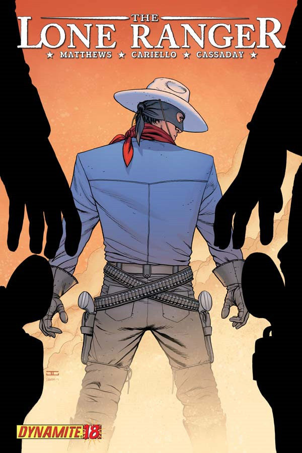
Cover by John Cassaday
This cover is all about fantastic construction. The triangle is a classic shape in art, used to draw one’s eye to the focal point of the piece. Here we have two triangles created by the gunmen in the foreground pointing directly at The Lone Ranger. The cover is also very un-Cassaday-like in that his work usually falls very heavily into realism whereas The Lone Ranger’s blue shirt is drawn and colored very simply, almost flat.
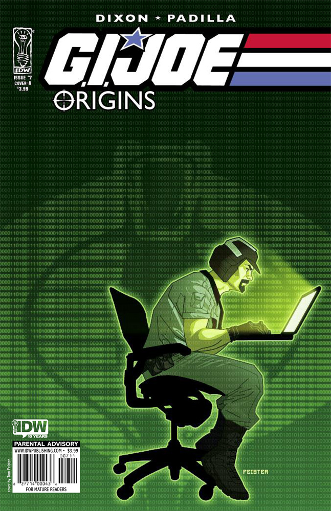
Cover by Tom Feister
I love this cover for two reasons. One, the design is great. I like that the subject is not centered and that negative space dominates the image. I also love this cover because it tells the story of what happens in the issue in one single, powerful image. Mainframe spends the entire issue sorting through tons and tons of data trying desperately to gather the evidence needed to convince the rest of G.I. Joe that a shadowy organization called Cobra really exists and it out there and dangerous because at this point, Cobra only exists as patterns in the data that only Mainframe can see. All of that is conveyed in this one single image.

Cover by Mike Mayhew
As far as a cover that would stand out on the store shelves, it’s hard to beat this one. It’s also hard to beat in terms of fun and whimsy. You know a comic book cover is doing its job when it grabs the eye and holds it. So many comic books come out, week after week, that they become one big blur. I can scarcely remember the majority of them. This one caught my eye immediately and stood out from the pack. It did so for one simple reason. Lil’ Cupid Spider-Man is adorable.
Those are my favorites. What are yours?


I found the G.I. Joe Origins cover to be remarkably bland, but was happy to find that the actual issue was very good.
I liked the Final Crisis Aftermath: Escape #5 cover. If I’d heard anything positive about the previous issues, I might have picked it up.
Of course, the All Hail Megatron covers continue to be epic.
@stuclach So you’re reading G.I Joe origins, is it a good jumping on point or should i hunt down the first six issue?
My favorite cover was batman& robin #4. I love the colors Quitely uses.
@Stepho – I think this would be a reasonable jumping on point. This issue was in no way tied to the pervious Origins issues (from what I remember), but it did link to the most recent issue of the main G.I. Joe book. However, I don’t think you would need that issue to understand this one.
I believe the next issue is going to be the start of a new arc from Larry Hama (or Lama, as I like to call him).
I would have said Dark Avengers #9 hands down, but it looked I was fairly disappointed when I got my hands on it. I adore the ASM #605 cover.
Gah! I forgot to pick up Lone Ranger #18!
I bought Dark Avengers almsot purely because of the cover, which is weird because I had dropped the title, don’t like Deodato, and Nick Fury’s leg looks pretty weird. Still, aside from the leg stance, I think it is a pretty great portrayal of Fury, facing odds that seem completely out of his realm. Although, I can’t help but think that it may have been more striking if Ares was in the same positiong and Fury was just standing there, like what actually happens in the issue.
How is street of Gotham not on here? That was such a great cover with mr zsasz cutting himself and the shadow of batman crossing over him…soo good.
How can they not mention the Moon Knight cover! It was probably my favorite. I also really like the GI Joe cover. It was simple, but really good.
I don’t really know why, but I really like the Batgirl #2 cover this week.
First off, the Cassaday cover is great. That much said, it seems that his talent and history make him fall into the category of Bru’s Cap or the majority of Johns’ run with GL. I expect excellence and get desensitized to it. He is only news to me when he mis-steps.
Not hating on the pick, ’cause it is a cool shot, just one man’s opinion.
Ultimate Comics Armor Wars #1
Oh, defintely Streets of Gotham.!
I really like both the Dark Avengers and the Batgirl covers.
Sad, Neither Blackest Night #3 nor Blackest Night Titans made the list.
@boomergirl: BLACKEST NIGHT: TITANS #1 came out in August. #2 isn’t out yet.
I think that LONE RANGER cover has more triangles in it than just the gunmen to the left and right of the cover. The Ranger’s square shoulders and wide leg stance create two triangles that leads the eye down his torso and up his legs straight to the Ranger’s butt – and his guns. That composition is really great.
And that AMAZING SPIDER-MAN cover looks like someone stuck on a Spider-Man costume onto a baby. Which is kinda creepy. Still, those proportions looks pretty spot on to me, right down to the pudgy little baby thighs that Lil’ Spider-Man is sporting.
@JeffR: Oh, there are definitely more than two triangles on the LONE RANGER cover. It’s a clinic in construction.
Loved the Iron Man covers. Both Armor Wars and Invincible. I’m excited about the Ultimate Armor Warsm, since I have fond memories of the original Armor Wars storyline from my youth.
Dark Avengers and Ult. Armor Wars were the best of my pull this week.
That Amazing Spider-Man cover was definitely different. I immediately noticed the issue on the store shelves. Granted, I didn’t buy it, but it’s a definite eye grabber.
I forgot about Armor Wars. I liked it as well.
I can see the appeal of the Spidey cover, but the painted rendering made it seem too reverential for my taste. It’s like, "Here’s this whimsical cute little idea–NOW LET’S GIVE IT A PAINTED LOOK AS IF A FINE ARTIST SPENT A MONTH LABORING OVER IT!" I like the basic idea, though. Can you imagine if Frank Quitely drew it, though? Super creepy Spider-Goblin…who LUVS you.
Cassaday’s covers are always great. Can’t say I agree with the other two picks though…
Out of the books in my pile I think Punisher Noir #2 had a great cover. Great use of contrast and the drawing of The Russian looked really good. It was a Tim Bradstreet cover and I know a lot of people like his work.
Although I hate to admit it, the cover for Dark Avengers was really good. I just laugh everytime I see Fury unloading his gun into Ares but he’s still going right at him.
Just out of curiousity, has All Hail Megatron ever been featured as a cover of the week? I have never read the book but their covers always grap my attention.
oh, and the cover for the 3 story secret histroy of giant man is fantastic
@edward: Yep.
Interesting choices. Not a fan of the later two, but I do really like the Lone Ranger cover. it’s got brilliant construction as Conor notes. For me, there were actually 4 covers that stood out to me from stack today:
Invincible Iron Man has a lot of straight lines and curves which draw the eye to the only non-gunmetal aspect of the cover. Despite being a "pin-up" it also has something to do with the content of the story. LaRocca has really stepped up his game on cover design recently and it compliments the book.
Moon Knight and Streets of Gotham both are classic character pinups that also work as character study which is awesome. What’s interesting is the two covers are very similar with single-color but shaded/blanched backgrounds and both play with light sources. Zsasz has never looked creepier and you really feel the knife digging into his arm. With Moon Knight, I really get the sense he’s popping off the page. I really love both Nguyen and Lenil Francis Yu so it’s no wonder I love their art.
I also really like the cover to Batgirl this week. It’s simple, but it really works. There’s also effective use of null space there.
Really great covers out this week.
that spider-man cover is awful
Lone Ranger takes the prize. You can actually make that background (the one on the Gi Joe cover) if you google something like: ASCII image generator. It’s rather reminiscent to the binary shown in "the matrix" trilogy. Very cliche’ so it’s obvious it shouldn’t get the prize.
@Mangaman: As I said in the G.I. JOE description, it’s what the cover image represents, not the artistry involved.
Amazing Spider-Man has had a series of strong covers recently, and that one really does stand out. Loved the Lone Ranger cover, too. It’s one of my favorite books and I usually like the covers a great deal.
That Spider-Man cover is one of the worst I’ve ever seen. If I saw that in a comic shop and knew nothing about Spider-Man, there would be NO WAY I’d even consider buying it.