Covers are like promises.
One time, when I was about nine, I dreamt that I was in an old bookshop deep under the pavement, and in that bookshop were all the Goosebumps books that would ever be published, well into the future (this would later be loosely adapted by another writer into a Doctor Who episode with Elizabeth Corday from ER). I casually browsed the aisles until I realized that I was dreaming and would eventually wake up. I scrambled to look at all the covers and commit them to memory, determined not to forget them like so many other dreams. Eventually I rolled out of bed and found a pen and paper and tried to sketch the images from my dream. Later that day I pulled the papers from my book bag. Not all of them made sense. But some of them did. A lot of them were about dragons. None of them were about camp. And we all know that the last thing R.L. Stine needed to publish was another one about camp.
Anyway, these are some of the comics covers from this week that I really sort of liked.
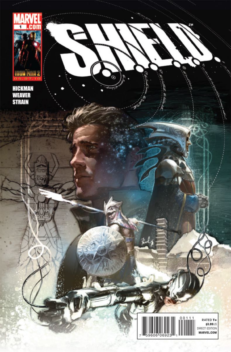
S.H.I.E.L.D. #1
cover by Gerald Parel
I'm gobsmacked by Gerald Parel's truly cinematic cover design, which encompasses the full scope of this ambitious first issue (Galactus as Leonardo's Vitruvian Man? What else do you need? Oh, fish skeleton inspired headpieces too!?). But what I really love is that logo. Slightly skewed, with each dot incorporated into the celestial map. That whirlpool also mimics a pattern that's totally ingrained in the organization's mythos. They're Steranko circles! Give me a moment before we continue on. Hickman and Parel have temporarily blinded me with science!
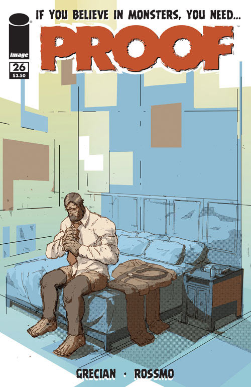
Proof #26
cover by Riley Rossmo and Chris Grine
Bigfooted John Prufrock gets ready for a night out with the same comfy confidence with which Mr. Rogers swapped cardigans before a trip to Make-Believe. The design is all about juxtaposition. A savage looking sasquatch in a tidy bedroom straight out of an Ikea catalog. Everything about it is square, with the crisp perspective of the corner angle and the rectangular swatches of color throughout. I love how the color of the logo both contrasts the blues and greens from the wall and pulls from the comparatively duller hues of John himself. A great solitary character moment and slice of life.

Turf #1
cover by Tommy Lee Edwards
Like the S.H.I.E.L.D. cover, the composition here is totally cinematic. If the former is Star Wars, this is Indiana Jones. The creepy gents in black stand in for stone gargoyles and the gunman in the background rises out of the architecture of the bridge, almost an extension of the urban landscape. Oh, and there's Angelina Jolie during a costume fitting for Changeling! This could be a typical cops and robbers story, but we've got an anachronistic space ship literally cutting right through the rest of the image. Worlds collide. It reminds me of a story my grandfather told me about his uncle, a flapper, and a cornfield. There weren't any aliens in this story, but I couldn't have cared less, given all the other details that were included.
Tell me what I've missed and who I've slighted, but–do remember! Show your work!


Love, love and love. Nice picks 🙂
Sheild and Turf enticed me to buy them off the cover alone… great picks.
The SHIELD cover is indeed gorgeous. I’d prefer it without the IM2 ad though, I think.
I can’t wait to read Turf, but will wait for the TP, nice picks anyway 🙂
That Shield cover is magnificent. I hadn’t seen it before.
I’m not sure why, but Proof has never done anything for me. I read Vol. 1 and had no interest in continuing with the series. That cover looks nice. I like the contrast between the normal and abnormal.
I love the cover on Batman and Robin #11.
Steranko Circles is my stripper name.
I love The SHIELD cover as well, but loved the variant by Weaver even more. Win, win.
I am SO glad you picked the Proof cover. If you look closely, you can see he is smiling just a little- it says so much about the character. I want to get that in a poster.
@stuchlach: It only gets better after the first volume. If you have a few extra bucks one week, try one of the other volumes.
Otherwise, I always love the House of Mystery covers- always pretty dramatic. And though it was only a pic of RR, Robin, and Batman coming towards the reader, the Red Robin cover made me kinda giddy.
I hate it that the Goosebump series are getting new covers. I want my old school, bright colored covers to stay! Don’t ruin my childhood! 🙁
Great choices and yes SHIELD’s cover was awesome.
The Pile: Batman Confidential #43 (Bad story, but the cover shows why people should pick a comic up with Kieth art) Sweet Tooth #8 (Nice, surreal looking cover. Judging from the future issues this is tame in comparison)
The Rest: Flash Secret Files and Origins #1 (Now that’s how you do a page of Flash changing costumes! Can’t wait for Manapul next week…) Demo 2 #3 (Love the idea of the post-it notes making the woman’s face. Also great use of colors) Thor and the Warriors Four #1 (Cute, funny cover with Power Pack and Thor. Alex Zalben I could kiss you right now)
Worst Cover: Sparta USA #2 (I don’t know what is going on this cover….but it looks fugly and colored pretty badly)
Best Trade: Batman and Robin Deluxe HC (As everyone has already mentioned; great design and color palette for the trade)
I loved the Da Vinci variant for the SHIELD issue.
This is the first time I’ve agreed with every choice. It’s almost like you read my mind.
@HailScott – I will try to grab them via Interlibrary Loan. Thanks for the heads up!
Everything about the S.H.I.E.L.D. book was amazing. My favorite cover was to The Flash secret files though.
Man, I really love that S.H.I.E.L.D. cover. I had to wait til today (Friday) to pick up my books and Hickman’s book was all sold out except for the one varient, b/w issue for $2 more, that wasn’t nearly as cool. I had to buy it, though, b/c I couldn’t wait to read the thing.
Red Robin had the best cover for me this week–I stopped mid-sentence to "Ooh!" delightedly.
My favorite cover of the week is for Wolverine: Weapon X. It has a very striking image of Captain America surrounded by a swirl of Deathloks and Wolverine. One Deathlok is looking out of the lower right hand corner at the viewer.
completely agree with the TURF cover, its so well put together, and I didnt even catch the bridge thing.
@TheNextChampion, yes, I liked the Sweet Tooth cover as well.
I also liked the Carrie like cover of Ultimate X. Lots of energy in the background, while this still scary character in the foreground.
And The Muppet Show cover was just a nice grouping of characters.