Covers, guys and girls.
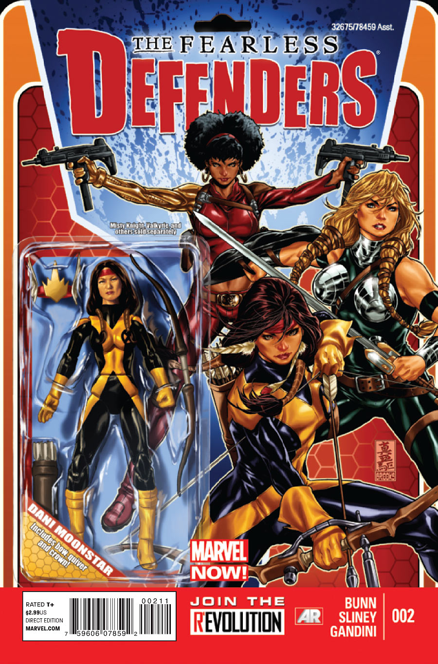
The Fearless Defenders #3
Cover by Mark Brooks
All that’s missing is the karate chop action.
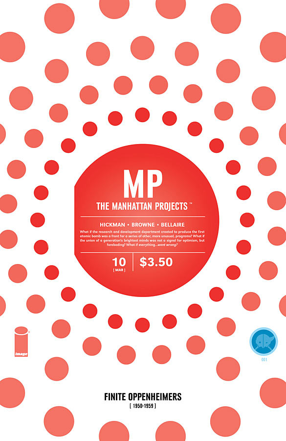
Manhattan Projects #10
Cover by Jonathan Hickman
The guys at my shop call this one the Strawberry Shortcake issue. But really, given the context, I’m reminded of a virus. Inside, Red Oppenheimer cannibalized the Blue Oppenheimer, consuming him body and soul. Eventually, Blue learns to reprogram the assumed souls, mounting an Oppenheimer civil war. It’s trippy. It’s color-coded. I dig it.
Batman #18
Cover by Greg Capullo
Alfred really needs to contact that chimney sweep about the Bat Cave’s bird problem.
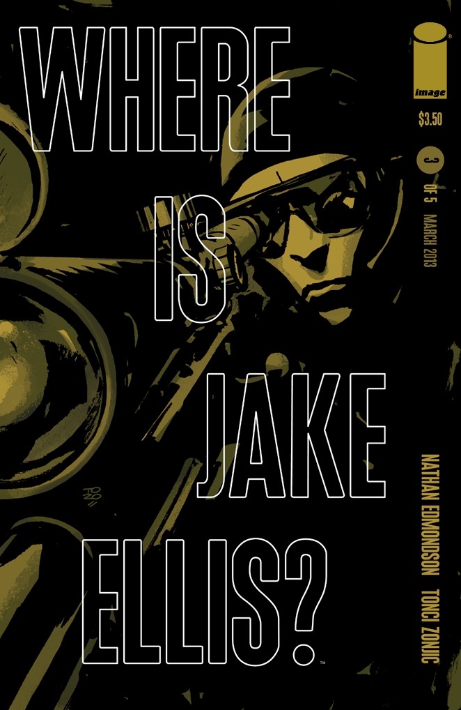
Where is Jake Ellis #3
Cover by Tonci Zonjic
He’s right there! I love the elegant implementation of typography and color in this series. Each cover is cued to a specific color overwhelmed by shadow. This one is a particularly strong representative for the series as it’s all about tracking, hunting, answering the question: Where is Jake Ellis?
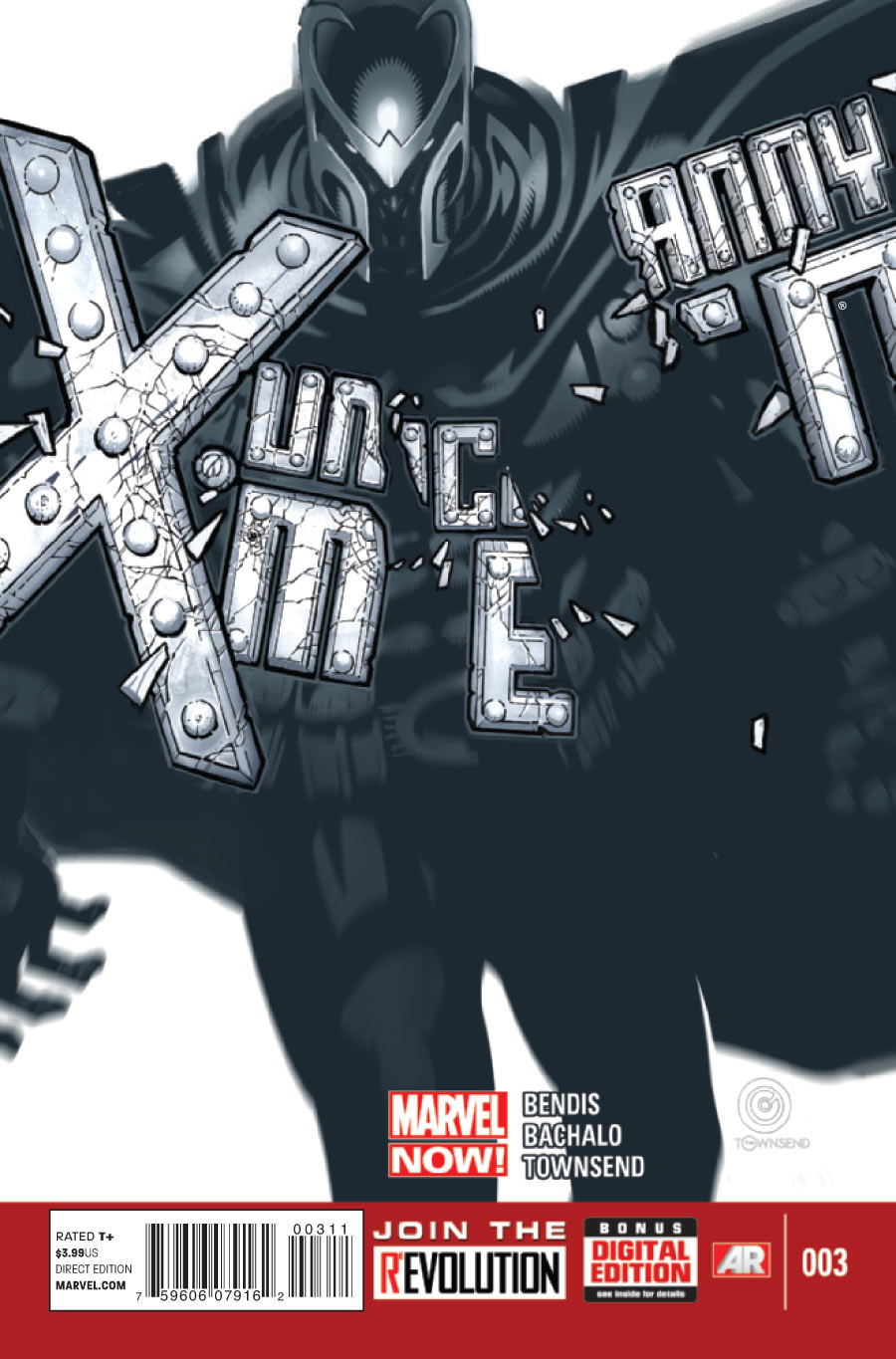
Uncanny X-Men #3
Cover by Chris Bachalo
Always a fan of destructible title logos, and this one actually serves a narrative purpose. Is Magneto destroying this X-Men group from the inside? Is he manipulating its many factions to recombine them in a stronger whole?
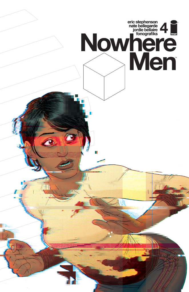
Nowhere Men #4
Cover by Nate Bellegarde & Fonografiks
While this image finds greater resonance in the closing pages of this issue, it’s also a perfect visualization of the main conflict. These scientists are experiencing a shift, a major reconfiguration of their genetic code as well as their place in the world. Everything is in flux.
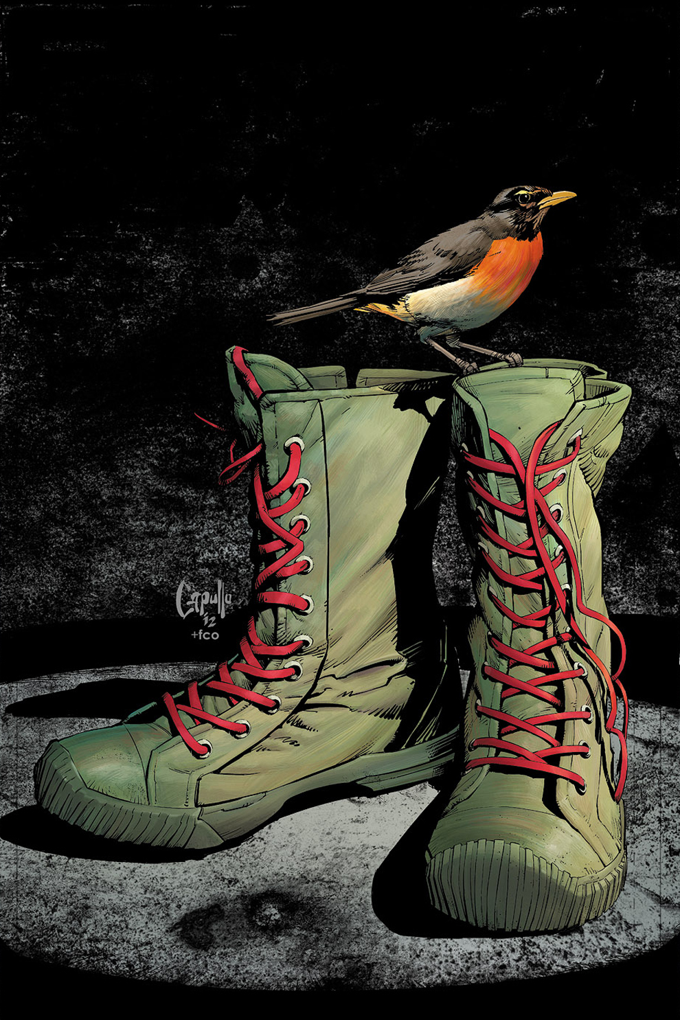


Capullo’s Batman cover is stunning. So simple, and so bloody effective.
I think my favorite for the week was, of all things, Fearless Defenders #2:
https://ifanboy.com/wp-content/uploads/2013/03/The-Fearless-Defenders_2-674×1024.jpg
Ahhh! I forgot about that one. Adding it.
That’s a fantastic cover.
Chris Bachalo is definitely one of my favorite X-Artists. He could be drawing a book that centers on a team containing Maggot , Adam-X the X-Treme, Graymalkin, depowered Prodigy, X-Man, and Jubilee and I would not think twice about buying it. Actually, that’s a book I want to see now.
Don’t forget Marrow!
Yeah, Bachalo is soemthing special. I don’t really care what he draws…he consistently transports me to another place when I look at his art. It’s just…I mean I know he’s not to everyone’s taste, but I cannot get enough of his stuff.
I agree, I really enjoy Bachalo’s art! He is one of the few X-Men artists that I don’t have a signature of. I don’t think he goes to any shows or signs anything for fans though…
My only beef with the Fearless Defenders cover is that every character’s face looks exactly the same. This artist does future covers for this book, too, and they also suffer from the same problem.
I do love the concept, though – super awesome.
What about Star Wars #3? https://ifanboy.com/wp-content/uploads/2013/03/Star-Wars_3-200×303.jpg
It has Han Solo on the cover! HAN SOLO! 😀
I’m very surprised that Batgirl didn’t make the best covers! It was the most emotional of the Requiem covers. As the tears stream, her entire costume takes on a fluid look.
Oh dang wow I thought the fearless defenders cover was an actual toy. I’m staring at it and I’m still confused. That is some ace art right there.
Very little love for “Nowhere Men” on here, disappointing…
I love it, this issue was my pick of the week & definitely a great cover!
Yeah, no hyperbole, I don’t think a writer has utilized text pieces so effectively since Alan Moore and the art, colors, and production are a cut above everything else out there in single issue format right now. It has everything I loved about “Wildcats 3.0” and so much more…
Very much agreed. Working on a feature about it, coming soon.
@Paul, that’s not soon enough! Out of curiosity, who was it that wrote an article on the series before it came out? That article was the main reason I even checked out the series. I remember it was an interview with the writer and that same week had an article about “Come Back”, Image’s time travel book. I don’t want to compare the series to “Watchmen” too much, that’s a high standard to live up to. It’s so good tho; the characters, the story, the ideas (juggling while cycling sounds like the ultimate test of skill).
@IthoSapien Whoa, by no means was I comparing this to “Watchmen”. I just think all us comic book fans have seen our share of text pieces go both badly and just fine over the years. “Nowhere Men” just happens to be the first time I’ve ever looked forward to them as much as the comic content…
@Paul I’m happily awaiting that feature and really hope this issue gets a little show coverage… Good on ya, with rest of the weeks covers…
I too have been really enjoying Nowhere Men. I picked it up half on a lark, half on the basis of the iFanboy article mentioned above. I look forward to the upcoming feature.
Also, agree on the use of text pieces, especially in this issue. Normally when I discover extended text chunks in comics I roll my eyes and think “if I’m reading a comic, that means I am not in the mood for prose,” yet, it works here. Plus, I will admit, I was thinking of “Under the Hood” while reading the excerpt from “Science Friction” this evening . . .
Whoops that’s my bad, I saw “Alan Moore” and “text pieces” and filled in Watchmen. Usually I hate those in comics, especially when they add nothing to the plot and just seem used to round out page numbers. I’d like to see more of the fictional ads/movie posters like the robot or Stanley Kubrick film with Micheal Caine.
By text pieces do you mean full-blown prose pages a la LOEG or just lots of text on a panel that may or may not come across as poetry a la 1980’s Moore?
I love the concept of the Manhattan Projects cover and it’s a great representation of the story inside the issue. Also, the cover for #15 shows that tiny blue dot is going to multiple very quickly with the sequel to this.
I love Bachalo’s UX cover and Phil Noto’s variant to it was great as well. Capullo draws perfect Robin boots.
Great action figure cover idea with the hole at the top even but Dani Moonstar is a New Mutant and belongs in an X book.
Greg Capullo’s cover is fantastic. At first glance, I thought it was a Brian Bolland cover (which is a very good thing!)