Covers, covers everywhere, but not a drop to drink.
What?
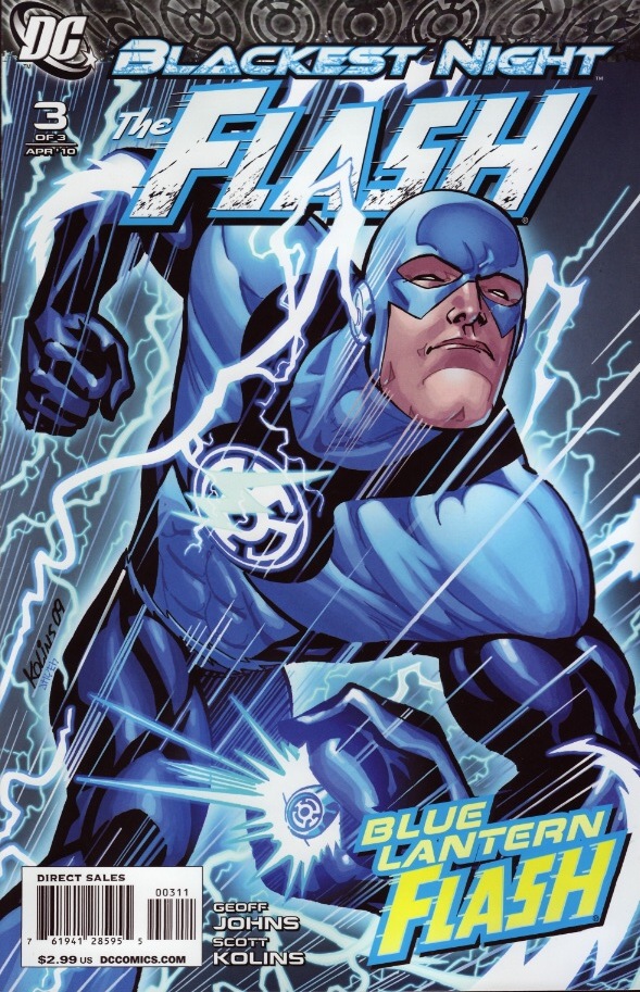
Blackest Night: The Flash #3
Cover by Scott Kolins and Michael Atiyeh
Can't go wrong with monochrome blue. Well, you can, but penciler Scott Kolins and colorist Michael Atiyeh certainly didn't. Kolins has always been an ideal Flash artist because his linework is so kinetic. Many artists can convey power and grandeur, but few can suggest incredible speed. Kolins handles it in spades, and this cover is a perfect example of that dynamism. It's not just about the speed lines either. I love the diagonal momentum, the way Barry's head is just edging past the logo. And what a great showcase for the awesome Blue Lantern costume. I almost want it to stick around permanently.
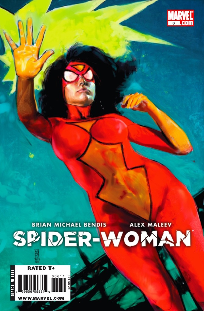
Spider-Woman #6
Cover by Alex Maleev
Not sure of the exact process Maleev is using on this series, but between the photo or live model referencing and the coloring medium, there's this whole dusty, cakey, body paint thing going on. It adds dimension to the figure of Spider-Woman. Just look at the exposed portion of her face and the contours of her right hand. But with those super-saturated colors and the black brushwork in the background–a crude suggestion of a city skyline or the framework of a bridge–it almost looks like an urban mural. This image is all about the juxtaposition of near photo-realism and painterly abstraction. I love that big spash of highlighter yellow in the top left.
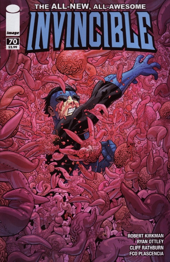
Invincible #70
Cover by Ryan Ottley & Fco Plascencia
That's a lot of sequid. The extent of the detail in this image is mind-boggling. A lesser artist might have cheated their way out, fully rendering the front-most sequid bodies and merely suggesting the squirming tentacles of those in the back. But scour over this cover and you'll be amazed at its depth. Ottley must have been working away at this one for ages. Even aside from the fine detail, this is just a cool composition. We're in the thick of the action. Our hero is overwhelmed by the enemy and we're right there with him.
Anyway, these are the three covers that leapt out at me this week. What tickled your fancy, iFanbase?


Good choices. Love the invincible cover.
Of the above, I’d go with The Flash. My fav this week was the Daredevil cover. God damn it is beautiful.
well for one thing all the deapool variants stunk. i loved the guardians of the galaxy cover. spiderman was good only cuz i miss mcniven
I really liked the Daredevil 505 cover this week.
Yikes!
I guess it just proves the point that all art is subjective, as that Spider-Woman cover is harsh.
My favorite of the week? Power Girl! Amanda Conner is just plain awesome.
My vote’s for Guardian of the Galaxy.
The Flash cover is awesome. It just leaps off the rack at you.
Excelent description of the Spider-Woman cover Paul!
I think Maleev either did the cover in oils or used the "oil brush" in illustrator. Working wet in oils (vice layering or drybrushing) will give that matte/blended look. Plus oils can be very vibrant when used raw.
My favorite was Daredevil. Classic!
My only problem with that Daredevil cover was the amount of negative space up top. Just seemed off to me. Otherwise a totally gorgeous cover and a definite honorable mention.
Another worth mentioning this week is Simon Bisley’s cover for Hellblazer #264. I love the color scheme and the cluster of figures against that solid color background really pops.
Not bad choices, seeing the Flash cover up close makes me appreciated more. Although I think the best cover of the week should have went to Green Lantern Corps #45. Not only for having Guy Gardner having a Chainsaw; but for being a pretty simple image but looking very sharp and colorful as well.
Azrael #7, Deadpool #19, Punisher #14, Hellblazer #264, and The Stand: Soul Survivors #4 had great covers as well.
Worst Cover: Uncanny X-Men #521 for…..well because of Greg Land, by miles.
Best Trade cover: Ignition City vol. 1 for just giving us a beautiful old school design. Would love to have that as a poster.
Good choices. I also liked the Azrael cover (but not enough to buy it).
My favorite covers this week, save one, were variants. While the Flash cover is pretty cool, the Manapul variant with the blood-stained Rogues is just awesome. Miller’s Daredevil Deadpool variant is just really fun, but my favorite this week is definitely Horn’s Green Lantern variant with Scarecrow. Now only if he actually played a part in the issue! Turner’s cover for Supergirl #50 is also great. I just love the way he draws women, I can’t help it.
I love your descriptions. This is superior art criticism.
Hmm, just going through the covers on the site (not what I bought), I’d have to go with the Spider-woman and Hellblazer as good compositions, and then Incorruptible (nice use of negative space) and Die Hard Year One (nice design).
@daccampo – I had the very same thought about Incorruptible. Great negative space and the contrast of the blue and orange was terrific.
Absolutely, Paul. It’s interesting to just scroll through the list on the site and see which little thumbnails stop you in your tracks. Incorruptible did that. Also, I seriously had to really look over the Die Hard cover for a little while. It took me a minute to realize that the colored stripes were probably representing the blur of city traffic. And then I realized that the sillhouette of the city was reflected below the color bars. What’s also cool is the way the eye is directed down the page. You’ve go thte title, obviously, which leads to the city and the tallest figure, which draws you down to the other two figures. The bottom figures hand actually leads you to the barcode at the bottom.
And I even feel like there’s a balance between the light blue "sky" spatter at the top and the red "blood" spatter on the bottom. It’s all very balanced, drawing you from left to right, top to bottom.
Speaking of getting stopped in your tracks, there’s a Supernatural cover using some kind of production still from the TV series and it’s staggeringly rough. I suppose there’s a market for that, using photos of the cast to sell the book, but I wish they’d show more faith in their interior artist, or hell any artist in their stable.
I suspect they probably think they can sell more with photo covers — particularly in book stores. Didn’t the Star Wars books all do that around the time the Phantom Menace started coming out?
But I agree. Actually, I did buy a Supernatural TPB awhile back (I like the series), and enjoyed it quite a bit. The art at the time was by Matt Smith, I believe, and he did the cover and everything. So that was a decent package. But, yeah, these photo covers can be a bit obnoxious.
My favorite was actually
Stand Soul Survivors #4 (OF 5)
As the kids would say "That Flash cover is off the hook" or wait is it "That Flash cover is sick" no it could be "That Flash cover is groovy".However it’s put it’s simply outstanding.
Liking all of the covers (although the lighting/shadowing on the Flash’ face is a bit iffey in comparison to the rest of his body and the screen furniture on the page is sadly distracting from the art underneath.
Personally I found Incorruptable very pleasant (although the eye flow is a little imbalanced towards the bottom of the image), Black Widow’s a hugely accomplished piece of cheesecake art, Deadpool’s very stylised, Ignition City’s interesting with the characters pointing to the left rather than the more trad right and Web of SPiderman and the Gauntlet HC probably my pick of the bunch.
@Paul, @daccampo: Isnt there an unwritten rule where, when you use photography as a comic cover it won’t do well? Like when it’s a TV or Film adaptation, if you use a still shot from the film or just a picture of the cast; it will be a bad comic.
I’m also not as into the Spider-Woman cover; her face looks disjointed (which sounds like a rude comment to make to a lady in a bar… which it would be).
Spider-Woman’s costume really looks painted on, both on the cover and inside. It’s really super skin-tight it might as well be painted on. Saves time changing into it, all she’d have to do is get naked and she’s in costume.
And they shouldn’t be putting photo covers on Supernatural unless the art inside actually looks like the characters. Which it doesn’t. Dean and Sam in the comic look nothing like the actors, which is a shame.
@TNC I liked the GLC cover as well.
The Spider-Woman cover is not looking so good.
Spider-Woman’s body definitely looks like a real woman’s body.
Not into the cover as a whole.
Next month’s Spider-Woman cover looks awesome though.