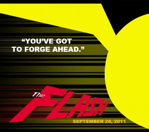
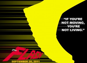
Here in comic book land, we see a lot of teasers. Most of them are slight variations of cover images, or possibly full page pin ups. This is, of course, sort of lazy and ridiculous. I don’t even realize it usually, because I’m so used to the same thing over and over. Slap on a mysterious phrase, add glowy effect, send out, and they’re done.
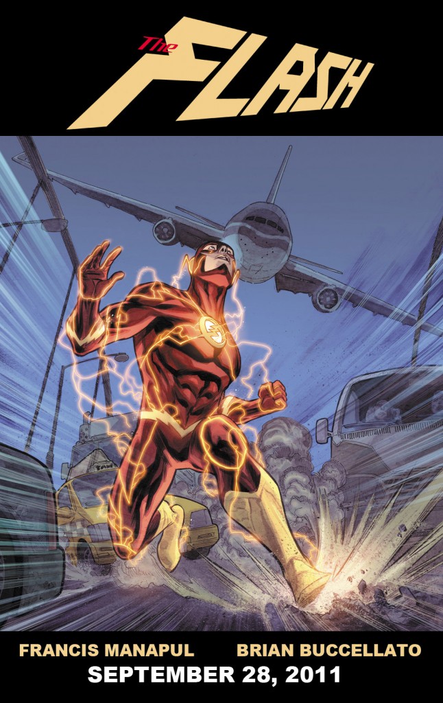
But these teasers for the upcoming new The Flash #1 (seemingly the 43rd Flash relaunch of my life), by Francis Manapul and Brian Buccalleto, remind me that this iconography is so strong that most of the time, they’re selling themselves short.
That’s how you do it. The book is out on September 28, like it says 4 times above this.


YES! YES! THANK YOU! YES! GOD YES!
Sorry. I get so frustrated at the lack of value paced on good design at the big two. They are selling comic books which are heavily dependent on visual appeal and their design values are usually ridiculously subpar. I’m so happy to actually see something that at least refers Paul Rand instead of being a couple photoshop filters.
I feel a huge relief right now. Thank you!
I like the idea of what is going on for DC, but I have to say, It is not uncommon for a comic book to be on volume four right now. I just wonder about those comics that have gone from volume one or two all the way to volume five or six in the twenty years I have been reading. It kind of makes me sad.
That said, I love these ads, and I will continue reading flash comics until they stop printing flash comics.
Also, the art (presumably from the actual book) looks awesome.
Eh. I don’t see a whole lot different between this and most comic design. A stronger (Bass-inspired) concept than others but execution is still weak – the whispy gradient especially gives it a cheap ‘shopped feel.
Would have been better without the default typesetting on the quote. Leave the whole thing out, would have been pretty nice…except for the last one which is community college level design 1 homework.
Those 3 images are pretty cool minimalist design (so trendy right now).
At least DC is trying to do something different. These ads still don’t look as cool as the licensed T-shirts they sell at Target. Thats a problem. For a company headquartered in New York City, they sure as hell don’t know/care how to find a decent designer.
“At least DC is trying to do something different.”
That’s the point. You can snoot all you want and incorrectly tag this as a Bass-inspired design, at least it doesn’t have lens flare.
for comics ad design its an improvement, but its not winning any awards, or getting into Com Arts anytime soon.
some of the most amazing ads could be coming from the comics world, its just not something they value i guess.
to stab a guess i would say there’s no budget for advertising in comics…which means low pay…which means experienced or innovative designers obtain work elsewhere.
You would think that products created by “artists” would have incredible design sense as the norm across the industry? My guess again would be that even ambitious interior artists at the big 2 wouldn’t get a chance as those design decisions are most likely made at a corporate level.
and my last guess is comics tend to be insular (comics artists are only comics artists) and look down at Fine Art and Design degrees as being somehow elitist. But those are an easy way to learn all about the lineage of design which helps inspire new design.
now if only there was a comic website with access to comic’s management who could get these questions answered?…
hurm.
Looks like a winner!
Each of these is more interesting than the entire issue of Justice League was.
This has to be better than the last arc & Flashpoint. Manapul has to do Flash as much if not even more justice than he & Geoff Johns did him on the first arc of their last run.
This looks inspired by Chip Kidd and some of the logo work he’s done for DC.
Francis Manapul was put on this planet to draw The Flash. this is one of the books I’m most excited for!
“Slap on a mysterious phrase, add glowy effect, send out, and they’re done.”
This made me LOL.
So true.
or Marvel’s new strategy: Show one character you are mildly interested in, surrounded by blacked out blobs!
Yes, those are some good ads. Simplicity, excitement and uniqueness all in one.
Perfect. I want to like this since I’m a long time Flash fan from all the way back into the 70’s. Sad Wally will no longer be apart of this, and does any one know how they’ll explain Bart? Is he still Barry’s grandchild? Iris and Barry are no more so its confusing.
At least Manapul down plays all that silly detailed line work on the new look.
I see I’m not the only Wally fan out there.
Wally came 3rd in a top 100 DC characters list at comic book resources. He’s familiar to lots of younger fans from not just his series but from the animated JL show, and he’s even almost had a movie or two made about him. I’m confident that Wally won’t be forgotten for long.
The styling looks great – the logo needs help – but overall its great that DC’s really making an effort to make the reboot feel new.
The most interesting covers since the Iron Man Reassembled covers of about 2 years ago
awesome. great teasers
Nice teasers, and a good reminder that the Flash has one of the more dynamic outfits out there. That said, I’m not that much of a fan of the character, so my decision to pass on this title is unchanged . . .
If he writes even half as well as he draws then we’re in for a great run! HA! Run! Get it?