BATMAN INCORPORATED #3
What did the
iFanboy
community think?
Pulls

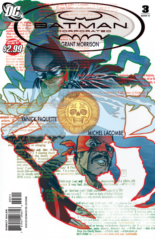
Art by YANICK PAQUETTE & MICHAEL LACOMBE
Cover by DAVID FINCH & SCOTT WILLIAMS
Variant Cover by J.H. WILLIAMS III
Size: 32 pages
Price: 2.99
I don’t know what’s up with Grant Morrison lately but I’m glad to finally have this series back on track. The first two issues, while not perfect, were a blast to read because Morrison is bringing back the Silver Age craziness into the Bat-Universe again. After recruiting a Japanese Batman, we now have Bruce go to South America to recruit El Gaucho into his new Bat-Corporation. This isn’t the first time we’ve seen El Gaucho and he was one of many characters Morrison brought back into continuity with the ‘Batman Must Die!’ arc so many years ago. Can the magic from that previous arc go into this issue?
There is a bit of a divide with me on this issue particularly. On one hand, this issue is really crazy with a lot of weird ideas and action sequences involved. I mean Morrison in a span of a couple of pages introduces a new villain with a parrot on his shoulder, the threat of blue scorpions, and a hot air balloon chase. That type of stuff, and a few other moments, really bring the best out of this series. Morrison is giving us a modern take on Silver Age ideas but it doesn’t feel so ridiculous to take us out of the story. On the other hand (wait for it), there are some things in here that just confused the hell out of me (there we go..). The opening pages just didn’t make sense to me even though I know it’s all to just introduce the main villain for this arc. So I get the message but getting us to that took way to long and introducing even more new characters made it even more confusing to figure out. I thought that would be the end of it, but then I turn the page and suddenly we have El Gaucho narrating and joy of joy there is no translation for it. So Morrison went from this being a silly comic to a chore of going online and figuring out what the hell a character is saying. At the end of the day, I don’t think it makes it a bad comic in any way, but the tone of this series keeps changing and I just want Morrison to stick to one tone.
What’s hurting my enjoyment of this series a bit is the artwork by Yanick Paquette and Michel Lacombe. On paper (heh, paper pun) it does look good and Paquette definite has a good eye for detail and panel layouts. I mean a two page spread of El Gaucho ambushing goons with his motorcycle looks really good. But the inking for me just ruins it for me. Everything looks too ‘thick’ or the lines kinda smush in with the coloring. Heck even Nathan Fairbairn’s coloring looks a bit too thick for the actual pencils. The one thing I’ve noticed is how Paquette and Lacombe draw Bruce’s chin; I swear Jay Leno is under the cowl and that’ll be the end game for Morrison (count on it). Also, apparently Paquette/Lacombe couldn’t do all of the pages in here so we get Pere Perez to do two pages toward’s the end. He seems to be the stand by for Morrison books that are extremely late and I gotta admit….I prefer Perez’s pencils in those two pages then the rest of the issue. Everything is sharper, cleaner, and brighter then the other pages by the regular artists. So I for one would welcome Perez to do this series if given the chance.
I still think this is a fun comic, don’t get me wrong. It’s crazy, silly, and Morrison writes some pretty entertaining action sequences. But the change in tone throughout the issue just hampered my enjoyment of the story. Also, Paquette and Lacombe’s art really isn’t working for me on this and it doesn’t help that a fill in artist to do two pages is much better then the overall product. But hey, maybe we’ll have another 2-3 month gap between issues so it can do nothing but improve right? Right?
Art: 3 - Good


Leave a Comment
Login or Register to get involved and leave a comment