“Baby, remember on the bus and my hand was on your knee.
when you love somebody its hard to think about anything but to breathe.
Baby, I am the cub who was washed out in the flood,
When you love somebody but bite your tongue all you get is a mouthful of blood.
[repeatx1]
Here we go-”
–The Fruit Bats, singing about liking comics covers and not being able to think about other things. But not really.
Extreme perspective shots like this show just how incredible a draughtsman Rodriguez really is. This composition offers a new level of visual complexity to what could’ve been fairly rote. The “evil reflection” concept has been done to death, but the unique bird’s eye view and meticulous detail make for an exceptional vision.
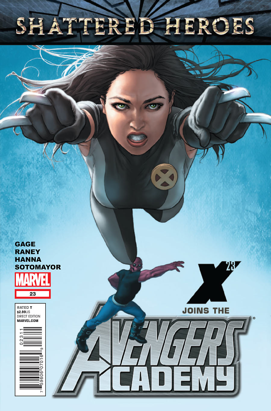
Fastball special coming right up. Mostly, I like how clean composition is, with a stark background and an instantly readably premise. X-23 joins the team, and she takes a cue from Dad on making the perfect entrance. Without the inclusion of Mettle in Colossus’ pitching position, it might’ve been too simple a pinup. But his place in the background turns this into a story. Or at least a verb.
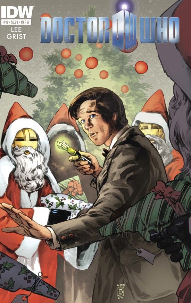
The true meaning of Christmas. The camera is positioned perfectly here, as is the dramatic lighting. The guns wrapped in gift paper? Icing on the cake.
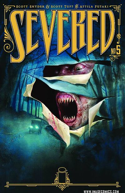
I’ve showcased Futaki’s cool burst-through-the-canvas covers for the series before, but this is one of my favorites. Perhaps subjective, but I love this combination of colors. The bold mustard yellow logo looks terrific over the moody blues and greens of the wooded road. Conceptually, it also looks like dude’s about to eat that car.
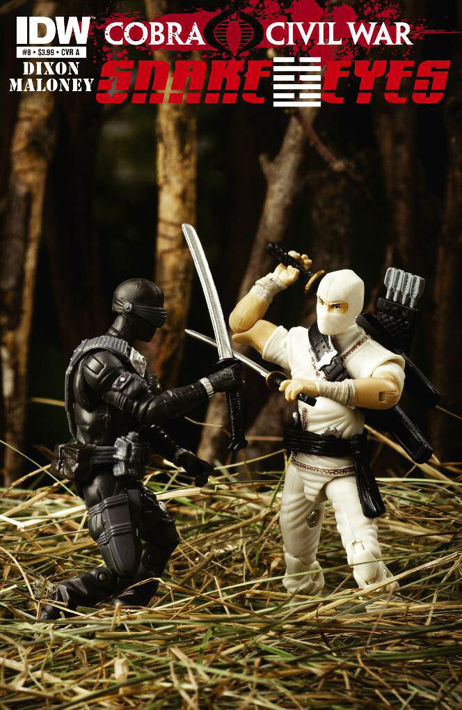
Usually I cull the week’s best covers by browsing our own database for the standout images. This one leapt out at me on Wednesday at the shop. I doubt we’ve ever included a photo cover, but this one absolutely sings. I was instantly transported to a Saturday morning long past, glued to my personalized lineup of cartoons. Remember those commercials for action figures set in deserts and forests, where the kids always had the perfect boulder and crystal clear puddle to use for terrain in their play-acting? It’s such a bizarre source for nostalgia, but it’s there.


I love that Snake Eyes cover, too. It is spectacular. I think I’ll dig up my old figures and play a bit.
If iFanboy had a “like” button, I’d have hit it for that comment.
This has to be the worst Best of the Week in Covers in a long while, if not ever.
I agree… somehow these covers just do not sing my tune… except the first one… I agree that the perspectiv is somewhat cool
True, that Locke & Key cover is pretty awesome. Also, I don’t know how Batwoman doesn’t make this list everytime it’s released. The way Batwoman is colored, to the image of Flamebird, damn it’s gorgeous.
To be honest, it was a rough week for covers overall. As for Batwoman, this month’s was not one of the series’ best. Too busy for my liking.
Love the Severed cover. In fact, loved all the Severed covers so far despite what Dave Johnson say’s!
The Avengers Academy cover on the other hand does absolutely nothing for me, in fact I think it’s downright awful. The characters look like they’ve been plonked on a generic background with little or no thought. The background itself looks like it was knocked up with a cheap desktop publish program effect and the logo placements are really weird. Just generally bad.
Corrections on the Avengers Academy write-up. X-23’s a clone of Wolverine, not a daughter. More importantly, the character in the background is “Mettle,” not Fortress.
Whoops, couldn’t think of his name and went with his original monicker from the original announcement. Which I suppose was changed for legal reasons.
As for X-23, I know she’s a clone but stand by the Dad gag.
Is Gabriel Rodriguez winning things?
He should be winning things.
They seriously used a picture of action figures for a cover?
Yes and it is awesome. IDW has done this two weeks in a row, and those covers have sold out FAST.
It’s one of three covers. The others are drawn.
Best cover I’ve seen in a while.
“It’s one of three covers.”
Ah, well that explains it. I know some series use the occasional photo-for-a-cover for variants. Still throws me for a loop every time though.
The severed covers are all really nice. To be able to create a coherent design system across multiple issues with each piece functioning on its own is a really big challenge and handled really well here. I’d nominate the Severed covers for best cover series of the year if you had such a thing.
The GI Joe one is pretty fun. I’m sure i had that exact same battle at some point as a kid. =)
From my pile Batman and Robin gets my vote for cover of the week. It’s all of the awesome.
From these I love the Locke and Key one. It’s often overdone but the whole ‘desaturate everything but one figure’ thing works really well here.
I would agree here, The B&R cover was awesome (maybe too awesome for this week?). The AA cover was downright ugly. The rest i don’t mind.
If I saw that action figure cover on store shelves, it would make me pause and give it a second look. Here’s hoping it becomes a thing with other publishers, because I wouldn’t mind seeing an old Michael Keaton-chinned Batman action figure punching out a Super Powers era Joker figure on a cover.
I am hoping beyond hope that IDW gives their Ninja Turtles book the same treatment.
It is funny you mention that the kids in the commercial always had the perfect play area for their toys. i never thought about it as a kid but as an adult I realied that most of those toys would have been a lot more fun to play with if we had the same setup that the kids in the commercials did.
Paul, another round of nice selections. When I saw the Snale Eyes and Storm Shadow cover, it was cute, but immediately made me think of this documentary that I saw sometime back where take photos of ‘action figures’ was taken to an art form. That coupled with Bill Mantlo in my thoughts makes me recommend MarWenCol to any and everyone in the iFanboy Nation.
http://www.youtube.com/watch?v=pMWFhplFSEQ
That GI Joe cover sent me back to my childhood also! How to sell toys and hook up kids into comics: that cover!
Anyone else remembers the GI Joe ads in comics during the 80’s? I stared at those for long lingering minutes hoping to have those too!
It’s well and truy insane that Frankenstein: Agent of S.H.A.D.E. #4 is not on here. J.G. Jones’s Fear of a Monster Planet for zarks’ sake!!:)
“Usually I cull the week’s best covers by browsing our own database for the standout images.”
This sounds like the worst idea since the iFanboy cover database is often lacking in much of the independent comic covers.
That’s my starting point. I take note of what I see in the shops and in the press releases I receive as well.
Seems like there are a lot of folks wearing their pissy-pants today. The Severed and Doctor Who covers rock and Locke & Key takes the cake.
Understood, but look at this cover that @radiojejune was pointing at.
http://whatculture.com/wp-content/uploads/2011/12/FRSH_Cv4_main.jpg
That is tight
I thought for sure Frankenstein, Agent of SHADE was going to be on here. It’s a beautiful classic horror movie poster.
+1.
I’d love to eject that Avengers Academy cover from this list
Liked them all but the Avengers Academy cover. Batman and Robin cover should have been in its place.
I agree with the above comments on the Frankenstein cover, but what about Demon Knights? That imsge has been leaping out at me ever since DC released the promo . . .