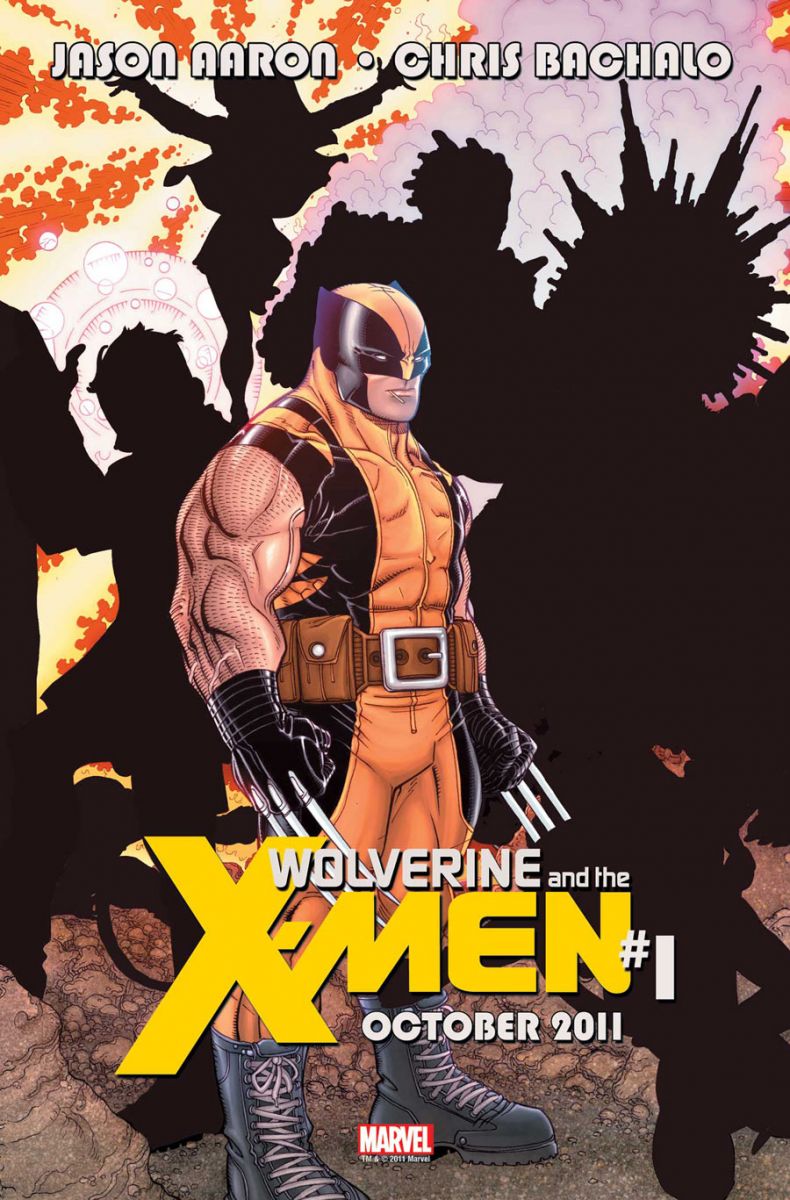
Yesterday we got a look at Emma Frost and her shadowy Uncanny X-Men team. Today we get a vague outline of Logan's side of the schism with this Nick Bradshaw teaser for Wolverine & the X-Men #1 by Jason Aaron and Chris Bachalo.
I'm pleased that Giant Sea Urchin Lad and Amorphous Shadow made the cut!
Meet the full team when Wolverine & the X-Men #1 hits shelves in October!


Apparently the Schism was over how much cake Wolverine gets to eat. It looks like he wins and the answer is: a lot.
Wolverine–3 ft of total mayhem!
Did Wolverine eat the rest of the X-men?
Iceman.
Wolverine is in ‘Wolverine and the X-Men’?
What a Revelation!!
I assume there’s no point getting this one if you aren’t getting the other one.
that is easily one of the worst drawings of wolverine I’ve ever seen.
I’m thinking that’s Rockslide from the Young X-Men.
I didn’t know Wolverine was Hobbit-short.
I echo the dislike of the Wolverine design but Aaron has me at least interested, if it’s $2.99 I will likely grab #1.
I like stocky Wolverine. He’s like an ornery ol’ badger. Looks good.
@nextchampion lol ya who knew wolverine was in the book.but it looks like they are learning from those I am a avenger ads I ordered my issue already so im game.
This drawing is easier to swallow if you pretend it’s Puck dressed as Wolverine.
Wolverine is pretty short. ~5’4 I think. This drawing is more like he really looks. Small, jacked and furry. I think that is rockslide as well; he has been running around with wolverine and jubilee.
@paul I like a short, stocky Wolverine too (It is traditional) but I hate Bachalo’s art.
This is interesting. Yeah, yeah. Wolverine on “Wolverine & the X-Men”. Ha. But what makes it intersting is that Emma Frost was the first reveal on the supposed Cyclops team. And it didn’t seem as if there was a Cyclops shaped silhouette in the Uncanny teaser. Had Wolverine not been the reveal here, I’d assume that these promos didn’t include the leaders. But it does, so it makes you wonder what lies ahead for Scott Summers???
Also, sure looks like Nightcrawler to the left of Wolverine.
I know Wolverine’s short but this is ridiculous, I mean his arms are bigger than his legs, by a lot. Also, his mask lacks the traditional points, and wtf is with that belt?
I’m with j206 I think I see Nightcrawler to his left.
It’s Ink and powered-up Sunspot!
Fat bastard!
I am so sad that this book is not actually called the Society of Snikt. Paul you’re a mad genius.
Looking like Havok and Iceman for sure
With Havok there I’d guess Rachel or Polaris as well.
These redacted ads… ugh. Could be interested given the team. Seems to be Nightcrawler on there given the tail clearly visible to the left. There are some anatomy issues with Wolverine there
is the urchin not warlock/douglock!?!
Also, loving that Wolverine look. He’s supposed to be super short and it makes sense for him to be stocky as hell.
Plus, he’s got a toothpick in his mouth, that’s always cool.
im am so dissapointed that Bachalo is the aritst on this book, Jason Aaron is probably the only reason ill still buy it because of that
He might take the entire New Mutants team with him. I think Gambit might be behind him holding a card. Kitty and Jubilee will be with him.
Having a Bachalo “guess the silhouette” is a bit like a rorschach test.
And Wolverine SHOULD be short and stocky… LIKE A WOLVERINE. I’m glad someone’s takin’ him back to his roots.
That said, I see Psylocke, Gambit/Havok/Nightcrawler? 0B, Rockslide/Iceman, Rachel Summers? Other than those vague guesses, no clue.
That is pretty clearly not Chris Bachalo art.
This looks like Nick Bradshaw art, not Bachalo.
@andybmcd Bradshaw did the variant. Bachalo is doing the main cover and interiors.
Looks like Havok anyway, the flier could be Rachel Summers maybe and based on how I remember Bachalo drawing Iceman before, I’d say thats him in there. Not a fan of the art at all really.
@kidCharlemagne They don’t like to be called “fliers.”
I dunno why people are knocking it here; I want Wolverine to look like this all the time.
why oh why does EVERYBODY draw him in the yellow and blue uniform?Bring back the brown and black classic uniform with the ridiculous points please!
Steve Dillion was the last artist (I remember)that used that uniform and it looked great
I think he looks more like a nasty-ass honey badger.
@Jesse1125 I get that the brown uniform with the big points has a cool visual look….but has any writer tried to explain why Logan wears it?
I think the points (even as small as they are in the above image) would look ridiculous in real life, and Wolverine is probably ten times more anti-style than I am, so what gives?
he’s such a little pudge! haha its kinda funny.
really poor ad design. The main logo is cool, but some of that type is just amateur level.
@KenOlchalek point taken. I think it was designed(the brown/black)with his claws in mind.They incorporated sharp edges/points because of his claws.Served no practical purpose but just looked cool. Now in that above design what purpose do all those damn pouches serve him?toothpick carrying case? lol
I guess I’m in the minority here, but I dig this Wolverine design. I always prefer artists who draw him short and compact.
@Jesse1125 I think the fundamentals of this costume (minus the huge belt and the weird boots on him here) work really well. It’s either my favorite or my second favorite with the brown one. The original yellow and blue/black is probably third. Somewhere after that are his current X-Force suit and his New X-Men look. Last: Jim Lee’s boring blue and yellow uniform. He’s just one of those characters that have had a lot of different looks but almost all of them look good.
And I like the short and stocky renderings of Wolverine. I just think all the black around him is making the drawing look fatter. And the logo and shadow cutting his claws short isn’t helping. It’ll probably look better in the full artwork. (Nothing’s helping that arm though… That’s just… No.)
Why is he fat?
hahahahaha oh god, that is a RIDICULOUS look for Wolverine. It’s adorable, though! doesn’t it make you just wanna pick him up and snuggle him? I might buy this just for the cover.
WTF!! Wolverine becomes a midget? this would be great if they are targeting 5 yr. olds with this book
Almost as bad as Liefeld’s Fat Captain America from a few years ago.
i actually like the way he looks. It’s certianly stylised but it has character. the agian i don;t read X-Men so who cares what i think?
everybody knows that the shorter the logan, the more badass he is
When did Wolverine join the Super Hero Squad?
Looks like he has accidentally stabbed someone with this left hand. Hopefully there is a healer on the team.
Why are his claws cut off by the shadow, anyway? Unless they’re sticking into someone. Like Armor or Kitty. Still kind of rude, though.
I think that is a great Wolverine image, only the hood ear thingies are to short.
I don’t like the idea of Wolverine as the leader of the team. I think the leader should be totally devoted to that team, not moonlighting on two Avengers teams, team-ups with Spider-man and deadpool, and going off on solo adventures twice a day. Wolverine should be the guy who shows up right as you’re leaving, guts some bad guys, then takes off while everyone else cleans up the mess.
I love this picture of Wolverine – short, stocky, and looking very much like the little guy you don’t want to mess with. I loved Darrick Robertson’s depiction of him as well, which was very similar to this. Wolverine was originally 5′, 3″ in the comics. A lot of artists seem to have trouble drawing characters of differing heights so Wolverine has ‘grown’ over the years.
If they would just change the colors of this uniform from primary yellow and blue to brown and black I’d be very happy.
I love the stocky like a fire plug look for Wolverine. I also love the slender Paul Smith version of Cyclops. I wish more artists drew the characters as if they had unique physiques.
Jeff
Hate to have to skip this title but seeing Bachalo’s named attached is an instant “No thanks”. Remember when several people were griping because Pacheco’s Wolverine was stubby in Schism #1? Well check out Bachalo’s snub-eared, big footed, stubby Wolvie! lol
Or is that Bachalo’s Wolvie? He doesn’t have the freaky long face and inebriated ear-to-ear grin.
@keith7198 The image above is by Bradshaw
I like the general design, I hate pouches, I do think his proportions are off.
Gah why does Bachalo have to be the artist? It’s not often that i don’t try out a book solely because of the artist, but this may be one of those times. his art kinda killed the “Shed” arc for me in Amazing Spider-Man and his art was the main reason I dropped X-Men after issue 6. Sigh guess i’ll just be checking out the Uncanny relaunch…
Ugh. Short and stocky is fine, that is how Wolverine should be. But that picture is just ridiculous, the arms alone. Ugh I say. (and I hate the title, wasn’t Wolverine and the X-men a cartoon already?
@RoiVampire “I see now said the blind man”. 🙂
I like it he looks tough thats the way he’s supposed to look
I think it looks good, That’s how wolverine is, most artist’s can’t draw how short he is. I love chris’s art and can’t wait to read this!