SAUCER COUNTRY #1
What did the
iFanboy
community think?
Pulls

Pencilled by Ryan Kelly
Inked by Ryan Kelly
Lettered by DC Lettering
Colored by Giulia Brusco
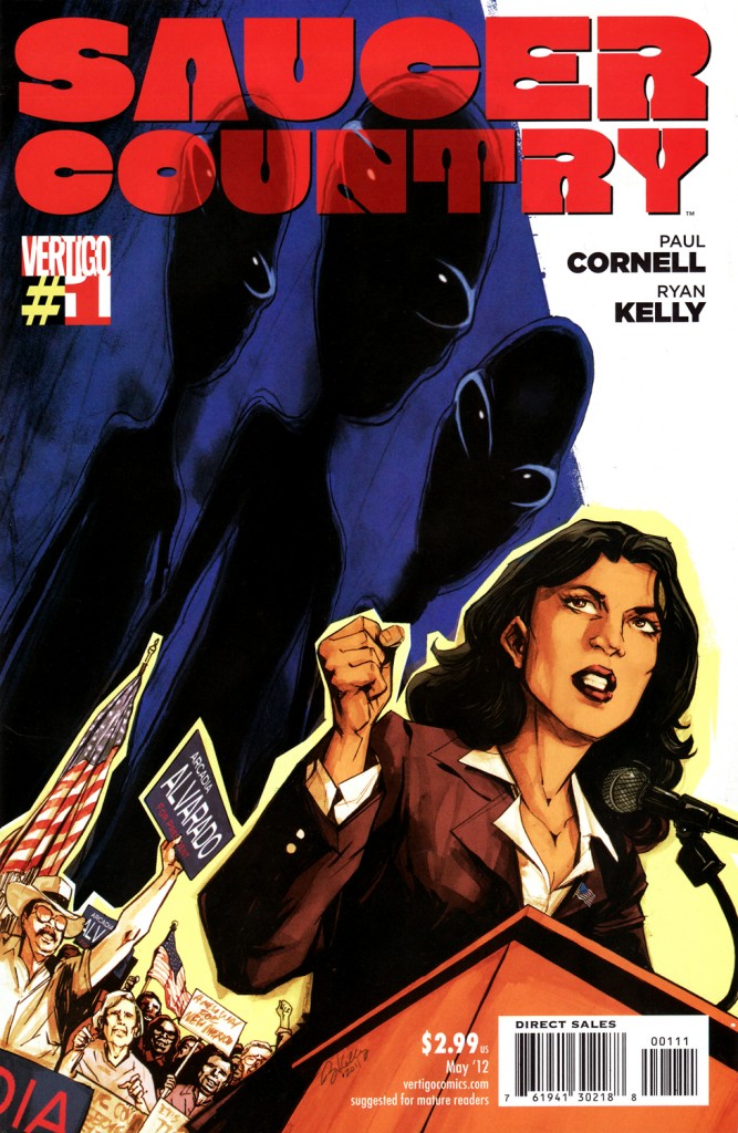
Cover by Ryan Kelly
Cover Color by Dave Stewart
Size: 32 pages
Price: 2.99
Look we all know a big #1 issue is out this week and unfortunately ‘Saucer Country’ is not it. Well maybe it should be it considering there is a lot of things going for it. A) It’s written by Paul Cornell. B) Ryan Kelly is the artist. C) Aliens are involved and who doesn’t love them? And D) It’s a #1 issue for a Vertigo series and that’s usually something people will celebrate. Maybe Image does have the upper hand when it comes with Saga, but does Vertigo have yet another hit on their hands?
This is a bit of a balancing act for Cornell when I look back on this issue. He is normally a very ‘crazy’ writer in that his ideas are ‘out there’ and he has no problem crossing the line of sanity for the sake of the story. While there is some of that going on here, like a guy imagining the figures from the Pioneer 10 Plaque talking to him, but for the most part this is grounded in reality. We follow a prominent, female politician as she decides to run for President. She may, or may not, have been abducted by aliens and I think this series is going to go the route of debating whether she’s crazy or not. But considering how crazy her friends are I don’t think it’ll take long to see whether she’s telling the truth or not. So Cornell has to make this seemingly political thriller into an ‘X-Files’-like story and I think he blends the two well in an intriguing first issue.
I think what also helps to keep this book stay grounded is the art by Ryan Kelly. Of course we all know Kelly from great series like ‘Lucifer’ and ‘Local’ and while I wasn’t a huge fan of those series per say; I really loved the art in both. It’s an interesting style Kelly has because it’s kind of cartoony but there is a good bout of realism to it. Like, the characters have somewhat cartoony figures or eyes but their clothing and even the backgrounds look really realistic. I mean when you see things like the Arizona desert or a Harvard office, it feels like you’re actually there or at least Kelly is somewhat photo-referencing. The colorist, Giulia Brusco, should get major kudos for this first issue because if this issue is anything, the coloring is going to be integral to the art. She sets the tone right for each page for EVERY page and it really stunned me how great she is. Using the right blues and greens for nighttime scenes, or the use of purple for a ‘nightmarish’ feel to an empty house, and in general everything is really colorful, The designs just stand out because of this coloring and I have a feeling this won’t be the last time I give props to Ms. Brusco if she stays on this title long term.
For a #1 issue I think this is a great start to an intriguing story. However, there is one thing that makes me not decide to make it a ‘POTW’ worthy title. Most Vertigo titles start off with an incredible first issue with a big twist or intriguing set up for the future. For this series? To be honest you could just read the solicitation and get everything you would need for the first issue. It’s a political thriller involving aliens and while Paul Cornell did a great job here, there is nothing that stands out as ‘WOW’ worthy. It’s just a solid first issue by the man and it certainly helps he has a great art team for this series. In the end I am excited for this series but I do hope there is some sort of ‘kick in the pants’ type of moment to really elevate this series.
Art: 5 - Excellent


Leave a Comment
Login or Register to get involved and leave a comment