ASTRO CITY #1
What did the
iFanboy
community think?
Pulls

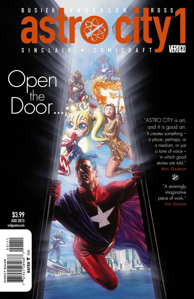
Art by Brent Anderson
Cover by Alex Ross
Size: 40 pages
Price: 3.99
Going into this I’d never read a single issue of Astro City. But none the less was curious due to its “Pick of the Week” status, as well as the buzz of it returning to a monthly ongoing after so long. I’d only heard of Astro City through the occasional Alex Ross google search to marvel at his cover work, thus stumbling upon many of his AC covers in the process. Despite the prospect of going in blind, I decided what the heck and picked the issue up knowing that Busiek was attempting to be accessible to new readers.
After having finished it for the second time, mere minutes ago, I’m torn. On one hand the concept and locale have intrigued me. Busiek doesn’t lie, the issue is quite accessible in terms of content even though I have no connection to any of the characters shown. Which may be why the issue failed to grasp me in any way. I was waiting for it to click, to understand the reason behind the excitement and I just couldn’t.
It’s gotta be the fact that I’m not welcoming home old friends with the return of the series. I feel like this would be much more exciting if I’d read the previous series and now was getting more of what I’d been invested in. But I don’t blame the creators for forgoing the traditional route of a set-up issue, and just jumping straight into the action.
Unfortunately in this case the action wasn’t entirely compelling and this oversized issue could have told its story in half the pages. My favorite part about it is the introduction to the new character, The Broken Man. For the moment his interactions with the reader provided the most interesting bits in the book, especially the final page. The rest felt run of the mill in terms of plot progression.
Perhaps the biggest turn off is how hit or miss the art can be. Sometimes we’re treated to some great detail and pencils. The body language is pulled off subtly and quite well. And yet there are so many pages where it looks thrown together, with vague backgrounds, and crowds that look pasted onto the scenery. It’s awkward, and lacks heart, which hurts the populated atmosphere they’re going for.
I’m uncertain if I’ll continue reading this series. Perhaps I’ll check out the trades if I’m pushed to (any suggestions guys) or if the next issue looks compelling. I really wanted to like this, it was just way too rough around the edges and lacking in that necessary hook.
Art: 2 - Average


Leave a Comment
Login or Register to get involved and leave a comment