ASTONISHING X-MEN #29
What did the
iFanboy
community think?
Pulls

Size: pages
Price: 2.99
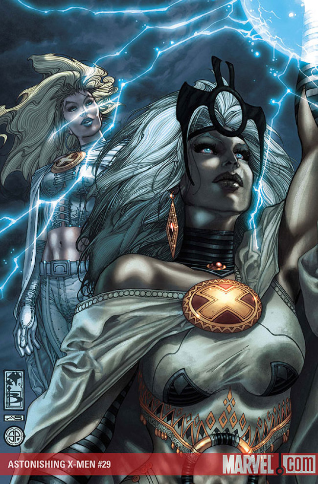
I haven’t liked this series since Whedon left, and I’ve been troubled as to why. Bianchi’s layout and pencils are mesmerizing. I love the way he draws these characters, yet something has been jarring me since he took over. It’s the colors. The glossy colors are destroying my enjoyment of this comic. The opening panel of Storm’s face is beautiful, but then the colors are simultaneously muted and shiny in a way that my eyes just can’t abide by. And that’s a damn shame.
Another problem I have: Astonishing has been the title out-of-synch with the rest of the X-men books ever since Whedon/Cassidy turned it from a monthly to an almost-quarterly book. I think, now, that it’s supposed to be in line with the other books. But, early in the story, Cyclops and Beast discuss how they haven’t seen Forge in ages. And Henry mentions that he was in touch with him just after M day. Ummm…didn’t they see Forge at the end of Messiah Complex? Hasn’t Scott been contacting him in X-Force and Cable so he could track down the baby?
Forgetting continuity, Ellis is trying to hard to be Whedon, and he doesn’t have a knack for it. He’s usually not a bad creator of dialogue, but the speech in this book is stilted. And while no one seems to be “out of character”, they don’t click together the way they did in Astonishing. To clarify, I don’t mean “click together” as in, be friendly, I mean, their interations don’t seem important here. I don’t care that Emma may be screwing with Scott, they way I cared in the first 24 issues.
All of this may be a result of the long gaps between issues I don’t know. I just know that this has gone from being the best X-book in the Marvel U to a mediocre mess, which is a shame, given the talents of this creative team.
Art: 3 - Good


Leave a Comment
Login or Register to get involved and leave a comment