Pick of the Week
What did the
iFanboy
community think?
Pulls

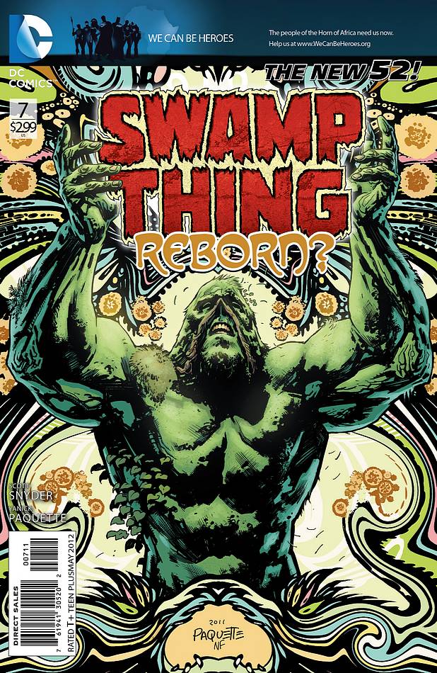
Art and cover by YANICK PAQUETTE
B&W Variant cover by YANICK PAQUETTE
Size: 32 pages
Price: 2.99
Have you ever considered the fact that maybe Scott Snyder isn’t really that good a comic book writer? Maybe he’s just a really smart guy, and figured he could slide by as long as he was constantly and consistently paired up with excellent artists and collaborators. The list of people he’s worked with in his frighteningly short time in the industry is exemplary: Scott Wegener, Rafael Albuquerque, Sean Murphy, Jock, Francesco Francavilla, Greg Capullo, and now Yanick Paquette on Swamp Thing. The fact his, Snyder’s first published work in comics wasn’t even three years ago. In that time, he’s up there with the biggest names in the industry, and working with artists most comic writers would kill to do a backup story with. So maybe it’s not that he’s some great writer, it’s that he knows where the bread is buttered when it comes to comic books, and you lay back, and let the pencil jockeys distract readers with stunning visuals. Then, when they hand out the Eisners, you just sit back, smile, and do it again. He’s a genius is what he is.
So let’s begin with his current Swamp Thing ringer/artist, Yanick Paquette. There’s no one out there doing work like Paquette at the moment. He doesn’t quite get the accolades of a J.H. Williams III, but he’s right there, and he’s proving with every issue that he is exactly the guy for this book with his unorthodox layouts, and organic as can be creeping plant life back grounds. The fact is, this issue was almost 100% explanation between a naked dude, and the spirits of some trees, and he made that work. At the same time, every single nook and cranny of this book is filled with some vine, leaf, thorn, or shrub, if it isn’t filled with the grotesque rotting corpses of the rot with their backwards heads and dead eyes. It’s not wonder the dude has to have a fill in artist every few issues. This is some heavily crafted stuff. There should be some special award for “baby head on a spine with wings” but that it’s only one tiny part of the overall collage of ickiness filling these freaked out, psychedelic pages.
Giving Paquette all the credit would be missing something very crucial. No, I’m not talking about Scott Snyder yet. Remember, he’s planned all this, and it doesn’t matter what he does. I’ve been seeing a lot of bad coloring lately. I don’t know color theory so much as know when color looks bad. Conversely, when you see a lot of bad coloring, it becomes very easy to notice good color, and Nathan Fairbairn colored the stinking eyeballs off of these pages. He had to do creepy, ghastly, gross, and swampy. The greens stand out in sharp contrast to the red, yellow, brown of the Rot, and add even more texture to pages that weren’t lacking in texture to begin with. He accomplished these great looking pages by actually laying off, and not overdoing it, while sticking to a specific palette. It’s perfect, and so well done that most readers won’t even notice it, which is a bit of a shame, but that’s how things go in the coloring game.
So as you can see, we don’t have to give Scott Snyder any credit for this. He’s just hanging on to some talented coat tails. Except that he isn’t. The fact is, Snyder is on a streak that we haven’t seen in comics or baseball since Roger Maris in 1961. Again and again and again, it’s become the accepted norm that his books will be “excellent” at the very least. He’s one of the few guys to come out of the DC relaunch and still have our attention seven issues in, on a character most readers don’t have much experience with; on a character who hasn’t even shown up until the last page, half a year later. No one gets away with that unless you’re very good, regardless of who’s on art. He hasn’t built a world from scratch as much as rebuilt a world, which is how things work in big time comics, regardless of how much Alan Moore doesn’t want it to be that way. The work of re-establishing the world of Swamp Thing, the Green, Alec Holland, and more, while fitting it into the DC world at large, introducing new elements, and keeping the readers interested is a daunting task. This issue is the moment before we go over the falls. Holland didn’t want it, and here we find his justification for giving in to the moment we all knew would be coming, and I completely bought it. Can I point out, again, that this was almost all a dude talking to some tree dudes? And yet, it succeeded regardless, and if you got to the last page of this issue, and didn’t want to see what comes next immediately, that’s your problem, because this thing was perfect.
We’ve done this well without Swamp Thing, and when #8 comes along, the situation’s going to change, and the book will shift gears. Snyder’s shown he can do that well enough on his other titles, and it keeps me excited so we don’t get into the ruts that are so prevalent in ongoing series. Yet, on its own, as a way of getting from one place in the story to another, this was a wonderful issue, and Scott Snyder can write really well after all. Those amazing artists certainly don’t hurt though.
Josh Flanagan
I’m not over the baby head thing.
josh@ifanboy.com


Scott Snyder’s checks are still good, I see
haha jk, definitely looking forward to reading this
Banner ads at the top of comic book covers always look stupid and jarring, especially on this month’s masterwork from Paquette. I was hoping DC had lost this habit with the New 52 but it looks like the Big Two are still confused sometimes about what makes a good looking cover. DC basically trashed this one. It’s like a bank logo on a Fillmore poster or something.
I’m glad I’m not the only one bothered by this. Couldn’t they put the ads on the covers that aren’t great?
Did you even look at the “stupid” banner ad? Its not like it is promoting a cross over, Its to help with famine in Africa. Its just a comic-book get over it.
@ztb. I didn’t say the purpose of the ad was stupid, so spare me the self-righteousness. Maybe next time they can cover the entire front with ads and put a banner at the top saying “Swamp Thing”. After all, it’s just a comic book.
I think it does its job pretty well. Its bland and generic and that’s exactly right. It draws your attention by being there but the characters that belong to DC are silhouetted. Sure that adds a mystique and draws the eye but it also removes their details and importance and the focus is more on the words than the images which are stripped of feature and colour. I think putting this on the cover of a comic book is a bold choice but valid. People should be forced to look at that sort of thing other wise they turn away.
AAAAAAAAAAAAAAAAnyway, can’t wait for the trade.
They work out cheaper and I have no money currently lol.
Though am I right in thinking this will be the first issue of the second trade? Cos that’s gonna suck
@bobby2889…… I thought this first arc was supposed to be seven issues but I’m not sure. The banner design is great in itself, it just clashes with the rest of the cover, especially color wise. It’s not so bad on O.M.A.C. and Static Shock because those are blue anyway. But this one-size-fits-all approach is part of the condescending attitude DC seems to have towards the direct market. For them it’s a test market for trades and a chance to sell ad space. I get that, fine, but holy crap, at one point this issue has three full ads within five pages. One of the reasons I buy the monthlies is for the covert art but I’m going to have to re-evalute all this because it’s not making sense from either an esthetic enjoyment or a money standpoint. DC keeps saying they’re concerned about the shrinking direct market but it feels like we’re being slowly steered away toward digital and trades.
I’ve only ever bought trades to be fair. I’m still in university and prefer to save up for a single spendage and also they look nicer on a shelf. You get the cool covers in the back in what I see as a cool gallery and for me the package just feels more complete and delicious. Yes I used that word to describe a comic.
I do see your point about it clashing however if you decide to do it across the books then its hard to pick a single banner that’ll work on all.
Come on man ok all kidding aside. I know the snyder check joke must be getting old by now. But swamp thing realy. Now to be fair I dropped it after issue 2 because I just didnt care about swamp thing so maybe missing out bit if you dont like the main character which I dont I find it hard think I am. But my pick was avengers children crusade 9,and manhattan project #1
Now to be fair to you josh you may not be reading children crusade since you dropped alot of your marvel books
But I loved it. Copiel rocks. And maybe your not a hickmam fan. So while I respect your picl. I disagree great writing as usual. Josh
Coipel has nothing to do with any of the books your mentioning. Jim Cheung draws Avengers Crusade. I can understand why you’d get them confused though. A slight difference is that Coipel’s faces are a bit fatter/ with wider jaws.
Can understand why Josh gave it the pick though. I agree with you though nastysnow Avengers Children’s Crusade was the most enjoyable book for me for the art alone! Action Comics was a close second
thanks for the corection
I did get them mixed. Up. You make a good point on there art being so simalar. Cheungs art is amazing. Im glad you enjoyed it,as much as I did.
This book was good, but Animal Man (the best I’ve read all week by far), Manhattan Projects, OMAC and Action Comics were all better, I thought.
Children’s Crusade 9 was easily the worst book I read all week, and one of the worst, most depressingly wrong headed books I’ve read all month.
Good choice Josh. My pick was between this and Manhattan Projects
Mine too.
If anything ruins a cover its a barcode guys, c’mon lets get honest. Other then that, I love the review. Its a real testament to Snyder’s talent that he can handle DCs most popular character, Batman, and one of its most obscure, Swamp Thing, with such deft and competence.
Great review Josh. fantastic issue. still trying to decide between this, Manhattan Projects & OMAC.
Swamp Thing was good, mostly because something actually happened and it wasn’t the bad guy giving one long speech the whole issue, but Manhattan Projects fucking destroyed it. It was absurd and kind of horrifying at the same time. Magical. Just my two cents, though.
Question…is that huge iFanboy Flash ad in all DC comics this week/month? brought a grin to my face when i turned the page:)
Great pick Josh, after I finished this issue my first thought was, “Holy Shit, Wings!!” Immediately followed by the knowledge that the rest of my pile faced an uphill battle for POW.
I didn’t read this, but Manhattan Projects was my potw.
I’m having a hard time latching onto the story in Swamp Thing (it’s not that it’s bad at all, I’m just starting to think it might not be my thing), but Paquette’s art is truly excellent….with the small exception of some of the layouts.
I think it’s more an issue with the ad placement in the book than any shortcomings of the artwork, but the organic panel shapes often lead me to read two pages that face each other as a double page spread, when they’re intended to be two single pages.
Am I the only one having this problem?
you are not, sir. i loved this despite the fact that i read across the page when i was supposed to read down it many, many times.
That did happen to me once, so for the rest of the issue, I just made sure to pay extra close attention to panel flow. I’m not complianing, though, as the layouts (& finishes) were knock out . . .
This review is getting me excited to read this tomorrow. All I know on this issue is that it might be the most violent mainstream comic I’ve seen. Cause the preview at CBR had a ton of stabbing/chainsawing in it, then Snyder should a page on Facebook where people were getting stabbed in the head….I guess it’s violent?
This was just a great book. This series started off a little slow but these past few issues have been what I was expecting. Easily my Pick of the Week.
Agreed. 100%. This is a phenomenal issue.
The trade collecting #1-7 is $8.12 on Amazon vs. $13.93 digital and $20.93 in floppies. Crazy, especially considering that Amazon offers free shipping. That’s more than $20 yearly saving on just one book (minus your eventual LCS discount)! I love my monthlies and trade waiting might harm the book but there’s some serious food for thoughts here, not only regarding trade waiting but also regarding digital pricing (buying it in trades saves more than $9 per year). I really need to check if there is a trend here. I will calculate how much I would have spent for my 2011 floppies purchases and compare it to TPBs and digital.
This tirade was born from the fact that I was considering jumping on from #8 and planned to buy the TPB to catch up on previous issues.
Paquette is a great artist, but I’m really not digging these layouts for the most part. I thought they were best in the last few pages, with the branch-like borders, but when we get these swirls of light greens, I find them distracting. I think it’s in small part due to the color. The comic is pretty dark and the light greens of the panel borders stick out too much for me. With a JH Williams comic, we don’t usually get such a strong dichotomy between the content of a panel and its borders. It’s much more fluid and naturalistic. The branch-like borders in the end are in silhouette and blend much more nicely with the rest of the page.
Story-wise, I was bored until the end. It felt repetitive and poorly paced. What happens at the end though was pretty damn great. I’ll continue with the title to see what happens when it crosses over with Animal Man, but I may drop it after that. We’ll see.
Canadian artists are taking over, well at least trying to!
Seriously. I thought no issue was gonna be able to beat Batman #5 this year. But dammit, I think this one just might. And of course its from Snyder too.
I really think we are witnessing something special in the world of comics with Snyder.
Like Josh said, he just started getting published in comics just under three years ago…
4 weeks is just too damn long…
Great issue & great review Josh, although the throwaway comment about Alan Moore did seem a little unnecessary – I think that drum has been banged enough already.
As much as I liked this issue, I still enjoyed Animal Man more for the mix of humour and horror.
On a side note, I had the pleasure of meeting Yannick Paquette at a comic con a couple of years back. Not only is he a fantastic artist, he’s a heck of a nice guy! You can tell when talking to him that he loves what he does. Really made my day and made me an even bigger fan.
LOVE IT! …hmm useless comment?
This was a great issue, probably the best since the series started. Snyder and Paquette are working their hardest on this series and it shows….However, and this is what made this NOT POTW for me, the layouts are driving me crazy on this. Paquette is being ‘too cute’ or just being too complicated on purpose for these pages. I love the layout designs, but when I get confused on what panel to read for three straight pages then that is a big problem. I don’t mind Paquette trying to be like J.H. Williams III but clearly he anit no J.H. Williams III. Just make them a little more simple and this series is golden.
My POTW was Manhattan Projects #1. The best #1 issue since Chew #1 actually….and we know how that series has been.
I’ve not read this yet but the cover has put me right off. The artist clearly doesn’t know the character at all. Where is his dangling phallic nose/beard and his floppy eyebrows. Why has he got a nose and a mouth. This is just awful. It’s not even DC for heck’s sake its….
WHAT THE HELL!?!? THIS ISN’T MAN-THING!!!
Nice review, and I hate to be that guy (which really means that I secretly love being that guy), but your baseball metaphor seems off. Did you mean DiMaggio’s streak of 56 straight games with a hit in ’41? Roger Maris’ 61 home runs in ’61 wasn’t really a streak, and we’ve seen it surpassed six times since. Sure, those six times were accomplished by guys who are assumed to have used performance-enhancing drugs, but can you conclusively rule out that something similar isn’t going on here? My only explanation for the continuing consistency of the three tiles of Snyder’s each week are a) a Robert Johnson style deal with the devil or b) a Prisoner of Azkaban type of device that allows Snyder to work more than 24 hours a day.
I don’t know jack shit about baseball. So, you know, whatever.
I read swamp thing the other night and loved it. But this evening Manhattan Projects really knocked me out, my POTW hands down. But both were fantastic. Great week of books for sure.
this issue was awesome. the art was beautifully disturbing and i dig alec’s attitude towards the parliament of trees while they burn. this swamp thing is kicking ass.
Great review, Josh. I agree on all points. This book is on fire.
It’s a little strange Josh commented on Yanick Paquette’s uniqueness than immediately compared him to JH Williams III
This month’s issue has me salivating for what happens in April. I can’t wait to see Alec’s true creature revealed and find out what happens with Abigail. I started reading this new volume on a whim and would’ve kicked myself if I hadn’t. Swamp Thing has been one of my most looked forward to titles since issue three. Some feel this arc has been a little slow on the get go but I disagree and feel that each issue leaves me dying for more.
Sorry Josh, I think Luthor Strude or Suicide Squad was far superior this month and probably every issue. It’s a tuff week I know with so many great titles that come out and they compete hard. Great column though, and I can see why this is your POW.
K
Swing and a miss.