Comic Books
HELLBOY IN MEXICO OR DRUNKEN BLUR ONE SHOT
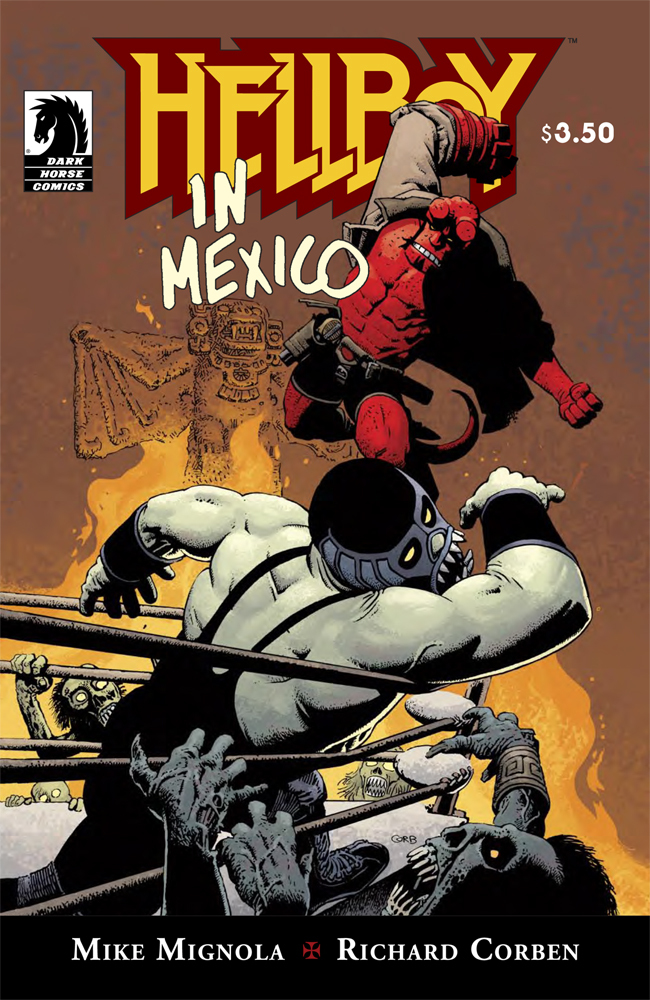
During the 1950s, Hellboy caravans across Mexico with a trio of vampire-killing luchadores, finding the undead; evil turkeys; a terrible bat god; and a little too much tequila.
Reuniting Mike Mignola and Richard Corben, the creative team behind the Eisner Award-winning miniseries Hellboy: The Crooked Man!
* Arriving just in time for Cinco de Mayo this issue features a variant cover, in Spanish, by Mike Mignola.
Writer: Mike MignolaArtist: Richard Corben
Colorist: Dave Stewart
Cover Artist: Richard Corben
Price: $3.50
iFanboy Community Pick of the Week Percentage: 14.6%
Reviews
| User | Added | Spoilers | |
| MoniBolis | 05/07/10 | No | Read Review |
| bigyanks | 05/05/10 | No | Read Review |
| TheNextChampion | 05/05/10 | No | Read Review |
| akamuu | 05/04/10 | No | Read Review |
376
Pulls
Pulls

Users who pulled this comic:
All users who pulled this comic


Richard Corben
That’s all I need to hear in picking up a Hellboy comic.
Damn my new trade-only policy for Hellboy. I’m buying this because who knows when it will be collected.
Seriously Mignola + Corben + Stewart? Doesn’t get any better.
I want to get the spanish variant cover.
En Mexico
The geek in me wants both covers. Anyone else feeling that Corben’s art keeps getting better with age? Seriously, its like he is just hitting his prime.
THIS IS GOING TO BE THE BEST COMIC EVER
Very Very Very Excited, I love these one shots
How could this be anything other than wonderful?
man, i really really really dislike Richard Corben. really dislike.
He had nothing but nice things to say about you.
i know. That’s what makes it so awkward
@edward: If you’re being serious I need to ask…..Why no love for Corben?
It’s just a taste thing. I find that his character design are amorphous blob like figures. The compostion within the comics panels are very lose. There’s a great textural quality of figures that are very simply drawn. basically, aethetically i don’t found it pleasing. if i feel any response to his stuff, it’s this seems very rushed.
And i known a lot of people have said that his style fits into the hellboy title after mignola but seriously, what comic are they reading? Re-read Mignola’s stuff, this is not simliar. from the characters to style to story telling.
@edward: aethetically??? Are you drunk/stoned as fuck again? Cause I am!
Are you talking about my spelling? because i missed an ‘s’
and yes. i don’t like it
I’m right there with you pal. Never liked his art, but love Hellboy. So I guess that overrides my dislike for the man’s pencils. What can you do?
If this doesn’t set your heart aflutter then you don’t love comics.
Corben is a bit tough to get used to at first. I remember looking at his first Hellboy work (Makoma) and it was a very different from what I was used to with the series. Overtime I got over the differences and Corben’s style stuck with me ever since. His ‘Haunt of Horror’ mini for Marvel was fantastic.
It looks like drawings from Mad magazine when Mignola used to draw the book. It’s not a positive comparison
If by MAD Magazine you’re referring to John Severin’s artwork, then yes, it is an extremely positive comparison.
ha ha. yeah, lets agree to disagree. it’s like i said just a personal taste thing
Y’know Edward I felt the same way about Corben’s art too a while back (I remember totally hating his "STARTLING STORIES: BANNER" work when I first saw it) but I agree with TheNextChampion; it was something that I had a hard time getting used to at first, but slowly, little by little, my dislike of it became a fascination and now I enjoy it.
Man I tell you guys I loooooove me the idea of Hellboy going to Mexio 🙂 That title alone had my interest peaked before I saw who was working on it
Corben has a very distinctive style. And with that there always come people who don’t like it. I love Corbens artwork, but I can see what Edward is saying.
My shop had run out of this by 11:00am. I’ll have to wait.
For me, Corben’s stuff works for less serious stories like this. I don’t know if I could read a major mini with him doing the art but for short stuff like this I’m fine with it.
@Spoons: I don’t know why, but I think if Corben was the ‘ongoing’ artist, I would love it.
A fun and beautiful looking comic. Really, probably the best Hellboy story I’ve read in a while.
I bought this issue on a whim and thought it was a great issue. I really liked both the art and the story, and I’ll be checking out Hellboy next month.
@TNC- My problems have more to do with my bitterness that Mignola rarely/ever does the art anymore for issues. I enjoyed the issue alot (My POW) but it only reminds me that we aren’t likely to see Mignola in any real art capacity for a long time/ever.
This was fantastic. I have not read such a fun yet emotionally impactful story in a long time. And Corben’s art was absolutely gorgeous.
Corben has really established himself as a real Hellboy artist now. His work was kinda rough on the "Makoma" arc all those years ago, but this was amazing!
I especially love the first half of the issue. How they established the atmosphere and setting, and just how the story of HB and the brothers battling and boozing was told was incredible. Best Hellboy issue in a while!
So i read the issue last night and had a chance to re-evaluate the art. My opinion hasn’t changed. It’s this stoner-tippy-R. Crumb style that is totally unsuited to the book.
I mean, a lot of blacks in a panel doesn’t make it suitable to Hellboy.
oh, and every character’s face looks half-finished and moronic
I loved this issue. I think Corben’s art is perfect for this sort of story. It gives it more of a pulpy, light-hearted feel, which is great for the Hellboy universe every now-and-again.
@Edward-regarding your R. Crumb comparison, Do you not like that kind of style at all? or is just that you don’t think it fits into the Hellboy universe?
@jwaesch: i like the r. crumb style but it’s extremely indicative of a certian era and style of comics. it’s become an aroctism. it doesn’t really fit with the sophisticated mignola style
You will be happy to know if you google ‘aroctism’ it comes up with this page. I think you meant anachronism, but I say this is an opportunity to make a new word.
aroctism: An artistic style indicative of a passed era where such a style was much more prevalent, which no longer fits or works in a medium. Most commonly used when discussing comic books or graphic arts.