 Just like a good action movie, comics filled with action are fun and sexy.
No wait, they aren’t. They really aren’t… But they could be.
Comics could be filled with sex, drugs, rock and roll. Call me crazy, but part of the reason I enjoy action movies is for the well-built, sweaty people running gracefully around in them.
And how about mysteries, spooky thriller comics, they aren’t particularly stylish or gripping either. Why not? I want something like those fabulous old Hitchcock movies, where Cary Grant or Gregory Peck run around looking frazzled and haunted. Why can’t we have some of that in our comics? Some of those tall, strong, impeccably-dressed, mysterious tough guys who no one really understands like we do, (mostly because there is often a first-person dialogue and we can read their minds, but you know what I mean).
In fact, while I’m wishing, could the whole comic be really stylish and confusing, but simultaneously quite direct and primal in both plot, dialogue, and most of all; the look?
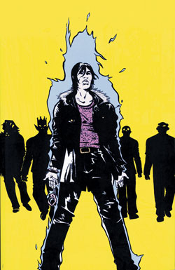
On all of the above, Heavy Liquid delivers. Paul Pope creates a wild ride of a story, rumbling it’s way around the world of 2070 like some crazy, dirty languid subway. He uses every tool at his disposal to paint a picture of this dirty, messed up future, filled with intrigue, danger, violence, and beauty.
This is the story of a man who is addicted to a drug made from the titular “heavy liquid”, (something like a metallic cake batter until it is heated and becomes liquid). It’s also about a group of friends who stole the drugs from a dangerous bunch of gangsters. Or maybe it’s not about drugs… interestingly, no one actually knows what the heavy liquid is, but it’s very rare, and seems to have a few interesting uses, so it’s a commodity. This man has lost dear friends, he’s lost his lover, he’s lost his lust for life, and ultimately he’s just lost in life, and he wants to be that way too.
 All of this information is conveyed in the first few pages, so I’m spoiling nothing to tell you this. It’s that kind of a ride – immediate and immersive – everything is just thrown at you and you’re expected to take it all in. As a reader, it’s a lot of fun to get a book that demands full attention, expects commitment and involvement. And while it’s set in the future, there is never a moment where someone says “Gee, please explain what that gadget is, or how the economy works, or how medical technology has changed?” Those things are all in the book, but they’re incidental, just things happening in passing, tools people use. Basically, the future is not the story, it is just the environment – the future is one more aspect of this rich book.
The initial few pages of this book set up such an iconic character, a hero with so much potential for adventure, that the book is immediately addictive. It’s a lot of fun to obediently follow the path laid out and slowly uncover the secrets, but just as much fun to meander through the side alleys of notes and details which map out the rest of the world in the book.
In the past, I’ve found that often a writer will start a book with great enthusiasm and excitement, only to peter out and eventually leave the story with some major questions unanswered, or even worse, leave the story half written. I hate it when a wonderful book turns to metaphorical mush, you can almost feel the writers saying “So ummmm, can I stop now? Have I completed the number of pages that I am contractually obliged to write?” This is not that kind of book.
 Heavy Liquid has got a great rhythm to it, it’s like a perfect mix of science-fiction, manga, rock ‘n’ roll, heist, spy thriller. There are just enough points of realization, moments of discovery, chase scenes, flashbacks, surreal new characters, emotional outbursts, and big city-scape moments to keep you reading. Despite this consciously-created tension, most of the time it’s slightly too chaotic to follow, in a good way, i.e. it takes it out of the formulaic and into the unknown. That perfect imbalance, throwing the reader off with surprises and incongruity, is precisely why this is such a fantastic example of Paul Pope’s work. He’s made books that are more well known, or more widely purchased, or won awards, but this feels like the one that was yanked right out of his unconscious mind. These characters all feel like facets of what he’d like to be in a slightly more exciting version of reality.
With a saturated brush, Pope’s inking is distinctive and evocative. Somehow he manages to take a very ancient-looking loose, calligraphic brush stroke and make it look like Moebius (contributing his futuristic vision and obsessive attention to detail) and Kirby (for his dynamic, kinetic lines of movement, and square-jawed heroes) got together and some kind of unnatural, mutant art baby.
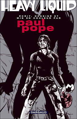
Nearly 10 years after it was originally published, the story is still entirely engaging. At moments there are tiny indicators of the era that it was created in, (like the millennial-era excitement about the future, the fashionable functionality of the gadgetry, the multi-purpose nature of the clothing), and none of these are negatives. In addition to the quality of the originally published book, this new edition has been completely redesigned in 2 pantone colors, it’s cleaner, more classic look. Apparently this new version is based on the French version, published by Dargaud. When Pope first came to the fore, with work like this, THB, 100%, and then Batman: Year 100, much was made of his youth and fashionable attire, the whole New York hipster culture that he seemed to embody. But separate the work from the hype, and you can really enjoy it. With it’s classic noir components and it’s dirty city, all broadly painted, it’s just rampant fun and eminently worth reading this new edition and enjoying the ride.
Next week: Leonard Starr‘s Mary Perkins on Stage is sassier than I ever could have imagined.
Sonia Harris wishes it were the future. She would like a jetpack, a replicator, and a roomba. If you have any information on the whereabouts of these items, contact her at sonia@ifanboy.com.


i did pick this up right away, as i’m a huge paul pope fan and it was originally released during one of my comic breaks.
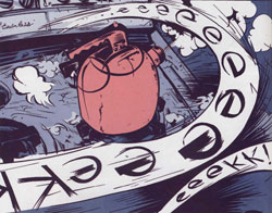
i love his artwork, but was distracted by the type and how it was scaled to fit in the balloons. i think pope draws the balloons on the page by hand? in his other work the lettering looks more hand made but in this series the various sizes of fonts just glared at me (must be my typograpy bone). and i’m not so sure how successful the k + 2 spots worked. i might have preferred b/w or full glorious colour like batman 100.
anyhow, i thought the publication design was really nice. DC really make a point to making their HCs special and this was no exception. the price on the other hand was unreasonable high. i mean look at the LOCAL HC and what a value that was for 10 bucks less.
i’im really looking forward to 100% now too!
i promise im not picking on sonia, i just dont get paul pope. i just dont. i dont care ofr how his figures are distorted, i dont care for his sense of story…i dont get it. explain it to me. i wanna lovew everything or at least as much as possible
@areml That’s so funny, I had exactly the same issue with the font, but after a couple more readings I got used to it. The weird part was the afterword, where he says that he commissioned it to be a custom font that would look like something from 2070. I just wasn’t getting a futuristic feeling from it, it looked more like a Frank Lloyd Wright kind of thing to me.
Sold! This sounds fantastic.
I agree with just about everything said here! Heavy Liquid is a GREAT book. It was ridiculous that it was out of print and impossible to find for such a long time. Two (somewhat minor) complaints from me.
1. $40 price point is too high for this book. I know it’s a nice hardcover, and they redid the coloring…but still. If this had been $30, I would have been all over it immediately. Instead I had to wait for it to go on sale at my shop. $10 matters!
2. They printed to close in to the gutter for my liking. There are pages where bits of dialog and art are so far into the gutter of the page, that they are for all intents and purposes, unreadable. I have to pull and flatten the pages with both hands to get at those hidden little interiors, and that’s not something I like to do on a book I already feel is a bit overpriced. Kirbys Eternals Omnibus from Marvel is the other really bad example of this I can think of off hand.
Neither of those are enough to ruin my enjoyment, but they do stain an otherwise excellent book.
@Lukebunny You’re gonna love me: it IS under $30, it’s only $26.39! Use the link I put on the words "Heavy Liquid" near the top of the article and check it out. And I’ve gotta agree about the gutters, but what can I do? I’d rather have it near perfect than not own it (lost my individual issues ages ago).
I’m so impressed; first the font and now the gutters. The iFanboy readership are fussier than print designers! It’s so refreshing to be in an environment where people appreciate attention to detail.
@soniaharris I did get a copy a while ago (for under $25 even!) thank you though. And I have to agree, we do seem to be some fussy cats! I’m a book binder, so everytime I see less than perfect book construction it gets my blood up. I actually bought the Ivan Brunetti Schizo collection "Misery loves comedy" because it was a nice smythe sewn binding that was just gorgeous:)
this looked really good. now you’re article convinced me sonia. im down with this. im getting it!!
Heavy Liquid was one of the comics I ever got my hands (first being Bob and Harv…)! Didn’t expect to see it featured up on IFanboy. Also, I had no idea it was put out by vertigo. I didn’t read superheros back then so at the time that name meant nothing to me.
I’ve had the Vandal’s Ball and Chain stuck in my brain since I woke. Literally, as soon as my eyes opened, that song started playing in my head.
But Paul Pope sure is good, isn’t he? What sets him apart for me is his ink-strokes — a lot of love went into them, you can tell. It espcially impressive is how he uses them for buildings and other constructs – without rulers and certainly lacking mechanical precision, he’s got just a wonderful life not just to his actors, but to their surroundings as well. Very good choice for a showcase, Sonia. Pope definitely deserves a shout out.
Ahhh, HEavy Liquid, fantastic stuff.
To my mind however, you just can’t beat 100%. It just felt like such a true examination of the human condition, dealing with love and longing, and the reality of being an artist in the world.
Even though it’s set in the future, it’s very very relatable.
Granted it’s been a while since I’ve read it, the issues are lost in the stacks somewhere, and maybe it was the timing of when I read it in relation to where I was with my life (and relationships), but to me 100% is Pope’s finest work.
I guess its unexaplainable