"I say Hillshire, you say Covers!"
"Hillshire!"
"Covers!"
"Hillshire!"
"Covers!"
"Go art!"

Uncanny X-Force #3
Cover by Esad Ribic
This is an absurdly cool Frazetta homage. You just hear a Wolfmother riff as soon as you lay eyes on it.

Conan: Road of Kings #1
Cover by Doug Wheatley
"Oh. Fuuuuuuuuuuuuu–"

Strange Tales II #3
Cover by Ivan Brunetti
I'm actually cool with calling this cover of the year. I wish we lived in a world where this kind of cover was viable for a typical Big Two title. Where any of the artists featured in the interior could do an arc of ASM or Action Comics without the glass being shattered on the emergency torch and pitchfork cabinets around the country.

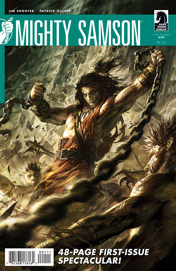
Mighty Samson #1
Cover by Raymond Swanland
Big fan of these new Dark Horse cover treatments with the color ribbons across the top. Much as I love big, bold title logos, the minimalism here is so clean, and so versatile that it never gets in the way of the cover image itself. I love the movement in this particular composition. The blur of the chains in the foreground, just out of focus. We're in the thick of it all, and that's exhilarating.

Wolverine #4
Cover by Jae Lee
I just don't tire of these Jae Lee covers. He has a classical understanding of form and light and composition. They're so haunting. Great sense of scale in this standoff too. Very much a David and Goliath situation. Appropriately powerful and visceral and scary.


I love M.O.D.O.K. skipping rope. That’s just straight awesome.
The most affective way to kill Wolverine, rip off his head…
Can’t get enough Esad Ribic. Marvel needs to get him on another Marvel Knights mini.
Gah! So sick of Jae Lee! He draws the same composution over and over and over!!!
And the characters are all in the same location every single time! On some vague foggy rock where you can’t see feet. It’s driving me crazy!
Don’t care.
@JumpingJupiter But they are beautiful…
Jae Lee’s covers are great examples of a painted-yet-dynamic style. All are great.
The cover to Darkwing Duck #7 is also pretty great.
Strange Tales II takes the cake. The adorable, hilarious cake.
Loved the Jai Lee cover!
is the wolverine ant good??
@Paul- I don’t care for your don’t care.
It’s getting a tad passive/agressive around here these days.
…and while you’re not caring, I think the Jae Lee covers have been nothing but unimpressive with stiff figures, uncomfortable expressions, weired musculature, and bland poses.
I too love the Jae Lee covers.
Swanland has been drawing some killer covers for those Shooter reboots.
@TomO Just saying that I don’t mind that Jae Lee’s covers has a uniform aesthetic. If you don’t dig ’em that’s cool too.
Might be hard to not get a little pissed if you post 5 covers and saying “Look, those are awesome” and people keep picking on the one thing they don’t like instead of saying something nice about one of the other four.
Nice covers, again. I pick a “Cover of the Week” for myself lately as soon as they are up on iFanboy, and my choice always ends up in your choices as well. This week, it’s Strange Tales. Of course. How can you not love that.
Hmmm Wolverine’s claws went through Colossus… I always wondered about that.
No problem here. That’s the great thing about art being all subjective, with different tastes and all. I just got browned off from the implied (unintended or not) dickiness of the snark in a section of the website called “COMMENTS”.
Apologies if I came off as a dick. I was a bit brusk there. But comments can go both ways. You’re allowed to disagree with the article writer, but I think the article writer should be allowed to disagree right back.
Listen, I don’t have admin rights to post my favorite covers. That’s what the thread is for, to talk about art and stuff. I’m a graphic artist by trade so I say my opinion here. Sometimes it’s positive when there’s covers I think are strong. This regular feature is one of my favorite part of the website.
I understand the necessity of an artist to be consitent. I just find that Lee’s composition and setting and tone of choice only occasionally fits the commission. It’s very distinctive. And yes a triangular compostion is very strong and a moody and ambient setting is compelling. But take an artist like Frazetta who’s style is ambient, who often used triangular composition and had an umistakeable style. But every piece has something to offer that the other pieces don’t. He does not repeat roughly the same piece with different characters which is kind of what Lee does a lot. I’m bored of seeing it all the time.
I could see myself hanging three of Lee’s stronger pieces on my wall, they’d look really cool together beacause of the repeated composition. But that’s about as much as I like to look at Jae Lee’s stuff. Occasionally. I find Lee has taken a type of cover which would work well as a series and made it his career. I’m bored of it. Do something else!
that Samson cover is really good!
I think the problem is that Lee normally hasn’t been used this much as a cover artist. He does a couple every year (normally just THE DARK TOWER covers); but for some reason the tail end of this year we’ve seen a bunch of covers by Lee. It does get a bit repetitive because you see the one-note style, tone, and structure he does with each cover.
This cover feels a lot like the Widowmaker cover he did, and also the Villains one shot he did, and also the covers for Deadpool Pulp. I’m not saying they aren’t good covers because it all looks familiar, just that it’s really easy to spot now.
Ewww. Strange Tales 2 is NOT my cup of tea. (In fact I call it straight up ugly. But hey! One man’s trash is another man’s treasure as they say.)
Ivan Brunetti’s cover for Strange Tales is great, and so much fun. It’s pick of the week for cover alone. He did a cool cover for the New Yorker Halloween issue.
http://forbiddenplanet.co.uk/blog/wp-content/uploads/2010/10/New-Yorker-Halloween-cover-Ivan-Brunetti.jpg
Wolfmother? Really? That’s who you think of when you look at a Frazetta cover? Oh, son…
Lol
@JumpingJupiter –well i don’t like the Jae Lee cover either. To me it looks like two painted statues fighting. I don’t mind working within one composition….i love it when Mike Mignola does it.
eliminating the composition as a variable is an interesting post modern approach where you are in effect reworking the same image over again to discover new things and the focus turns to mood and paint quality over rendering. I think because Lee is working with super hero illustrations that doesn’t quite work as well for that approach. But then again, Mignola finds a way to make it work again and again. I think because his stuff distills down into a cohesive and stylized image.
You know what I always notice about Lee covers?
They always seem to be set in some high mountain tops or somewhere in Ireland. The characters are always standing on rocks and there is a constant fog.
Used to love Jae Lee, now not so much. He was a top 5 guy for me. Now I just feel like I’ve seen it, and when artists intentionally obscure feet, over and over again, it drives me crazy.
@TheNextChampion YES! That’s what I mean! >(
But that said, there’s still something about Jae Lee that looks like no one else, and I obviously get that.
@wallythegreenmonster
That’s a good point. My wife (a professional artist) uses this technique. She paints roughly the same thing repeatedly but changes the lighting, the textures and little details so that each piece has a very different mood despite being compositionally a copy of all the others. There’s something about how Lee does it that seems more like stock imagery to me.
I never noticed Mignola using this technique. I’ll have to check it out.
@josh The way he draws clothing is incredibly distinctive. It’s a strength.
@josh –what is it about comic fans and their obsession with always seeing the feet? I always seem to hear that remark over and over. Wasn’t that one of the big knocks on Rob Liefield’s work?
@TheNextChampion —thats his Bob Ross thing. The rocks and fog are his “happy little trees” =)
@wallythegreenmonster Feet are hard to draw, and it’s one thing to leave them out when they’re not needed, and it’s another to constantly use tricks to escape drawing them. Once you notice it, you can’t unnotice it. It’s a lazy shortcut. If you want to be a professional artist, you should learn to draw feet, hands, horses, everything.
@josh –one of my friends is a professional illustrator and he mentions a similar thing with hands referred to as “mitten hands”
Uncanny X-force is the best of the lot in my opinion. I don’t HATE that Jae Lee cover but I DO hate Colossus’ face,he looks like Frankenstein
Good cover, I also though the Darkwing Duck #7 cover was clever
@Avistann: You made me remember Darkwing Duck!
That was my personal Cover of the Week. Just a great tribute to the Detective Comics debut of Batman. Shocked that wasn’t included.
@josh Or artists could be like Skottie Young and draw completely stylized, disproportionate feet. Or like Mike Mignola with his Hellboy and some of his monster designs. Young, Mignola and Jae Lee are different kinds of awesome partly because they know how they want to draw a picture and do it in a fully realized manner.