Covers. They're the first part of the book you see. Unless you're blindfolded. And then you're probably in trouble. Or involved in some kind of kink.
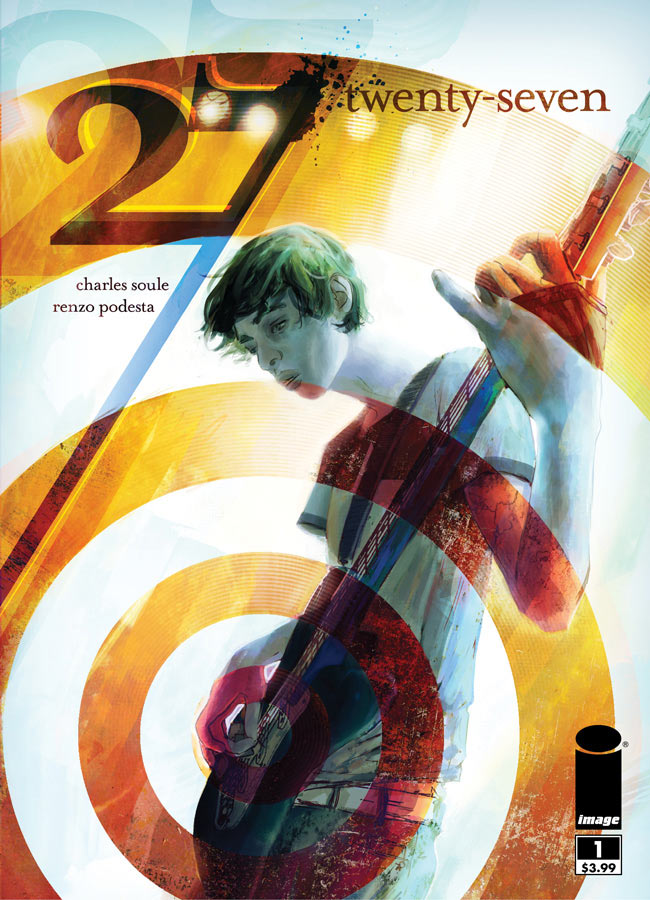
27 #1
Cover by W. Scott Forbes
Are we sure this isn't James Jean? Because damn. Love the off-center bullseye. Look at in one of two ways. Rock emanating from callused fingers, the hours of practice human digits were never meant to endure. Or rock emanating from the crotch. Dig the parallel line of the 7 and the neck of the axe.
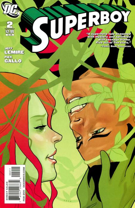
Superboy #2
Cover by Phil Noto
A stunning closeup. The delicate line work and the choice of when to go for or hard line and when to simply evoke that line through color. But my absolute favorite bit is the rosiness of Ivy's nose.
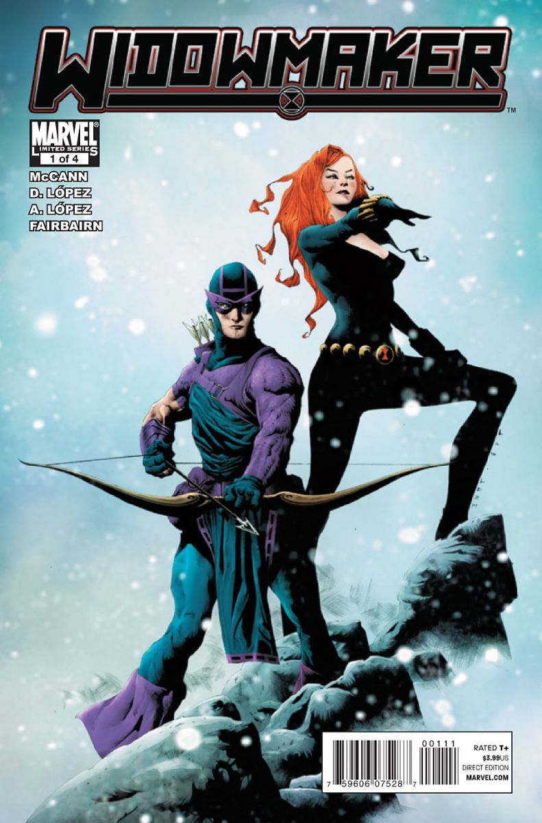
Widowmaker #1
Cover by Jae Lee
It's all about the flowing cuffs on Hawkeye's boots. Okay, maybe it's more than that. Maybe it's the texture of the clothing, from Clint's wrinkled tunic to the clean lines of Black Widow's catsuit. And the softness of the snowfall. It literally looks cold.
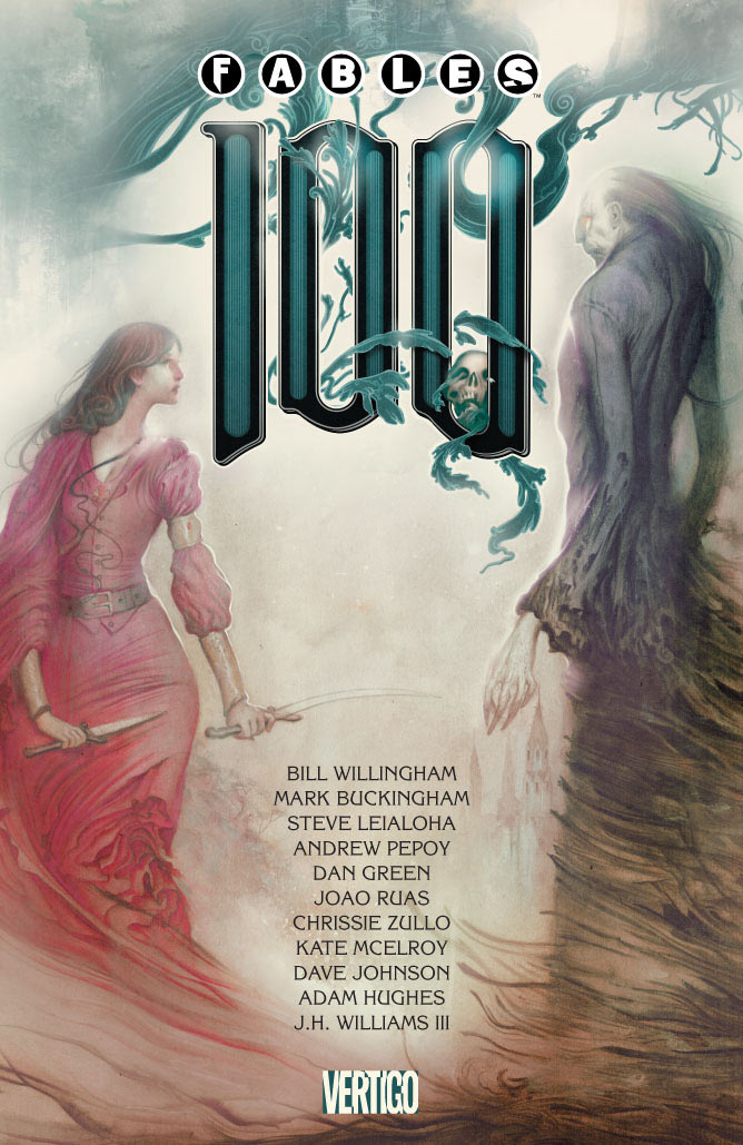
Fables #100
Cover by Joado Ruas
A landmark issue with a wonderfully austere cover. We've seen a memento mori motif a few times before, especially with this villain. But I love how it functions here in the ornate "100." This feels like an encounter. The story of the space between two forces. Top notch.


Oh, those are nice! Good points about the clothing on the Jae Lee cover, that really adds some dimension to the image.
I didn’t realize TWENTY-SEVEN had come out. I wanted to read that. How was it?
wow, that 27 is awesome. I’m waiting for the trade, but I may pick that one up just to frame it.
I’m really glad that typography seems to be getting better on covers.
Love the Fables and Superboy covers. Beautiful.
You’re right about the coloring on the SUPERBOY cover. I like that the vines are all contained by a green line instead of a black one. To me, it seems to emphasize their organic nature. Cool stuff.
That Fables cover is amazing. Great stuff.
Fables was a issue that cost $9.99 and the cover helped sell it. From the beautiful art, to the big 100, and to the names of the writers or artists in the center; you knew you were getting something special. The cover should sell the issue and this cover did just that! I didn’t think twice about spending more than double the normal price on a single issue.
Lately I have been digging everything that Jae Lee has done.Another out of the parker!
I listened to the podcast about 27 and was interested, but I had this nagging feeling that, as a guitar player, I wouldn’t dig the art… I’m not digging that cover at all.
@Grandturk What about it?
@Grandturk That’s not the interior artist. We did a preview earlier this week, and it looked like this.
No alternate Flash cover by Darwyn Cooke, What?
Nice choices though. I found it funny at the shop this week that issue 100 of Fables was set aside because they thought it was the next volume in the Fables trades.
Generation Lost had a striking and beautiful cover. I spent a couple of minutes staring at it, appreciating the black and white with the deep reds for impact.
All very nice,
That 27 cover could be a variant for Scott Pilgrim and the Infinite Sadness…..
This never happens, but I disagree with every choice. I would say those were the more lack luster covers this week. how does Northlanders not make it, with it subtle beauty of the woman under the ice? Or First Wave with the great trio shot if the Spirit, Batman (pointing a gun at YOU!) and Doc Savage framed by a clenching hand? I would honestly say that Widowmaker cover was one of the worst covers this week even.
I detest Fables and EVEN I think cover 100 is a keeper.
If anything it’s teaching me how to do covers right.
Also I suppose I’m the only one who is going to say it: spider-man/maryjane rip off anyone? But hey it’s done well here so I’m not really complaining. Just an observation.
@pm & Josh – just seems to me like no one has ever convincingly drawn a guitar in a comic book that didn’t look like some aborted Danelectro design. And now based on the review from the podcast, I’ll probably skip it altogether.