When you can reference the immortal Tom Jones in Best of the Week in Covers, you try desperately not to but then do.

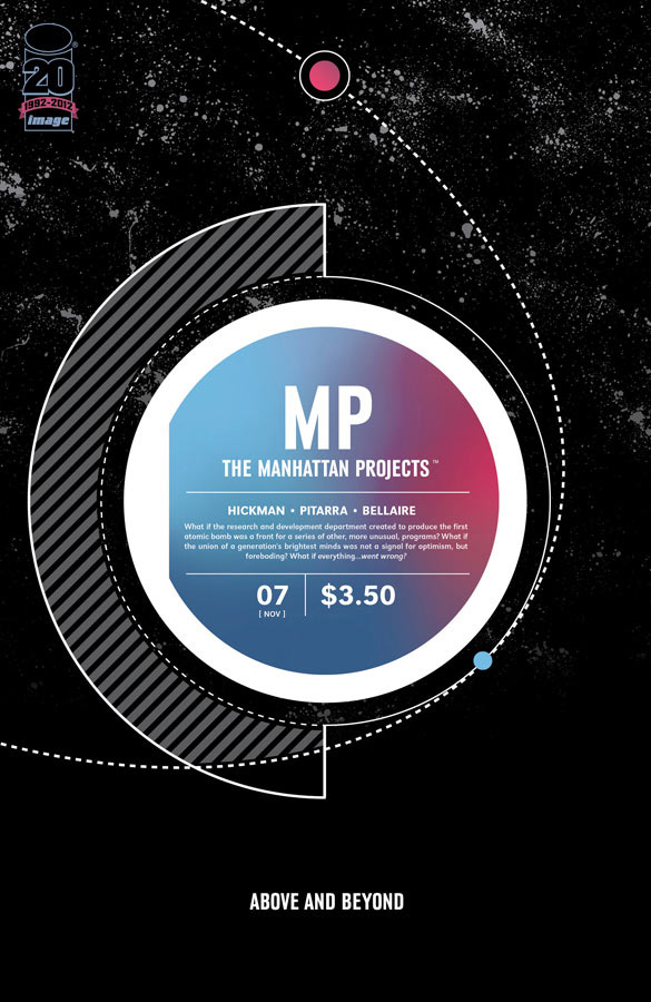
The Manhattan Projects #7
By Jonathan Hickman
Pure elegance and a healthy dose of mystery make each new Manhattan Projects cover an irresistible candidate for Best of the Week. This month is no different.

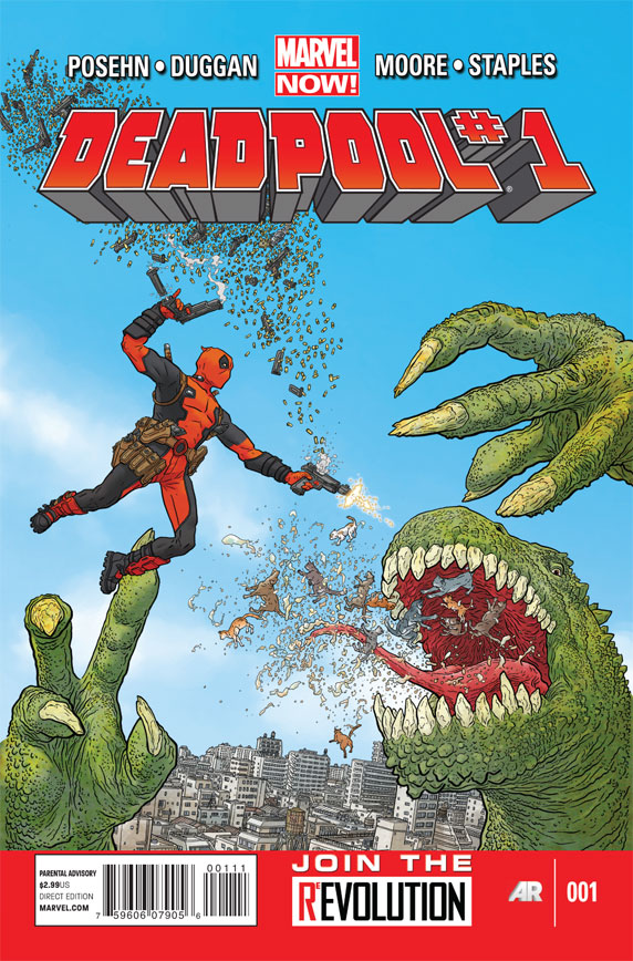
Deadpool #1
By Geof Darrow
Yes, Josh’s newfound zeal for Deadpool has pervaded the site entirely. Though this isn’t the first time the Merc with a Mouth has landed a place in this feature, it might just be the second. But the again, how could we ignore a new Geof Darrow cover, especially when it features one of his signature giant reptiles and that exquisite level of detail and texture?

Buffy the Vampire Slayer: Willow – Wonderland #1
By David Mack
A lovely and dreamlike portrait of Willow Rosenberg as only David Mack can envision or realize. I’m quite taken with the oldschool Vertigo vibe, an aesthetic that seems so appropriate for this world and its themes. It’s also an inventive interpretation of the story’s Wonderland motif; Willow through the Looking Glass, the Looking Glass through Willow.

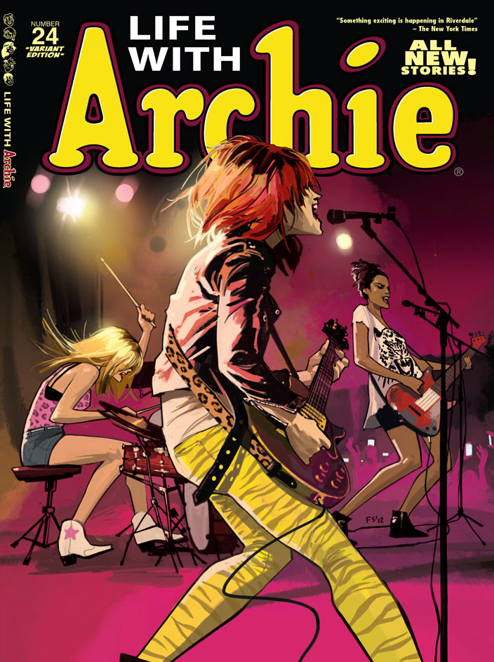
Life with Archie #24
By Fiona Staples
What’s new, Pussycats? Whooooa-whoaaa-whoaaaa-whoa-whoa! Archie covers are typically fun to look at, and in recent years they’ve bunny-hopped well out of their former comfort zone. Last year, a KISS themed Archie cover even topped our Best of the Year list. But how often does an Archie cover feel quite this dynamic? Fiona Staples brings motion and verve to Riverdale with this fantastic snapshot of Josie & the Pussycats.


I love the postures on the Josie and The Pussycats cover. I just noticed that the drummer is kind of playing left-handed (left foot on the bass drum). Does anyone know if this is something Fiona Stapes did just for the cover, or is it that way on the interiors too?
Actually, the more I look at it, the more I realize her kit is set up very strangely. Still, very cool cover. I love the way the backlight is colored on Josie’s hair and jacket.
If there’s one thing I’ve learned in this life, it’s that Melody is not every drummer.
Maybe Fiona is a guitarist? That Les Paul is pretty good, especially with this perspective. I think we all know how guitarists view drummers.
Yea that drumset made me look twice too – but I’m guessing only drummers would ever notice, and who cares cuz we’re just drummers. That guitar is slick.
@zlbenson: Haha, yeah, as highly evolved creatures, us drummers can look beyond such nitpicky things. 😉 That said, as a drummer and a video editor, I do get annoyed whenever I see a drummer in a TV show or movie that IS clearly not playing the music we’re hearing.
First of all – didn’t this cover make the “best of” a while ago? I’ve definitely not only seen this cover but I’ve also made comments on it. And now that I’m reading Scalped, I see that Alana is a bassist.
@ato220 – If she was, she’d know what to do with the instrument cable.
I meant “Saga” not “Scalped.” Interesting Freudian slip…
@Grandturk: Nope. It did get a spotlight article when it was solicited, though:
https://ifanboy.com/articles/fiona-staples-does-josie-the-pussycats-very-right/
That Willow cover by Mack is fantastic!
I *love* the Willow cover! I’ve switched to trades for the Buffyverse, but I almost picked Willow up just for the cover.
Good lord, that Archie cover is phenomenal. So much dynamism conveyed by Fiona through her thin line and heavy shading (or credit the colorist there, I don’t know) I actually feel like this is a moment captured from an actual concert. One of the best covers of the year in my book from a pure composition standpoint for sure and someone call Dave McKean because David Mack is re-doing his Sandman covers in exquisite fashion.
The LIFE WITH ARCHIE cover is reminiscent of LOVE & ROCKETS artwork where the perspective is from the left side of the stage as the band is playing like Fiona Staples’. I’m not sure if that piece is the cover to an issue or splash page within because its a little before my time, but I remember the artwork itself. The Staples cover reminds me of it in the best.
Sorry, I dont see the appeal of circles and text. Wow, its two circles orbiting an eye. Probabaly took 15mins to cut and paste together. Having never read the comic, this cover explains nothing and doesnt compel me to read it. Here’s hoping the interior is more interesting then the cover.
http://en.wikipedia.org/wiki/Composition_(visual_arts)
I don’t care if it took two minutes or two months. It’s an elegant design. Each issue’s cover does relate to its content, it’s just subtle in most cases.
It’s a great series. Well worth your time.
I would say its a simplistic design that lacks power, emotion, or interesting composition. And the cover is so subtle that you have to read the tiny text on the cover that explains to you what the book is about. The only thing that stands out is the $3.50. Which I suppose gives you some information. Just nothing that would motivate me to buy the book.
Then don’t, I guess.
I’m not being a douche. Its just, did the same people who designed the new USA Today logo design this cover series? At first I was like, “Oh wow, the audacity!” and now I’m like, “Oh, another circle.” It annoys me in the same way that covers annoy me when they show a bunch of heroes “dead” on the ground and some villian triumphant. It gets to a point where the original aspects of it that made it interesting in the first place become cliche and boring.
@RedBaron504: Unless Jonathan Hickman designed the new USA Today logo, then no.
I guess I’m just not bored with the motif. I like the clean design and the subtle additions and changes made each month. Would I want every series to follow suit? Of course not. But I think it works here. And again, I like the mystery. It fits with the tone and themes of the series.
I have to say that I agree with ‘Red Baron’ here.
The ‘Manhattan Projects’ cover just bores me. It looks like an album cover for some overrated Prog Rock revival band or something equally pointless.
Also, Max Power – whilst I appreciate the point you were making, If it takes a Wiki link to explain why its a good cover…then it isn’t really a good cover. A cover is supposed to grab your attention and hold it long enough for you to pick up the book. personally, I’d like to see a show of hands (or whatever) from everyone who, having never read the series before, picked it up based on the cover. Anyone?
I’m not trashing it entirely, or saying that its devoid of content, just that its really, well, boring for a comic book cover.
David Mack does some really beautiful work. Wish he’d do a series with interiors again like he did with Vision Quest in Daredevil. That was amazing.
And I love the Archie cover as much as I did when we discussed it before when it was solicited. I may pick that up just for the cover.
Old school Vertigo is a perfect description of the Willow cover.
Agreed, was thinking the same very thing as i scrolled down only to see Paul had stated it better already, just gorgeous
the Archie cover is amazing!
Man, is it nice to see Geof Darrow again, nobody does large scale action like that guy. You could look at one of those for hours.
Too true!
why is there so few covers ever listed in this weekly feature? why not a top 10 or something?
surely there is more than just 3 or 4 interesting covers in one week. Moloch #1 was a very good cover, for example.
I love Josie and the Pussycats.
See Love and Rockets #24