Great covers are like Patrick Duffy agreeing to routinely mow your lawn out of the goodness of his heart.
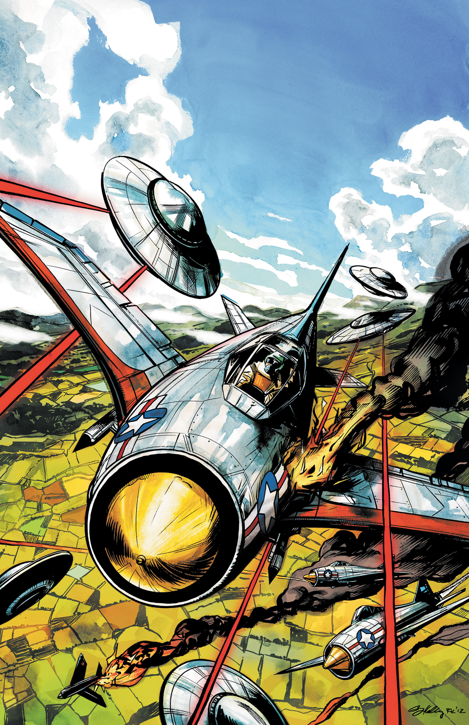
Saucer County #7
By Ryan Kelly
Beyond the tight, thrilling composition of sheer peril, I’m also taken with the heightened contrast and saturation on display. There’s something subliminal in that coloring choice, something that might subtly unnerve viewers because it’s just slightly off kilter. It ratchets up the anxiety in an already tense visual.
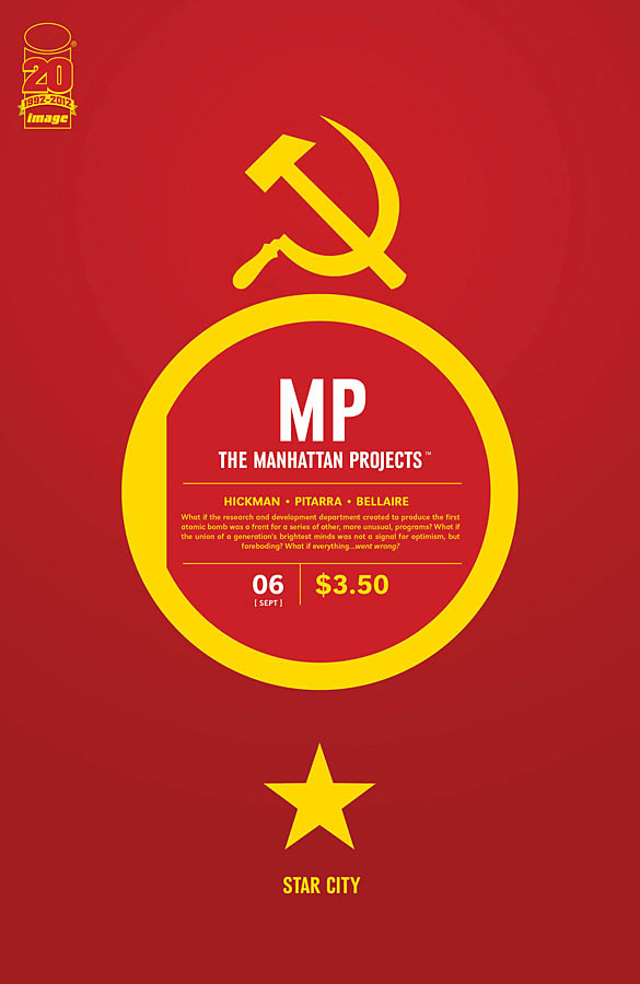
The Manhattan Projects #6
By Jonathan Hickman
There’s an extreme elegance to each cover in this series. What I loved about this particular cover from the moment I saw it in Previews is how instantly it sets a tone and informs the narrative. There are no characters here, no situations. But as with any flag, it bodes something specific.

The Massive #4
By John Paul Leon
It struck me that the text down in the bottom right is highly reminiscent of a Tintin title card. Is Callum Israel the extreme forward progression of that character? That’s something to chew on.
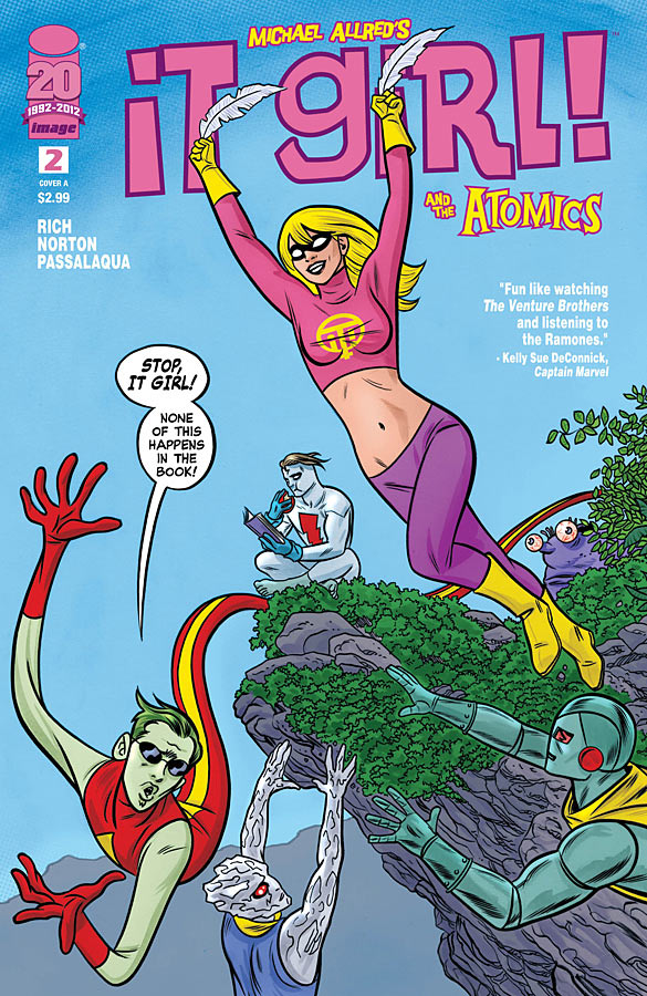
It Girl! & The Atomics #2
By Mike Allred & Laura Allred
It Girl!? I just meta!
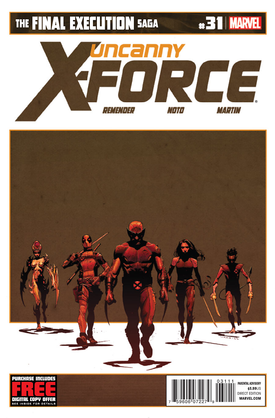
Uncanny X-Force #31
By Jerome Opena
I love that it’s brown. I can’t really explain why. That’s not a pretty color, especially highlighted in orange as it is. Maybe it harkens back to The Wild Bunch in some strange way. There’s a feeling of sunset here, and that’s appropriate for a few reasons.

the shadows on that X-Force cover… so good
Yes! Hell yes! Hard to pull of something like that, but he does it so effortlesly!
That’s an intriguing point about The Massive and Tin Tin cover fonts, Paul.
I’m not a Tin Tin devotee, but I know the basics. Are you seeing any other connections in beyond the globe-trotting natures of both books? Callum Israel isn’t a journalist like Tin Tin, but if the backmatter is any indication, he seems to keep a pretty detailed log of his activities. Interesting.
It’s “Tintin” not “Tin Tin”… Sorry for bitching, I’m a Quebeccer and it ticks me to read “Tin Tin” (like a Tin can or something :P)
Ken – I wouldn’t have considered it prior to noticing the typography, but the visual just took me back to those fantastic Tintin albums I embraced all those years ago. But when I got to thinking about it, there are some parallels. The globe trotting of course, but also the intrepid desire to do good, to champion the truth. I may be reaching, but I think it puts the book into a cool kind of perspective.
KillTheG1mp – I don’t want to pile on, but ever since the new movie came out I’ve noticed a lot of people typing it as “Tin Tin” and wondered if that was due to a translation I’d never read. “Are they correcting me for using the English/American variation over the European version?” As far as I can tell though, it’s always been Tintin.
Perhaps the Tintin / Tin Tin name confusion comes from Rin Tin Tin, the famous dog and subject of Susan Orlean’s latest book? I know that before I read the Tintin books in college, I didn’t know the comic character from the dog.
@Paul: Yeah, I really don’t think it’s intentional on Brian Wood’s part, but I think it’s a cool insight nonetheless. Certainly a topic for some graduate student to look into a few years from now.
@KillTheG1mp: Noted. I think the repetitive rhythm of the name made my brain (and others, according to Paul) want to make it two words.
Well it’s always been “Tintin” for me. The pronounciation “Tin Tin” (like a Tin can…) in english is just normal, since the sound “[ ɛ̃ ]” doesn’t exist…
Tintin sounds like “Matin” (morning) or “Putain” (prostitute). So yeah, it’s not your fault guys for not being able to say the name correctly, it would probably be like talking with crumbs of soda biscuits in your mouth! 😉
I suggest checking out the trailer of The Adventures of Tintin in french though, you’ll hear the name and know what I mean. Doesn’t sound at all like “Tin Tin”! 😉
It’s T-ah T-ah, like when the dentist says open wide and say “aaah” = Tah tah. Right?
Hahaha good guess but no… 😉
The sound doesn’t exist in english. It’s easy to make when you know how, but trying to explain it just by writing it is pretty damn hard… It’s a nasal vowel coming from the back of mouth/throat… I use it daily when I speak french but yeah, best guest would be to listen to some french people say matin, putain, chien, Tintin… 😉
Sorry, can’t help more than that hehe.
That Saucer County cover is thrilling. It’s got me all excited for the Independence Day sequels.
They all kick ass!
I might be the only one who really doesn’t like Mike Allred’s art.
Ha-ha! I’m happy to confirm, “you are not alone”.
Their execution comes across as a below-par pastiche of Curt Swan’s LSH of the 1960’s.
Mild apologies to any folk who regard my comment as utter sacrilege.
Great picks Paul. When I first saw the Massive cover, I couldn’t help but see Robert Redford standing there. The Saucer Country and Manhattan Projects covers have all been absolutely fantastic. Hickman uses a minimalist design aesthetic to such a wonderful effect, I think next month’s is my favorite so far.
Also great about that X-Force cover is that it’s an actual panel in the book.
how the hell was justice league 12 not on there ?
JL #12 came out two weeks ago. This was the best of THIS week in covers.