This is the best of the week in covers…that we know of.

Invincible #81
Cover by Ryan Ottley
"That cloud looks like an elephant!"
"That cloud looks like a dachshund on a surf board!"
"That cloud looks like Invincible and PowerPlex about to pluck the kidneys out of each other and play hacky sack!"
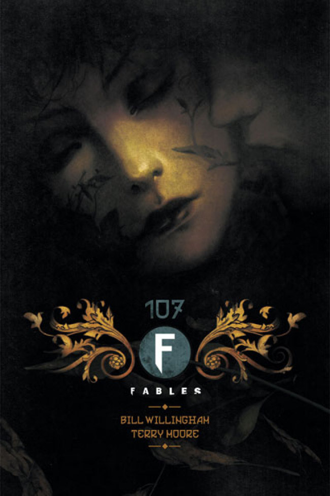
Fables #107
Cover by Joao Ruas
It's a kissing book. I love the softness of the image. The shadow play. There's a satisfying crispness to the dying leaves of the title seal. It's too regal to label it a simple logo.
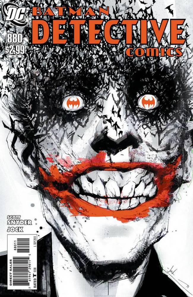
Detective Comics #880
Cover by Jock
For decades, artists have found iconography in the Joker's teeth. More recently artists like Lee Bermejo and now Jock have turned to the character's gums and lips. Everyone knows gums are creepy as all sin. This is also a striking example of the unending Ouroboros connection between Joker and the Batman. One does not exist without the other. Here, one even scatters to the four winds because of the other's absence.


I love that Detective cover.
I have a feeling that will not be the last time we see the Detective cover. It’s going to have to be the cover of one collection or another. Instant classic.
The Fables covers are always remarkable examples of book cover design. The art direction is always different, but you always can identify it.
The Detective cover is quite nice and creepy.
That detective cover blew me away when I saw it in previews a few months back. So great. And that Fables cover? Yes please!
I love how willing Fables is to play with the trade dress with each issue while still maintaining the same identity. Very cool.
Luuuurve that Invincible cover.
That Detective Cover is by far the best handling of the Joker in a single image that I have seen EVER!
Jock’s Detective cover…WOW!
I bought all three of these books and love all three of these covers. Excellent covers and very good issues.
Det Com / Jock with Invincible as a close second.
That Detective Comics is just a weak imitation compared to the Lee Bermejo Joker from the Brian Azzarello OGN from years ago, seen it already and it is still better now. Only one half decent is Fables cover, once you remove the typography, quite beautiful and sinister as you can’t see the eyes. Kinda Lewis Carroll meets american psycho with a sinister dollhouse thrown in
@Lovedrop Two completely different styles.
Saw the Jock cover last night… it haunted me…
Cover of the year by Jock
Two nightmares are coming with Detective Comics #880.
First the cover, and then the horrible shower page.
Show me a Jock cover for Batman that Does not have a flurry of flying bats.
I love his style but it’s getting a bit like John Woo and white doves flying out.
@ericmci So the 7 covers Jock has done for Detective have a visual theme, and this is a problem?
Josh- Use once or twice-very effective. Used that often- less effective.
That’s my belief.
@ericmci -Anyone can get lucky with one stellar image…takes real talent to spread that concept out over a series and really make it seem like one coherent body of work.
Jock’s cover is sick! I love it!
Each of Jock’s Detective covers are spectacular. He will be missed after the re-boot.
Also Scottie Young Deadpool Wolverine cover I think is great.
@ericmci This is not how art or the world works.
@PaulMontgomery Respectfully, I’d have to point our that ericmci did say that that was his personal belief, not an absolute rule, which is exactly how art “works.”
I think all of Jock’s Detective covers have been wonderful, btw.