Covers! It’s just another way of saying blankets. Or the front of books. Folks, I’m exhausted.

The Walking Dead #100 (Cover H)
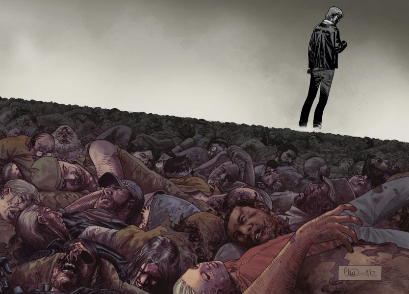
By Charlie Adlard
Ah, the ol’ canted sea of dead friends and acquaintances. It’s that diagonal horizon that makes this whole thing sing. A dirge, I suppose.

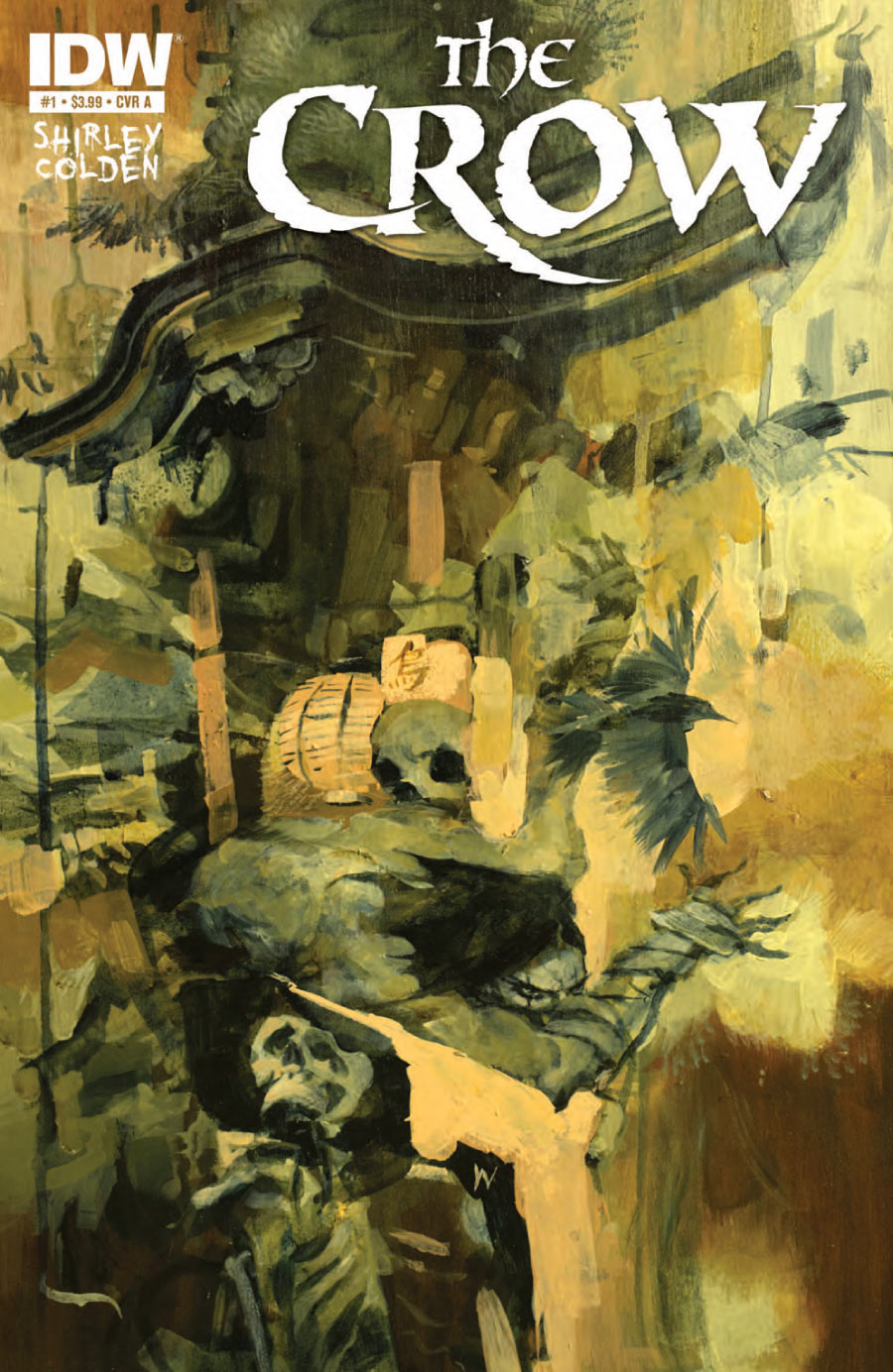
The Crow #1
By Ashley Wood, Kyle Hotz
I’m not entirely sure what we’re looking at here. There’s some bones and some skulking about. Some kind of parapet situation. There’s that titular bird. Stop snickering. I should’ve said eponymous. What I love is the limbo blur. Like a life flashing before your eyes, the images not quite righting themselves or solidifying in the haze of dying.

The Walking Dead #100 (Cover C)
By Frank Quitely
This is maybe the strongest representation of old lady textures ever rendered in comics. That fabric that only old ladies can get away with. That hair that isn’t quite hair. You just know she gives out pennies on Halloween.

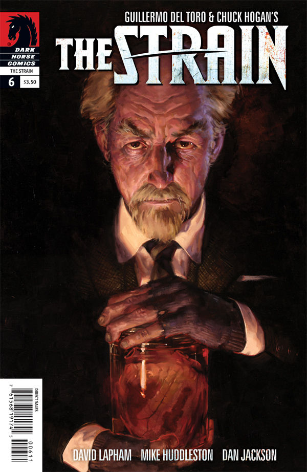
The Strain #6
By Mike Huddleston & E.M. Gist
Oh. You…you shouldn’t have. It’s that straight line composition, running right down the center, that really does it.

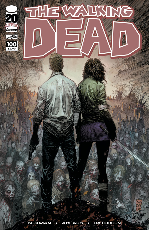
The Walking Dead #100 (Cover B)
By Marc Silvestri
There was a lot of debate at my comic shop this week as to the best of the 37 variant covers. Everyone had a different opinion. This one is mine. It’s just a classic composition choice. It’s the one that reads #100 to me. The boldest and the most iconic. If I could change anything, I’d position some of those zombies around the bottom, between the viewers and that lonely knoll. Having our heroes surrounded would make for an even stronger visual representation of their hopeless position in the story.


exceptionally well played with the Cranberries.
That CROW cover is incredibly abstract..very cool.
love the Quitely Walking Dead cover….buy sad that the McFarlane cover didn’t make it on here….
Just because it’s McFarlane? It’s a fun pinup.
because I like the McFarlane cover the best…wouldn’t matter who drew it…
Not sure I agree with your proposed change on that last Walking Dead cover. To me, it’s like they are the only thing standing between you and that horde. It’s like you’re there.
That’s a good interpretation too. Hadn’t thought off that.
My favorite variant is the Todd McFarlane cover
I liked that one too but that Quietly grandma zombie is creeepy.
My favorite thing about the Quitely is that she’s not even deformed or decaying. She’s just an old lady who wants to eat your face.
i know, in my head she’s not even a zombie, just an old lady upset about those kids who keep cutting across her front lawn
Love the picks. But you are missing the Todd McFarlane cover. My favorite of all The Walking Dead #100 covers.
Okay, guys. Sell me on this Walking Dead Todd McFarlane variant. Because all I’m seeing is a fairly standard pinup. What do you like about it?
I’m just a sucker for a good old Todd McFarlane cover / art. Miss the days when I would walk in my comic shop and pick up a beautiful Spider-Man comic all drawn by the man. Just missing him in action. The man can draw the hell out of a comic. Love the detail in the art that only McFarlane can do. Zombified Rick is badass as well.
I like ’em all, but I think zombie Rick standing on Lori’s grave about to blow his brains out is at least as visually interesting as an old lady with excellently rendered old lady fabric and skin.
So, as long as it’s Todd McFarlane, it’s enough? Alright.
I dunno. The concept is pretty on-the-nose. Quitely’s simple portrait is at least an impressive drawing. In my opinion the McFarlane piece is the least interesting of the many variants.
I don’t think the McFarlane cover is bad by any means, but I do think it is lacking some of the gravitas the other covers have. It’s a scene from a horror movie, while some of the others covey the actual atmosphere and tone of the entire series. I generally find his detailing to be the part I dislike most about his art, but I am in no way discrediting anyone who enjoys it. He’s a very good artist, I can’t deny that.
I see it the same way. Old creepy lady is nice and all. But zombie Rick standing on Lori’s grave caught my eye right away. To each their own…
Every month this book comes out , we the readers, are wondering …. who is going to die next ? All the variants are all pretty standard if you ask me. Rick with is back turned with a pile of bodies behind him or just your standard battle shot of one or two of the survivors fight in what seems to be every zombie the world has to offer. Pretty standard. Yet the one cover that stands out is the Mcfarlane cover. A spooky look into what might be. Does Rick get bit ? Does rick even survive ? Has all the mounting stress finally caught up with him and he decides to end his own life after a tragic event ? Thats what makes his variant INTERESTING. The Quietly Cover is awsome but its a zombie cover. The texture and coloring is perfect, like the majority of his work, but it is still just a zombie cover.
If you take issue #1 and butt it up next to Mcfarlanes cover you have your self books ends to Ricks journey thus far.
Paul wrote that Mcfarlanes cover is a “pin-up”… wow……maybe issue 100 rendered Paul totally schocked and un able to think ! HAHAHAHAHAHAHA
But…it’s ugly.
hahahah right!. What a hater! HAHAHAHA
Weird, for me it was the Ryan Ottley cover that really caught my eye. Not getting the love for the McFarlane one, it’s pretty boring. I suppose it is pretty special as it was finished in time for the release!
Ottley variant for me, too. It’s the one that I’m going to want to look at more than once. Many of the other variant covers have an immediate impact, but my eye tires of looking at them for long. The Ottley is dynamic in contrast to most of the other variants’ static posed shots. The Quitely is striking, but my eye does not want to linger there. Whichever your favorite, it’s cool that they printed a lot of different high quality cover images so that we could choose.
Louis CK is harvesting organs now?
well played, sir.
Covers are just blankets for your comics. Also that Silvestri cover is the least Silversti-esque art I’ve seen him done. That is a good thing.
Oddly, I wish Rick wasn’t on the Adlard cover. It looks almost like an after thought, like a picture of him taken from a previous panel or cover and stuck on. I would love to just see the piles and piles of dead, just them, to let the weight of it sit with you. Nevertheless, it’s my favorite of the covers. To me, it’s this gut punch, how much loss you’ve gone through as you’ve read this series, how much has happened, how horrible all this is. You can look through the faces and remember each personal horror story and how you felt as you first read it. It’s reflective, and perfect. And since Charlie’s been doing the interiors since, what, issue 7? He’s the perfect man to do a lovely anniversary, wrap around cover. Out of all the covers I think his is the only one that actually carries any weight past the original look and design, and that’s because of his integral tie to the series for all these years.
The other variants are fun way to celebrate, but none touch his in my opinion.
Seeing Dale in that Adlard cover is heart-wrenching.
Agreed. But even more so was seeing the little baby hand. Poor little child. 🙁
I really liked Venom’s cover art from this week, I don’t even read Venom but almost bought that issue like I did a cpl issues ago of the one where it had all the bullets with Venom faces on em, just for the cover….but I do like the interior art on that series as well and will probably get the trade since I missed most of the run so far.
I like Silvestri’s cover the best of those TWD 100th issue.