The comic book cover. The last, best chance that a book has to catch a potential reader’s eye. So why is it that so many are just so bland and cookie-cutter? The world may never know. On the other hand, without all the boring and uninspired covers, we would probably appreciate the good ones less.
Which covers really impressed this week?
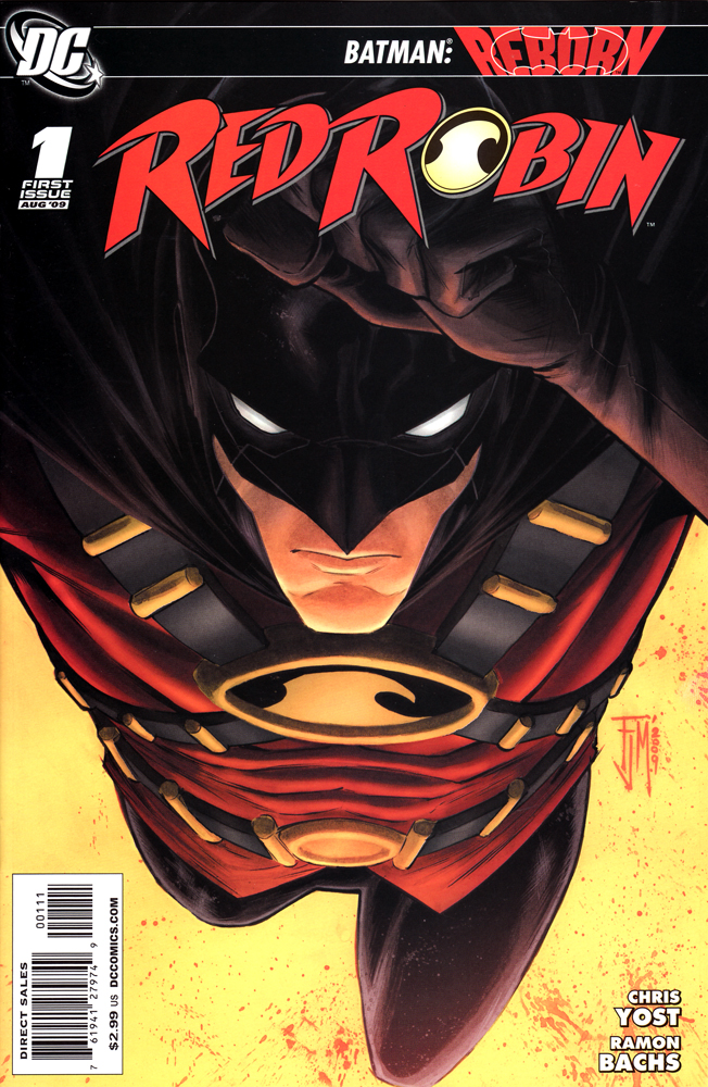
Cover by Francis Manapul
This is one of those covers that leaps off the shelves at you. In a sea of comic book covers that feature long-to-medium shots, this extreme close-up of Red Robin coming right at you commands attention. Francis Manapul, where have you been all my life?
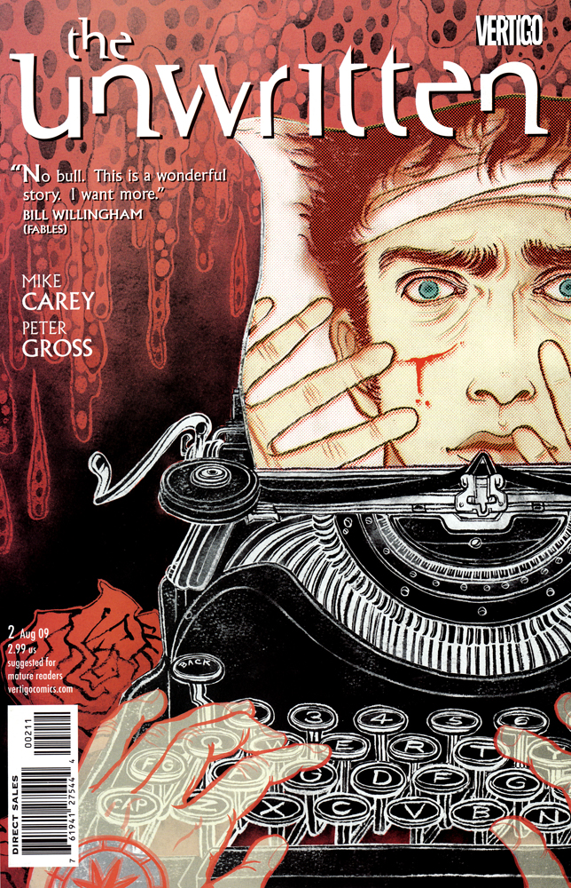
Unwritten #2
Cover by Yuko Shimizu
This is a cover that does a great job of telling the story of the comic book in one single image. Is Tommy Taylor real or is he a fiction character brought to life? That was the question raised in the first issue of this series, in the second issue we are closer to the truth and this wonderful cover might hold some answers.
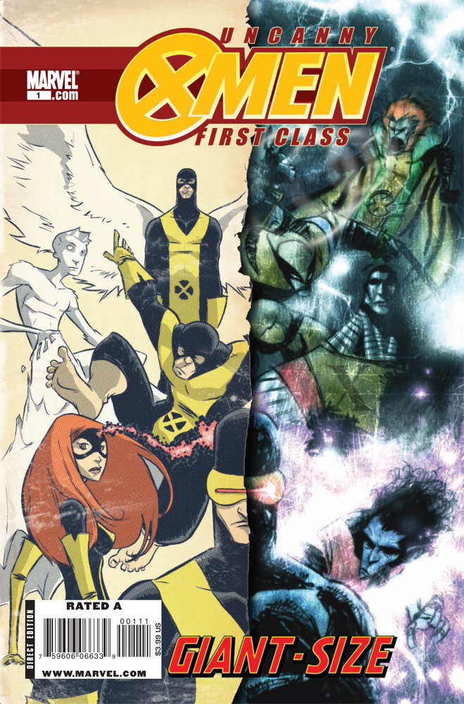
Uncanny X-Men: First Class Special #1
Cover by Skottie Young
Skottie Young has got to be one of the most unique artistic voices in comic books today. His images look like no one elses. This issues was all aout Scott Summers coming to grips with the fact that the original X-Men were no more and he had a new team of mutants to deal with. Why does Scott look so glum? It’s probably because his book used to be awesome.
That’s all for this week, let’s see what comic covers have in store for us next week!


Yeah, I would have bought that X-Men First Class if Young did the interior too. Great cover.
Good week for DC Covers. Batman, Action and the Green Lantern Corps I also have been enjoying what Ethan Van Sciver’s been doing with the Rebirth covers. Each one is so detailed and intricate. Time to step it up Marvel.
The art inside unwritten get really good when something magic related happens. The stair scene was very pretty. These covers are great
I’m finding that I like yellow backgrounds. Batman & Robin #1 and Red Robin #1 both looked excellent and both featured striking images on a yellow background. Maybe DC needs to adopt that for the Batbooks until Bruce gets back.
@stuclach: I agree. Those yellow backgrounds really helped the books stand out to me.
The composition of the Red Robin cover is terrific.
I don’t pull Bat books but that Red Robin cover is pretty sweet.
I can’t wait for Manapul’s run on Adventure
The X-Men cover rocks.
I think the Unwritten cover is the best.
I love these columns. Any chance of implementing a COW (Cover of the week) system for users?
Batman and Red robin were awesome. Amazing spiderman was also quite good.
You picked a pretty weak Deadpool cover last week, but not pick a great Deadpool cover this week?
I dont understand the world anymore -_-;
TNC: this is your chance to start a website!
@jimski: I dont know how too….
Besides, I’d rather be a follower then a leader.
I love that Skottie Young cover to pieces.
And, dude, the book is still awesome! The Wolverine story in this issue ("the man from s.n.i.k.t") was one of the funniest things I’ve read in ages.
Red Robin’s cover is actually a long shot, not an extreme close up. Long shot is the whole body, medium shot is waist-chest up, close up would be just the head, and extreme close up just the eye, or a hand, etc. Like Captain America #25 is an extreme close up of Cap’s hand in glove.
Very nice Robin cover.
You’re not a golfer are you?
@KickAss: It’s a close-up. If he were to straighten out his body, it would just be his head and upper chest.
The Unwritten cover was so good, I bought it. I forgot it was out altogether, and covers rarely register with me, but this one was a magic eye-magnet.
I really liked the Unwritten Cover, but I am truly surprised that Deadpool #11 isnt up there. I love that cover, its just so funny.
Even though I still love Around Comics there are times when I miss Skottie on it.
That Red Robin cover pretty much says everything. Everything being I’m a bad ass don’t f@&k with me.
the best cover this week i saw was the one that no one had: the red robin jg jones cover. it looked gorgeous
Well Deadpool wasnt part of the covers this week. But seeing what the cover will be for the 1st year anniversary issue (or #12), there’s no doubt it will be one of the best 🙂
@conor: If it was just his head and upper torso then yes it would be a close up. But because it’s a shot of him, I’m gonna say swinging, and we see his whole body….it’s a long shot.
@TNC: Nope, it’s not a long shot. The classification of the type of shot has to do with how close the subject is to the camera, not how much of the figure is in the frame.
@conor: Then my high school teacher gots some explainin’ to do!
@TNC: I’m sure he does.
love the xmen cover
I love how great the batbook covers have been lately.
i love the unwritten cover!! so good and awesome. the red robin one was very awesome too!!
@Shot discussion people…The original argument was that it was not an extreme close up, which is true it is not. It is also not a long shot or a medium shot but most likely a medium close up. There is no exact definitions for these divisions, but it is not an extreme close up or even a traditional close up.
The last XMFC mini was so awful. I bought this GSUXMFC solely for the cover.
Mark Waid just did an article "What The Perfect Cover Looks Like" on The Spirit #29 at http://markwaid.boom-studios.net/ He goes into details on coloring and composition. Also says he’s going to use it as an example of how to do it right for a long time to come. Really interesting.
The Deadpool cover was awesome this week. It was the best one that I saw. Definitely should have been in the top 3. I just don’t see the "beauty" of the Red Robin cover. It seems pretty boring to me. The other two covers look pretty interesting.
That Red Robin cover should have had him saying "Buy me or I’ll sock you in the face!"
The Red Robin cover is just plain gorgeous; it’s pretty much the reason I picked up the book this week. I can’t wait to get some more Francis Manapul in Adventure Comics!
…
Not convinced by the choices. In a week that gave us two cool Deadpool covers, the Soul Kiss cov, The Spirit, X factor 44, Beta Ray Bill, Unthinkable, DMZ, Punisher, Anna Mercury and a host of other top class covers I’d have chosen any of them over the three offered (sorry 🙂 )
Anyhow: my three would have been: Soul Kiss, Deadpool and poss Wolvie vs Hulk (for placement rather than artwork).
I noticed Soul Kiss too. It was a really cool design, but not particularly great "art". Not that there’s anything wrong with that.
I personally don’t find that SOUL KISS cover all that interesting.
I first noticed Manapul when he was doing comics like Tomb Raider and such and wondered when his talent would eventually move him to either DC or Marvel.
And while Skottie is very talented, his style is not entirely unique. It’s kinda rooted in his predecessor, Humberto Ramos and others, and his work is very similar to some of the AP Comics guys, which is no longer in existence.