Covers, covers, everywhere. But not a drop to drink.
Here's just a few of the week's best:
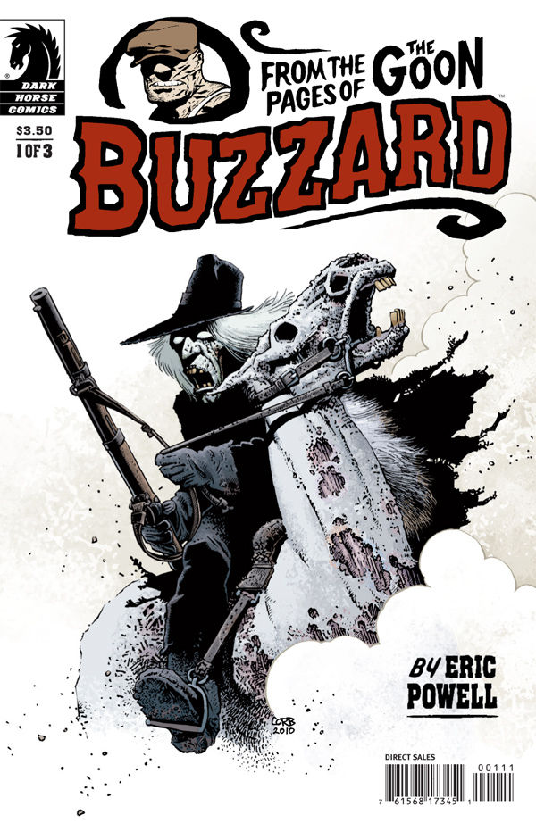
Buzzard #1
cover by Richard Corben
One last ride before the glue factory. I'm an absolute nut for all things Corben, but this particular image really struck me. With the contrast of white and black you really get to appreciate the man's line work. Note all that pigpen business down around Buzzard's foot in the stirrup. All that grit and cross-hatching and stipple. You can hear the fles buzzing. Just a great sense of texture and wear-and-tear. Couple that with that stellar weird western title logo, and you have yourself a downright spooky work of art.

Shield #2
cover by Gerald Parel
Again, one of my new favorite title logos is back with those celestial Steranko circles! Two jokes: Did any on you have that odd baby portrait as a kid where there were two versions of your own image in the same photograph; one normal baby down the bottom and then a larger image of your bald head looming ominously in the darkness above? That's what this is sort of like, and isn't that sort of weird. Also, does anyone else here Tom Hanks stage whisper, "da Vinci!" whenever you open this book? I love the peculiar composition of this piece. There's a great contrast of darkness and light, with much of the detail positioned right there in the middle, almost a diagonal line from north to south.
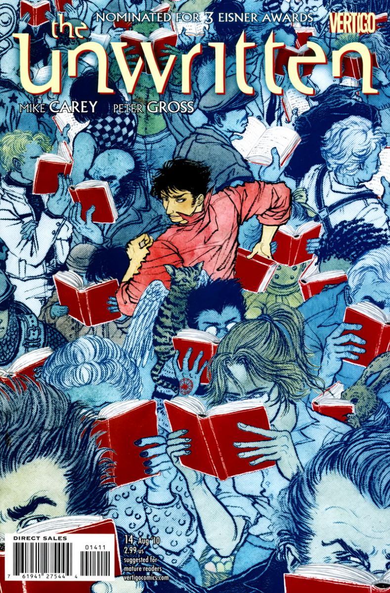
The Unwritten #14
cover by Yuko Shimizu
This bit of Where's Waldo whimsy comes courtesy of regular series cover artist Yuko Shimizu, who seems to have picked up the torch for fine art comics covers just as James Jean was leaving the industry. Shimizu's work is always top notch and never looks like anything else on the racks. Here, crafty color work connects a reluctant Tom (in pink) to the brand new Tommy Taylor book (in red). Book clubs have never been so sinister.
Aight, hombre. What I miss?


THE UNWRITTEN’s cover reminds me of the San Diego Comic-Con in 2005. HARRY POTTER AND THE HALF-BLOOD PRICE was released that same weekend and everyone was reading copies. You’d see ‘tweens in manga-inspired outfits reading quietly on a patch of floor near the bathrooms. A Batman was reading it while eating a slice of too-expensive con pizza. People wandered through the exhibition hall, clutching their copies. At one point, I even saw a pair of teenage sisters each holding half of a single copy and reading it at the same time. I felt like shaking everyone, yelling, "The book will still be here on Monday! You’re at the Comic-Con! LIVE IT UP!"
But, oh yeah, covers! These look great!
That Unwritten cover makes me even more irritated that my shop ran out of copies before I arrived.
@stuclach – Is it possible that you’ve confused a Cracker Barrel for a comic shop all this time? Because based on your stories…
Daredevil was my favorite this week. Really dug the pop art vibe.
The Buzzard cover reminds me of something out of Supernatural. I’m surprised the Darwyn Cooke Jonah Hex cover didn’t make the cut. I also liked the Captain America cover this week.
the typography on sheild is fantastic
Is that blond guy on the left of the Unwritten cover Lucifer? Apparently, there’s a secret addition from a previous Carey/Gross series hidden among the characters, so I assume that’s him…
@PaulMontgomery – That might explain the overabundance of useless trinkets and the inexcusable dearth of comic books…. I must investigate further.
I didn’t know Eddie Vedder was a member of S.H.I.E.L.D.
Great picks, especially love that Corben cover. But no love for Batman #700? Seriously the best looking cover I’ve seen all year. Even the Mignola one didn’t get any love. 🙁
The Rest: Jonah Hex #56 because…..well it’s Darwyn Cooke! What do you expect? Kevin Maguire did another great cover for Booster Gold #33, a funny twist on the previous cover.
The Worst: Invincible Iron Man #27 for having, without a shadow of a doubt, the worst looking Iron Man in history.
Best Trade Cover: Gotham City Central Vol.3 HC: On the Freak Beat
@TNC: iron man: yeah… ironman’s cover was pretty bad. Worst part is we KNOW they’re referencing the movie BLECH!!!
@TNC: Booster Gold: OH! I DIDN’T REALIZE THAT. WOW. XD!
@freebozo:
did somebody say PEARL JAM!
http://www.youtube.com/watch?v=ePjESN9pRdg
@TNC:
I love the new Iron Man redesign. But the way everybody other than Adi Granov drew it has been ugly.
It doesn’t even look like Eddie Vedder. He looks like Kris Kristofferson.
@Paul the upper image – the full body pic is totally Kris Kristofferson 🙂
The Buzzard has always been a very down-trodden and bleak character, but damn! this cover is the absolute embodiment of Agony. Just look at those faces.
Tons of great covers this week, and I don’t think you can go wrong with these 3