Phone the paramedics. I'm having an art attack. I leave everything to my two dogs. Scatter me out to sea. But leave a stone out in the fields etched with the words: "Here lies Paul Montgomery. The covers were just too good that week!"

New Avengers: Luke Cage #2
Cover by Eric Canete
There are few things in the natural world more beautiful than a bengal tiger. It's as if the cosmos said, "Well, we're going to need something almost erotically dangerous that the people will want to tattoo on themselves unto eternity. Something charming enough to huck those corn flakes we're working on." And there are few people so perfectly suited to illustrating their ferocity as Eric Canete. Only because he has such an understanding of anatomy and sinew and kinetic energy can he compose such savagely distorted scenes of action. It's probably impossible to draw an unexciting image of a man brawling with three tigers, but Canete takes it to another level.
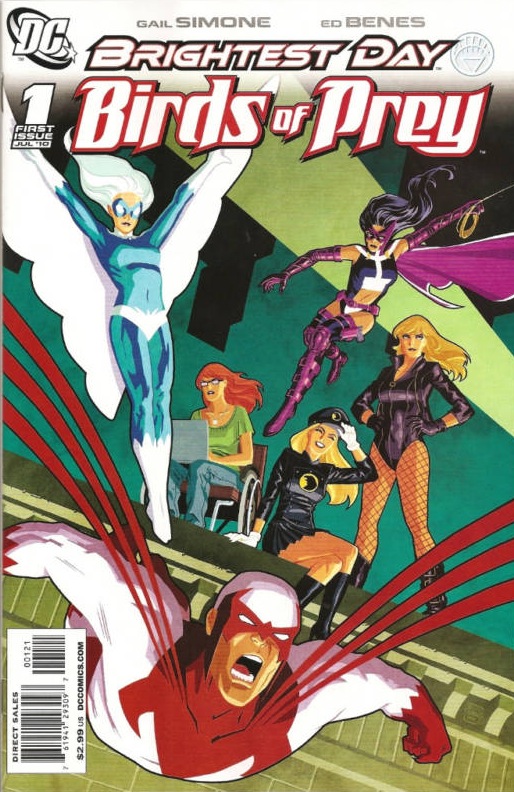
Birds of Prey #1 (Variant)
Cover by Cliff Chiang
Clifford, you big rad dog. So colorful without overwhelming. It's those lavish jewel tones. Dig the kanted angle of the rooftop, and the way that Hawk's pummage, the limelight and Dove's sillouette actually frame the group right there in the middle. A great mashup of color and line and form without feeling like last year's geometry notes. Lots of grace here too. Dove looks like an award statuette. Lady Blackhawk's smile almost feels like vintage Darwyn Cooke.

Amazing Spider-Man #631
Cover by Chris Bachalo
I'm twitching here. Reptiles make me writhe, just thinking about that texture and those unsettling bird-like movements. Bachalo's got a truly creepy interpretation of the Lizard here. He's rendered just about every irregular scale of him. It's visceral and offputting and so much scarier than most previous takes on the character. You can practically hear him scuttling around, nails against pavement, scales flaking, all in pusuit of Spidey. Then there's that lighting, burnt orange like an angry, humid summer evening. This one just screams atmosphere.

Daytripper #6
Cover by Gabriel Ba
Easily my favorite cover for the series since that debut issue. A gorgeous, haunting image with a sophisticated composition and a lot of restraint when compared to some of the previous five. The seascape and the distant church up top are almost impressionistic, ethereal. Down below, a very clean image of our man typing at his desk in the dark. Sort of lonely, sort of sad. But what really pulls it all together is that bold, paneled, almost monolithic window. It brings in so much warmth. It's a candle. Maybe a portal into the landscape he's imagining as he types. The panels are so complex though. You don't automatically think of that configuration when tasked with designing a window. There's structure to it, like a window in a cathedral. I'm getting a bit of a spiritual tone. Solace.
CORRECTION – Bigyanks informs me that the "church" is actually that big Brazilian Jesus statue. Which is cool, because we're always seeing photography of just how huge that monument is. Here it's this distant, sort of mystical presence.
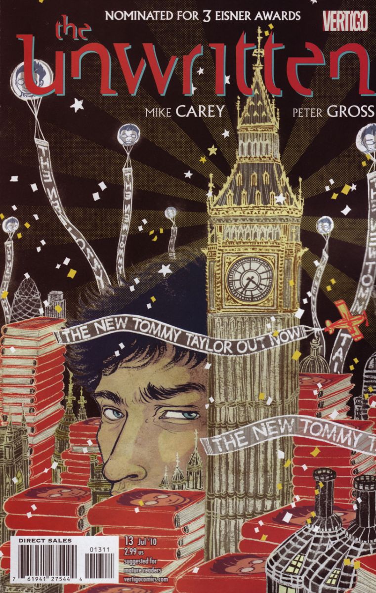
The Unwritten #13
cover by Yuko Shimizu
With the release of a new Tommy Taylor book, all of London is in jubilation. But there's something sinister just beneath the surface. Tommy's ominous head seems like that shady eel camped out in an otherwise pleasant fish tank. As always, the coloring is stellar, and the white outlines lend it this wonderfully shabby quality. Like costume jewellery. Those balloon banners are a neat element too. Like jellyfish. With all the ticker tape and glitter it's maybe more of a snow globe than an aquarium. The movement and the atmosphere is so murky, portentous.
Okay, you lot. What'd I miss?


Every cover of Unwritten could be cover of the week. They are consistently excellent.
I also enjoyed this week’s BPRD cover. I’ve sent the last 24 hours trying to visualize that thing walking around in California. It’s a bit to surreal for me to pin down. I love that.
I absolutely love that daytripper cover. I could happily see that on my wall as a piece of art. Also love the spidey cover, Chris Bachalo is my comic art god!
Jeez. The Unwritten’s covers are just outstanding.
Great picks this week fellas. I don’t read NA: Luke Cage but Canete’s covers do entice me. Which is what covers should do after all. And Cliff Chiang always gives me the warm and fuzzies. I don’t think I’ve ever seen anything of his that I didn’t like at least a little.
Love the coloring of the tiger cover. I always enjoy this iFanboy feature but this is the first time I clicked on a link and whispered, "Oh my God."
not to be a picky ass but @PaulMontgomery that is a bachalo cover. Townsend is either the inker or colorist. Bachalo’s art sig is even on the cover, the little red circle dealie.
Ah, I was confused by the Twonsend signature right beneath it. I’ll adjust it.
Thank you, thank you for reproducing that Daytripper piece without the logo because, somehow, it increases the gorgeous quotient tenfold. Love it.
Love, love, love anything that has Bachelo or Shimizu for cover artists. That’s the only thing that has been consistent with me and Unwritten, the amazing covers. Shimizu should do more then just Unwritten for covers.
My Pile: The only one in my pile that I really enjoyed was Punisher MAX #7. Dave Johnson does it again with an off-beat, but very imaginative design of a cover.
The Rest: Booster Gold #32 had a great cover by Kevin Maguire, makes me wish he was doing the interiors for the series. Mike Fyles, Iron Man Noir #2 cover is a good mix of craziness and a nice homage to pulpy novels.
The Worst: Bryan Hitch for not even trying in New Avengers Finale #1. What is up with the positions with some of those characters? Mockingbird, Ms. Marvel, Wolverine, and Luke Cage look really silly in those poses.
Best Trade Cover: Question vol 6.: Peacemaker
Turns out the person who designed Hello Kittywas also named Yuko Shimizu.
I was kind of confused (and excited) there for a moment…
That Luke Cage look has a Dustin Nguyen feel to it. Nothing wrong with that.
I like how the only guy in the BoP cover looks like he flying away from all the womens in fear.
It’s too bad the ferocity on the Luke Cage cover didn’t translate into the issue itself, but that is a beautiful piece of Canete art.
The Bengal Tigers on the Luke Cage cover remind me of James Jean
Very much agreed.