Don’t eat Best Covers.
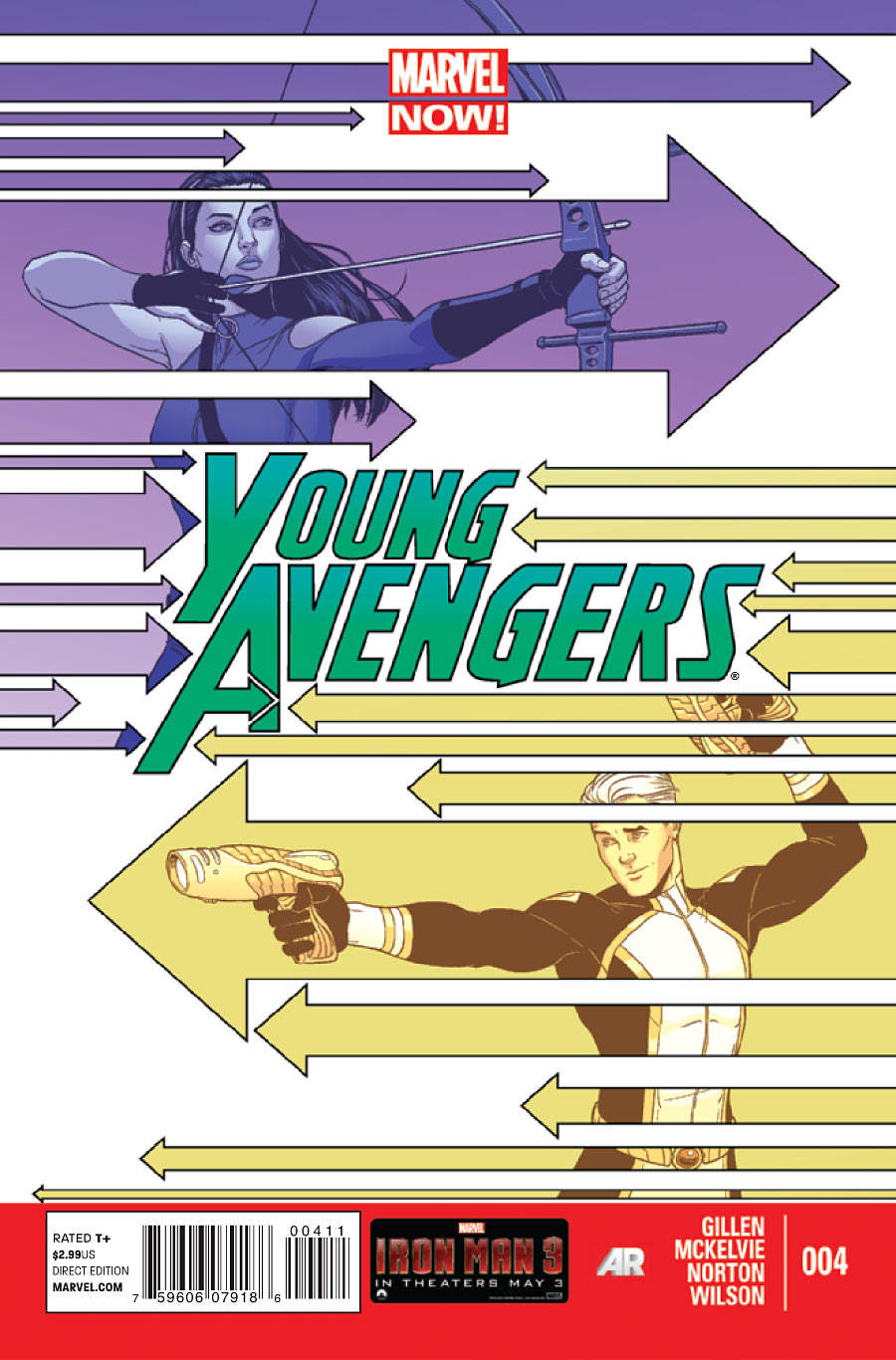
Young Avengers #4
Cover by Jamie McKelvie
Arrows! I think there’s also some kind of sex metaphor happening. It’s early though. I’ll just go get a cold shower before moving on to…
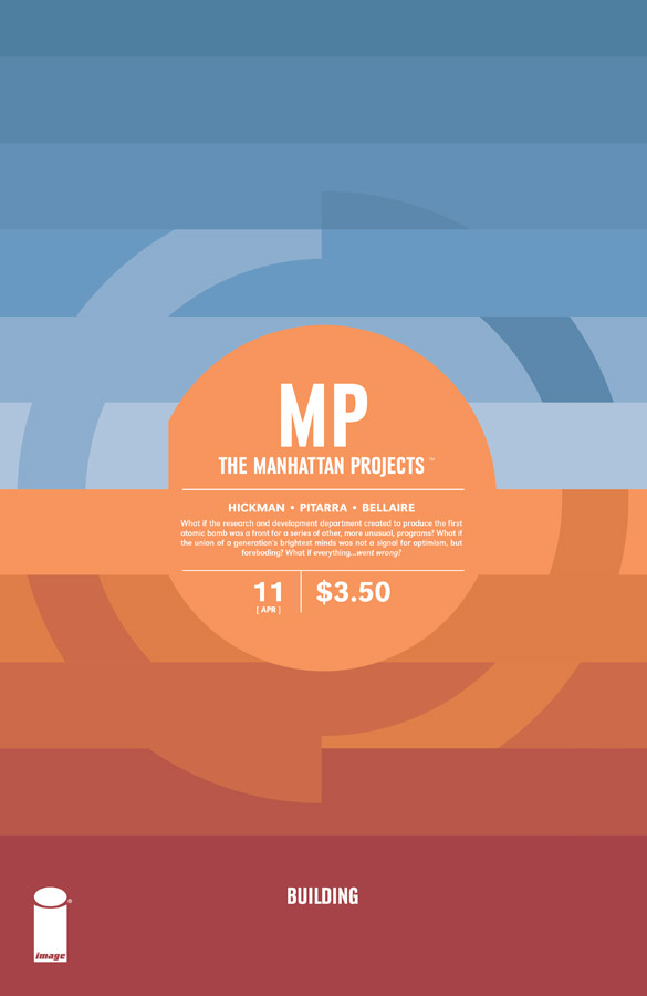
The Manhattan Projects #11
Cover by Jonathan Hickman
Unusually warm and earthy for the series. As with the Young Avengers cover, I’m drawn to the interlocking tessellations. It provides just the right amount of symmetry and asymmetry to keep things orderly and interesting.
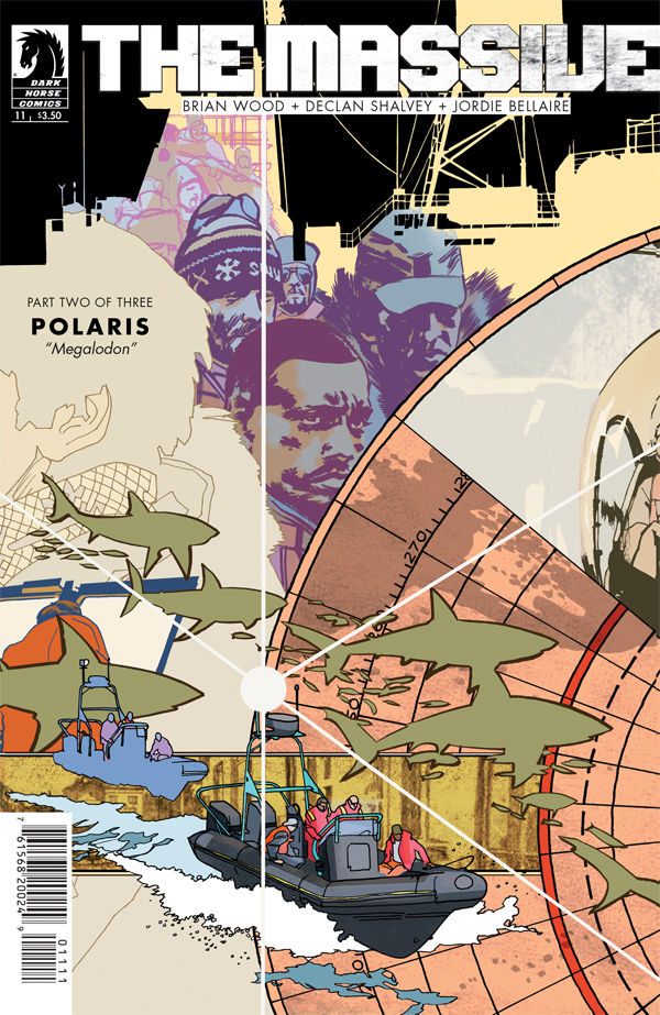
The Massive #11
Cover by John Paul Leon
There’s so much going on in this collage, it’s practically a Cosby sweater. Somehow though, the signal triumphs the noise. I really think that central node and the white lines spilling out like lines of demarcation help bring order to the chaos. I could also go for some Shark Bites right about now.
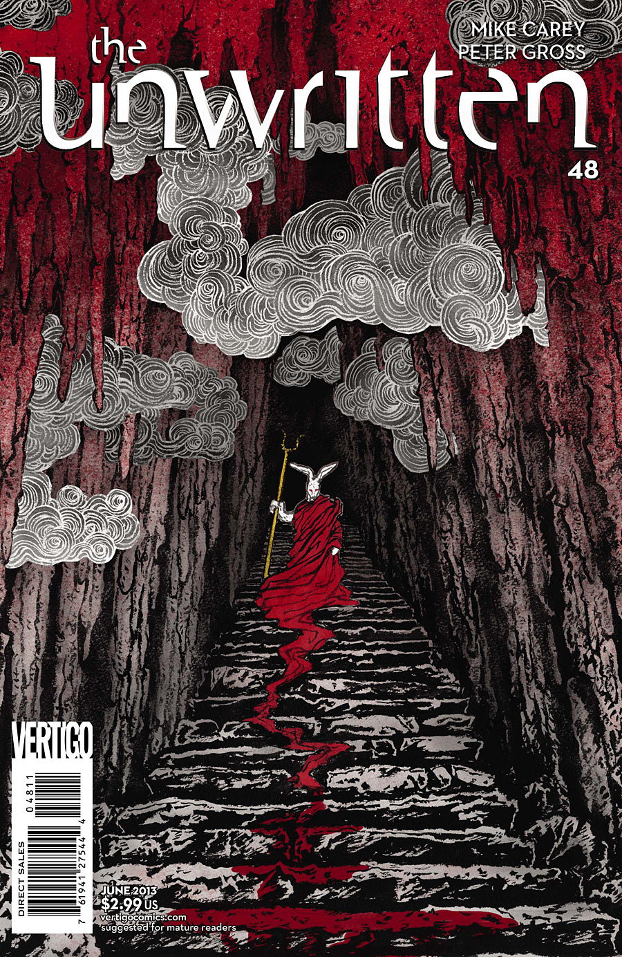
The Unwritten #48
Cover by Yuko Shimizu
Not exactly the white rabbit I’m itching to follow. This arc has its Orpheus theme, making this particular angle all the more haunting. If the myth holds, we’re about to be swept back into Hades. The real beauty of this piece is in those clouds, how they accentuate the depth of field in their staggered placement. I’m reminded of a carnival shooting gallery with targets and atmospheric elements flying in and out of the stage.

FF #6
Cover by Michael Allred & Laura Allred
One of these things is not like the others! There’s a wonderful pop art sensibility to this one, and it again goes back to tessellations. Ben Grimm, himself, is a tessellation pattern of rock fragments, and now his face forms a pattern of its own.
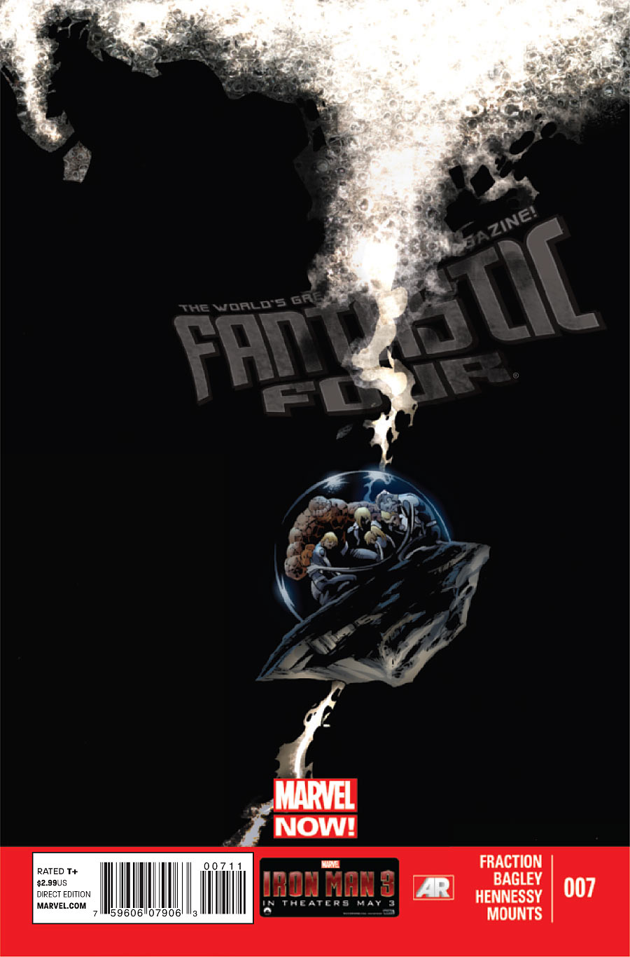
Fantastic Four #7
Cover by Mark Bagley, Mark Farmer, & Paul Mounts
Negative space and the Big Crunch. Love the use of tilt, overwhelming darkness and scale to create a sense of isolation and, not just fear, but despair. “Where are we? Well, at least we have each other.”


Nice selection of covers!
I really like the Fantastic Four cover – I agree, the art team does an excellent job in creating a sense unease and hopelessness (including the title that appears detached and fading).
Daaayyyyyyyuuuummmm!!! Dude just pulled out the Shark Bites. Take me back, son.
But in seriousness, yeah, that Massive cover shows how ridiculously skilled JPL is. (#10-12 are interlocking covers btw.) It’s not just the composition, but also the varied illustration/coloring styles that really separate the elements in these.
That Unwritten cover is beautiful too. I love Shimizu’s patented linework in the clouds.
really wish the big two wouldn’t insist on putting banners on their books! i’d be so pissed off if i created something as visually compelling as that fantastic four cover, only to have that thick red banner arbitrarily slapped on, idiots!
Also, I’ve always wondered why the Big Two (et al.) have to put the UPC codes on the cover. Can’t imagine my Saga or Manhattan Projects covers with that ugly little box.
Kudos to Dark Horse and Image for not infringing on the art, with ads, etc.
The cover artists know where the banners are going. They anticipate these things. I really like how they are at the bottom of the page now. It’s easy to ignore them in ways the banners being on top was not.
As for UPC, they go on the cover so they are easier to scan. My local shop has to pull them out of the bags to scan the UPC. So annoying.
So glad to see Young Avengers and Unwritten made this list. They are both quite striking in their own way. I hadn’t thought of comparing Shimizu’s clouds in that image to a shooting gallery, but now that it’s been pointed out, it seems quite apt.
That Fantastic Four cover is quite evocative as well, Yes, it would look better without the banner, but at least it’s down at the bottom now, a little less obtrusive.
I don’t usually get as excited about the Manhattan Projects covers as others do, but this week’s is fabulous. The colors do interlock in just the right way . . .
That Unwritten cover reminds me of Donnie Darko.
This is my favorite MP cover to date. Interesting that Paul calls it “unusually warm”, because the story itself was unusually touching. Can’t be a coincidence.
Also, the FF cover reminds me of Snood.
I dropped fantastic four because I wasn’t enjoying it and I didn’t bother with FF because I wasn’t all that interested in the team. I think I might have to grab the FF trade just for Mike and Laura Allred.
Yuko Shimizu worthy of her Eisner nomination, best cover by a long shot!
Tessellations!