Covers. But only the good ‘uns. The face-melters.
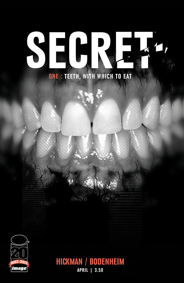
Secret #1
By Jonathan Hickman, I’m assuming
Well, now I’m all unsettled. This is like going to the dentist and hearing Nine Inch Nails flooding through the speakers. Then your dentist strolls in and he’s Rip Taylor in a bloody smock with a bag of molars. Stark. Creepy. And I love that logo.

Conan the Barbarian #3
By Massimo Carnevale
“Try not to disturb the eels.” Dig the ethereal glow amidst the murk. Both sensual and scary with a color palette we don’t quite expect for such things.
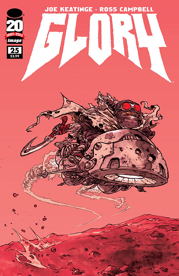
Glory #25
By Ross Campbell
A pink nightmare. Really taken with the figure’s extreme detail juxtaposed against the sparse landscape of Mars. The logo looks terrific here.
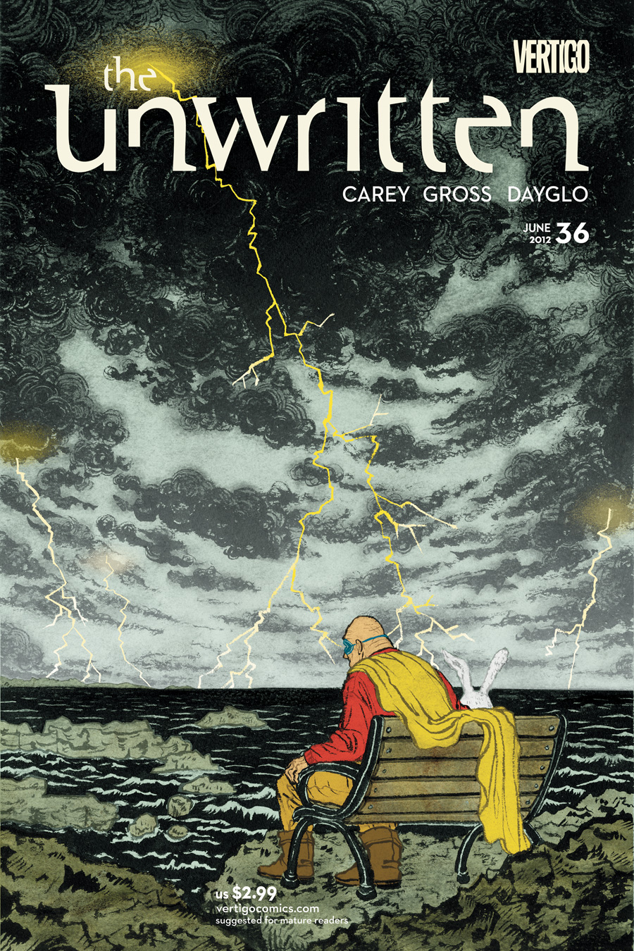
The Unwritten #36
By Yuko Shimizu
A threatening sky overwhelms a fallen hero who once claimed it as dominion. And then, you know, there’s a bunny. There’s no denying the questions posed by this image, or the mood it inspires.
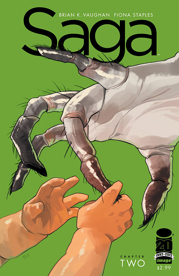
Saga #2
By Fiona Staples
A close encounter of the “Oh, noooooooooooo!” kind. The color here is so striking. So clean. And then you get to the warmth of Hazel’s skin tone. The softness. In harsh contrast to this harsh, overly articulated alien hand. It activates the primal urgency to protect as well as that fear of spiders. Of the unknown. It’s just visceral. A sneak preview at the conflict within.


Great selection, as always…I especially liked Saga & Unwritten.
Come to think of it, has any of the Unwritten covers been anything but awesome?
I love both of those, too. The Unwritten cover really captures the feel of the issue. I love that.
The Unwritten has probably the best series of covers start to finish, mores so than any other series. Ever.
I call your Unwritten and raise you Fables.
The Fables covers can constantly hold their own with the best book jacket designs out there. always a fun time….but yeah i agree, Unwritten covers are always good.
i’ve always felt that the DMZ covers were consistently awesome, but a much different aesthetic obviously.
Yeah the Unwritten cover looks amazing makes me want to start reading it.
I would also say Northlanders covers are always amazing too but to bad it is over.
I really didn’t like the Secret cover. I think it’s ugly. But, it sure is noticeable, I’ll give you that. That says something for the design’s success.
Ugly because of the design choices or just because of the subject matter?
A little bit of both? That’s just my initial reaction, yuck. The design elements are clearly an “homage” (to be kind) or a “rip off” (to be mean) of a LP cover of the band Swans “Filth.” Or it’s an entirely unintentional replication of design elements which would indicate an unfortunate ignorance of classic record album covers. Here’s the wiki page with the cover image:
http://en.wikipedia.org/wiki/Filth_(Swans_album)
Oh, that is strikingly close.
On the bright side, that is an amazing album. If you like your rock hard and uncomprising. As a critic quoted on the wiki page says, “the ideal soundtrack for mass suicides or nuclear holocausts.” If the comic is as ruthless as that Swans album, it’s an appropriate reference / call-back.
I think the cover to Secret is the best I love the intensity of the whole image & really striking too.
Excellent stuff another winner by Mr. Hickman!
I really love the Secret Cover. That logo is so nice….simple with one little bit of specificity that just conveys everything. Nice restraint to not slaughter it with sfx. I also really like how it feels more like a book jacket than a typical comic book cover, which is a direction i’d love to see more of in comics.
I love the Saga cover for all the reasons you gave….except personally, i just really don’t like green as a design choice…especially THAT green (PMS361 or so…). yes designers are as specifically snooty about their Pantone swatches as they are about typefaces! =)
I definitely prefer this green to the Rachel Rising green.
yes i agree. Green has a lot of connotations with environmental stuff in design, so i always tend to think that first, but thats my take. I don’t see that green in my mind when i think of the art in this book, so maybe thats part of my issue. It feels disconnected to me maybe…?
I should love all greens, but it wouldn’t’ be much fun if i were that predictable!
This is one of those things that design people are very concerned with and adamant about, but in practice, most readers don’t register. Strong theory doesn’t always translate to real world context.
totally agree, that we do fuss over dumb little things. However a lot of that fuss comes from a place of wanting to figure out the best combination of “ingredients” to convey the concept and ideas the best…..or its often personal biases.
it makes no sense. I think Jonathan Hickman said something about designers (himself included) spend too much time “pixel f@cking” their own work to death…i.e. wasting time on stuff no one will notice but you.
What I’m saying, Wally, is that you are obsolete. 😉
heh, i see what you did there. 🙂
Great choices. The Glory cover makes me want to read the book, and at the end of the day, that’s the idea.
Unwritten is beautiful as always.
The eel quote was classic, Paul. Well done.
Love actually is, all around.
Whoooooo would be calling her chubby?
Honorable mentions to Lobster Johnson: the burning hand #4 & Batwoman #8.
I’ll allow it.
Thanks you, your paulness.
The coloring of that Unwritten cover reminds me of the cover of Confederacy of Dunces.
Saga and Conan look pretty sweet.
I dunno. I disagree with the SAGA assessment. It doesn’t seem to invoke fear for me, but, tenderness. I think on the surface you get a bit nervous, but, if you look at it long enough, it almost seems like it’s a gentle alien hand that’s holding Hazel’s hand. Almost gingerly.
I guess that it can work both ways. Like a subterfuge and lulling of security before the strike, but, for me, I’m not getting that. It seems almost like a caring and sympathetic hand.
But I guess that’s just because I’m an optimist about these things. 🙂
Did you read the book?
No.
But this is my assessment of just seeing the cover on its own. I kinda had a feeling that people with the knowledge of the story would gleam the necessary implications.
😉
Great selection Paul. Shimizu is so good it hurts – every single Unwritten cover is a masterclass in creating a striking image that speaks directly to the content of the book it graces.
Great choices……the Saga cover especially. I also really liked the cover to Deathstroke this month.
Good choice on covers, I liked Secret, love Glory(pink nightmare is a great way to put it)…”he looks likes a pink nightmare”…..love that Conan cover, unexpected and looks like J.H. Williams lll art, also love the Unwritten cover, just grabbed vol 1 and have yet to read it. I don’t know if anyone read The Secret History of D.B. Cooper #1 by Oni Press but thought that was a solid cover of the week too, along with Amy Reeds washed out in the rain watercolor night glow effect on Batwoman #8.
Dave Stewarts colors are among the best and explain Conan cover and wish him and J.H.Williams lll would get back together for full duties on Batwoman.