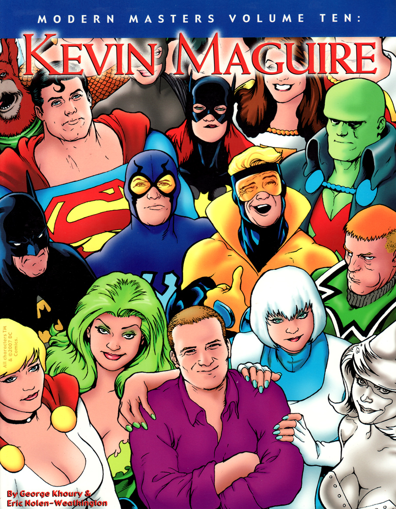
DC released the Kevin Maguire variant cover for the final issue of Justice League: Generation Lost on their blog.
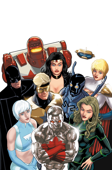
If it looks familiar, it should because DC has been milking this iconic cover design on Justice League International-related books since its very first issue. Overused? Probably. Does Kevin Maguire want to gnaw his arm off before having to draw another one of these? Possibly. Do I still love them because Justice League International holds a special place in my heart? Yes.
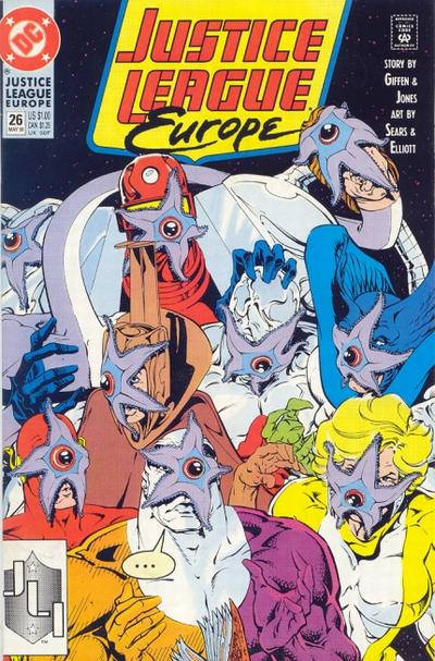
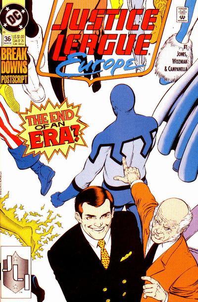
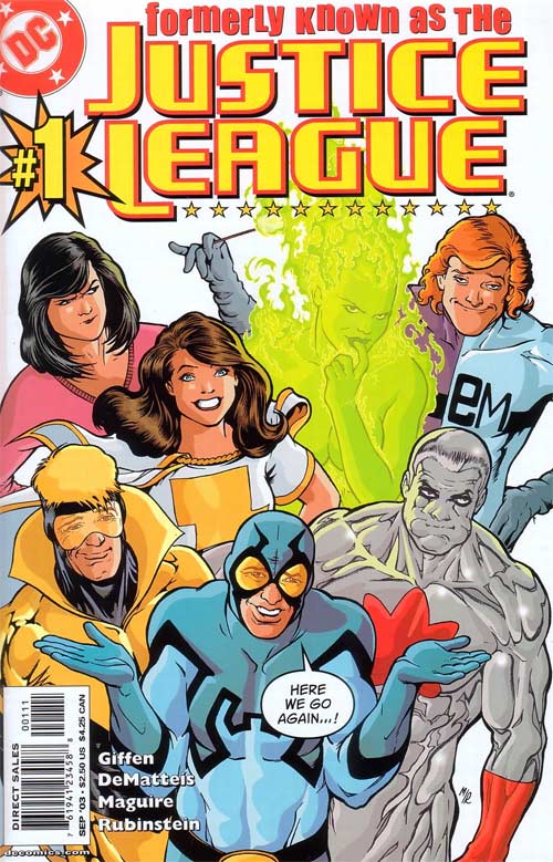
Here are some of the other instances of the cover that I was able to dig up (some drawn by other artists):


yeah i love this cover treatment too. Sometimes recycling an idea really works, especially when its so self referential and iconic. Too bad thats the variant and not the common version.
I don’t see the connection
I approve of this cover!
love it. especially batman in the newest one.
!!!!!!!!!!!!!!!!!!!!!!!!!!!!!!!!!!!!!!!
I would be really happy if, after Generation Lost finishes, we get a new JLI book from Judd Winick featuring most of these characters.
This is the first time I’ve ever considered buying a variant cover.
I’m avin’ it!
@mrlogical — yeah i could be down with that. Although i’d like to have some more traditional Justice Leaguers in it. The B team thing is cool for a while, but it would be cool if they rotated some heavier hitters into the mix, kinda like how Powergirl, Batman and Wonder Woman are popping in.
That cover is undeniablely classic.
if they launched a new book with this team plus batman, WW and power girl i would not only buy it but promote the shit out of it to everyone i know who reads comics or is even slightly interested in them
Another one: that Justice League Antarctica annual. That might be my favourite.
I love that Skeeets made the cover (finally!)
I love these covers too, Conor. Here are a few more variations on that theme: Justice League Quarterly #1, Justice League Quarterly #3, and Justice League America annual #4 which jxc already pointed out. DC really loved this layout in the late 80s.
I never, ever ask my shop for a variant. I’m gonna beg for this one.
I liked the older, less glossy covers better than this new one.
@wallythegreenmonster Those three were heavily involved with the JLI teams.
I don’t care how many times they do it. It’s iconic now.
that is great and really fitting for the book, loving everything about Generation Lost so far!
Updated with more covers. (Thanks, JeffR).
@conor Any time. 😉
Yes, please, a JLI book! Come on!
If I wish real hard, this will become an ongoing…right?!
@conor –yeah i know…i guess i misspoke…i just don’t know if an ongoing with this current team would be sustainable or that interesting without the bigger characters.
There’s also this version from Fringe
I loved that first JLI cover. So great.
What’s wrong with their faces???
I think the colorist/”sculptor” just overwhelmed the subtilities of mcGuire’s linework
I love this cover but Power Girl looks like she got hit with a bus… one that could hurt her face.
@JMann —i’m tending to agree with you. I feel that way about a lot of contemporary coloring. I think they overuse the gradients, soft blends and photoshop FX because the tools are available. The pencils tend to suffer. They are taking something that is stylized and should maybe be handled as flat and graphic and trying to introduce realistic light and shading. I know a lot of people like it, but i don’t. I think its too opposing forces. I think the coloring in some of the older covers shown here is SOOOO much more powerful than all the photoshopping.
Well the old saying of ‘It it anit broke, don’t fix it’ applies to this classic cover perfectly. I’m not complaining though cause I love Maguire and I do love it everytime he (or someone else) does a parody of the cover.
Although I second conor’s comment on that sometimes he must get mighty annoyed drawing it for the 1,000,000th time.
@wallythegreenmonster It all depends how it is done, when the digital coloring was first introduced people went totally overboard but now you get people like Bettie Breitweiser who bring so much to that table that a book like Hulk or Atlas suffers when she isn’t behind the mouse.
What ever happened to Oberon?
I love those covers they are fun!! I will miss this title most as it has hit the last book in my stack every other week. Best for last!!
K
Love this retrospective of JLI team covers and will definitely be buying this variant cover (which I typically loathe do). This only works because of the comical nature of the JLI, but it works so freaking well!
That’s fantastic to see all these covers, thanks. I think JLI has a specially place in a lot of hearts. It’s gotta be in the top 5 great DC creations.
@ResurrectionFlan –oh i agree. I understand that 99% of comics are colored in photoshop, sometimes the effects and tools are overused to the point of them calling attention to themselves. I really dont’ like the realistic shading on stylized drawings but thats me….its like lettering or design…you don’t notice if its done well. You notice when it calls attention to itself.