 The inevitable is coming, we've known for a while now and I've even had time to come to terms with it, but with times like this the fact that the current run of Uncanny X-Men is coming to an end.
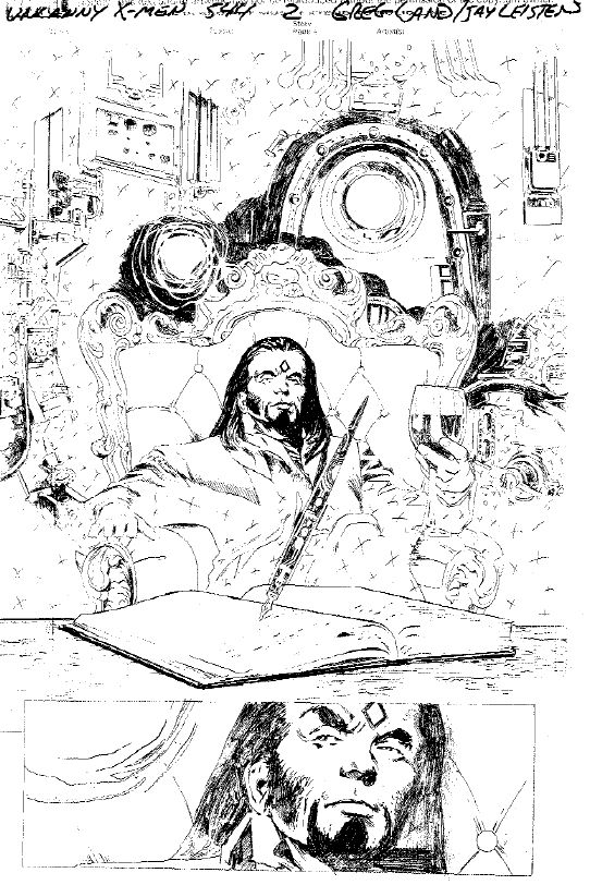
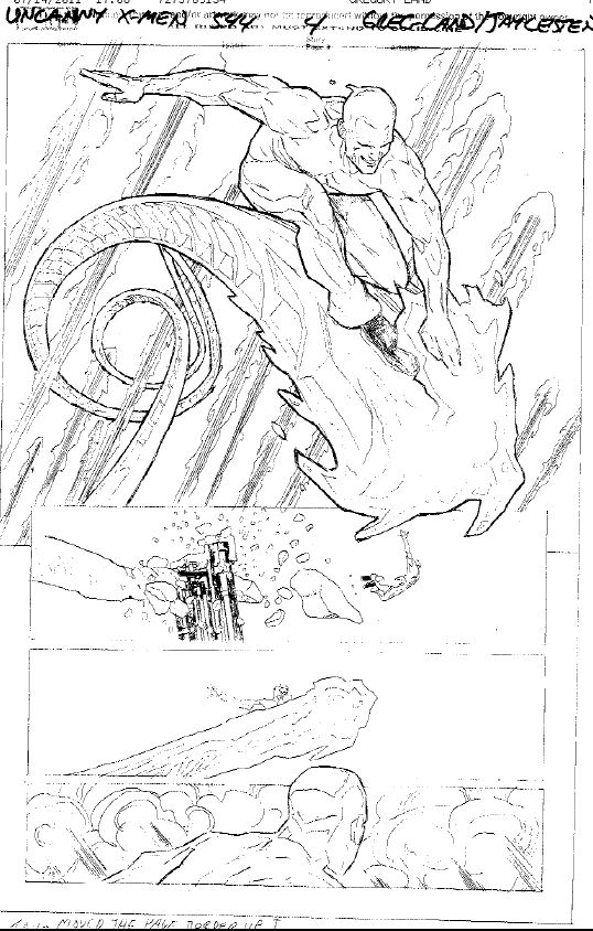
Now, I'm not sure if Marvel is purposefully screwing with me, or what, but today they provided us with an exclusive look at some of the interior pencils for pages of Uncanny X-Men #544. Below are 4 pages from the last issue of my favorite comic book title, with art by Greg Land.
In this preview we see on Page 2, Mr. Sinister, an X-Men villain that we haven't seen for quite a while. Then on Page 4, a pretty cool shot of Iceman, one of the more underrated/underused characters in my opinion.
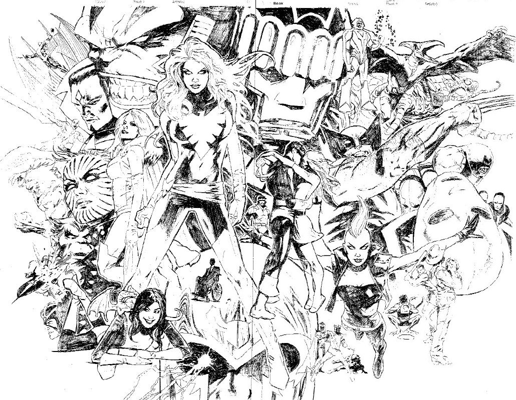
And then finally, we get to see the double page spread of pages 8 and 9 which, I'll confess got me choked up a bit with its portrayal of many of the classic characters and key moments in Uncanny X-Men. Personally,even with not being a huge Greg Land fan, I have to admit, he drew the hell out of this double page spread. I stared at it for at least 20 minutes, just absorbing it all in and reliving the years of happiness I got from reading Uncanny X-Men.
After seeing these pages, it's clear that Uncanny X-Men #544 is going to go out in style, leading into the re-launch of Uncanny X-Men later in the year.
Uncanny X-Men #544, written by Kieron Gillen with art by Greg Land costs $3.99 and goes on sale on October 19, 2011 (a day which I will be spending most of it curled up in the fetal position)


Oh god that double page spread looks terrible, is Land continuing with the relaunch?
I think it looks pretty good.
Not bad. it’s not my favorite art ever, but I’ve come around to Greg Land with time.
It’s mostly the terrible Jean Grey/Dark Phoenix that’s throwing me off…
@ron I gotta say that double-pager looks sweet to me.
Don’t worry they’ll eventually go back to the original numbering when it hits the 600 mark, just like every other title. 🙂
That double page spread has nearly everything I love about the X-Men, ever. sigh
I kniw im in the minority buy I love greg land art
@nastysnow yeah, I don’t get the Greg Land hate. It’s not like he’s Liefeld or something.
@ron If only it also had talented artists who defined the look of the characters time and time again.
I love this:
“we get to see the double page spread of pages 8 and 9 which, I’ll confess got me choked up a bit“-Ron
“Oh god that double page spread looks terrible”-gobo
That had me smiling more then these horrible pages I’m seeing right now.
Greg Land is the best. I think I can safely speak on behalf of everyone … everyone in comic book Land, that Greg Land is the best X-Men artist ever.
@ron I love the sentiment of the DPS, it’s all my favourite stuff too. Mohawk storm, Sinister and Apocalypse, Havok’s old costume, a baseball game, all awesome stuff. I’m historically almost as big an X-Fan as you. It’s just the Landness of it all that ruins it for me.
That and the fact that it’s coming back in a couple of months with a new #1 that will inevitably be renumbered makes the whole “Final Issue” thing ring fairly hollow.
It’s like Ron is trying to grasp for anything to like about this finale considering it’s:
A) Getting renumbered for no reason
B) Greg Land is drawing the final issue
C) Greg Land is STILL drawing this supposite ‘big’ title.
Could Marvel put out an alternate version of this issue drawn by…anyone else? Sell it for $10 and I’ll buy it. Seriously.
It’s a small blessing that Land being on this issue isn’t all that bad considering it’s hardly the “FINAL ISSUE”. Just a hiccup in numbering (kind of like Land being on a book is a hiccup in integrity).
I’m sure the images depicted in the double page spread were determined entirely by what he could find to “reference”. Five bucks to whoever can figure out where that Apocalypse head is traced – I mean “referenced” – from. It’s way too expressive to be a “Land original” (oxymoron?).
Also, @ron, using the word “ART” in the title of the post and then filling it with Greg Land is a little misleading.
Wow,i just dont get the land hate but to each there own.i am a fan of his
I like the idea of Sinister having long hair. I don’t know why, but the thought of him looking into the mirror, thinking “Hm… probably need a trim” just makes me laugh and laugh. It’s probabyl because he’s so evil.
@nastysnow
Some of the hate is just bandwagon jumping but the rest comes from his method. While the actual art looks ok to me it is the fact that he lightboxes (traces) women from stills in porn movies.
While you can make an argument for this being ok with some characters he does it with everyone (not always from pornos
The spread is EPIC!
Ok @parker
@Parker If you don’t like his long hair, don’t worry, it will probably short or curly on subsequent pages.
Land’s Apocalypse looks pretty awesome. And damn, I love me some mohawked Storm. Glad to see the look return.
@ron i will also miss uncanny since it was the first comic i ever bought in single issues
Is it just me or is everything from that 2 pager from Claremonts 80’s run?
Been waiting for the X-Men to deal with Sinister ever since he came back in X-23
It’s a discussion that has been going on for a while now.. I’m surprised there are still people in comics fandom that haven’t heard about Land’s methods. Not only has he traced porn, (which COULD be a simple case of photoreferencing.. if you want to give him the benefit of the doubt) but he has also been shown to trace other artists’ work. That’s way over the line, for me, and in my opinon, should have cost him his job. No wait.. that might be bad.. then he’d be over at DC cheapening more characters I love.
Okay since we’re supposed to be commenting about this article in particular…
As an old X-men fan who hasn’t read anything “mutant” in a long time, it IS really nice to see characters I recognize! I tried to get back into x-books a few years ago and picked up a few on the rack and it was like I had to look at the cover again to see if it said X-men.. I was lost story-wise, art-wise, and character-wise… but that image would have pulled me back in.
I should pick up some of the back issues of the titles Ron has been talking so much about lately.. He’s just about got me sold on the idea of enjoying mutant books again. And that would be fun!
Land’s Juggernaut has looked fantastic in the current tie-in.
Greg Land is ok… I just hate how every femaile character has the same face and are all drawn in the same 4 or 5 poses… they look like mannequins.
@ron is it a complete reboot for Uncanny or r they jus cont. after the 544 when the team supposly spits into 2 teams after Schism????
@kidCharlemagne That’s what I was wondering. I’m far from an expert on X-Men, but it really makes the 80s look like the heyday. Greg Land continuing to do art is proof that the most vocal comic fans are definitely the minority.
My cynicism clashes with my love of the subject matter in that spread. I grew up on the stories depicted and they honestly helped me through some pretty horrific times.
But I look at the Dark Phoenix front and center and recognise it as being a retread from his previous work, then the Wolverine pops out as another reused piece. The Cyclops/Marvel Girl kiss is wonderful, but within a plist second I’m wondering what the original image was and how good the artist/photographer who originally created it is.
The Logan/Peter/Kurt image is perfect, but I wonder where Land got the base figures from. Rachel’s face looks so good it is very reminiscent of John Romita Jr., then of course I wonder if it actually is JR.
Beast looks very similar to Alan Davis’ work, Kitty looks unlike any other female on the page, the Magneto helmet looks to be from a cover he did on Uncanny 516 etc. etc.
Land has an eye for composition, but you see so many different styles in his images and so many examples of him swiping other artists, photographers and then reusing them over and over that it just leaps out each time I look at his work.
I despise his art for many reasons, the intellectual dishonesty to begin with, but I guess most of all that his art always gets in the way of the story for me.
@whitespyder9 That’s my complaint. I like the overall look of Land’s work. But every issue you’re going to get some weird, out of context grin and two or three female characters with the exact same face but different colored hair.
Look at Sinister on the first page and then again in the splash. Two completely different references, not just because of hair but facial structure. Also note how the triangular soul patch is slightly off on the first panel and in the splash, a mistake he makes quite often when adding additional details to a swiped reference.
Pretty sure Apocalypse was once Hulk.
Sorry you start picking at one thread on his work and it just starts to unravel.
@kidCharlemagne @toshimoko29 It’s not all from Claremont. Apocalypse and Archangel are from X-Factor (by the Simonsons, et al.) and Beast becoming furry was from his solo run in Amazing Adventures (by Gerry Conway, Tom Sutton, et al.). Sabretooth was created by Claremont and Byrne, but first created for Iron Fist. And of course the original team, Havok, Sauron, Juggernaut, Sentinels, Scarlet Witch, Quicksilver and Toad were all pre-Claremont. And there could be someone hiding somewhere else in the pencils.
i have a feeling that after 16 issues it will return to original numbering
@where4artthoucarlos I think it will last a little longer, probably through to 600. That’s a good four and a half years and it gives them a chance to do one of those big, overpriced 50th issue specials that we all love
that spread REALLY isn’t that bad, the almalgum sums up Uncanny in a nut shell. Lower right, depicting Logan, Peter and Kurt (sans uniform)playing baseball is priceless!
I love everything in the double page spread. Especially because everything in there is from 25 years ago.
For those confused why so many find Land distasteful, have a look here
It isn’t the complete list of his swipes of course but you’ll find a lot of familiar images there. In fact compare the first image of Sinister in the chair with the swipe of Adrian Paul from Highlander. It’s the same image but with added hair, a beard which seems to float slightly out of alignment with his face, an off-center forehead diamond and bushy eyebrows. It just needs glasses and a big plastic nose and the disguise is complete.
Can’t get that song out of my head… “watchin’ porn… with Greg Land…”
@Funnybooks — haha yeah me too. I was awesome-d by that skit.
i really can’t handle Land’s art. He has obvious technical rendering and draftsmanship skill but the work is so vapid and soulless…and every panel, every character has the “photo-shoot wind machine hair’ and game show host grin. Its painful to read an issue with his art.
Those pages look good, but like so many have pointed out, swipes all over the place.
At least those shots don’t look like they’re directly photo referenced, not to me. You have to believe that he’s heard so much about it he can hardly do it anymore and be taken seriously.