We talk a lot about comic books here, obviously. We talk about story. We talk about art. We talk about continuity and character motivations. But one thing we hardly ever dwell on are comic book covers, which is funny because when you think about it the comic book cover is one of its most important elements. Or at least it was, before the age of the internet, the advanced solicitations, Previews, and every other tool the modern comic book reader has at their disposal used to figure out what they are going to buy before they go into the store. Before all this stuff all you had to go on was the cover on the racks – was it eye catching? Was it exciting? Was it dynamic? These days I’ll still let a good comic book cover sway me. Sometimes if it’s a light week (ha!) or if I’m just itching for something new, I’ll let a new cover catch my eye like a pretty girl at a bar, and I’ll saunter on over to investigate.
I’m a big fan of covers. I should amend that to say that I am a big fan of good covers. I come from a family of artists so I appreciate a good piece of art. And a comic book cover isn’t like the art in the interior of the book. There is no sequential art at work, there is no no storytelling, there is just a single image designed to entice or to inform. And if it’s a really good cover and it’s done its job then it does both.
I went to my shelf of comics (where I keep my purchases until I have enough for a new long box) and I randomly grabbed four books without seeing what they were.
And here they are.
 X-Factor #32
Cover by Glenn Fabry
Artist Glenn Fabry is primary known for his much-celebrated Preacher covers. Those covers were beautiful and evocative and really helped to set the tone for that series. It was a perfect marriage of covers and comic book. They even put out a book collecting those covers.
This cover here is not so good. I have two problems with this cover. The first is the composition. There doesn’t seem to be any plan behind it, at least not one that I can see. The characters seem thrown together at different sizes and at different depths. It looks like a collage of images from different sources rather than a singular piece.
The second thing about this cover that I just don’t like is the depiction of Guido. Granted I might be biased because I think that Guido is one of the five dumbest characters in comics. Here he looks like a raging, blue Hulk monster. His face is unsettling, and not in a good way.
It’s not all bad here. I really like Fabry’s depiction of Siryn. She is clearly the focal point of the piece and my eye goes right to her every time I look at it. There is a lot of personality in that face, especially when compared to the others in the same image. She is very striking and that’s a good thing because this cover really needs the help.
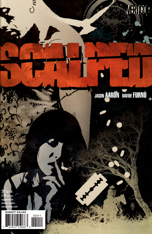 Scalped #20
Cover by Tim Bradstreet
Tim Bradstreet is one of my favorite cover artists. His stuff is so beautifully composed and packed with emotion, and that emotion is usually sadness. That’s why he’s the perfect guy for a book like Scalped, which sweats sadness and despair on every page.
This issue of Scalped is the final chapter of the sex and drugs fueled story arc between Bad Horse and Carol. It’s an emotional wreck job and all of those elements are captured perfectly by this cover. Carol is smoking a cigarette, probably post-coital. There are pills strewn across the cover and a prominent razor blade. But most importantly, there is a distant and melancholy Bad Horse standing behind Carol. The symbolism is overwhelming. There is a distance between Bad Horse and Carol that they just cannot seem to overcome.
Every month I look forward to Scalped for the fantastic covers as much as anything else. Everything about this book is top notch.
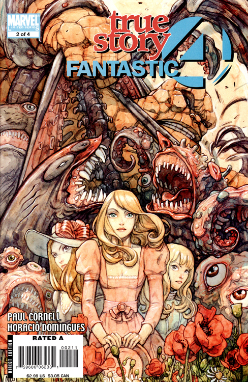 Fantastic Four: True Story #2
Cover by Niko Henrichon
There is almost too much going on on this cover. Almost.
Is there an artist more suited for this book than Niko Henrichon? With a mix of whimsy and terror, the tone of this book is unlike any other that I’m buying right now. The art on this cover perfectly captures that feel. My eye is first drawn to the sweet little blonde girls on the cover. And what’s this behind them? A forest of some sort? Nope, it’s some creepy looking monsters attacking The Thing!
Normally I might say that this cover is too busy but in this case it totally works. It’s so busy that at first glance you don’t take in the whole picture, but as you look closer all the details are revealed and the tone shifts drastically. That’s an artist completely owning their canvas and taking the audience where they want them to go. That’s a beautiful thing.
Nothing against Horatio Domingues who is doing a fine job on pencils, but I really wish that Henrichon was doing the interiors of this book.
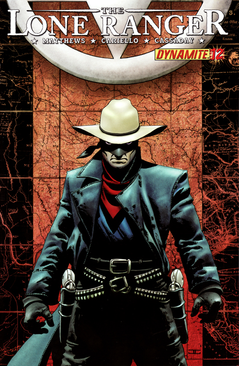 The Lone Ranger #12
Cover by John Cassaday
What we’ve got here is your standard pin-up cover. What is this, a Marvel book?
I kid!
As I said last time, the problem with covers like this is that they don’t tell you much about what happens on the pages inside. While great to look at I need a little more to go on, especially in a book like this whose release schedule could charitably be referred to as erratic.
If you have to have a standard pin-up cover it might as well be by John Cassaday because that means it’s going to be damn pretty. The Lone Ranger is all about intensity and anger and Cassaday’s got that here in spades. The Long Ranger looks mighty pissed off and I have a feeling that we are moments away from silver bullet-ridden bodies.


Great post!
Most of the covers that have caught my eye were by Jim Aparo, Joe Staton, Rich Buckler or Dick Giordano. I think I really started paying attention to covers with George Perez. His Avengers, Justice League and New Teen Titans covers have been amazing. Alan Davis is another good cover artist.
Probably my favorite other than George Perez or Jim Lee has got to be Tony Harris. His Starman covers were awesome.
One of my favorite covers is the JLA cover by Tom Nguyen and Doug Mahnke. Everybody in the League is in motion including Plastic Man.
Most of the Vertigo book had fantastic covers. Fables, Books of Magic, Sandman, Preacher, etc.
Well would it be lame to say Alex Ross’s cover are the ones I like best? Seriously, that man could do a cover of Blade and I’d still pick up the issue. Every cover he does are just so unique on their own, and I would love to see them become posters more-so in the future. Hell I want a book just talking about Alex Ross covers. Come DK you can make Veritgo Encyclopedia, you can edit that book.
Oh and I second Vertigo with having fantastic covers.
Great idea for a column but I have an idea for a slight twist.
But first: What’s the number one purpose of a cover? To get you to buy, or at least page through, the book. It can be a mood piece or a promise of "more boobies inside" or (my favorite) illustrating a question that you need the answer to -"Wait the Flash is running to save that guy but on the other side of the wall is another Flash from the Golden Age. How can that be? He’s a comic character in Flash’s world!"
I think the Scalped cover does the best job because it gives you a sense of mood and subject matter. If you’re attracted to that cover, you’ll like what’s inside. Pinups do little to intrigue.
And Conor, you’re from a family of artists. Do you draw or paint? Any refrigerator pictures promising great things in the future?
Okay the slight twist to be done by any of the iFanboys, or maybe they each pick one – walk into the comic store, look at the covers of any book that you know little about and see if there’s a cover that makes you want to pick it up. Show us and tell us why. Then review the book. Eh, just a thought. But I like the discussion of covers. I’m for more in any form.
@ thenextchampion
You might be looking for Alex Ross’ Mythology. The DC art of Alex Ross. It’s not just covers, but it’s pretty damned close.
Which of course you should pick up through the ifanboy store, not what I linked.
🙂
Is Jock returning to Scalped?
Man, you pick four books at random and manage to pick up 3 from the better – perhaps best – cover guys in the business.
Fabry is an absolute favorite of mine but I agree that cover kinda blows (but Siryn looks great). I’ve got that Preacher cover collection, too. Bradstreet is always a favorite. And Cassaday, well, whaat can you say about that guy that hasn’t been said?
Nice article. I’d like to see it as a semi-regular feature.
Cool, I just fired off an email to the iFanboys about covers. A few hours later. This.
The True Story cover is gorgeous.
I don’t read it, but that X-Factor cover is like your typical ‘floating heads’ movie poster. Boring, bland and only exists for a "He’s in it! And she’s in it too!" reason. But hey, some films with those posters are huge hits, so what do I know?
I agree with others about Vertigo, and for my money nearly every cover of Y was beautiful, interesting and dynamic.
Bradstreet is a joke. At least that Scalped cover isn’t as bad as his Punisher covers though, yeesh. You want some great covers? Transhuman, Proof, and anytime Frank Cho does a Marvel variant cover.
Lovely analysis of the Scalped cover. It’s almost enough to finally push me over the edge into giving that book a chance.
That X-Factor cover, on the other hand, literally made me cringe in the store. Ugly and boring is an awful combination. But why the hate for Guido, Conor? (I’ve only worked backwards to episode 90 in the podcasts, so if you’ve addressed it already, I apologize.)
@CAM: I have that book, and yeah it is pretty sweet. Although that is bunch of stuff of Ross’s; from modeling pics, to covers, to issue art, a lot more. I’d definitely recommend it as well.
I’m talking about a book entirely on covers. Like how they did a whole hardcover on Batman covers or DC women. That would look great as a coffee table book.
Hickman is my favorite cover artist.
@sunnyvaletrash~
Jock returned this month with another awesome cover.
conor, mate, there’s a reason. james Jean has won an eisner award for his covers 5 years in a row. i don’t read that book but Jean is fantastic
… um, okay?
I love this feature. Can we make it a regular one? Please??
@Ameer: I totally agree!
nice article. i agree @Ameer…we need more of these articles.