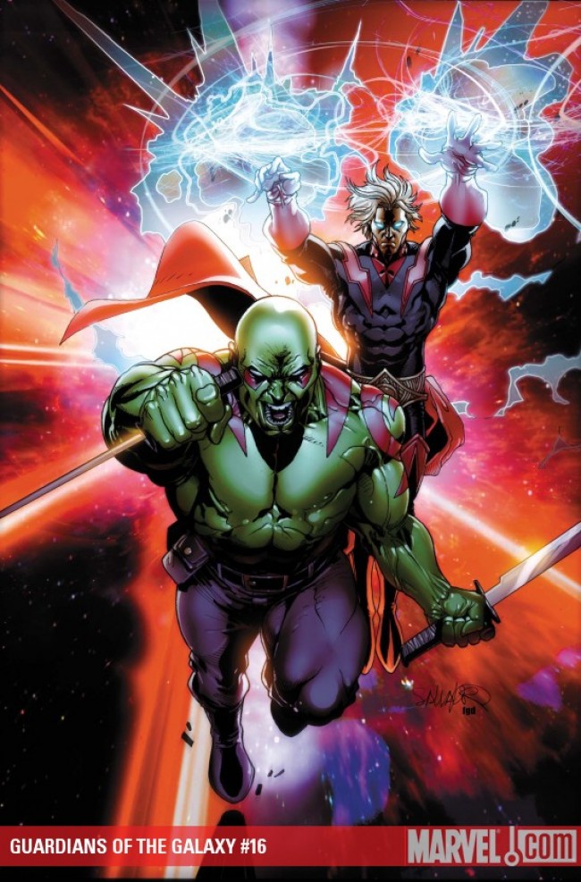
GUARDIANS OF GALAXY #16
What did the
iFanboy
community think?
Pulls

Size: pages
Price: 2.99
Writing a review for this one is a little tricky. Let me start by saying that Guardians is one of my favorite books. It has been consistently great from month to month (except for a small hiccup in issue #9 where the art in the second half was atrocious).
Abnett and Lanning do a good job moving the plot forward. We finally learn why Starhawk keeps coming back to the past, which ties in to the current War of Kings event. There are also some nice character moments with Mantis and Charlie-27.
Unfortunately, these good things are almost undone by the art. Although Craig’s style worked pretty well in issues #11 and 12, here, it doesn’t mesh well with the story at all. In those issues, Craig was only drawing a few characters in a side adventure. Here, though, he’s trying to handle ten different figures in the main story. What makes Pelletier and Walker so great is that they can give each character so much personality and detail. Craig, while great at conveying action, stumbles with the character art. The only one who looks decent throughout is Star-Lord. Yondu comes across as a blue pygmy (quite unlike how he looked when Pelletier drew him). Also, I’m not sure if it’s the colorist, but most of the panels look like blurry cartoons; everything seems out of focus.
You may enjoy this issue much more than I did if the art doesn’t bother you.
3/5 stars
Art: 2 - Average


I was most distracted by the look of Jack Flagg. I certainly prefer Pelletier for the AnL titles.
The art in this issue was awful.
The art was baaaaaaaaaaaaaaaaaaaaad