GREEN ARROW YEAR ONE HC
What did the
iFanboy
community think?
Pulls

Size: pages
Price: 24.99
This review contains spoilers, click here to read
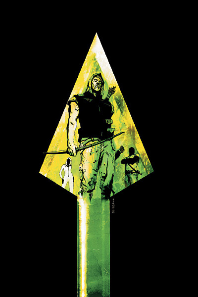
This HC is another HC with a dust jacket, but if you remove it you'll discover that unlike other HC with dust jackets, this one is green and coarse a bit, instead of the leather like black HC that is usually the case.
Also - Green Arrow is imprinted on the cover and he is partially colored in black.
This HC is meant to teach the reader about the first year of an established character - this time Green Arrow. It might also seem like a retcon or trying to give a certain character more of a background and substance.
Calling it Year One might stretch it a bit and might limit the writer and in this HC the Year One is loosely interpreted. You might say he spent a year, and you might not. To me it looks more like a few months - maybe half a year.
We meet Oliver Queen who is Green Arrow while on a thrill seeking trip with his guide and we discover that he is a thrill seeking youth with a big inheritance that he wastes away on self indulgence. On one of the trips he is betrayed by his guide and sort-of friend and he survives and arrives at an island (which seems to happen every time - I guess the actual drifted for days and eaten or drowned motif is not very appealing, so in a story you can navigate your ship according to people hanging onto pieces of wood - when that happens you know that land is near).
He discovers that he needs to survive on his own, and he finds out that the island is used as an opium farm where plants are grown that produce highly profitable drugs. Keanu Reeves is nowhere to be found. He decides to help the locals and fight back. There is also a villain that seems like she will be a major foe to Green Arrow.
The arc is pretty much ridiculous and unbelievable and you just have to go with it, and it's a nice way of taking some guy in a Robin Hood costume or a Peter Pan costume and giving him a meaning.
Also his ridiculous costume is in here but in a much more realistic manner.
The drawing is very dynamic and there are onomatopoeias that are used here which is something I hate (if you can't show it using the drawing you're not that good of an artist in my opinion - I don't usually need to see "knock" in a panel where someone is knocking on a door. A good artist will be able to illustrate the loudness of the knock without relying on onomatopoeias, and I don't think it's crucial to know that the character knocked twice before he stopped) but here it is done in a very good manner, and in a sensible way - sometimes people like to write words that produce a sound that is non existent or impossible to fathom.
There is a combination of shading using computers and using black color which is an old method of shading and is not very popular since it consists of basically taking a nice drawing and painting a streak of black on a big part of it.
I don't like to see evidence of the use of computers in the drawing, and I very much enjoy a hand colored comics so I liked it - it took away from the dominance of the computer - I'm not saying those black streaks are hand made, but it takes away from the video game look that the art sometimes has.
The coloring is pretty much uniform - like painting a drawing using MS Paint. The black streaks and computer shading are there to cover the lack of color. There are also several places where everything is colored in one color which is sometimes annoying. There are pages that separate the different parts and they seem to be colored using markers - the glowing ones my teachers made me buy to highlight text. There is also some color used for the light that sometimes gives it an effect of glowing - like in a panel where we see light through a hole in the ground, which is nice.
The drawing seems to be a bit sketchy meaning that the lines of figures are not refined - lines are harsh and not very curvy, and lines are not finished - a drawing of someone's knuckle for example might end a bit before reaching the hand, meaning that if you were to paint that area using MS Paint the color would leak. So it basically looks like a sketch before the artist starts to paint.
Since this is collecting just 6 issues the HC is thin. The pages are plastic like - not the modern glossy pages but similar, and the pages are thin.
This arc is a nice way to make sense of a guy that prances around in a Peter Pen costume if you can suspend your belief just above "a bit".
It is not outright nonsensical but it is not "just a bit unbelievable" - it's something in between.
It's basically: He has a natural skill with a bow and arrow, and he has a great bow.
It was short and enjoyable, but I'm not running to the store to buy a TP with him anytime soon. I still need to warm up to the idea of an old character that still retains its absurdity. Batman has changed a bit - not so much of an accessory belt nowadays, but his persona is used for intimidation so I'm okay with it, and Superman needs the aerodynamic properties of his special non stretch underwear that resist the power of his kryptonian butt and hips.
I just still need some time to get used to an extra from a set of a famous parody movie made about a very famous Kevin Costner movie, so I'll probably search for some team book once I'll finish reading the JLI run.
Art: 4 - Very Good


Leave a Comment
Login or Register to get involved and leave a comment