GOTHAM CENTRAL HC VOL 01 IN THE LINE OF DUTY
What did the
iFanboy
community think?
Pulls

- ABirdseysView
- acbg
- AlphaFlightFan
- amlah6
- areml
- boostergold4
- Brandon2
- broderboy
- buckeyerdld
- CammyKnoxville
- CGPO
- chris
- chrs7637
- CleophusWayne
- Cobert92
- ComicBookGuy37
- conor
- Crippler
- DanielV
- DavidB
- DavidMacfarlane
- debany
- Dez
- drummerman1126
- ender1979
- eureka375
- Eyun
- Fevernova
- gamboa1047
- gat0rl1vebeatz
- GeminiTwin
- gothamcentral79
- Gray
- Grendel1972
- Guardedmarman
- GungaDin
- Hank
- Heroville
- hidefjohn
- holoman87
- jakov42
- Jasonmatthew
- JFernandes
- jguerra
- joedunn75
- johnnyj227
- juand182
- jwlanglois
- KahunaBlair
- kaonohi
- kevmann16
- KingDiamond
- Labor
- Lelandp13
- lmiller31
- Lriversiii
- LukusLuke
- Midness
- mistersizzle
- mitchster
- Mob2012
- moron
- MPJB
- MrGlass
- mulletpeep
- mxc
- NealAppeal
- nicks911e
- Nigel66
- nstorts
- OccultPanda
- Optimus187Prime
- Osyris
- Panamagreen
- PaulSharkey
- philipgraves068
- purdueboiler
- RobAbsten
- Roblaw
- rockgod27
- RolandofGilead
- Ruo21
- sciencenate
- ScorpionMasada
- SilentRob
- Simps
- sithlord23
- SixGun
- spndx
- SteveRice
- thebear
- thefragilenin
- tjnewton
- Todd
- Tork
- uvayankee1
- WetWork
Size: pages
Price: 29.99
This review contains spoilers, click here to read
This review is for the Gotham Central TP that collects the first 5 issues... If you want a review of the hardcover there are two reviews of it on this website.
*The Message by Grandmaster Flash & The Furious Five is played in a loop, which seems appropriate for Gotham City*
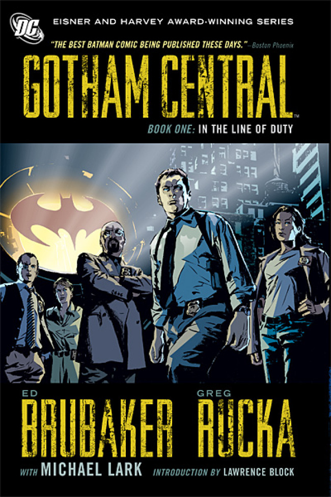
The TP starts with a nice introduction by Lawrence Block which says that Gotham is basically New York and tells us what that means.
The cover is cut a little short meaning that the pages stick out a bit but barely.
The paper is a regular one meaning it's not glossy - it actually feels like paper.
This TP contains two mysteries and is told from the police force's point of view.
The first involves Mr. Freeze who is planning something big and they need to stop him before it's too late, and the second one focuses on an investigation into a murder of a young girl that happened some time ago, while Firebug is roaming the streets and setting things on fire and keeping them busy.
Everything is placed in panels, and there's an interesting choice: when a word baloon touches a panel's border it eliminates it, meaning the border is there but you can't see it.
The coloring is pretty uniform and there don't seem to be too dark colors. There is a lot of earth tones in the coloring making the city look boring and monotonous, which is an interesting choice.
The drawing style is somewhat realistic but the coloring makes it unrealistic (maybe a change in coloring and maybe also a change in drawing would've made me care more about the people in the TP, and maybe not), there's partial panel recycling but barely (meaning parts of a panel are recycled instead of entire panels), and there's a big use of streaks of black for shading in addition to small shade changes sometimes.
The art is not my favorite but I can appreciate it - it's very dynamic at times (but it looses most of it towards the end).
For instance during the Firebug chase scene - {panel 1} we see someone talking using a squad car's two-way radio with his mouth open, the next panel {2} is much larger and we see a lot of squad cars and officers and a big fire in an apartment building.
After that {panel 3} we see someone climbing (Sarge) on a platform and we see he's chasing someone - we see one leg of whoever he's chasing in the air and a small part of the other on the ground, and we see two officers behind them trying to climb to where Sarge is - everybody is in motion.
They show them in the midst of climbing to a higher platform.
After that {panel 4} we see Sarge's two-way radio in the air (falling) and a beam of fire coming up to Sarge's hand, after that {panel 5} we see him caught on fire and in the midst of falling backwards and the character he was chasing is amidst the flames and is all black and in a stance that suggests he's about to jump, and in the next panel {6} we see Sarge grabbing his coat that caught fire so he won't get burnt, after that {panel 7} we see the black figure in the air, we see the flames, we see Sarge kneeling - in the midst of standing up while talking in his two-way radio, and we see the other two officers running towards him - one of their legs in the air and the other on the floor, and we see that Sarge's coat is now totally ablaze.
Everybody seems to be in the midst of moving.
*the music is changed to Surfin' Bird by The Trashmen played in a loop*
The lettering is great - the letterer payed attention to small details: like when Batman jumps while things fly around him and land on cars nearby because of an explosion, and there's an onomatopoeia for the noise that those things make landing on the cars (I'm not 100% sure about that but it didn't seem to be a sound coming from Batman) which indicates a great attention to detail.
There's an onomatopoeia for an erupting fire ("skash" - but prolonged) that is shaking and that letters in it are in different heights (they're not in a straight line) and the end of it rises (like the flames - it's as if that onomatopoeia is a flame) - it seems like the letters are dancing.
There's also a font that looks like hand-writing meaning some of the font is italic and is all uppercase, it's shaking and is reddish-brown - like the writing of a crazy person that wrote something over and over again and even bothered to use uppercase letters to emphasize it, and is used for a homeless character.
His word baloon is filled with little spikes and medium-sized spikes that have little bumps in them to further convey that crazy-person feeling - it's not the usual superhero word baloon with straight spikes that show surprise or amazement etc.
There's a police-car siren for a squad car that's moving and the onomatopoeia chosen is a repetitive "WHEEOO" - it curves in half a circle until it reaches the car to show you the road the car was driving and it corresponds with the curve in the road, and the rigid and constant font seems to echo the nature of a siren nicely.
The letters are upper-case and any holes in letters are reduced to small slits, and the top part of the letter is prolonged (most of them at least) meaning that the hole of an O is in the middle of the bottom half of the letter, and the letters are rectangular - they mostly look like one rectangle after the other - each standing on their shorter side (except for the W which is sharpened in the bottom and is square on top. The top looks like this: |-| / |-| ).
The letterer chose great onomatopoeias and wrote them on the page in a perfect way.
The first story ends up in an anticlimactic way where Batman shows up and kicks the bad guy's ass in several seconds and it was a waste of time.
The second one incorporates the world in a nice way - Robin fought Killer Croc in a school, one of the kids stole a batarang, and the fact that there are people with special suits is incorporated into the environment - and the fact that their suits exchange hands.
One of the detectives has an unexplained hatred towards Batman (besides the obvious "he doesn't have to work in the confines of the law, and he always gets the job done") and it gets somewhat comical and unrealistic, but maybe that hatred will be dealt with in later volumes.
I wanted the story to deal more with regular crimes but show the effect that the very special characters in Gotham have on the place, but it seems to focus just on villains that end up facing Batman.
We see some of the relations between the people in the unit but not much, but later volumes might expand those relations.
This is just the first TP but they chose to put two short stories in it - I guess to hook people right away, but a longer story that spanned an entire TP or more would've been better.
Being a first TP means that being the hook and not having much room to develop needs to be taken into consideration, but they have powerhouses to battle in that genre.
The hook of "the police in Gotham" isn't enough to keep me buying and reading, and I don't need another cop show in comics form - having it in this form adds nothing for me.
There's already "Inspector Morse" where each episode spans for a long time, and where we slowly see Morse's alcoholism nicknamed "his liquid meals", in one episode we see his relationship with his partner (Lewis) coming to a boil because he lets Lewis do all the dirty work, we are told about his past and his suicidal thoughts when he was a kid in one episode and his concern for teenagers - that they see too much at once and think they have nothing else to see or live for, we see his unsuccessful tries at finding love, we see his chauvinistic nature and him slowly acknowledging it and remedying it somewhat, we see his battles with his commander (chief superintendent) and with the measly budget, we sometimes see him be a bully and sometimes breaking the law to get results, and more.
We have "Law & Order: SVU" where we see Elliot Stabler's hatred for people that abuse kids, in one episode we see why - he has kids of his own, we see Casey Novak who is an ADA fighting a bad judge that rules according to looks and not the facts and who puts innocent people into jail when evidence to acquit them is clearly present, we see her crusade against him, we see her fight with her boss trying to convince her to prosecute certain people despite not having very good chances to win the trial.
We see the victims: it deals with serious subjects - like an episode where a young sociopath child kills another child and his father avenges him - he shoots the sociopath kid in court and we later find out (after he was found not guilty) that the father did it in cold blood and that he planned it (there was no temporary insanity as his lawyer claimed), there's an episode where a man suspected of being a pedophile who deals a lot with kids with cancer is about to be charged and prosecuted but we discover that the complaint was bogus, and that the mother that filed that complaint did it because she didn't want a pedophile loose in the streets - she slowly poisoned her young daughter to make sure her hair falls out and that she gets sick - she wanted her to look like she has cancer and to take her to that man to get abused, but he doesn't abuse her so she tells her daughter to say he did - really fucked up shit with great dilemmas.
We realize at the end of the episode that that pedophile will be able to use that bogus complaint as a shield each time a new one is presented - he can claim persecution, and that the only way for them to catch him is for him to molest more kids.
We see an episode where there's a murder of a young girl that is still in school and the main suspect is a girl that gets bullied all the time - she is suspected by her peers and by the police, but the police find the real murderers - two of them claim to just be there but not help with the murder, but eventually they are revealed to actively help the murder and to not having any remorse, and as the trial ends the detectives get a call on their radio that shots were fired at that same school, and arrive to discover one dead girl and the abused girl (who was the original suspect) and that she was the shooter.
The girl cries that it wasn't going to end - the bullying - despite being proven to not murder the original victim, so she just shot a girl that was bullying her. She cracked.
We see a temporary pedophile which might seem schlocky but is handled well and never reaches absurdity despite leaning towards it sometimes. A grown woman abused a young boy but we discover that it's because she has a history of being a victim to sexual abuse and that a tumor in her brain caused her to be more driven by impulses and to lack self control - that tumor is removed and she returns to normal but we realize at the end that the tumor will return and that more kids will suffer. A great dilemma since she is a victim herself and a good person that because of something she can't control like a tumor she loses control and turns into a monster.
This series is going against powerhouses - we need more than the hook, but as I said - there might be more developed in future trades.
I want to see more of the victims - seeing an entire flaming building without seeing the casualties or reading about them, and seeing a photo of a body is very business-like, cold and detached - we don't get the effect of what the villains and criminals do, and there isn't some intriguing crime unlike "Law & Order" that deals with very scandalous and interesting and problematic crimes that challenge the viewer, and there isn't the slow build of the investigation like in "Inspector Morse".
I would also like to see more of the relationships between the officers.
This is like Sin City, Fables and Invincible for me - I'll get the second TP sometime in the future because of people suggesting that you need to read more than the first, but I'm lukewarm regarding those and thought they were very average.
Someone giving me the TP is very unlikely, finding it cheap and for me to not want to spend that money on something else is very unlikely, trading it for something else - comics related or not and to actually choose the second Gotham Central TP as what I want from what s/he is offering in exchange is very unlikely, and getting it as a gift is very unlikely, so it will take some time (it's the same with the rest of the series I listed above).
Also add to that the formatting problem - the page placement here sucks because of two surprising moments being ruined - when Mr. Freeze attacks - we see the two detectives in small panels and at the end of the page we see a gun pointed at them, and the next page has Mr. Freeze in a very big panel - obviously meant as a surprise (as a "oh shit/fuck" moment), but you'll see Mr. Freeze before you'll finish reading the first page - it needed to be moved one page so the reader will have to flip the page to see that surprise.
That's the major one and because I took too much time writing this review, I'm not sure what's the second one - maybe the homeless guy attacking the cops, or when Batman is flying towards Mr. Freeze who is on the roof - I'm not sure... Maybe something else.
The different parts of the two storylines weld nicely (I didn't notice a stop in flow - there's just a small stop between the end of one storyline and the beginning of the next) despite being separate issues. A small rectangular space is used to show us that we switched to a different chapter, and I think it arrives several pages after the start of the chapter (I haven't checked if it's true).
There's a nice lettering touch in that space as well - the font and color of the storyline's name changes from storyline to storyline - the first is green and upper-case and straight forward, and the second is uneven and looks like a typewriter font - the letters are lacking color sometimes which makes them look made by a typewriter that lacks ink.
In the beginning of the TP there's a map of the city without any words - just a basic scheme, but maybe it's New York's? (because of the introduction) I don't know and I'm not interested enough to check.
At the end of the TP there are the covers and after them some drawings in black color and a few in pencil of the different characters in the police-force.
*It's still pretty hot but I got the AC on. I reckon that when the glaciers melt they'll flood the world and cool it, will cause all the forests that were cut down to return and flourish, and eventually trickle to the ground so countries with bad water sources or gradually disappearing water sources will have clean ground water that they'll be able to pump, and we have enough bears as it is, so losing one type isn't a bad trade. That's how global warming should be fought - let it happen*
Art: 4 - Very Good


Leave a Comment
Login or Register to get involved and leave a comment