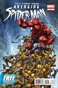
AVENGING SPIDER-MAN #2
What did the
iFanboy
community think?
Pulls
Art by Joe Madureira
Cover by Joe Madureira & Ed McGuinness
Size: 0 pages
Price: 3.99
I apologize for my previous review this week, but like ole’ Grand-mammy Destructo sez: “If you have nothing nice to say about a particular comic book write a snarky one-liner and be done with it.” Actually, her saying was more about inferior races and the one-liner was replaced with a lead pipe, but you get my meaning. Grand-mammy was kind of a jerk. Seriously though, even the ads in this book are better than what took place over in Hawk & Dove #4. I say that without even a hint of attitude. There is a Yaris 2-page ad in this issue that literally made me let out a girlfriend-startling “HA!” That’s how entertaining this book is.
When last we saw Spidey and Red Hulk, they were being glomped upon by a giant subterranean worm. How they get out isn’t necessarily funny by itself, as we’ll all seen it before in comics, but I was impressed with its presentation. And I think that is just one example of why I like this book. Even if we know what the joke is going to be from the set-up, Wells does his best to present it in a new way.
Not that humor is the only thing this book has to offer. I was hemming and hawing the other day about the lack of differences to me (the uninitiated Red Hulk reader) between Rulk and the Original Flavor Hulk. In certain books, if you told me there was a simple coloring error, and Red Hulk was actually supposed to be Green Hulk, I would believe you. But here, Zeb recognizes his years, if not decades of service in the Military and has Spidey deal with him as such. (Also, does Red Hulk ever change back? I don’t think I’ve seen Thunderbolt WITH his mustache lately. Was his change permanent?)
Besides the writing, I absolutely have to mention the art in this series. I didn’t really know that I was missing Joe Mad! until he returned with this book. His work has the right mixture of expressive cartoonism and detail to bring this story to life and make it just as much fun to look at as it is to read. Props also have to awarded to Ferran Daniel, for the colors on this book. It’s a breathe of vibrant air after the hue-debacle that was Ultimates 3. Also, I’m not sure who is responsible for this, but making the word bubbles of the yellow C.H.U.D.S look like engraved stone? Brilliant.
This book is so much fun that even though it’s just started, I’m sad that it will some day have to end. Check it out if you haven’t already.
Art: 5 - Excellent


Now you got me more excited to read this and I have to wait next week before grabbing my humongous pile of comics at my LCS! :'( DAMN YOUUUUU!
I’m sorrrrryyyyy! Maybe u should have thought about the consequences before attempting to lead a comic-free week or two.
Now, what have we learned?
😉