Comic Books
MARVEL COMICS > SPIDER-WOMAN > 2
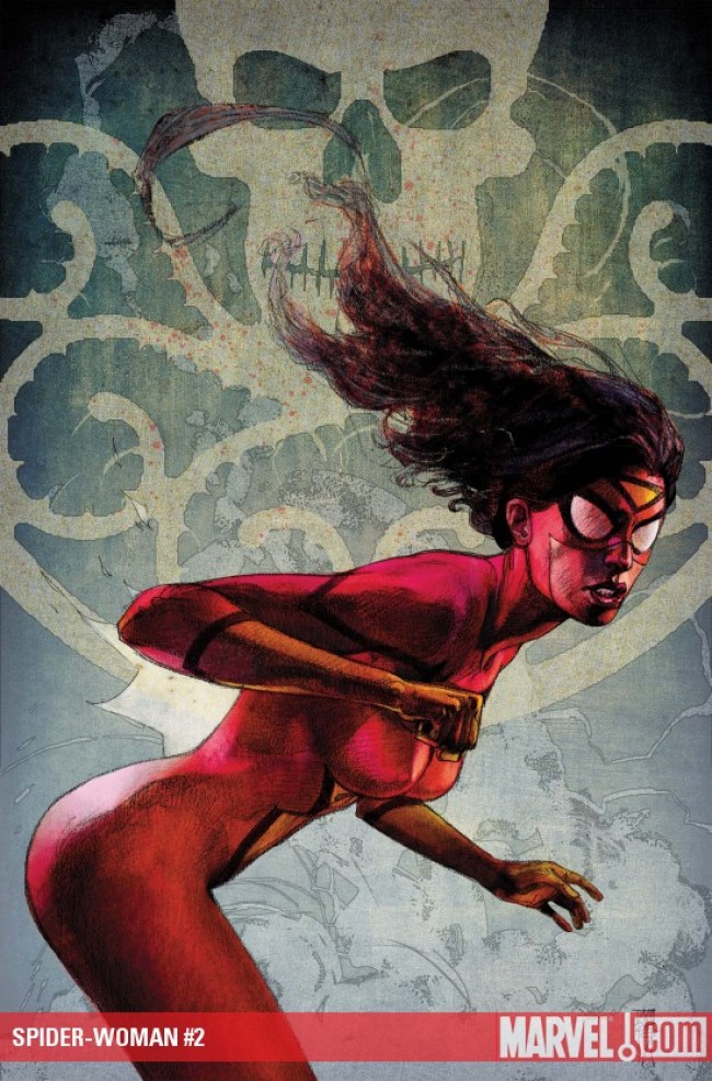
SPIDER-WOMAN #2
Price: $2.99
iFanboy Community Pick of the Week Percentage: 1.6%
457
Pulls
Pulls

Avg Rating: 4.1
Users who pulled this comic:
- 70namrepuS
- ABirdseysView
- aboris26
- abstractgeek
- acbg
- ActualButt
- adrian
- adrianhosseini
- Agent005
- akamuu
- AL13N4112
- AlanRob
- aliensurfer
- AlphaFlightFan
- AmirCat
- AMuldowney
- Andrew
- AngryDad
- Animalvader1
- anrcampbell
- Anson17
- ApesRus
- apoptosis81
- AquaPimp82
- AquariusDog31
- ArchMerc
- arestocomics
- arquilla88
- asigchris
- astoriajohnstons
- astyak
- atma
- austinite74
- babydoll
- bansidhewail
- BarbarianKing
- BatStewie
- bazhorne
- BCGuy
- bcmiller189
- BenBugenig
- benisjamino
- benk
- betrayl
- biftec
- BigNobes
- bigsime22
- bitingthesun
- bizreal1015
- bluedream
- bnicholas1
- bobdoad
- bobstable
- Bobtrombones
- BoldCoffee
- BoogieKnight
- boostergold4
- box19
- braincloud
- Brian
- broderboy
- bryanpittard
- Bryce31
- btljuce
- buffalowhig
- busboy
- bzzzash
- cabernetfranc
- cadiq
- canucklehead
- Canyonwalker
- CaptainSweatpants
- captbastrd
- CaptDS9E
- CaseyJustice
- cav
- chad
- ChrisB
- chrs7637
- chuck
- Chunkahash
- clay
- ClaytonMoore
- CleophusWayne
- ColdVenom
- ComicBookGuy37
- conor
- Constable
- Cooper
- cornflakes
- corpseed
- COWoDOOM
- cprevite
- Crin
- CronyC
- Croz
- csvaccaro
- ctrosejr
- cutty
- cylonpete
- daccampo
- Dan
- danderson
- danlewis410
- darkmage
- Darksud
- darrenjackson
- DDevil1964
- Demo916
- Devastron
- Dietz82
- djb19538
- djgarciarx
- Doctor2Geeks
- doombug
- doomwad
- dopehat88
- DorianP
- DP1982
- drdeeeznutz
- dredscott33
- drew724
- droptop80
- droracle
- dsaint
- dunefish
- dustin
- Eitanman
- ellocomoco
- emissary
- ender1979
- enez
- Eric
- EricDee598
- erikduane
- ERock
- est1864
- esuarez27
- eureka375
- Fantomas
- fenway
- Ferrian
- FiascoRodriguez
- finestjuan
- Finn007
- fleaman
- flounder56
- FluffNFluff
- ford
- FraggleUprising
- Gabe
- GadlenPK
- gandalf25
- Garrett
- gat0rl1vebeatz
- geekmonkey
- genelaw9
- GENX
- georgeXjr
- gettsr
- ghettojourno
- girvan
- gkelljr
- gobo
- goRimbaud
- gothamcentral79
- Gray
- Grayghost
- greendart32
- Grendel1972
- GrendelRK
- grigs
- GROOT
- GungaDin
- hakaider
- halfthai
- HammHamm81
- HankMcCoy
- Harske
- Hawkeye
- HaZaa
- HBD
- hellboy42
- HermitHomeboy
- HerrStarr
- HeX
- HipHopHead
- hoaznod
- Hoshigaki
- ichthyophobic
- iGotKittyPryde
- Ilash
- immortal
- Indycwf
- InfiniteComics
- IroncladMerc
- iSteve
- J4K3
- JackAcid
- jag2004
- james
- JAMESDEAN2020
- Jarrett
- Jasonmatthew
- jdnicho
- jdub
- JediComicFan
- Jedimasterrob2001
- Jeffc
- JFernandes
- Jim
- JimBilly4
- Jimski
- Jinnpo
- joawmeens
- joeycardgame
- JohnnyStooge
- johnthrax
- JonBoy
- jonclifton
- Jonesy
- jonloveless
- jono87
- Joppe
- joseph4587
- josh
- joshbiz
- Joshrector
- JR
- jramsey1
- JRoUKno
- jsbigman
- jtrem
- jtrigg13
- juand182
- junoro
- Jurassicalien
- jwlanglois
- k5blazer
- kaonohi
- KawiRider
- Kaylon
- kbowness
- Kerrizor
- KevinAB
- kevinscomics
- kevsname72
- KidJayson
- killboi
- kingpinII
- krad00
- krypto
- kubrick1978
- kwisdumb
- kymsoke
- Labor
- Lantern1025
- Lauren
- Lelandp13
- Leon
- levitakis
- LexSanz
- lilmikeegee
- lincolnputnam
- liquidfiction
- lucero
- Luthor
- macdad34
- madderhorn
- magnum240
- mansuper
- marc0403
- MarcSpector
- marcushill73
- MarkBiz
- markbovenzi
- martianmonkey
- mc9457
- medz
- Megnolia
- Michael1025
- mikeandzod21
- mikegraham6
- mikeromo
- milez42
- Misfit529
- mitchster
- mlilien
- modbbt
- monkeeeboy
- mountainwindcat
- MPJB
- MrGlass
- MrWilson
- muddi900
- mulletpeep
- Murakami
- musicologist86
- Myrlyn314
- neerdowell
- neftones
- nerdtastic1227
- newtype1089
- nickov
- nilcam
- NJBaritone
- NoFX4021
- Nonraw
- Noto
- Notsoevilsteve
- odare77
- odino1
- oldmanlogan88
- OmegaFlight
- Ongakuhenjin
- Osyris
- paeryn
- Parker
- patio
- PaulAllor
- peterpter
- PhantomPhrenemy
- Pompster
- Popmatic
- PozrDu
- PraxJarvin
- ProjectX2
- PTAhole
- Pumatastic
- pushover125
- PV
- queenrikki
- RadConsv
- rayclark
- redline925
- Reverend13
- reversematt
- richardelgie
- rift1128
- rjw3
- RMC
- roadcrew1
- robbiethegeek
- rockgod27
- RogueWarrior76
- Roken
- ron
- rubra
- rwpos
- SamIAm
- SamMorgan
- Sammy
- Sauceda
- saweez
- scallionsncreme
- scim
- ScorpionMasada
- Seba
- seNoj1
- sethkushner
- SgtSeedy
- shaunbat
- sigridellis1
- SilentRob
- Simps
- siraim
- sithlord23
- skeets
- skogis
- SmokMnky
- snappants
- Soma
- sonnysumo
- sonofrich
- SonorousStar
- southbymidwest
- spacegrass
- spndx
- StarSapphire
- SteenAR
- Stringer
- stustap
- Styjan
- SummerSleep
- Supascoopa
- Superhands
- Sweedy
- target242
- tarrydiggs
- tashiwt
- tastelikeburning7
- tdkelly
- TheAbominableDan
- thecannibalisticvagrant
- theegreatone
- TheGrumpyHatter
- thehorseman
- thelonelight
- TheSecondBatgirl
- theshadetool
- theswordisdrawn
- TheThing
- TheYanni
- throughthebrush
- thunderbird32
- Tiocore
- tittom
- tjnewton
- toddkelley
- Tonyt
- TopGun
- torippu
- trugamer510
- twistedkaijuu07
- twooldridge
- ultimatehoratio
- ungaro
- Unoob
- vadamowens
- Valcyn
- VegasK
- VelcroKing
- vibrolux
- Viewt
- vijay79
- VisionGX
- volzok
- WalkingCalamity
- wangman31888
- wanner16
- wartsandall
- Webhead
- weddleb
- WhiteRedBlack
- whitespyder9
- WildSeven
- willcrimson
- WilliamLund
- wingsfan757
- WinTheWonderboy
- WJWitherspoon
- WonderAli
- Wood
- x2cwaldr
- xebix
- xiseerht
- XsandOhs
- yetihands
- YoSoyJu
- yowellzers
- ytsan
- ZackConstantine
- zakcaldwell
- zayaz
- ZenescopeFan7
- zenman
- Zeppo
All users who pulled this comic
Hide users
%7B%22comicdate%22%3A%222009-10-21%22%2C%22comicid%22%3A11612%7D


Maleev’s art looks best, or better, in the motion comic vs. the printed comic. That’s a fact, it has to be said.
Widesceen laptop images, more vibrant colors. Compared to the small panels squished on the page, and dull colors on the printed page, it’s sad to compare.
There is so much stubborn ignorant refusal without logic toward the motion comic from this iFanboy community. When if this was Quitely’s Batman motion comic, people here would be wetting their pants and guaranteed Conor and the rest would lead the charge towards motion comics. But anything Bendis related here gets crapped on, predictably like a broken record.
Let the record show the art is in fact better on the motion comic.
@kickass I liked the first issue of this alot, and I love Bendis and Maleev, but I won’t be reading (watching?) any motion comic ever, no matter who does it. I can see having to move on to a kindle, or something like that, one day down the road, but a motion comic is just a low budget cartoon. That’s not what i want. If all comics became motion comics only i’d just stop reading them.
I don’t mind reading comics on the computer at all, but motion comics? no thanks, it just looks too cheesy
@KickAss
You’re so wrong, it’s not even funny.
@KickAss: I tend to agree that Maleev’s art looks better on the computer screen, it loses a lot of the detail in the printing process. I think i read somewhere that Maleev doesn’t like how his art turns out in the single issues. I would buy a Online version of Comic Book. But I find the motion comic to be very very silly and at times almost comical. I don’t quite know who they’re trying to reach with theses things besides people who would/do already buy the single issues.
@kickass Wow… you really need to get over yourself. The Motion comic wasn’t terrible, but it certainly wasn’t good. It moved too fast, the motion looked chintzy and the voice acting was… well… terrible, as if the performers did a table read. I couldn’t bring myself to get the second motion comic. I thought it was the source material, but I picked this up because my research interests lie remediation. I really enjoyed the story better in comic form. There was dialogue, a better flow, less glitz and I was able to control how long/short I held on a piece of Maleev art better than any pause button. Quite frankly, I’d be as opposed to a Frank Quitely motion comic as this one. It’s obvious that this was Comic First – Motion Comic second. Sigh…
Let the record show . . .
The truth is . . .
The fact is . . .
In reality . . .
I’m all over this comic.
I watched the motion comic…i didn’t enjoy. Just like I didn’t enjoy the watchmen motion comic.
I prefer the printed form of it.
Really loved the coloring of the last issue.
Not entirely sold on this book yet, hope this one will seal the deal.
I hated the motion comic, I was bored, and it ruined the plot for the 1st issue, I skipped the motion comic and am I know excited for this issue.
The motion comic felt lifeless, and the narration didn’t work when spoken aloud.
Back to the comic itself, I loved last issue. This reminds me of the old Bendis that I love, and that I just don’t get in his Avengers stuff.
Thought the last issue was great.
@vadamowens – i thought it was awesome too. although, i spoiled myself by watching the motion comic first. i wont have a problem with this one though
@mansuper I didn’t watch the motion comic b-c the ones I’ve seen in the past were too stiff and awkward. So I had no drive to watch this one.
good art good story i love this comic. all i can ask for is a new look for Spider-Woman
I want to be buying this, but I can’t justify another title right now.
First issue was super fun and beautiful. Can’t wait for this.
@VisionGX: I’ve always thought Spider-Woman’s costume is one of the best of any superhero.
I think my comic was broken. The pictures didn’t move, the sound didn’t work, and I had to turn the pages manually. All that aside, I still really enjoyed it. Weird.
I thought this issue was a step up from the previous one. I’m glad I didn’t get the second Motion Comic, too. I love Bendis telling the tale of a character ost in a world. (Daredevil, Alias, Ult. Spider-Man) I think his style and the artists he likes working with work better with the intimate than the big picture Marvel. 4/5 for me. "It feels a little… like peeing."
Maleev is so good.
I enjoyed it, but I didn’t love it. I really wanted to love it. A few months back I thought to myself I’d either get this or Batwoman in Detective. I ended up with both, and while I love Batwoman, Spider-woman has not grabbed me the same way. That being said I do have a thing for red heads.
I forgot how great Maleev was. I wouldn’t mind if Bendis dropped all the Avengers stuff to focus on projects like this one
I’m falling out of love w/ Maleev’s work. I realized that his depictions of women out of costume appear to be naught more than a photograph of a woman run through a photoshop filter. Photo reference is one thing, but this doesn’t look like it’s anything other than a straight up photo w/ some sketchy effects put on it. Liked the story just fine, though.
@KickAss
If I saw a motion comic done by Frank Quitely, I’d barf. And I love Quitely. I want to bring him to one of the six states where gay marriage is legal, wed him, and have him take ages to draw me pictures forevermore, but the second it was turned into a motion comic, I’d pull a Mr. Garrison switcharoo and start yelling about the sanctity of marriage (whatever that means). Same is true of the hideous mockery that is the Astonishing X-Men motion blech. My pants are no longer suitable for wearing whenever I even get near my hardcovers of that book thanks mostly to Cassaday’s art, but the MC makes me soil my pants in sheer rage and disgust!
No one here truly shits on Bendis without merit. A lot of us will surely agree that BMB got us back into comics. Those that aren’t on the Bendis bandwagon just aren’t fans of his work; no bigs.
Have you ever listened to a broken record? ‘Cause you seem to be unaware of what it actually sounds like, Mr. Pot, proclaimer of we, the Kettles black.
And the record can’t show your opinion, even if you state it as fact… especially since no one here’s keeping record. Except maybe Prax, holder of mass amounts of knowledge.
@captb – I’m surprised you weren’t impressed with Maleev here, I thought he was at the top of his game, or at least pretty close. Sure its heavily photo-referenced, but the colors, the layouts, the modd, the ambiance – its all there. I picked up the first issue of the Halo stuff he did and thought it was awful; I’m glad he’s back
@cutty
It’s nice looking, but it irks me and takes me out of the book that I can’t help but think I’m just looking at photographs with sketchy lines drawn over them. Maybe I’m wrong, but it doesn’t look like it’s just a photo reference job, it looks to me like actual camera taken pictures with effects put over them. At least when it comes to Jessica out of costume and almost every other woman in this issue. I felt the same thing at times of his Daredevil run.
If I see him draw a page and it turns out he has the uncanny ability to copy with his eyes and paste with his hands when it comes to photo reference, then I’ll never cast a disparaging word his way, but as of now, I hate to say it, but this just looks like Greg Land work that actually looks good.
Don’t a lot of artists use a lightbox though and essentially trace here and there?
@cutty This whole little conversation reminds me of Chasing Amy. "I’m the inker." "So you trace the comics?" "It’s not tracing, I add depth and shading." "Nah man, you go over what he draws with a pen. That’s tracing." 😉
@cutty
I’m sure, but I’m not a fan of it, especially when it’s so blatant. Look at the woman sitting down in the panel where Jessica and the cop are walking past, it has a text box that starts, "And another thing". Are you gonna tell me that that woman’s head and face match? There are panels where it looks like the only thing drawn on Jessica Drew’s body is her shirt and maybe her hair because she looks so stiff and like a photograph. I realize as I think about it that the model for Jessica is credited, so perhaps there is a concerted effort to have the character look like her (or rather, lack of a concerted effort to make sure the character doesn’t look like the photo reference; i.e. a talent in hiding one’s tracks that the aforementioned Mr. Land is balls terrible at), but that doesn’t mean I have to like it.
Here you may be saying, "don’t like it don’t get it" and frankly I might stop doing so. I do think the book looks nice, and I of course love Bendis’ writing, but I am very much taken out of a story when I see things like (what appears to be) an actual woman standing amidst drawn characters.
I have seen both and I love them both.