 Welcome again to another installment of Season One of #Tweetfolio Reviews!
This one will be a bit different: I’ll be doing a portfolio review and then summing up what I’ve learned from doing this experiment as this’ll be the last one with a penciler. I’ll be giving advice for ALL aspiring artists as well. Next week, I’ll be doing one with a colorist and the week after that with an inker.
Here, I’ll be reviewing the work of Jaime Salangsang, whose art can be found here.
Bon Alimagno: Can you tell me a little bit about yourself?
Jaime Salangsang: I’m 31 years old and residing in Manila, Philippines. I have roughly 4 years of experience working in the animation industry here in my country as a Layout Artist. I’m currently working as a Penciler / Storyboard Artist at Storyboardsonline.com. I’ve always had an interest in comic illustration and somehow ended up working in advertising as a storyboard artist.
BA: Who are your influences and what artists do you try to be like? How would you describe your style to someone who doesn’t read a lot of comics?
JS: I started reading comics when I was in high school in the early 90’s so I guess I’m heavily influenced by the artists from Image Comics — the Image founders, I worship them. These days I am inspired by a lot of newer comic artists. My style is somehow semi-realistic, kinda dark and gritty because of the heavy shadows and cross hatching, but I’m trying to lessen it to make it look more clean and clear.
BA: What are your goals in the industry and where do you see yourself in comics in five years?
JS: Right now I’m working as a storyboard artist, but my goal is to become a comic penciler and contribute something to the comic industry like writing stories or creating characters. I’m still chasing that goal and keeping that dream alive. Hopefully 5 years from now I’m already working with the giant comic companies or working with the best writers in the comic industry.
BA: What do you consider to be your strengths and weaknesses?
JS: I guess my strengths are my attention to detail when I draw something, trying to capture its texture to make it as realistic as possible. But sometimes I do tend to over detail my artwork and things get darker, thus losing a bit of focus on the subject. Another one of my weaknesses would be my human figures. Sometimes they’re stiff and lack facial expressions.
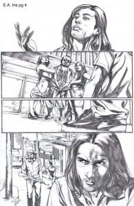
BA: I’ll be taking a look at the work specifically in the March 23rd entry of your blog.
Overall, I think you have a strong toolbox to build a professional career in comics. You have a strong attention to detail and consistent sense of anatomy. Your faces are well developed, especially the eyes which communicate a great deal of emotion. And you take chances with your camera angles that heighten the sense of tension in your storytelling.
JS: I have this small mirror beside my drawing table. Having a mirror beside you is one of the best pieces of advice I got from another artist. It helped me a lot to draw the emotions of the characters for reference. I like what you said about the eyes which can communicate a great deal of emotion. I try to make them look realistic to give the character more expression.
BA: I think you do still have some ways to go refining your craft before you’d be able to get work for a top comics publisher. Here are some concrete steps I think you can take to further your work and move towards your goals:
I think you ought to pull back on your lineweights. Your thick, heavy lines often overwhelm the feel of the page and make it difficult for particular elements to stand out. Pulling back, rendering in much thinner lines perhaps with a looser hand, would give your work a more organic, energetic feel. Right now a lot of your figures are weighed down by the thick penciling and it makes them feel more like statues than actual people. Trust the inker to add the weight and depth that you’re adding yourself in the pencils.
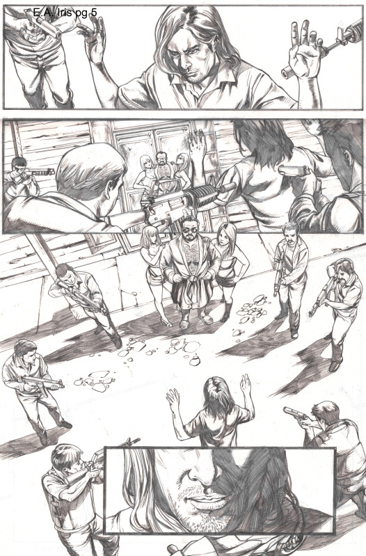 You mentioned your strong attention to detail and I think you ought to pull back on much of your hatching and shading. Instead of adding to the work it makes surfaces, especially faces, appear rougher and harder, almost as if they are carved wood instead of soft and pliable flesh. Much of the textures you’re adding are also giving colorists inconsistent lighting cues that might make it more difficult for them to color off of realistic lighting sources.
And while it’s a small sample size of pages, I like what I see with what you’re doing with your camera, changing up the angles to heighten the tension. But I think there’s basic camera movements you’re not doing. I’m seeing too many shots from directly in front or directly behind the characters. You need to move the camera around the space of the scene more and to really fill out the scenes they inhabit. Otherwise this jumping back and forth from behind and then in front of the characters might end up being too jarring to the reader. Aim for more shots from the side of the action, with smoother side to side transitions holding to the 180 degree rule.
The backgrounds are a bit too inconsistent as well. For instance, the blank background to emphasize the head shot is something you shouldn’t overuse but you use it three times in two pages. Adding some background elements or at least some shading/lighting cues would help better define the character’s location, otherwise we start losing track of how that character is located in relation to everyone else in the scene.
JS: About my line work, thank you for pointing it out, most of the time I have this tendency of redrawing a line or an image because I always (accidentally) smudge my pencil work and I get carried away with the cross hatching. But now that you mention it, I’m going to try a cleaner style with less shading and less hatching. Do you think it would fit my style? Any artists you can suggest I can look up to?
BA: Yes: I’m thinking guys like Scot Eaton and Paul Pelletier. Check out what they’ve done for Marvel the last few years. Their styles are clean but strong and confident like yours.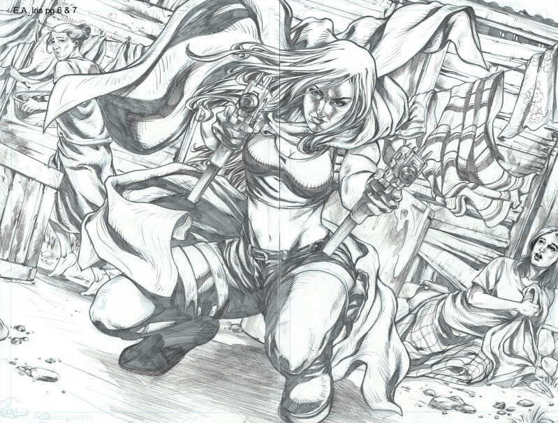
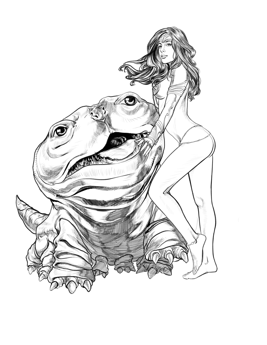
Also: the Dejah Thoris piece you did is a style I think you ought to be using more often. It’s clean yet detailed and lively. If you can replicate that style more often in your sequential work that’d be something that could be a more fruitful path to follow.
JS: Thanks again, Bon, for this review. I learned so many things especially the errors that I’ve been doing that I didn’t notice. I’m going to look for sample scripts and apply all the changes you mentioned. Hopefully in the future I can still send you a link to my latest sample pages and get some reviews again.
BA: Sure thing! Good luck!
***
As I wrote when I first started this column, #Tweetfolio is meant to be an experiment: I seek to simulate the portfolio review experience for artists who might not be able to make their way to a convention for an in person review. Does it work? Honestly, I wish I had more time to really drill down into the pages I’ve discussed in this column. My in person portfolio reviews tended to be intense 10-15 minute conversations. Sometimes I’d point specifically to panels and ask point blank questions about what an artist was thinking. Sometimes I’d even act out the camera angles and camera distances I thought would enhance the storytelling. Way I looked at it, someone may have traveled a heck of a long way just to get this little sliver of my time, and I better make it useful and worth the trouble they took to make it out to the con. I tried to do my best to recreate that experience here, but I think largely just scratched the surface of what this column could be. There’s only so much you can do over email.
I also wanted to draw back the curtain on something that seems like a mystery to many artists: how does one even get a portfolio review? I hope readers of this column can better understand now what sort of art I’d typically look for to personally review, where I’d set the bar in terms of quality. If the art wasn’t at the level you’ve seen in this and the previous three columns I would likely not have picked it at a show for a portfolio review. It’s a two way street when it comes to how time is spent. Just as I’d value an artist’s time, I also frankly didn’t want to waste my time if I thought 10-15 minutes with me would not be enough and if more work, fundamental work, needed to be done. Now, this of course doesn’t mean that if you didn’t get selected for a portfolio review that you have fundamental problems with your work. But it may mean you still didn’t clear a bar I’ve set. (And let me emphasize this is my point of view and something I always tried to tell artists is I could be wrong, I could be completely off-target and to find and listen to someone who’s advice spoke to their needs if mine did not.)
Aspiring comic book industry artists, I’d invite you to make an honest assessment of your work. Take a look at the artists I’ve selected, see what I’ve pointed out, what’s good and what may need further development, and see if any of those pointers apply to you as well. And be honest if there is a genuine gap between your work and what you’ve seen in these columns and endeavor to close those gaps.
Readers of this column may have seen there’s a small handful of notes I tended to repeat in my portfolio reviews. When I first joined Marvel, CB Cebulski had give me his core notes, repeated elsewhere including one of the Breaking Into Comics the Marvel Way specials, and over the two years I was there I refined them with my own voice and perspective. These notes I would often give as is to 85% of the inquiries I’d receive as I felt these were enough and nothing more could be added till these issues were first addressed. Perhaps some artists might find them useful so I repeat them here in full.
*When doing layouts, stick more to the grid.
*Don’t break panel borders. Instead of giving more importance to the objects breaking the panel, it distracts the reader’s eye and interrupts the flow of the story.
*Change how close and how far away your camera is from the action. You are using mostly one distance from the action and it makes the story feel static. Make the reader feel like they are there in the scene with them. Move the camera around so the readers feel like they are moving around with the action, dodging out of the way of the characters, looking over their shoulders, knocked down and looking up at them etc. Pull the camera out to show more of the figures.
*Include more backgrounds to give us a better sense of place.
*Work on your anatomy to render more realistic and three-dimensional figures that pop off the page.
*Loosen up the poses and facial expressions of the characters. Many look a little too stiff or are facing either a 45 degree or 90 degree angle toward the reader. This gets noticed and may lead the reader to become unexcited with the storytelling.
*Try to draw the most exciting second of actions. It’s not enough to draw what is happening, but to capture the exact second when things are most exciting so the art is most exciting. Imagine what a sports photographer would look for if they’re trying to photograph a football game. What would be THE shot that would land them on the front page of a newspaper. This doesn’t have to be every panel but makes the story more dynamic and active. The reader then imagines the actions that led up to that panel and the ones afterwards and engages them more with the story.
***
So that’s it for now for pencilers. Please join me next week when I do a review with a colorist. In the meantime, feel free to send over your questions and comments below and through my twitter account at @karma_thief.


Great review! I agree….That Dejah piece is stellar.
Definitely should be drawing some beautiful comix!!!