 Welcome to the first installment of Season One of #Tweetfolio Reviews!
For those just coming across this column for the first time, please check out my intro column for more background on what I’ll be doing in this space.
First up is Ibrahim Moustafa (on Twiter as @Ibrahim_M_) whose work to be reviewed can be found here:
Bon Alimagno: Before I give my comments, I’d like to tailor them to your specific goals and interests. Can you tell me a little bit about yourself?
Ibrahim Moustafa: I’m 27, and I live in Portland, Oregon. I’ve loved super heroes since I was a child, and that love caused me to rediscover comic art about 10 years ago. I’ve been reading comics actively for about 7 years now, and honing my skills as an illustrator for about 3 years. I’m currently drawing a book that will be published through IDW in the fall (the bulk of the black and white sequential work on my site). This is my first work through a major publisher. It is a creator owned book that I was hired to draw the second volume of.
I’d really like to be a part of a long series like Scalped. Something that is a fan favorite, a critical success (regardless of sales numbers), and that is considered to be a series that “matters” in the grand scheme of comics. I have a strong work ethic, and I’d like to be known as someone who is reliable, and can produce good work without ever missing a deadline.
I’d say that my influences (some in drawing and some more so in inking) are Alberto Breccia, Milton Caniff, Alex Toth, Stuart Immonen, Alex Ross, Chris Samnee, Dan Panosian, and Sean Murphy.
Last year, I wasn’t ready. When looking at some of my older work, Mark Chiarello pointed out an issue I was having with anatomy, and that I was being a bit too liberal with my panel layouts. It was excellent advice, and I’ve since done my best to rectify both issues. I was also able to get a review from Bob Schreck, who told me that I should try inking with a brush, (at the time, I was using pens). That advice quite literally changed my life, sending me down the rabbit hole to discover some of the greats like Toth, Caniff, Breccia, and others.
This year at ECCC, I had the chance to have another review from Bob Schreck. He had nothing but nice things to say about my work, and was happy that I’d taken his advice on inking. Needless to say, that was probably the highlight of the convention for me, as I have an immense amount of respect for him.
One reviewer told me that in certain instances, he thought that I was mixing textures too much. Citing examples of areas where I was using both brushwork as well as utilizing pens for the finer details. I also received positive feedback on that very same thing from someone else. So, I’ve tried to find more of a balance point with it, still using the technique, but trying not to overdo it.
BA: Honestly, I’m impressed by your work here. It’s professional and polished and demonstrates a mature handling of the medium.
I’d say you could, and really should, be working regularly within the comics industry at a high level. How would you describe your style to someone who doesn’t read a lot of comics?
IM: I would describe my art as a sort of “stylized realism”; fairly realistic with some simplified, more representational cartooning elements.
BA: Your style is developed enough to hold its own at the biggest publishers, including Marvel and DC. The grim reality though is the economy has forced even the Big Two to scale back their lines, presenting fewer opportunities for newer artists to establish themselves. Meanwhile artists who are in regular rotation or under exclusive contract will end up taking what opportunities there are for styles likes yours.
Your style as is would narrow your options at Marvel and DC though. The easiest places where I can see you fitting are on books such as Daredevil where Paolo Rivera’s clean, classical style has re-anchored the title’s look and feel from the grim and gritty styles of the last few decades. Your style would definitely be a continuation of that direction. But it’s not like Rivera and now Chris Samnee are going anywhere. I’ve seen a few new Vertigo projects like Saucer Country with Ryan Kelly, utilize a cleaner style as well and there will certainly be openings at Vertigo, depending on the creator and project. So your working on creator owned books already is a good path to take as the avenues that would fit your style rarely exist right now at Marvel and DC.
 How long on average does it take you to pencil and ink, say, 20 pages at the level of what is in the link?
IM: I can pencil and ink one page in a day. Sometimes, depending on the complexity of the pages, I can squeeze in 1.5-2 pages in a day, fully inked. Other times, a highly detailed page might take me a day-and-a-half. “A day” is relative, of course. They’re typically 10-16 hours. So, 20 pages is likely to take me 21-25 days. It takes me an additional day to color a page. So, roughly 42-50 days for an entire issue, all the way through to the colors.
BA: The ability to maintain a pace like that over an entire arc would give you an edge over artists with similar styles who may be slower. Editors in the comics business remember the artists who solve problems and a production rate like that could solve, many, many problems for a lot of them. Now being able to deliver pencils, inks and colors in one package like that in that time frame, is yet another plus for you. But being able to complete 20 pages of lineart in four weeks is a magic number that will open a lot of doors for you at every level of the industry, so you may be discouraged from coloring more often than not.
For the colored pages on your site, were you deliberately going for a muted palette to fit the story or is that how you most often color?
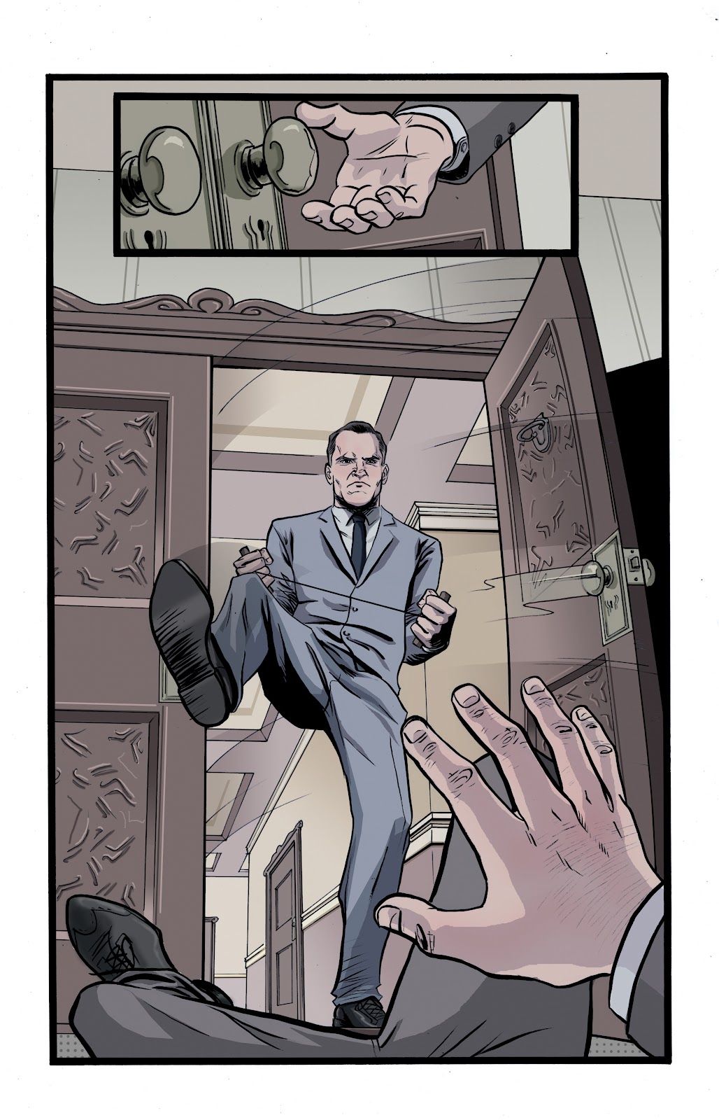
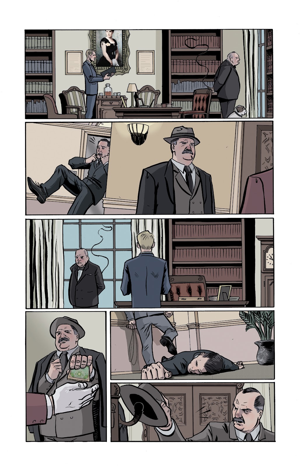
IM: I was definitely going for a muted palette. The story is about an assassin in the mid 1940’s, so I wanted it to feel a little cold, due to the subject matter and the era in which it took place.
BA: Your coloring style is well developed, too. The muted palette works for these particular pages but for superhero storytelling the coloring would need to be warmer so the pages feel less flat. Your palette is good, you separate foreground and background elements well, but saturating certain foreground elements at just the right times would add a little pop necessary to fit on most Marvel and DC projects. Take a look at folks like Matt Hollingsworth, Matt Wilson, Chris Sotomayor, Val Staples and Matt Milla, guys who’re able to find that excellent balance, adding depth in coloring even while when they play off clean line art.
I like how you listened to Bob Schreck about going with more a brushed inking style, as using pens over your clean lines would make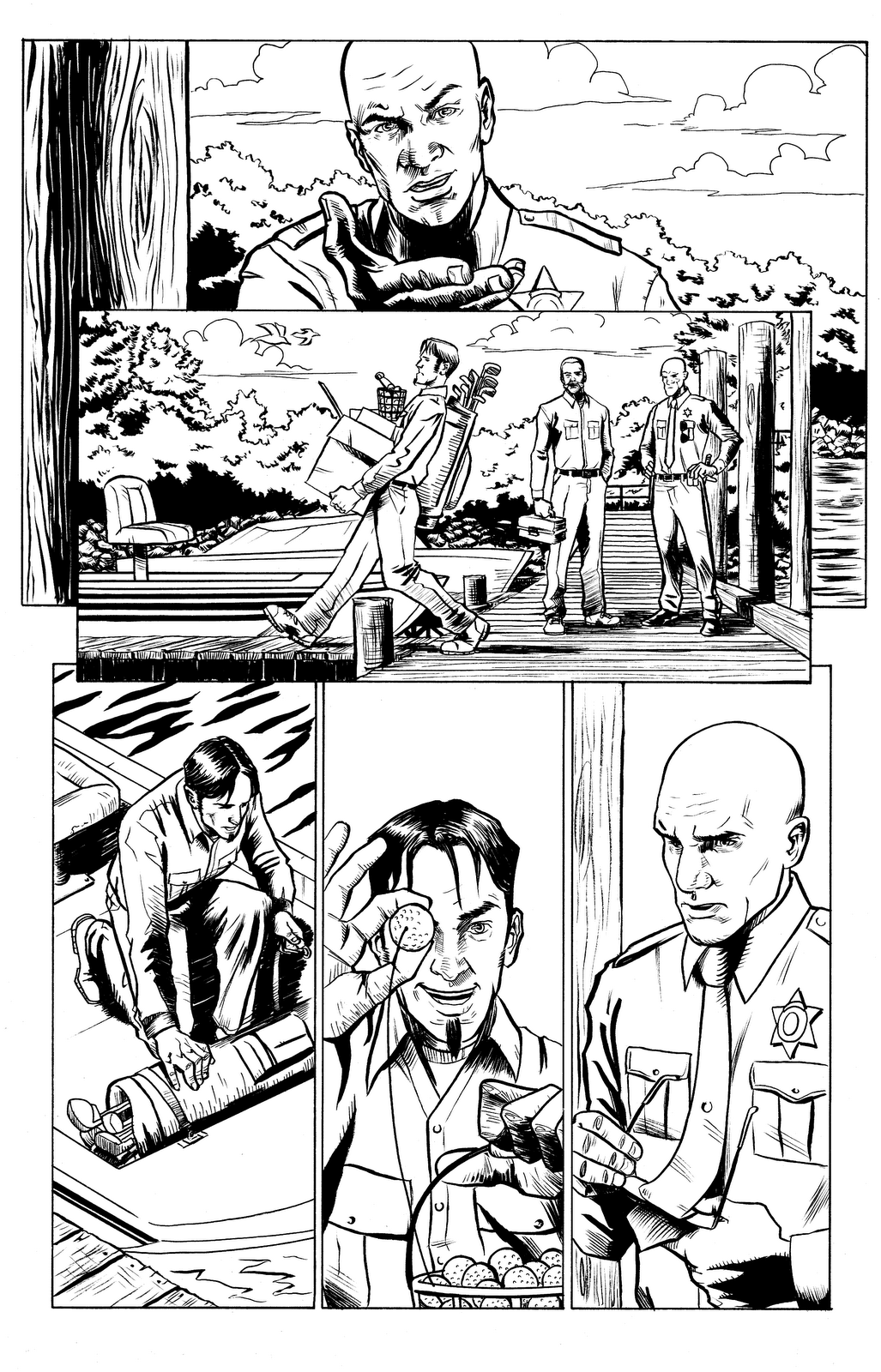 the work overall look stiffer and less exciting. Brush inking added a whole new layer to your work, making it feel more lively and organic in nature.
You need to carry this further into your camera angles and layouts. That’s the biggest hurdle you need to jump to get to the next level. Far too often we’re viewing the action in straight-on shots and from the same few camera distances. You need to vary your camera angles and camera distances from the action — make the reader feel like they are not just watching the action but participating in it. Present the reader with camera angles that make them feel like they are looking over a shoulder to overhear conversations, running away from danger, dodging out of the way of a kick or a punch. This will play off your clean style to add a more electric dimension to your storytelling. Think of how artists like Stuart Immomen, Cameron Stewart and Victor Ibanez use deceptively accessible styles, but it’s their storytelling that really brings the readers in.
And this is something I’ll be encouraging pretty much all the artists I review to do: reach out to online art collectives like Comic Twart and Ashcan All-Stars to act as showcases for your work. What’s interesting about blogs like that is how every theme the artists tackle becomes a new opportunity to show off new tools in their toolkit that they otherwise wouldn’t be able to show. Taking opportunities like that to show off all your different styles will allow you not to be pegged by one particular style that could pigeon-hole you too much.
IM: And I can’t tell you what a huge help your camera angle advice is. That is something that I’ve been trying to become more conscious about, and have really taken notice of. You were able to articulate it in a way that makes it much easier for me to assess.
Your review has me excited to get into the studio tomorrow and work on more pages, implementing your advice. I think that is characteristic of a job well done on your part. So again, thank you so much for devoting your time to this.
BA: Thanks for putting yourself out there like this and participating! Please keep in touch!
Hope you enjoyed this installment! Feel free to keep in touch with me in the comments below as well as on my @karma_thief twitter handle.
Please join us in two weeks for another #Tweetfolio Review!


Those are very professional looking pages. Nice work Ibrahim. And great review, Bon. As someone who tinkers with drawing his own scripts, I really appreciate the advice regarding camera angles
This is a great column. Thank you, Bon.
Those were some good looking pages, Ibrahim. Good luck!
good luck Ibrahim and Bon, a fantastic article. Cheers
Love this. Can’t wait to see more of these! And best of luck to Ibrahim. A great talent!
I really like your work Ibrahim, looking forward to seeing it on the shelves!
Thanks for the kind words, everyone!