Sometimes I wish I could show these covers to George Washington and Thomas Jefferson just to see how they’d react. But in the end, does it really matter what those guys think? They’re just named after presidents.

Hawkeye #3
By David Aja
I’m still not in love with the title logo, but this month’s composition has this whole Battle of Algiers things going on. Wait. Nevermind. I just googled it and those aren’t even close. Anyways, this is a little like Saul Bass doing a poster for the Olympics or Hunger Games or a cross-promotion between the Olympics and the Hunger Games, which is somewhat dubious, but still fun. Anyway, it’s a trip.

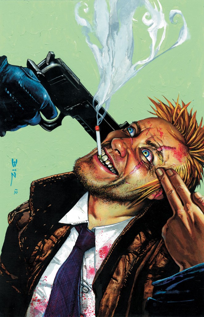
Hellblazer #296
By Simon Bisley
Bisley knows from crazy. His Constantine shows the wear and tear of decades meddling in the arcane, without and within. Poke around in this one and the color and texture are just unreal.

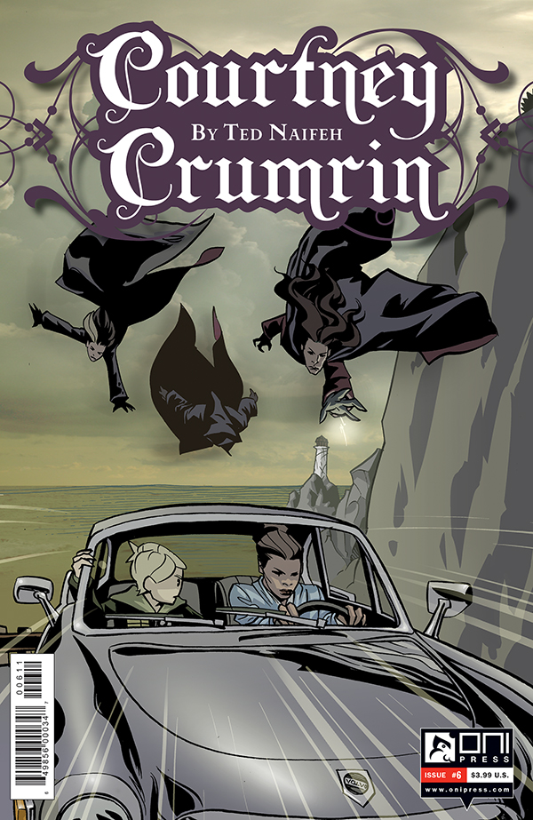
Courtney Crumrin #6
By Ted Naifeh
The momentum is wonderful and the subtle 3D elements do so much to enhance this moment of action. It reads like a still from an animated feature I’d desperately like to see.

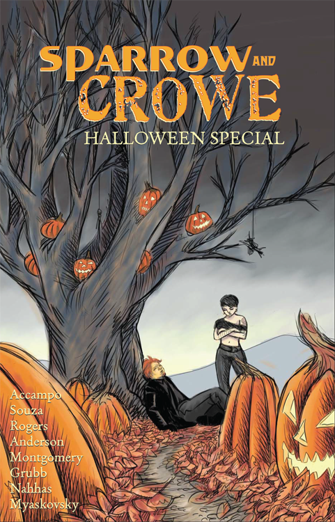
Sparrow & Crowe Halloween Special
By Jared Souza
Full disclosure, I have a story in this one. But there’s no conflict of interest here as I’m wholly devoid of shame. It was also nominated by someone other than yours (mostly) truly. But can you blame me for highlighting this gem? I’m so taken with the color, the play of warm, autumnal reds and oranges against the cool of the earth and sky. The perspective is also quite unusual with that low, distant vantage point. A spooky scene for a spooky book. And what handsome names adorn it!


Bisley is a bloody Genius!!! Love that ‘Blazer!!! =D
Really – what’s with all the Hunger Games references. That shit was terrible.
The covers here are all pretty good. Bisley is a monster – have loved his stuff for a long long time. The Hawkeye cover is very cool. Its simple and yet deceptively deep.
Hunger Games, like it or not, is part of the cult of archery so pervasive in pop culture this year. Me, I thought it was fun.
I have been a fan of the Hunger Games books for a few years now. Just because they are popular YA novels doesn’t mean that they suck.
i dunno man, i kinda liked the hunger games more when it was called “battle royale.”
I agree with mark. Tramps like us were born to run.
Battle Royale is an all-time favorite, but not particularly known for the bow and arrow motif. Now, if the cover featured a severed head with a grenade it its mouth or the lid to a sauce pan, we could talk.
loved the Hunger Games. Thought there was more actual story and characterization to it that Battle Royale.
The archery popularity thing is kinda crazy. The Olympics covered it A LOT more than usual this year.
Read the book and/or manga for Battle Royale. It’s one of the most character rich stories I’ve ever read.
i had no idea Battle Royale was a book. Like most Americans, i’ve only seen the movie. =p
Like most Americans, I have not seen the movie because it’s subtitled.
That Courtney Crumrin cover is excellent. Nice sense of speed and danger. I haven’t read an issue in almost 10 years. I think I’ll revisit it, see if it’s still up my alley.
it is a really nice cover. the witches — are those witches? i’ve never read this book — remind me of bone. now i really want to reread bone.
@Mark: It’s nothing like Bone but it’s great in its own right.
Finally Hellblazer gets some love!!
The Sparrow and Crowe Halloween special is good stuff. The last story is genuinely creepy. Twilight zone style. Paul’s story is a lot of fun.
The ultra-simplified logo on Hawkeye’s chest for this series looks like a comic book opening up.
great selection of covers. I’m right there with you on the the logotype on Hawkeye. I really don’t like the font it appears to be based on (Chalet) just because it got played out ridiculously a few years back when it first dropped. Has an inherent british/mod kinda style to it, which i don’t really get for this story.
i get the british mod part, but i like this logo. other than maybe phonogram, has anyone else used chalet in comics?
i dunno if its been used. Its one of those fonts i usually avoid for a lot of reasons. also, I just saw it on Fischer Price baby product packaging over the weekend, which i found amusing.
I also don’t like the scale of it on the page. Seems too small.
@ paul – disproportionate scale is not necessarily a bad thing. to wit:
http://www.dotkite.eu/wp-content/uploads/2010/06/Think-small.-February-22-1960-VW-Beetle-ad.jpg
In some cases, sure.
hmm well i’ve never seen the book in print so i dunno. I thin its a pretty good sized logo, but I can see how one might view it as small, especially in context of comics…most of the mastheads tend to use up most of the top space.
ugh. just realized i used the phrase “to wit.” sorry. didn’t mean to sound like a pompous douche there.