The weather outside if frightful, but these covers are so delightful.
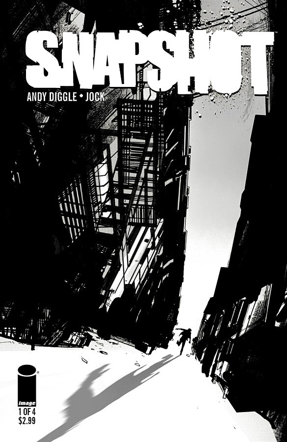
Snapshot #1
Cover by Jock
It’s like Scalped’s city cousin! Right? Dig the sense of vertigo (no pun intended). And the fact that optical illusion of that sliver of sky. From this curious angle, it almost looks like a bolt of lightning bearing down on our hero.
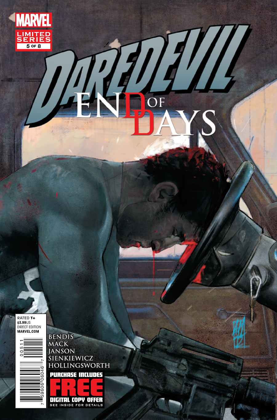
Daredevil: End of Days
Cover by Alex Maleev
Well, right off the bat, that’s not proper hand position on the wheel. 9 and 3 o’clock.
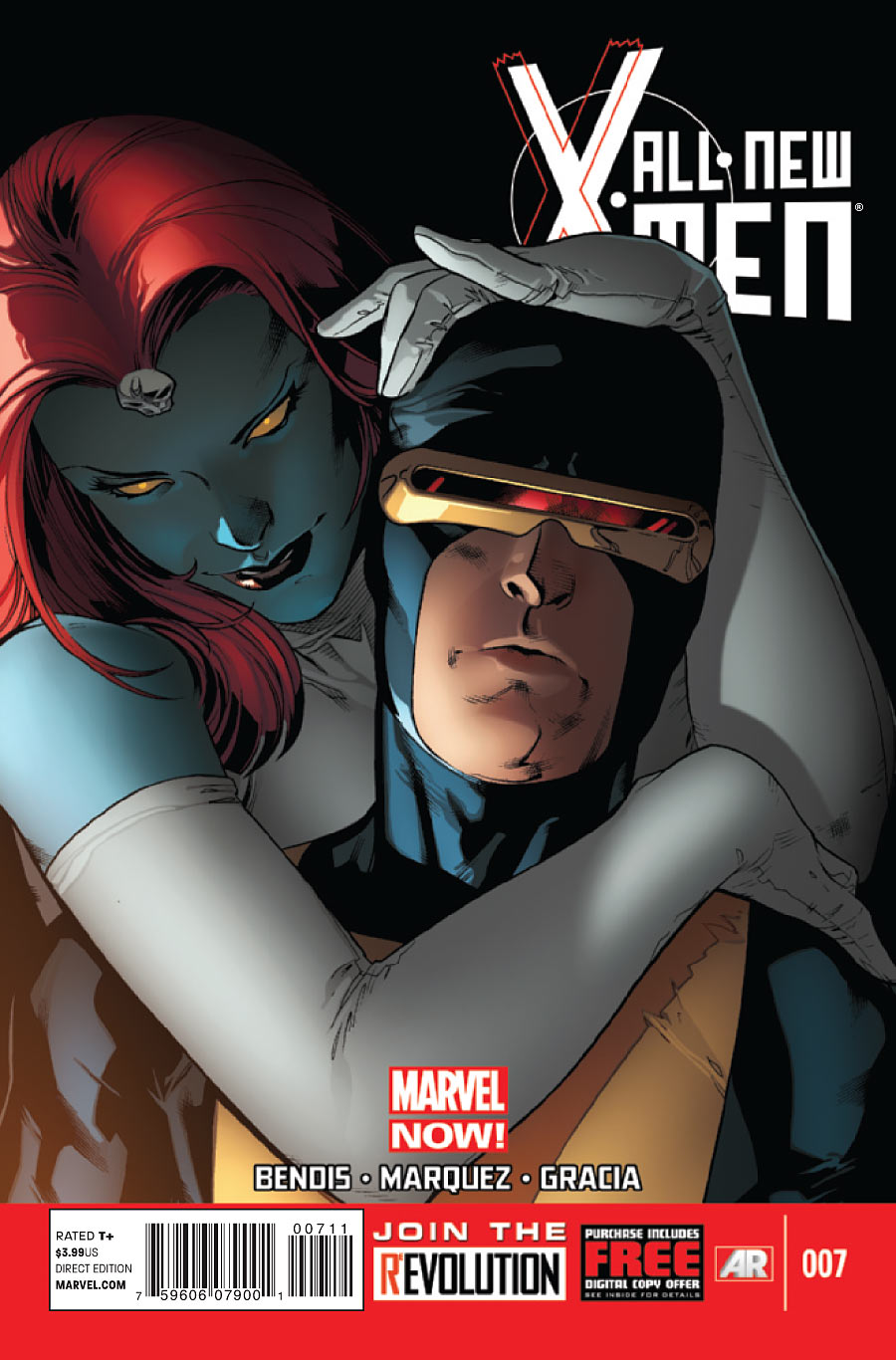
All-New X-Men #7
Cover by Stuart Immonen
A perfect encapsulation of this month’s story. Mystique is meddling. Mystique is playing the serpent of Genesis in a subtle seduction. Scott’s blank expression, the tilt of his head, and Mystique’s flirtatious headlock make this all so Raven.
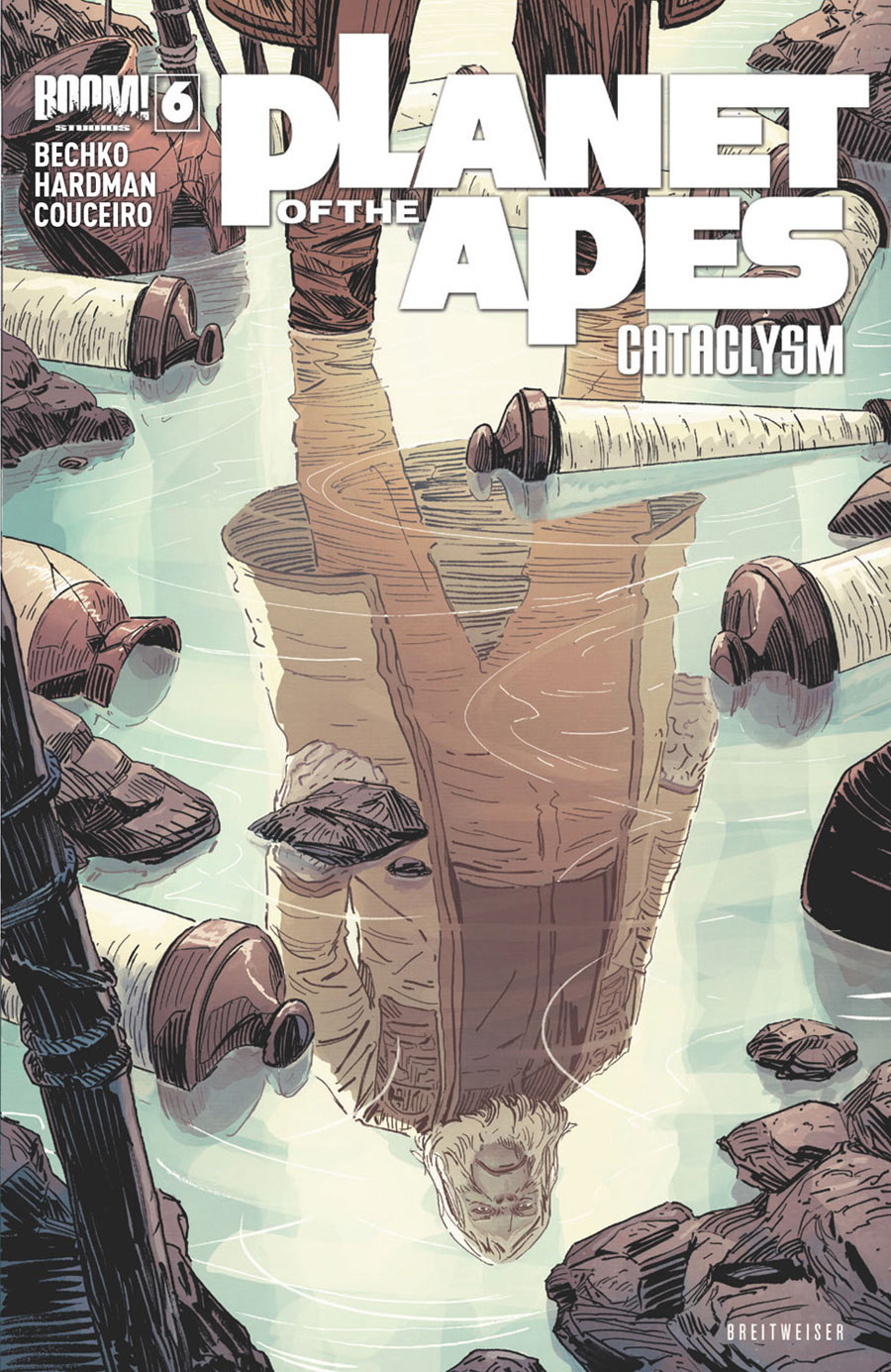
Planet of the Apes: Cataclysm #6
Cover by Mitch Breitweiser
For the Ape Planet’s theocratic ruling class of orangutans, the Lawgiver’s mandate is everything. Whether they fully believe it or simply struggle to maintain the theater of it all. A Cataclysm such as this has effectively turned their world upside-down.
<hr>


I almost missed Snapshot but Im glad i caught this book when I did.
Love the “It’s So Raven” reference Sir Paul!
I think the lighting is what impressed me the most on that All New X-Men cover. I can imagine that David Marquez’ relatively open line art really allows a colorist to cut loose. I dig it.
Hey Alex Maleev, I know I’m a guy but you wanna try and make babies together?
I thought the Green Arrow cover would have been in here… thought it was bad ass and made me wish Hi-Fi would have colored the interior art as well.
I love that Planet of the Apes cover. It makes me want to sing the Dr. Zaius song from The Simpsons.
I totally thought Crow would have made it this week.
…..maybe I”m the only one who reads it.
But seriously the cover was creepy fantastic.
That cover was really evil looking, good stuff.
Good choices, I love the Snapshot cover. I really do think there should be a few more each week cause there’s a lot of good stuff of there, great art on many covers, they all might not be great inside but this column is to spotlight the cover art anyway right? I always look at this list and enjoy seeing covers of stuff I read on here and seeing other ones again that I thought looked cool or ones I hadn’t noticed but am always left wanting more from this page in an unsatisfied way. We get more than this in best of panels…..cpl solid covers I thought deserve mention: Earth-2 #9(was just in your face colorful and intense), Snake Eyes & Storm Shadow #21(subtle death,Storm Shadow standing off to the side with a cover full of bodies with arrows in em), Ultimate Spider-Man #20(Miles trying to get out of Venoms symbiotic back of goo stretching it towards freedom looked really cool with they’re black costumes on a white background), and The Phantom Stranger ( which seriously should’ve just been on here period. Jae Lees Spectre going through the strangers mouth & eye was just beautifully creepy, and can’t believe they had the nerve to put a stupid banner on that one.) Those banners are an insult to artists.
I agreed, the Phantom Stranger cover is wonderfully imaginative and well executed. And Dial H #9 is another stonker from Brian Bolland.