UNCANNY X-MEN #523
What did the
iFanboy
community think?
Pulls

PENCILS: Terry Dodson
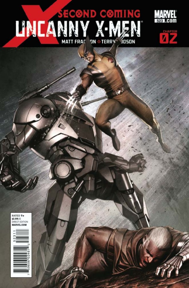
COVER BY: Mike Perkins
Size: pages
Price: 2.99
I don’t read x-books. I watched the cartoon as a kid and I read Whedon’s run on Astonishing ’cause it was Whedon (and conveniently it was also amazing). Otherwise, I’ve never been tempted to try read any x-books at all. I only picked up Second Coming #1 last week because of how light the week was for me. I liked it well enough, though and quickly added it to the pile of comics that we’re good enough to give away, if not actually save for posterity.
This week was a big week for me though, fifteen books, but I still managed to talk myself into picking this issue up. Something about the banner won me over, along with the idea that all the issues presented a chapter. As dumb as it might sound, for some reason I felt like this run would look good in a long box, and suddenly I was completely sold on the idea of becoming someone who reads x-books.
And not just a few books either. Reading over this checklist at the back of issue two, it looks like I’m gonna take a tour of seven different titles between now and July. This, dear x-books, is your chance to win me over. Make the most of it.
So far, I’m in. I really like how Fraction is handling all of these relationships while creating a strong since of urgency and emergency for the situation. I like the sense of momentary relaxation we get of Hope and Cable relaxing in the hotel room, particularly Hope crouched in front of a mini-fridge gunning what appears to be chocolate milk, though it would be nice if she were drawing a little more obviously younger – I get the occasional nagging feeling from time to time, ‘wait, are her and Cable gona hook-up?”
In general I liked the art, though there were a few points that were kind of hilarious though, like Cable reading the newspaper, which is as close to being blank as possible, excluding one box with giant bold font that tells both him and us exactly where the plot is heading next. There’s also a close-up of Wolverine towards the end, the business end of two guns pointed at him in the foreground, him ready for action in the center of the frame against a completely white background…..in the middle of a battle taking place outside at night – I don’t know that it could feel more out of place.
This was good though and I’m gonna stick with it. Speaking as a non-x-men fan, Second Coming seems pretty jump-on-able and people should check it out.
Art: 3 - Good


Leave a Comment
Login or Register to get involved and leave a comment