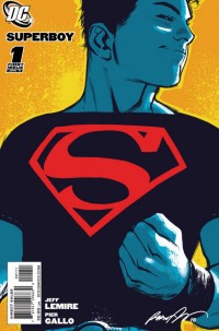
SUPERBOY #1
What did the
iFanboy
community think?
Pulls
Art by PIER GALLO
Cover by RAFAEL ALBUQUERQUE
Variant cover by JOHN CASSADAY
Size: 32 pages
Price: 2.99
Listen, I love Jeff Lemire but from judging by what we’ve seen so far – superheroes just might not be his thing.
Of course, it’s still early in his career dealing with them, but after being unimpressed with the various Atom stories, I was still hoping that Superboy would be a winner. The internet and comics fans are alight with glee thinking about Mr. Small Town writing about Smallville and the quieter side of American Life. I was excited to finally have a Superman-related book that I would be buying and loving.
But this issue just fell flat for me.
Now, the writing is ok. It’s not as effective as a lot of Lemire’s writing, but it works. The inner dialogue isn’t bad, the interaction between Connor and Lori is good, but there is nothing here that rings special to me. Even Lemire’s ability to communicate so well without words doesn’t really exist here. It just sort of reads like a mediocre pilot to a new CW program.
On the story front, there’s still not enough to judge here. Parasite is a pretty big deal to be handled so easily, and where the story ends with a certain character has me scratching my chin – but it doesn’t really have me pumped. The interaction with Ma Kent (and the subsequent “flower” layout on that page) is confusing and not really that meaningful.
It could all be a setup issue and listening to Lemire on “Don’t Miss” this past week still has me excited for where this comic might go, but I’m definitely not impressed with it so far (and to be honest I don’t understand the people who are giving it Pick of the Week and 5 stars across the net).
And then the art. I guess it’s pleasant enough, but the character design and in particular the design of Connor is terrible. Talk about a goofy looking guy. I mean he looks as goofy as oldest kid in Locke & Key, while everything else around him is done fairly well. The jeans are like 80s mom jeans, the shoes some nondescript brown blocks, the face all squished and doughy, the backpack that is made for a 5-year old and not a 6 foot something superhero, slung over one shoulder like it’s 1992. And the glasses. What the hell is with the glasses? When the nerdy/genius sidekick is dressed more fashionable than the main character, who is supposed to be this alpha male – there’s a problem. The backgrounds, the city’s, the fight scenes are all good. Just everything where Connor is standing around makes me gag. I understand this is Kansas – but CMON
Wish Lemire could draw it.
Art: 3 - Good


Leave a Comment
Login or Register to get involved and leave a comment