KICK-ASS 2 #1
What did the
iFanboy
community think?
Pulls

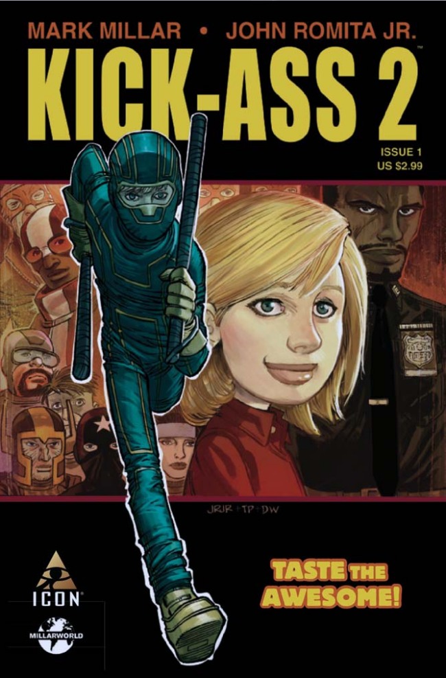
ART AND COVER BY: JOHN ROMITA JR.
Size: 32 pages
Price: 2.99
This Review was first published on my Blog – http://tombloggs.tumblr.com
I adored the first Volume of Kick-Ass, its over-the-top violence was something that wasn’t really explored in comics, and therefore it was something new and ultimately, fun.
This love continued onto the film, directed by Matthew Vaughn, which took the style and relatability to a whole other level. It is easily the best film of 2010 and closely follows the story told in the Comic Books (apart from Big Daddy being a little more realistic in the comics, and the same with Dave’s love life).
As you can imagine loving something as much as that kind of sets up high hopes for the sequel. And, even though we are only 1 issue in, I can tell this Volume is going to be better than the first.
Here’s why:
Mark Millar’s writing is the same greatness that was in the first Volume, using just one foul word to tell a huge amount about what the character is feeling and how they are reacting to what’s going on is what makes him one of the best. Now that the first Volume has been out in the wild for a while and everything from a Movie to Mugs has been made, I feel as though Millar has a better understanding of the Characters he has created and even the world in which they live in. Thats shown when Mindy (Hit Girl) obeys her Mum and Step-Dad and promises not be Hit-Girl anymore, and to have a real life. The next logical step for the Character and leaves you wandering how the world will cope without her killing machine alter-ego. How long will that last? We’ll find out. My guess, an issue… maybe 2. But she will be Hit Girl again, it just wouldn’t be Kick-Ass without her, and it wouldn’t be Millars book without her.
The visual team of John Romita JR, Tom Palmer and Dean White do an amazing Job and comparing the art from Volume 1 to Volume 2, you can really see how much it has evolved, but still maintaing that wonderful and established style. Everything seems grittier and more solid and you get more of the sense of pain and hard-hitting action than before. Therefore, the fact that JR JR has stepped down a level and let Tom Palmer finish the final lines and look of the artwork has benefited it hugely, but again, still keeping the same JR style that we know and love. A lot of credit for the Comic’s overall finish needs to go to colorist Dean White. His colors have developed so much since the first Volume, everything looks a whole more vivid and characters stand out way more on the darker grittier backgrounds he has colored so beautifully.
So… Yeah… this Comic Book is my favorite and arguably the best of the year so far. Which is a huge statement to make, but I back it up fully. It gets a full 5 outta 5. It sets everything up nicely for the rest of the Volume and has an awesome reveal which will give you goosebumps.
This review was first published on my Blog – http://tombloggs.tumblr.com
Art: 5 - Excellent


Leave a Comment
Login or Register to get involved and leave a comment