DRAGON SISTER GN VOL 01
What did the
iFanboy
community think?
Pulls

Size: pages
Price: 9.99
This review contains spoilers, click here to read
This is something that I bought since I wanted a good manga that wasn't already at book 21 which so many mangas seemed to be. Also because a lot of things seemed to be about either relationships or homosexual relationships, and my cold dead heart craves violence whether action or a murder mystery.
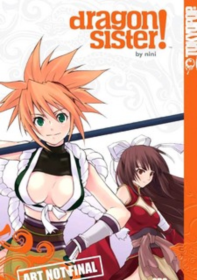
The small paragraph about this manga interested me enough and the cover helped - if I hated this manga I at least had a picture of nice breasts. I'm not one to buy anything with breasts on the cover, but this looks good to me, and if I don't think too much about it I can convince myself those girls aren't underage...
In the back cover in the bottom the rating states this is for ages 13 and up which is a rating system I hate, but here they at least specify why, and they place it in the action genre, and the top places it in the action/comedy genres.
This is read from right to left which is something I'm used to but I was still confused at first, and I wish they would have printed the guide that is in the end - that tells you in which order to read the panels - in the beginning as well. Without that manga video show iFanboy did I would have probably stayed confused for a while since I'm used to reading from right to left and wouldn't have accidentally tried to read it from the end and found the guide.
The drawing is alright but the style of the word balloons sometimes baffled me as to who was speaking. Word balloons that contain what someone outside of the panel says don't have tails for some reason.
Not all of the onomatopoeias have been translated but most of it was translated, and some of the translations ended up in weird places - like a thought text that was printed on the drawing without something bordering it.
Some of the transitions between panels is really weird and the drawing isn't good at showing when there is a flashback, but there's only one (I think) so It's okay.
Since this is black and white, gray is needed sometimes so there are lines and dots that are aligned in a certain way that seem machine-made.
The translation of the onomatopoeias is a little weird, for example there is one where it says "COUGH COUGH COUGH" and it's done in bold capital letters and maybe it's the fault of the translation - that it seems to have lost some dynamic nature. There is also one example where it says "whisper whisper" in a panel where two guards are whispering but it's so obvious it doesn't require onomatopoeias which is something some letterers do - write unneeded onomatopoeias or write something so long that trying to say it will make people think you're having a fit.
It seems like this was meant to be animated but I guess you can say that about any manga, but the use of the platform is not so good and somewhat confusing, and maybe some of that is because of the translators or the letterer.
Also there are a couple of major groups who I thought were allies until the end where it was shown they are against each other.
Before the comics there is a short and boring text about the three kingdoms - this is a comic about war and trying to control China.
The plot is weird - there are three brothers and one of them meets an old guy that pops out of nowhere and gives him a scroll that with it he can bring peace to China but they decide instead to take all the power from the people with it and to control them, but (reminding me of Ghostbusters) one of them wants to turn them to women as well.
That works - sort of, but the three brothers turn to three sisters, and we are told not to worry - they changed the people that were born after what they did but there are two powerful women around - those are the two girls on the cover.
It's weird so far.
They are two good warriors and they join a boy that is related to royalty and together they make a pact to be like brothers and to fight and die together, and they gather an army to fight an already established army of 100,000 and with the help of the girls they are successful for the time being.
That pact changes pretty fast when the two girls decide to be sex slaves to some crazy woman that can give the guy command of an established army, but that doesn't last long since he returns for them.
Average drawing with confusing word balloons at times and a weird beginning, and things are too confusing for me and things are too hurried, and the weird transitions between panels destroy any reading flow I might have had.
Also there is the cover problem here as well which haunts me for some reason - the cover is shorter than the pages which stick out as a result, but in the front cover that gap is small, and even smaller in the back cover.
There is a nice thing done in the spine - the genre is printed there so when you go shopping for mangas if your LCS places them like books (like my LCS does) and not like issues you will be able to skim through them.
This is in the action/comedy genre but I didn't notice much comedy and if it is intended as a comedy it's a weird comedy...
The book is divided into four parts and in the table of contents it is written in which page number each part starts but there is no numbering in the pages at all, and since the division to parts is done via a small text that is printed on the drawing it's hard to find them meaning it's hard to find a place to stop at or how many more pages I needed to read to end the chapter.
The plot is nonsensical - why would that old man give the three brothers that scroll and who is he? Maybe it's a part of the mystery but it doesn't make sense.
The second book will begin where the boy needs to fight the crazy woman to get the two girls back (the woman they sold themselves to as sex slaves) but I don't care and I'm not buying it.
If they are going to be damsels in distress throughout the whole series I just don't care, and I don't care about this people and it's not funny at all.
Add to that the fact that the creator isn't able to make this comic sensible (weird panel to panel transitions) and it's not good.
The drawing style is somewhat realistic and sometimes jumps to a 2D cartoony drawing like "King of Hell" or "Box Office Poison" does at times.
At the end of the book there is a short hand written note from the creator with two drawings in pencil, and despite it being in English it is still right to left - you read the right part regularly (left to right) and jump to the left part and read it regularly which is confusing and it turns to a shtick at this point in my opinion.
But the artwork is average and it's a short series so you won't be confused for long... Maybe the second or third (or fourth according to some websites) volume will clarify it and make it good, but I highly doubt it.
Art: 2 - Average


Leave a Comment
Login or Register to get involved and leave a comment