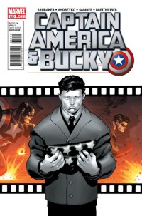
CAPTAIN AMERICA AND BUCKY #620
What did the
iFanboy
community think?
Pulls
Art by Chris Samnee
Colors by Bettie Breitweiser
Letters by Joe Caramagna
Cover by Ed McGuinness, Val Staples, Mark Bagley & Andy Lanning
Size: pages
Price: 2.99
There’s something about Chris Samnee.
When Captain America was renumbered, I figured that’d be a nice way to keep the new Steve stories in a nice stack next to but separate from the nice stack of Bucky stories. Sorry to say I like Bucky’s story more, perhaps just for the art. Full disclosure, my experience with McNiven is good but not great. When his characters are not jumping through the air or screaming for some reason as they let ‘er rip on an automatic weapon, I find they look kind of wooden. In Cap #1, there’s a scene at the old folks home when a doctor and Nick Fury are just walking and talking; that could look boring and it does. But Chris Samnee injects drama into every scene, whether it’s a funeral, a fight in an alley, or a kid watching a war news reel. Every face is expressive, every shot is framed diligently, and the pacing is superb in a stays-out-of-the-way, uh, way. For every tried-and-true 3D panel-busting leap Rogers makes in Cap #1, there’s a subtle fudging of the ink in Cap & Bucky #620 that emulates spit flying from a brawler’s mouth. And it’s damn beautiful.
There’s not much more you need to know. The story from Ed Brubaker and Marc Andreyko is a touching father-son tale as well as a succinct Bucky origin that reads like a 22-pager. Samnee, Brubaker, and Andreyko work so well together to tell a fun yet fulfilling yarn, I forgot this was a $2.99 issue. McNiven’s layouts are cool and all but the flash and the style can be distracting and take up too much space to tell a story deserving four dollars. Steve Rogers is in this book so I recommend coming over to Captain American & Bucky for your fix.
Art: 5 - Excellent


Gotta admit, I’m glad we’re getting to spend some more time with Bucky. I admit to being one of the most ardent about his return being a bad idea, but once he was back I realized how much he really does bring to the table for Steve Rogers and his role as Captain America that no one else really can.
Think it’s pointless comparing the two, apples and oranges. Love McNiven’s stuff, but Samnee has just a completely different style to appreciate…guess you didn’t like Civil War and Old Man Logan? Too bad, but McNiven to me is a bona fide comic book artist superstar, most fanboys would probably agree, but Samnee made a splash with his Thor work, and now he’s on this and he’s making a name for himself with a style that is along the same lines of a Darwyn Cooke I’d say. Can’t really categorize McNiven’s unique style with anyone else’s.
@Franktiger Oranges can be better than apples, y’know.
McNiven’s work is sort of similar to that of Mahnke, Coipel, Immonen.
It’s just a matter of connecting me to the story. I cared more about Bucky’s relationship with his father because the characters emoted. The funeral for Peggy Carter stirred nothing in me.
@nathematics hm, wouldn’t compare McNiven with any of those three, not even close. Funny you’d bring up 3 of the foremost comic book artists right now, all in my opinion with their own unique styles. I’m sorry, but Samnee just isn’t at that level for me right now, maybe after all is said and done with his work in this I’ll reconsider, but you’re talking big event series artists with Coipel on House of M, Immonen on the current Fear Itself, and Mahnke did some Final Crisis, not to mention his Justice League Elite work, Samnee just doesn’t compare right now.